Shortly after he got my booklet, A Preliminary Taxonomy of Poetry, Geof Huth wrote an excellent review of it at his blog, here. It is also a critique, which I will not respond to in detail.
Bob Grumman has released a new book, really a chapbook, entitled A Preliminary Taxonomy of Poetry, and it combines the two halves of Bob’s intellect into one. The first of these is an interest in clear thinking, in making distinctions even if only for distinction’s sake, an interest in definition and categorization. And the second is its opposite, though it is the second that Bob rarely sees. The second is a tendency to simplify distinctions by setting rules that are not in evidence in the facts, a tendency to muddle things a bit, to wander.
And I love both these halves of Bob, even though, or probably because, they both can annoy me and enchant me, because their annoyance is often a possibility for illumination and because their enchantments lead me terribly astray. These two halves of Bob are the two halves of his visual poetry as well. He creates some of the most considered visual poetry, a poetry interested in the word and new senses of syntax, and he sometimes creates with this intellect visual poems that seem to care little about their visual presentation. Then he will create visual poems almost totally inscrutable from a verbal point of view but which are still among the most beautiful visual poems around. His best work is among my favorite being created these days.
Somewhere I gave my opinion of this idea of Geof’s but I’ve been unable to find what I said. It wasn’t much, only that I wouldn’t call my intellect divided in two: it’s just the tool I use to define, distinguish and classify reality, among other things. Sometimes it is effective, sometimes not, but it’s the same intellect at all times. As for its creating “visual poems that seem to care little about their visual presentation,” this goes back to an ongoing difference of ours as to the importance of what I consider trivial decorative effects and he considers centrally important effects–because, I feel, I’m more committed to the conceptual meaning of poetry than he is, and less to the sensual meaning. A complicating factor is that I lack the means–e.g., a superior computer and printer–often to create poems that look as well on the page as I’d like them to. All of which may seem to have little to do with our taxonomy debate but which, I think, parallels his greater interest in trees than in forests compared with my greater interest in forests than in trees.
It would have been helpful if he’d provided an example of my “setting rules that are not in evidence in the facts, a tendency to muddle things a bit, to wander.”
So there’s the context for this, a little accounting of my point of view, which might be only an accumulation of my own biases. I’ve left a few things out. I’ve known Bob for just under 25 years. He is my oldest visual poetry friend. And we almost never agree on anything. We come to visual poetry with much different ideas. As a matter of fact, when Bob says “visual poetry” he means something considerably narrower than I mean when using the same term. We are not sympatico in that way.
Why Taxonomy?
Bob opens the booklet with “A Defense of the Taxonomization of Poetry,” which is an impassioned defense of taxonomies and the effort it takes to produce them. Part of the reason for his passion is that Bob has suffered through a few sometimes heated arguments over the years from poets, especially visual poets, who are themselves passionate in their opposition to taxonomies. These people see a taxonomy as the equivalent of an autopsy that produces no results. In this opening section, Bob does a reasonable, though quick, job of directly disputing the ideas of the critics of taxonomy, but he provides no justification for taxonomy at all, except to say that “an effective taxonomy” allows “the clarification of discussion.”
This is a big weakness to me. In the face of enormous criticism of taxonomy, Bob undermines the arguments of his opponents, but not in a way that argues the case for his own. All of his arguments are negative. None is positive. The one above is actually my reversal of his refutation of his detractors’. Bob needs to prove how his taxonomies do something valuable. What he does is insist that they do something valuable without clarifying those values or giving any evidence of any.
As I’ve elsewhere noted, I provided much more justification for taxonomy: for instance, I called it the basis of the conceptual appreciation of art, and declaimed that “At their best, taxonomies (and analysis in general) reveal ever-smaller mysteries, and ever-vaster interconnections to discover down or up to–while allowing us a vocabulary greater than ‘oooh’ and ‘ahhh’ with which to share our pleasure with others.” Geof has since shrugged these off as trivial. I’m in the processing of making much more elaborate points, but I consider these pretty good ones.
Upper Levels of the Taxonomy
This taxonomy of Bob’s is the most formal he’s ever created. It begins with the Universe of the taxonomy (in this case “Matter”), and narrows down from there:
Domain: Life
Kingdom: Human Life
Phylum: Mentascendancy (“the pursuit of meaningfulness”)
Class: Art
Order: Literature
Family: Poetry
Immediately, I’m thrown into a quandary, one of definitional confusion and doubt. Is Poetry really divided into Matter (instead of its opposing universe: Mind) or into Life (instead of Non-Life). Even if stored inside a human, aren’t poems really only inanimate? and are they not more things of the mind rather than of matter? A poem on a page is not so much the poem as a poem accepted into a mind. This is a serious issue, one that needs justification in the taxonomy.*
Frankly, I feel Geof has been thrown into goofiness here. But maybe that’s my fault, for not having defined “human life” as “everything having to do with human beings, including their activities and products.” I didn’t define “mind,” either. For me, it is irrelevant–a consciousness that observes matter but does not otherwise interact with it. It has no subclasses. I only put it in my taxonomy to be complete.
I agree with Geof that poems are only inanimate. However, while they are products of the brain, which I’m sure is what Geof means by the “mind,” so are cars. What counts in my taxonomy are what they are as matter, to wit: verbal expressions, oral or written. That they become sets of activated brain-cells is interesting, and I believe will ultimately vindicate the validity of my taxonomy (by showing which brain-cells are activate for each different kind of poetry in my taxonomy), but my taxonomy only deals with what’s out there in the real material world.
Even if that were not the case, I don’t see that it would make much difference. What defines poetries as written or spoken material artifacts would define them as mentally accepted artifacts.
At the Level of Prose and Poetry
Bob divides all literature into two main families, Poetry and Prose, and this might be a satisfactory division, though I would have, at least, discussed dramatic works and addressed the question of apparent hybrid forms, such as the verse novel and verse play. Here, Bob posits that “poetry is intended to be read slowly, read into rather than through: connotations, sounds, rhythms, flesh being emphasize rather than denotation only.” In general, the general direction of this definition is fine, but it’s too absolute and doesn’t take into account such facts as the inclusion of doggerel in the family of poetry, or that fact that many prose works depend on all the effects mentioned by Bob and also do not depend on denotation alone. This definition is complicated by Bob’s paragraph that consists of this sentence: “Literary prose is simply literature that is not poetry,” which seems to assume that any works that depend on denotation alone (or, let’s say, principally) are thus prose. This situation is quickly complicated again by Bob’s not-quite-stated-but-clearly-implied point that poetry is text that includes flow-breaks, the most well known of which is the linebreak. Whatever poetry or prose is or isn’t isn’t clarified here.
In other writings I’ve done, I’ve gotten into verse plays and other such things. In my unpreliminary taxonomy, I will, too. I didn’t here, which is a minor flaw Geof is right in pointing out. His main criticism may have resulted because I for got to say, as I usually do when differentiating poetry from prose, that poetry is verbal expression in which flow-breaks (as I define them) are clearly significant. Prose is verbal expression in which flow-breaks occur relatively very infrequently. Yes, it’s a subjective matter, and yes, there will be instances of works of verbal expression whose category will be difficult to decide. But expecting a taxonomy to be perfect is absurd.
The same argument holds for poetry’s being “intended to be read slowly, read into rather than through: connotations, sounds, rhythms, flesh being emphasize rather than denotation only.” I suppose I should have written that it is significantly more than prose “intended to be read slowly, read into rather than through: connotations, sounds, rhythms, flesh being emphasized rather than denotation only.” Again the problem of subjectivity (which no attempt to define or classify can avoid, but must only try its best to minimize) arises, and of the borblur where rare works of verbal expression occur that are hard to define. Note well, however, that what I say about poetry here is descriptive only. It has nothing to do with the classification of poetry, which depends entirely on whether or not its ratio of flow-breaks to words is sufficiently high to make it poetry or not.
I would add in passing that doggerel is, even without truning to flow-breaks, poetry on the basis of its sounds–since doggerel always has rhyme ends.
Flow-Breaks
Bob, next discusses, flowbreaks (I’m discarding the hyphen): 1. the linebreak, 2. variable indentation, 3. interior line-gap (which is simply a caesura), and 4. the intrasyllabic linebreak. Here is the genius of Bob Grumman. He sees and defines topographic features of poetry that others have virtually ignored and he sees how they fit together into one set of poetic tools. My only problem with this is that one of his examples of an intra-syllabic linebreak is really intersyllabic, and the the fact that a line breaks within a word or a syllable doesn’t make it significantly different from a traditional linebreak. What he should have used as his fourth category of a flowbreak was an instance of visual tmesis, which would be a different form of flowbreak.
I checked and was surprised to find that in obsolete verse, blocks of more than one space are used to form caesurae. I always thought of them as rhetorical breaks with nothing special indicating them but the sense of the text where they are, or a simple punctuation mark. The term, “line-gap” is still necessary, however, because it applies not only to blocks of spaces but blocks of anything else that clear put a blocking gap int&&&o a line.
My two examples of intrasyllabically broken words were “dev/ice” and “i/t.” line-break. For me, “device’s” two syllables are “de” and “vice,” but maybe I’m wrong.
I like “flow-break” as opposed to “flowbreak,” by the way, because I think the hyphen emphasizes its meaning.
Types of Poetry
This lengthy discussion has brought us only to the saddle-stapled middle of the chapbook, which is where Bob divides poetry into three classes: linguiexclusive poetry (poetry dependent on words alone) and pluraesthetic poetry (poetry that mixes “expressive modalities,” such as the verbal and the visual. This distinction is solid, though I have questions with the subsubtypes of poetry Bob identifies.
Linguiexclusive Poetry
Just one i in “linguexpressive.”
Bob divides linguexclusive poetry into three subsubtypes: orthological, xenological, and language. The first is fairly standard poetry (subdivided yet again into categories), the second is poetry that breaks with the conventions of normal sense and syntax in various ways, and the third subsubtype is both confusing and unnecessary. All of its pieces should appear under xenological. Bob has divided to use a term here (“language poetry”) that already has a meaning, though a taxonomically unhelpful one, and he gives it a new sense to no particular purpose.
Geof may be right, but I think of xenological poetry as breaking with logic, not breaking with syntax, although I can see that a breaking of syntax will also cause a break in logic . . . I think. Not to argue but for background, the reason for the split is that in an earlier version of my taxonomy I divided poetries on the basis of their innovativeness, and put surrealistic and jump-cut poetry under “xenological poetry” among the uninnovative poetries, since their innovations where much older than language poetry’s, and not, in my opinion, as great.
“Language poetry” has no real meaning. At least I’ve never seen it defined. well, unless you consider “language-centered poetry” a definition. In any case, I long avoided using it but finally decided that it was popular enough and appropriate enough to use, and that I could use it to mean “language-centered,” but go on to define it in much greater detail. I think I will keep it, but perhaps put it under “xenological”–after changing “xenological” to “xenexpressive.”
The definition he gives is “Language poetry is poetry in words [that?] seem to be used with almost maximum communicational responsibility. Language is at the center of such poetry, not semantics or sound.” This definition does not seem at all helpful to me, and I cannot imagine a poetry without semantics that still focuses on language.
I would guess my computer screwed me up when I wrote my “definition” of language poetry. However, the three kinds of language poetry I went on to define should have clarified everything sufficiently. Language poetry is poetry whose words seem to be used with almost maximal communicational IRresponsibility (I’m sure i mistake was mine, not my computer’s) Language is at its centr, not semantics or sound. That semantics is not at its center does not mean it does not have semantics. I’m trying to say that it focuses on what words do rather than what they mean. Then in my three kinds of language poetry, I show some of the ways it does that.
Pluraesthetic Poetry
In discussing the types of pluraesthetic poetry, I’ll skip any discussion of the fact that Bob redefines “visual poetry” for his own uses, because it is important for him to do it here in order for “visual poetry” to fit neatly into his definition of poetry. Bob, however, also distinguishes mathematical poetry and flowchart poetry (“poetry that uses the symbols of computers or other flow-charting in significantly expressive ways”) from visual poetry, but I do not. Mathematical poems add mathematical features that visualize the poetry, so I consider them visual poems, and to have a category for flowchart poetry assumes that process symbols are textual and thus not visual. I’d argue, again, that they are not orthodox text, so these poems are also visual poems.
I’ll just state my disagreement–and the reason for my disagreement, which is that the point of my taxonomy is to separate different members of the set, “Poetry.” A term is of value only to the degree that it is specialized. I should add that I flubbed my definition of flow-chart poetry; it should be simply “poetry that uses flow-charting symbols in significantly expressive ways.”
Also, Bob’s definition remains indefensible: “poetry that uses mathematical symbols that actually carry out mathematical operations.” These mathematical operations are not actual; they are apparent. That is a big different. Duck cannot be divided by yellow in any mathematical way, though it could in a metaphoric way that has nothing to do with math directly.
See my previous entry discussing this.
For reasons I don’t understand, Bob distinguishes between “cyber poetry” and “hypertextual poetry,” which is not a distinction. Hypertext poetry would be a subset of cyberpoetry. But the real taxonomic distinctions in the category would be between non-interactive and interactive digital poetries, not by the types of computer languages used in the coding of the poems.
To me the distinction is between poetry that consists of computer language and poetry that consists of regular language but may have embedded computer instructions that allow it to do things poetry without them can’t.
Bob leaves out of his poetry videopoetry, which might have some overlap with cyberpoetry that Bob will have to work out.
Videopoetry is just animated visual poetry.
Numbering
Finally, since Bob is presenting a complex nested taxonomy, he should design a numbering system that allows the user to determine their level in the taxonomy and, thus, be able to identify relationships more easily. At points I was briefly confused because I did not understand what certain headings were subsets of. Even the traditional outlining system once taught in school to students drafting essays could work here, but I think, given the number of levels in play, something direct though a little more complex, such as the number system in the Historical Thesaurus of the Oxford English Dictionary, would work better.
Good point.
Coda
Bob’s “Final Comment” includes this unsupportable statement: “I think no members of any other vocation care less about what they do than poets.” I’d say this is an unprovable statement, so it’s opening “I think” saves it, but I also believe everything after those first two words is false. Poets, in my experience, care more about poetics than about poetry. They are more likely to read someone writing about poetry than to read the poetry. They prefer, for instance, blogs on poetics over blogs that reproduce poetry. Poets are thinking people, even when guided by the heart, the spleen, the bone. But sometimes that interest in how poetry works does not extend to an interest in categorization. A general interest is not equivalent to an interest in taxonomy.
At the end of this, I realize that I’d like to see the next draft of this book. I like the idea of seeing how poetry can fall into categories, though I’m sure those categories will dissolve into one another. And I’m happy that Bob has made this book and glad that he has. But he still needs to prove how these defined categories could help us think about poetry. I don’t see it, even though I like the effort to make these categories and the entertainment of the results of that effort.
Finally, my thanks to Bob for giving me a special limited edition of one of the book, with a copy of one of his mathemaku pasted in. I’ve filled my copy with pencil marks of various kinds and notes to myself, but it is still a perfect copy. And I used pencil because I’m an archivist.
I truly thank Geof for his efforts. One of the reasons I say things like “no members of any other vocation care less about what they do than poets” is because, yes, they IN GENERAL are indifferent or hostile to projects like this of mine, even to my simple attempt over twenty or more years to get a list of contemporary poetry schools assembled. Two people suggested schools I didn’t have on my preliminary definitely incomplete list. I would add that I don’t think my idea of what poetics is comes very close to what most poets who think they’re discussing it think it is. But, hey, I’m a bitter old man long ignored by the public at large while tenth-raters make it big.
Not really. Just when I think about my situation in the world of poetry while writing entries like this one.
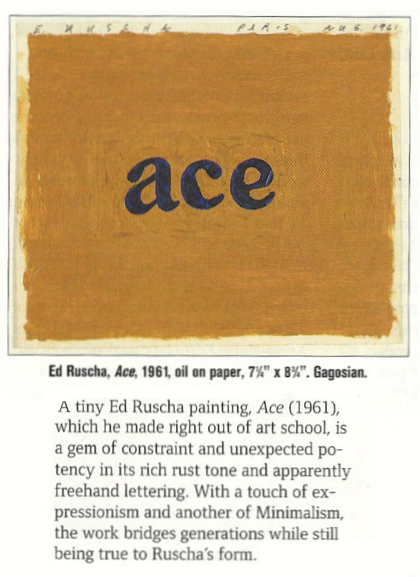


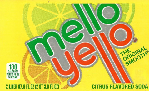
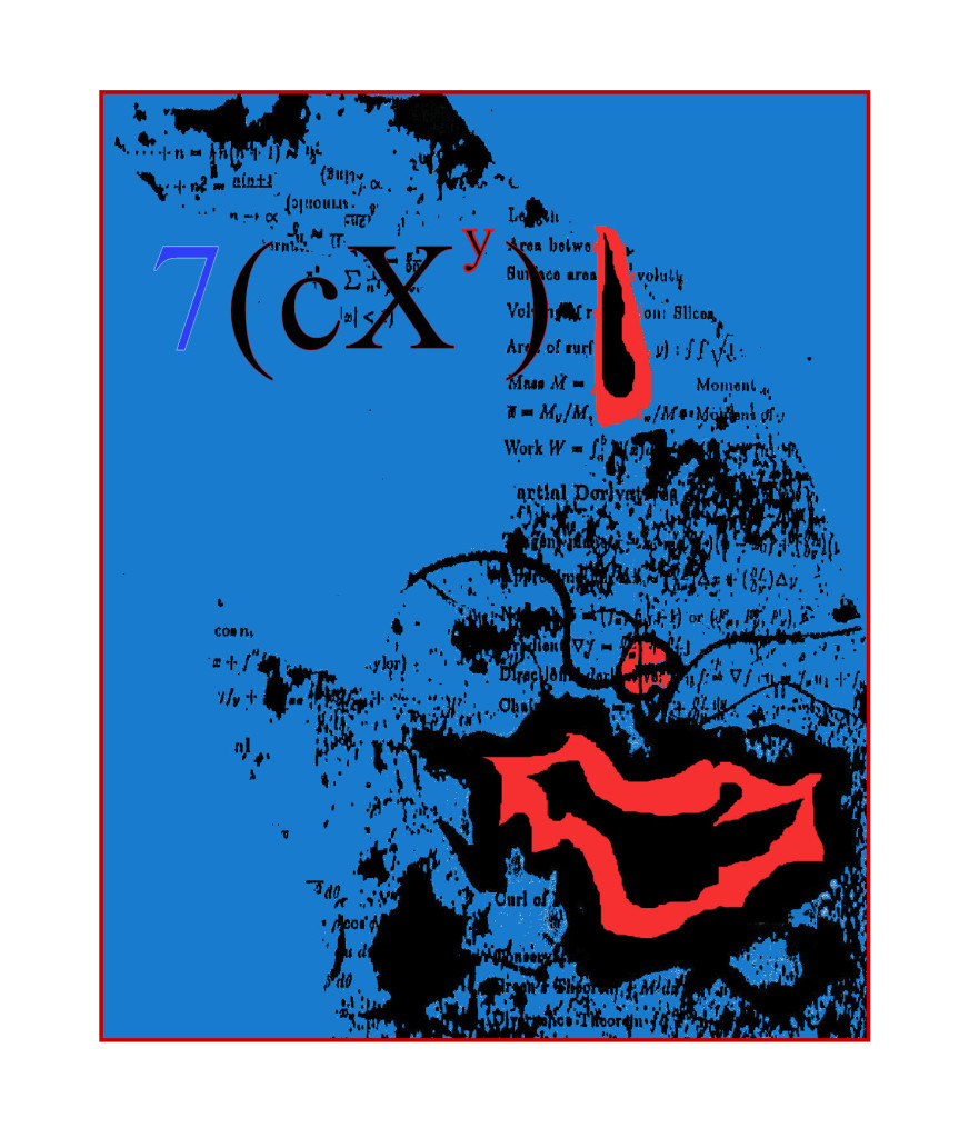
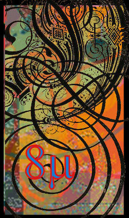

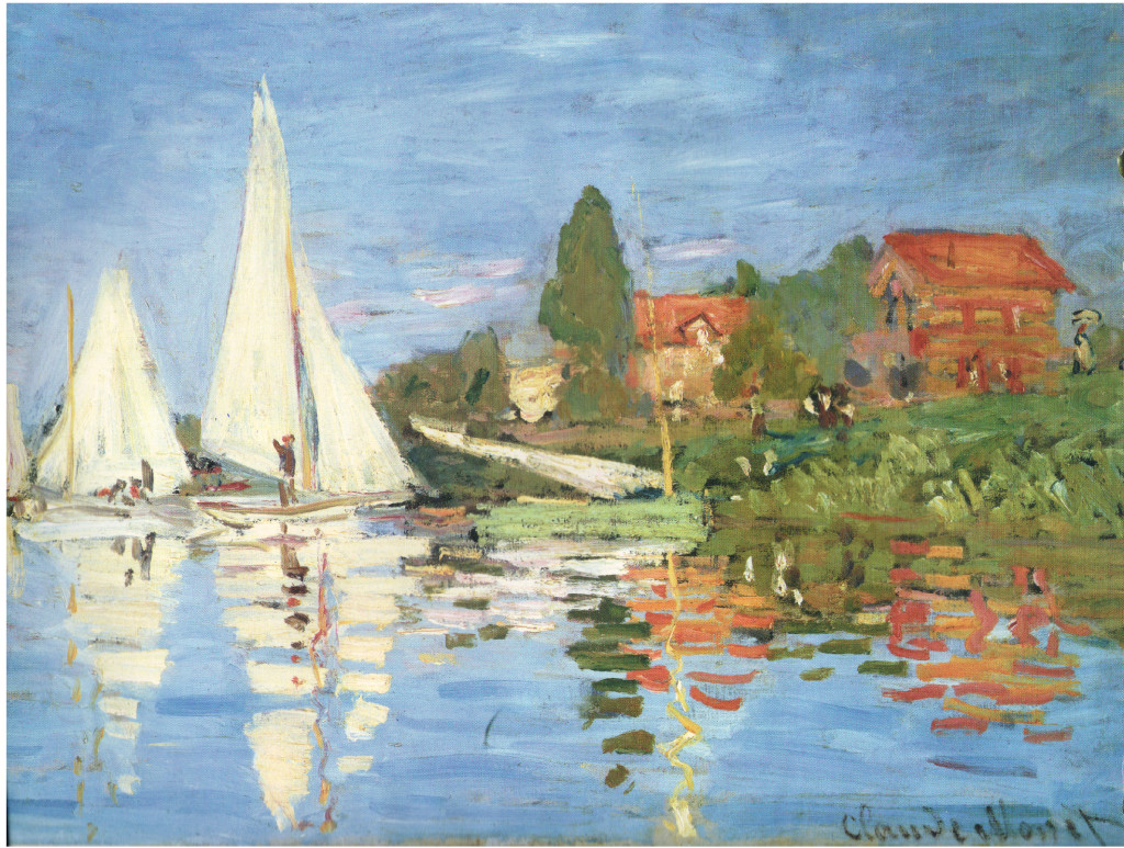
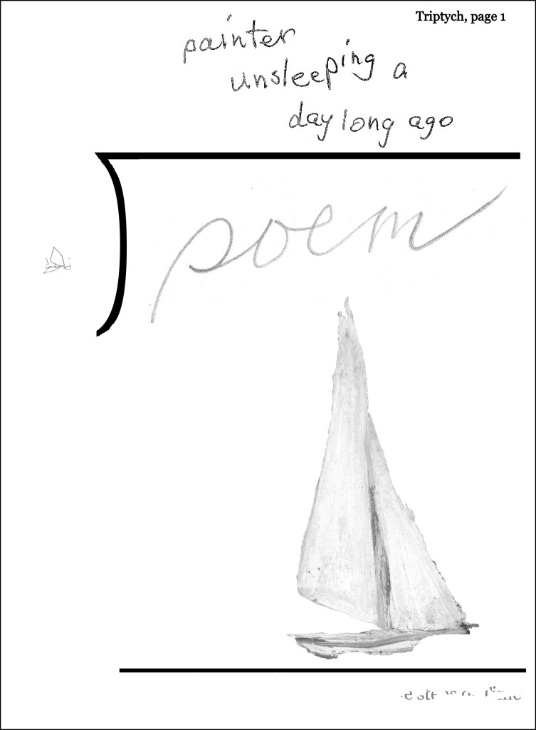
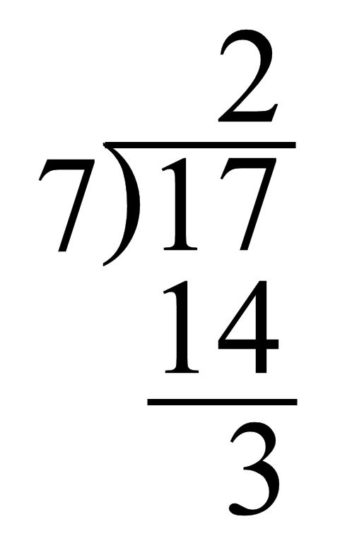
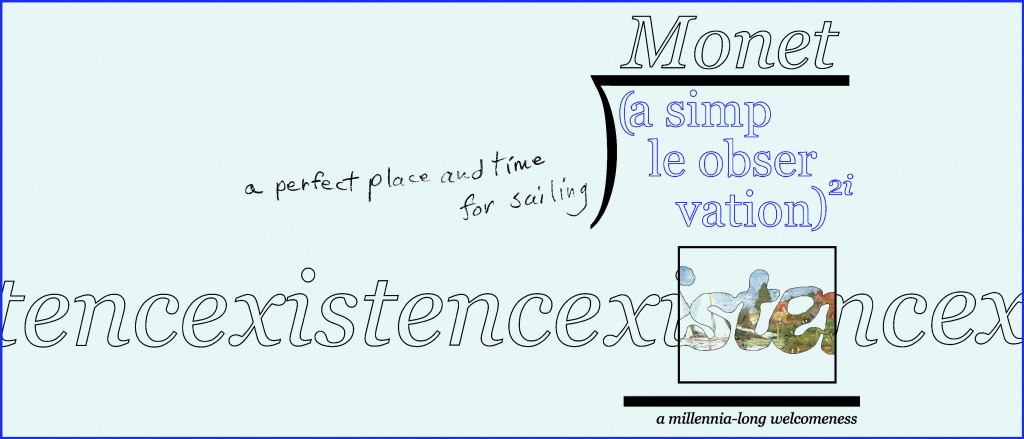
I don’t care whether a poem can be read aloud or not. Mathematics is written in text just as ordinary verbal material is. Text printed standardly is effectively not visual, as far as I’m concerned: it’s symbolic. So a purely mathematical poem, in my definition, would be expressed in verbal and mathematical symbols.
On further thought, it seems to me all mathematics can be read out loud. So what if one needs to see it on the page to understand it? That would be true of many linguexclusive poems, too. Even relatively simple ones. I’ve almost never understood poems I was unfamiliar with when read at poetry readings.
As for the child and candy cane, I like your reasoning, but it now seems to me you have simple shown that “candy cane + child = happiness” and “candy cane + child = obesity” are both incorrect! They should be “candy cane + child = happiness + X” and “candy cane + child = obesity +Y.” And “happiness – obesity + X – Y.”
One futher note: even if we admitted that difficult math must be seen to be understood, that would not make “candy cane + child – X = happiness” a visual poem since that particular poem would not have to be seen to be understood. That said, I can’t wait for the first mathematical poem based on mathematics you have to see on the page to understand.
–Bob