Entry 35 — Thoughts on Scatteredness « POETICKS

Entry 35 — Thoughts on Scatteredness

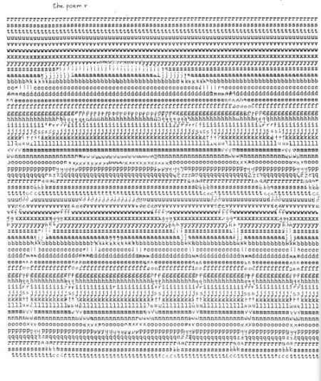
On Sundays, I turn off my computer at eleven in the morning and leave it off till five so people who want to talk to me on the phone can do so (which they can’t when I’m connected to the Internet because I have dial-up, and also like to stay connected to the Internet even when not using my computer so as to block junk phone calls).  Ergo, since it’s quarter to eleven as I type this, I’ll soon be off the computer.  I could still do a Major Entry offline, but it’s more difficult than doing it online and I’m lazy.  In any case, I’m going to do a quickie today, just this, quoted in its entirety with no changes from #671:

3 December 2005:

Someone I argue with on the Internet about who wrote Shakespeare asserted that “those who achieve greatness go about their work in a markedly different way than those who achieve only mediocrity. A scattershot approach to writing, wherein one works on several ‘major projects’ (forgive me for refusing to equate the composition of King Lear with the cleaning of your house, Bob, but I don’t think I’ll even bother to come up with support for this assertion) is an indication, not that we are dealing with a major talent, but rather that we are dealing with procrastination and mediocrity.” We were arguing about a recent Biography of Shakespeare that hypothesized that he finished four different plays in one year. My opponent claimed it wasn’t possible; I that it most certainly was. I used myself as an example of a writer who had a lot of major projects going at a time. Hence, my opponent’s distinguishing “mediocrities” from Shakespeare-level artists. I mentioned getting my house organized as one of the major projects I was involved in, which accounts for his reference to “the cleaning of (my) house.”

It seems to me many culturateurs (people whose contribution to world culture was major) worked on four or more major cultural projects (a major project needn’t be cultural) during a year, and some of them worked on two or more of them simultaneously, especially composers and painters. A blurriness of recall prevents me from thinking of any particular such culturateurs except for Leonardo–who was definitely handicapped by his approach to his endeavors; I wouldn’t say it was a “scattershot approach,” but it leaned that way, for sure.

I’ve always alternated between pride in my scattershot approach and worry about it. Certainly, it’s kept me from finishing much. But, I claim, only so far. Next year, will be different. Actually, this year hasn’t been so bad, for I finished one long-in-progress play during it (and two such plays near the end of the year before). At the moment, I am at work on (1) my book on the Shakespeare authorship debate (which is more an introduction to my theory of psychology, (2) a central life’s work of mine); (3) and (4) two new plays, (5) my essay on E. E. Cummings’s Influence (which I hope will become book-length at some point), (6) these blog entries (and improvements to my blog), (7) my mathemaku sequence,The Long Division of Poetry, (8) a large mathemaku I’m tentatively calling “Mathemaku in Homage to Modern Technology,” (9) my mathemaku, in general, (10) my Poem poem sequence, (11) getting mine house in order, (12) various anthologies or zines I’ve agreed to send poems or essays to and/or guest-edit. Impressive-sounding, but I do procrastinate, and play Civilization too much. I won’t finish any of these this year, and may not ever. Nonetheless, I’ll be severely unhappy if I don’t take care of most of them next year–as well as get the next volume of Writing To Be Seen, the anthology Crag Hill and I have co-edited, into print, another major project. It remains to be seen whether or not the results will make it above mediocrity, but I’m betting on myself.

Just changed my mind–got curious as to what happened with the projects I was working on almost exactly four years ago.  So, here’s the list again with my comments: At the moment, I am at work on (1) my book on the Shakespeare authorship debate (which is more an introduction to my theory of psychology (Whee, finished and self-published in two editions!);(2) a central life’s work of mine) (not sure what this was but probably finishing a complete version of my knowlecular psychology theory, which I am no closer to having done than I was four years ago); (3) and (4) two new plays (unfinished, one of them possibly lost in a computer crash, but the other at least half done): (5) my essay on E. E. Cummings’s Influence (which I hope will become book-length at some point) (I finished this as a long essay but haven’t made a book of it, which I still hope to do); (6) these blog entries (and improvements to my blog) (I have kept the blog going); (7) my mathemaku sequence,The Long Division of Poetry (I have extended this significantly since then and improved it, I believe), (8) a large mathemaku I’m tentatively calling “Mathemaku in Homage to Modern Technology” (I finished this); (9) my mathemaku, in general (I’ve continue producing mathemaku, although not as rapidly as I hoped I would back then); (10) my Poem poem sequence (It’s ongoing); (11) getting mine house in order (I think I half-did this, but it’s as disorganized as ever right now);(12) various anthologies or zines I’ve agreed to send poems or essays to and/or guest-edit (A few of these done possibly, but most not).

Leave a Reply

Visual Poetry Specimen « POETICKS

Archive for the ‘Visual Poetry Specimen’ Category

Entry 621 — Evolution of Style

Wednesday, January 11th, 2012

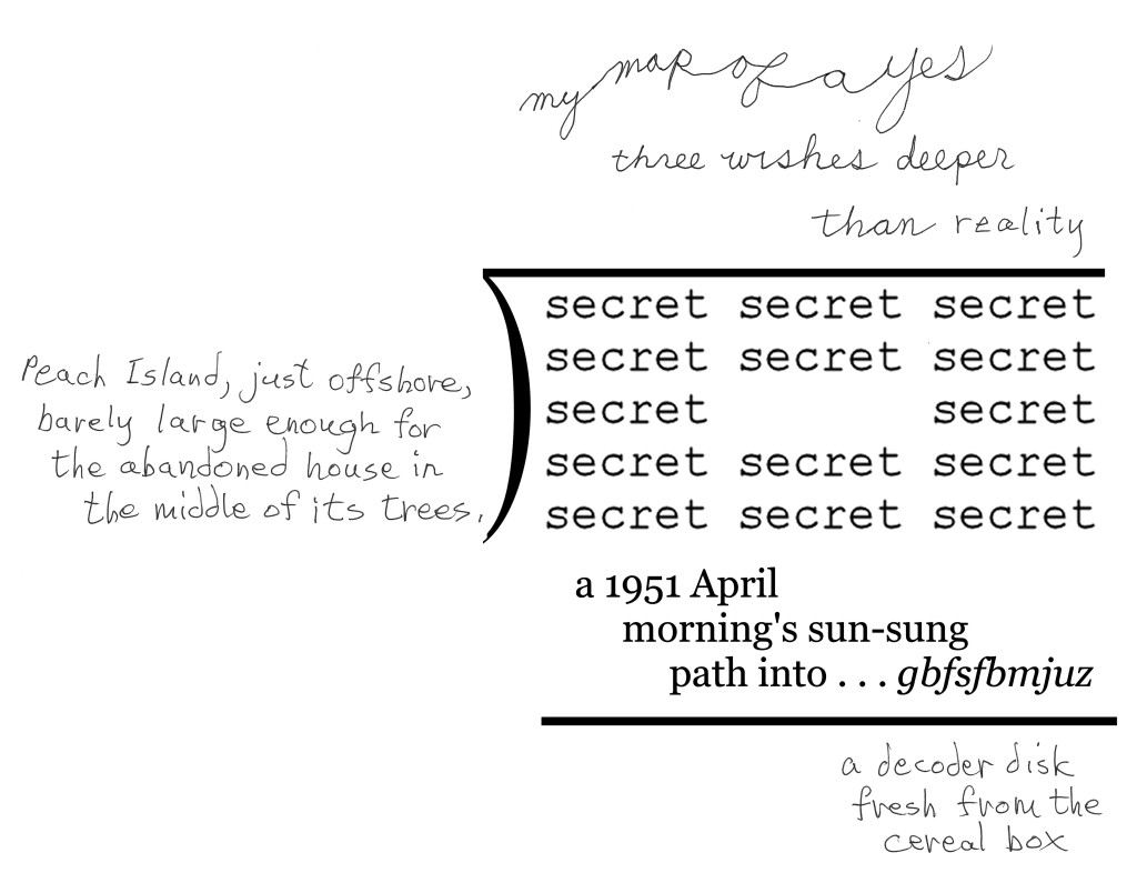
One of my works that I was particularly pleased with when I came across it while backing up blog entries was the following:


I have one problem with this: my only version of  it is a low-resolution jpg, which I don’t know how to convert to high-resolution tif, except by simply redoing it.  Any suggestions from anybody out there who knows more than I do about this kind of thing?

I didn’t re-post it only to ask for help, or because of how much I like it, but as an example of how my work as a poet has evolved.  Actually, I want to show that it has evolved.  That’s because Paul Crowley, the nut I most argue with on the Internet about who wrote the works of Shakespeare, seems not to believe that a poet’s style, or way of making art, evolved once he’s past his apprenticeship.  Of course, he will claim I’m not a poet, and that the evidence I’m about to produce to show my evolution indicates only trivial changes, not anything like genuine evolution.  I enjoy talking about my work, and analyzing any poem, so will go ahead with my demonstration, anyway.

First of all, I should state my claim: it is that over the past couple of years, my style as a poet has evolved appreciably, and that this poem illustrates it.

(1) I only began using cursive ten or fewer years ago, and never for more than a word or two.  This poem and two others have all or most of their texts in cursive.  Because the difference in expressiveness between print and cursive is visiopoetically meaningful to those who appreciate visual poetry, this wholesale use of cursive script counts as a significant evolution of style.

(2) My use of cursive is more elegant here than it is in mt other two recent poems making extensive use of cursive.  Note, for instance, the large O, and the increased gracefulness of all the letters compared with the letters in my other two cursive poems.

(3) Twenty years ago, I didn’t bother giving my poems backgrounds.  Since then I have, and have slowly been improving (but have plenty of room for further improvement).  Note the harmony of the background’s shape and colors with the text, especially the O. 

(4) The background has another important value–the connotations it picks up as a result of its being a variation (mostly through color changes) of the background in another poem of mine.  Connecting poems of mine with others’ poems and others of my own poems is another way I’ve evolved as an artist, not doing it until perhaps twenty years ago, then only very slowly doing it to a greater and greater extent.  This poem may be the first to re-use an entire background from another poem.  This is not trivial, for it allows this poem to suggest “dictionary-as-temple,” the main part of the foreburden of the poem its background is from.  It also should make this poem easier to enjoy, the same way the repetition in a new musical work of an old theme is usually pleasant to hear.  I believe the happiness of the colors of this version of the background gains from the reminder of the different, lower-key mood evoked by the other version.

(5) The use of color in tension with greyscale is another trick new to me twenty years ago that I exploit more and more in my present works, as here (though I’ve done more with it elsewhere).

(6) I think my language has evolved over the years, too–from fairly literal to metaphorical and/or surreal.  The “logic” of this piece and most of my recent pieces is not so easy to guess, which may be an unfortunate evolution, but an evolution nonetheless.

(7) You can’t tell from this image, which has been reduced in size to fit the normal computer screen, but the hard copy is larger than anything I did ten or more years ago, which is another result of evolution. 

Here’s my first or second mathemaku, done thirty or more years ago, to make the profound evolution of my style more inescapable. Yet I maintain this piece is at the level of later pieces; it is simply more condensed. For one thing, it is only linguistic and mathematical. Nothing visioaesthetic happens in it. The eye is used only to recognize the symbols it contains, not to enjoy colors or shapes the way my faereality poem compels it to–i.e., not a visual poem (except inthe mindlessnesses of those for whom just about everything is a visual poem). It is short, and printed. Its words are simple to an extreme.

.

Entry 620 — Getting Enough Sleep

Tuesday, January 10th, 2012

A little while ago (it is now around 9 P.M., 9 January)  I was feeling good.  I attributed this to my having gotten two naps today, one of an hour, the other of one or two hours.  And I had gotten six hours of sleep last night, which is about as much as I generally get.  I had just about finished backing up my blog entries and was very pleased at how good many of my poems seemed to me when I noticed them during the process.  Unfortunately, I got the dates up my upcoming entries wrong, and in correcting them, lost what I had written for this entry.  That pretty much wiped out my mood.  I can’t stand screwing up like that, but I do it all the time!


This is a pwoermd I stole from Geof Huth’s blog–because it has become too sophisticated to accept comments from dial-ups like my computer, and I wanted to comment on it.  It’s by Jonathan Jones, lately of Brussels, but a citizen himself of the United Kingdom.  What I like most about it is that it’s lyrical–as too many pwoermds are not.  It wouldn’t be a visual poem for me, but an illustrated poem, except that I subjectively feel “apri’ll” is producing the wonderful colors of spring it is slanted into a portion of (through sheer will-power).  Hence, in my taxonomy it is an infra-verbal visual poem.

.

Entry 618 — “Hungarian Vispo No. 2″

Sunday, January 8th, 2012

Marton Koppany’s latest visual poem may be the gentlest satire on a country’s government ever, if I’m interpreting it correctly. Note the boot on the head of one of the country’s citizens, for instance–and the complete insanity of the country the cloud with an umbrella suggests. Much more is going on that I’ll let you discover without help.

Hungarian Vispo No. 2

.

Entry 613 — Vispo SpamAd

Tuesday, January 3rd, 2012

The following is a detail from a Spam ad that I got yesterday.   It’s a good example of a commercialized visual poem.  Effective as an eye-catcher, but not very good as a visual poem.


 Below is my improved version.  Certainly not yet a great work but better than the original.  If you can’t see why, I’m afraid you aren’t too perceptive about the art.  If you can’t see how the basic idea could be used in a far better piece, you probably aren’t an effective visual poet, or are tired.


Diary Entry

Monday, 2 January 2012, Noon.  I got up late because I stayed up late last night watching my Giants fall apart, but win anyway because Dallas fell apart just in time to keep from winning.  I don’t think the Giants have much hope of going far in the play-offs, but I’ll be rooting for them.  And the other teams are pretty inconsistent, too, except for San Francisco and Green Bay.

I began the day by forcing myself to run.  Actually, I slowly ran, then ran fast albeit not really fast, then walked.  Rrrrrruuuuunnnnnn, rruunn, walk over and over until I’d gone around the middle school field four times (two miles).  My stamina is still amazingly poor, but I actually genuinely sprinted when I went all out.  Which is to say, I was able to pump my legs all the way up and stretch out, the way one does when sprinting.  I didn’t do it fast enough to really sprint, but I did it.  I was worried that I no longer could.  Now it’s just a matter, I think, of getting enough stamina to push myself harder, and for longer periods.  My “sprints” were only for around twenty yards or so–but maybe a whole forty once or twice.  Since getting back, I posted my blog entry for today, which was easy because already done.  I corrected my latest Page, “How to Appreciate a Mathemaku,” after getting a list or errors I very much appreciated from John Jeffrey.  I have a lot more chores to do, but I’m already worn out.  Maybe after lunch and a nap I’ll be able to get more done.

5 P.M.  One more chore out of the way: filling in the size and price of my works on the exhibition contract and tags.  I’m asking $200 for most of them.  Highest price is $600.  Two I’ll accept $100 for.  I don’t expect to sell anything.

.

Entry 598 — “Fifty”

Monday, December 19th, 2011

This is from Geof Huth’s blog:

 I liked this when I first saw it although I didn’t find it saying anything verbally.  When I finally realized it said, “fifty,” I thought it accidental because I couldn’t see why it would say that.  My slow mind eventually remember that Geof is now fifty-years-old, which makes this image a particularly effective representation of his present strange combination of freedom and awkward incompleteness . . . straining, yearning for something.  With his ego (“I,” as Karl Kempton would be sure to notice) lost or transcended.

Diary Entry

Sunday 18 December 2011, 6 P.M.  Another unproductive day.  Tennis in the morning, a fine meal at Linda’s in the afternoon.  A blog entry for today just taken care of a little while ago.  A little work done on my “Mathemaku for Scott Helmes” to count as “work on preparation for the A&H exhibition.”  And now I’d like to go to bed, but will probably read instead.

 .

Entry 597 — Chumpy Leg

Sunday, December 18th, 2011

John M. Bennett has another major collection of poetry out.  This one is called The Gnat’s Window.  78 poems.  Bilingual.  Closely inter-associating sequence.  Amazing.  I told John I’d try to do a critique of it, and I still hope to once my year-end chaos of chores is behind me, but–gah–John is one of the few poets I feel may be beyond my abilities as a critic, and he’s at his best–and therefore beyondest–in this book.  Part of one of the poems, which Diane Keys has found a way to, uh, fatten, in all the best senses, with color, a piece of cloth and some cursive annotations–and the circling of “crumpy leg, is below.  It’s from the back cover of John’s book.


Diary Entry

Saturday, 17 December 2011, Noon.  Wow, since getting back at eleven from tennis and a McDonald’s snack, I’ve already gotten the day’s blog entry posted, which was easy because it was already done, and made a finished copy of  the new version of “Mathemaku for Scott Helmes” at Paint Shop.  It’s not the official copy: it’s too small, and the official version will include the original cut-out fragments of magazine ads.  There will also be the A&H framed version which will be in between the one I just made and the official version in size. 

8 P.M.  Since noon I haven’t done much.  I printed out two copies of “Mathemaku for Scott Helmes” and scribbled annotations explaining the terms I will put on one that will be on display atthe exhibition.  Otherwise, I continued reading started yesterday of the magazines and books I will be reviewing for Small Press Review

.

Entry 587 — “The Bells”

Thursday, December 8th, 2011

My friend, Richard Kostelanetz is writing (actually, revising) an essay dealing with, among other things, appropriated art.  When he asked something about Tom Phillips’s A Humument, I remembered other superior examples of appropriation art such as the work on a dictionary of Doris Cross, and the following appropriation of Edgar Allen Poe’s “The Bells” by Michael Basinski, which I thought worth posting here:


Here’s the original:

Hear the sledges with the bells–
Silver bells–
What a world of merriment their melody foretells!
How they tinkle, tinkle, tinkle,
In the icy air of night!
While the stars that oversprinkle
All the heavens, seem to twinkle
With a crystalline delight;
Keeping time, time, time,
In a sort of Runic rhyme,
To the tintinnabulation that so musically wells
From the bells, bells, bells, bells,
Bells, bells, bells,–
From the jingling and the tinkling of the bells.

Hear the mellow wedding-bells,
Golden bells!
What a world of happiness their harmony foretells!
Through the balmy air of night
How they ring out their delight
From the molten-golden notes!
And all in tune,
What a liquid ditty floats
To the turtle-dove that listens, while she gloats
On the moon!
Oh, from out the sounding cells,
What a gust of euphony voluminously wells!
How it swells!
How it dwells
On the Future! how it tells
Of rapture that impels
To the swinging and the ringing
Of the bells, bells, bells–
Of the bells, bells, bells, bells,
Bells, bells, bells–
To the rhyming and the chiming of the bells!

In the essay I quoted Mike’s poem in, I called it “an amazingly loud-though-silent jangle of . . . Poe’s famous poem.”  I’d add here that Basinski’s version gave me the thrill that Poe’s version, I’m sure, gave many of its first readers.

* * *

Wednesday, 7 December 2011, Noon.  I’ve partly recovered from having accidentally deleted my blog entry for Monday.  A semblance of it is back up.  I also posted an entry for today.  I’ve done nothing else yet, but hope soon to go out to buy some frames and a pad of good-quality large paper.

Later note: I succeeded in finding two reasonably-priced frames of the kind I wanted (able to be stood up on a counter) that I bought.  That took care of my pledge to do something of value for my exhibition every day, barely.  Meanwhile, I sketched a new mathemaku.  Then took care of this entry.

.

Entry 584 — An & & My Full Triptych

Monday, December 5th, 2011

It seems that almost every time I seem to be getting productive, something knocks me down.  This time it’s only a lost entry–this one, that I was trying to correct some detail of and lost in the process–without realizing it, so was not able to try to find the lost material by backing up until it was too late.  So now I have to spend an hour or so, restoring what I can recall of what was here two days ago. 

 One item was this by Moribund Face:


And all three of my frames of “Triptych for Tom Phillips”:

About the ampersand, I commented something about how it expressed the essence of “andness.”  I loved the way its bird regurgitated what looked like all of itself, while looking to continue “anding” forever.  I said little about my full triptych except that if you click on them, you’ll see a larger image of them which may be helpful although still very small–and in black&white.  The original frames are each eleven by seventeen.  Oh, one thing I did point out was that the frames are about, “departure,” “journey” and “arrival,” and are intended to be about them in the largest sense, but particularly about them with regard to arriving–for either an engagent of it or its author.

* * *

Sunday, 4 October 2011.  Sunday is hazy to me now, three days in the past as it is.  I played tennis early in the morning–badly.  I didn’t return to my Shakespeare book, but evidentally got a blog entry posted, and probably wrote an exhibition hand-out or two.

.

Entry 551 — John M. Bennett’s “Cardboard”

Wednesday, November 2nd, 2011

There’s a Penguin anthology of twentieth-century out. It’s edited by Rita Dove.  Here’s a list of the poets represented in it, with thanks to John Jeffrey for having alphabetized it:

Ai
Elizabeth Alexander
Sherman Alexie
Paula Gunn Allen
A.R. Ammons
John Ashbery
W. H. Auden
Amiri Baraka (LeRoi Jones)
Ted Berrigan
John Berryman
Frank Bidart
Elizabeth Bishop
Robert Bly
Louise Bogan
Gwendolyn Brooks
Olga Broumas
Hayden Carruth
Lorna Dee Cervantes
Marilyn Chin
Sandra Cisneros
Lucille Clifton
Judith Ortiz Cofer
Billy Collins
Gregory Corso
Hart Crane
Robert Creeley
Victor Hernandez Cruz
Countee Cullen
E. E. Cummings
Carl Dennis
Toi Derricotte
James Dickey
Stephen Dobyns
Hilda Doolittle (H.D.)
Mark Doty
Rita Dove
Norman Dubie
Alan Dugan
Paul Lawrence Dunbar
Alice Moore Dunbar-Nelson
Robert Duncan
Stephen Dunn
Cornelius Eady
Russell Edson
T. S. Eliot
Louis Erdrich
B.H. Fairchild
Lawrence Ferlinghetti
Annie Finch
Nick Flynn
Carolyn Forche
Robert Francis
Robert Frost
Alice Fulton
Tess Gallagher
Albert Goldbarth
Jorie Graham
Angelina Weld Grimke
Donald Hall
Barbara Hamby
Joy Harjo
Michael S. Harper
Robert Hass
Robert Hayden
Terrance Hayes
Anthony Hecht
Lyn Hejinian
Garrett Hongo
Marie Howe
Andrew Hudgins
Langston Hughes
Richard Hugo
Mark Jarman
Randall Jarrell
Robinson Jeffers
James Weldon Johnson
June Jordan
Weldon Kees
Brigit Pegeen Kelly
Galway Kinnell
Carolyn Kizer
Joanna Klink
Etheridge Knight
Kenneth Koch
Yusef Komunyakaa
Maxine Kumin
Stanley Kunitz
Li-Young Lee
Denise Levertove
Philip Levine
Larry Levis
Audre Lorde
Adrian C. Louis
Amy Lowell
Robert Lowell
Thomas Lux
Nathaniel Mackey
Archibald MacLeish
Haki R. Madhubuti (Don L. Lee)
David Mason
Edgar Lee Masters
William Matthews
Heather McHugh
Claude McKay
William Meredith
James Merrill
W. S. Merwin
Jane Miller
Marianne Moore
Paul Muldoon
Harryette Mullen
Carol Muske-Dukes
Marilyn Nelson
Howard Nemerov
Naomi Shihab Nye
Frank O’Hara
Sharon Olds
Mary Oliver
Charles Olson
Gregory Orr
Michael Palmer
Carl Phillips
Robert Pinsky
Ezra Pound
Dudley Randell
Adrienne Rich
Alberto Rios
Edwin Arlington Robinson
Theodore Roethke
Muriel Rukeyser
Kay Ryan
Sonia Sanchez
Carl Sandburg
Delmore Schwartz
Frederick Seidel
Anne Sexton
Brenda Shaughnessy
Laurie Sheck
Leslie Marmon Silko
Charles Simic
Louis Simpson
Gary Snyder
Cathy Song
Gary Soto
David St. John
William Stafford
A.E. Stallings
Gertrude Stein
Gerald Stern
Wallace Stevens
Susan Stewart
Ron Stilliman
Ruth Stone
Mark Strand
James Tate
Henry Taylor
Sara Teasdale
Melvin B. Tolson
Jean Toomer
Natasha Trethewey
Reetika Vazirani
Diane Wakoski
Derek Walcott
Margaret Walker
James Welch
Roberta HIll Whiteman
Richard Wilbur
C. K. Williams
Miller Williams
William Carlos Williams
C. D. Wright
Charles Wright
Franz Wright
James Wright
Kevin Young

After seeing this list, I said what I knew I’d be saying before seeing it in a comment at a blog where it had been given an “A”: “Close to worthless. The good poets in it are already amply anthologized. Whole schools of the best American poets of the last forty years of American Poetry are entirely ignored. The one with Robert Lax in it (minimalism) for just one example. The editors of POETRY will find little in it, or not in it, to complain about-–which is proof of how bad it is.” 

Another ignored school, needless to say, is visual poetry, as represented by much of the work of John M. Bennett, such as this duo, “Cardboard,” that he posted just today (and he’s done scores as good):


I doubt anyone has more completely captured the essence of carboardedness–or the shuddery feel of decaying tenement rooms–than John has with these.  But with strangely joyful coloring in sharp contradiction of shuddering and tenements, but somehow absolutely right.  As with the poem by Gregory I seem to have abandoned, I find I need time before I’ll be able fully to appreciate these.

The Penguin anthology annoyed me, but after reflecting only briefly, it cheered me up: a comparison of its poets coming into their prime after 1950 to the poets in my crowd such as John M. Bennett could not more perfectly exemplify  academic art (including, I was amused to see, the least innovative portion of what’s being called “language poetry”) versus living art.  I may be deceived about the value of my work, but I know I’m not about that of my fellow visual poets.  We’re the Monets, Renoirs, van Goghs, Cezannes, they the French academics.

.


Enter 550 — Marton’s “Cursive” Again

Tuesday, November 1st, 2011

Marton  got back to me about his “cursive” yesterday, giving me enough material for a full entry.

 
He pointed out the direction of the leaves is not consistent.  I had not noticed it.  Which is a good lead-in to one of my much-repeated dogmas: there’s more to every good poem, however seemingly simple, than even a good critic will find on his own.  Marton believes that “the first and the second leaf are connected in a way which is not possible in nature.”  Hence, for him, the poem is displaying “the surmounting (or appeasing) of that impossibility.”  This is a reading in addition tomine, not a counter-reading since it is does not contradict my reading.  (Dogma #2: there is more than one good reading of any good poem-but there is only one main reading–to which all the other readings must conform.  That said, I read the change of the direction of the ellipsis to suggest oneleaf’s rebelliousness.  It doesn’t want to be part of an ellipsis.  Or, in my main reading, it it is eager for winter, and the other two leaves are not?  as for the linkage of the leaves being impossible in Nature, I’m confused: I view their stems as touching.  But is the image of a vine?  These leaves don’t look like a vine’s leaves to me. 
 
They don’t look like autumn leaves, as my main reading of the poem has it, either.  But they are detached leaves, so can’t be summer or spring leaves.
 
Marton also reminded me that he had dedicated the poem to me.  That, he added, “is an important piece of information. :-) ”  I was being modest, but I see that the dedication actually is important, for it connects the poem to my series, “Cursive Mathemaku.”  Thinking about that connection, I thought of something else to mention about the poem–the fact that cursive writing is personal.  The Nature in the poem is not a machine typing out falling leaves but an individual writing a poem with her leaves.
.
 

Entry 47 — Solution of a Cryptographiku « POETICKS

Entry 47 — Solution of a Cryptographiku

The Four Seasons

.

3 31 43 73 5 67    3 61 43 67 67 19 41 13    1    11 19 7 31 5  3 12 15 21 4 19    3 18 15 19 19 9 14 7    1    6 9 5 12 4  8 21 25 33 9 30    8 28 25 30 30 16 24 14    4    12 16 10 21 9  64 441 625 1089 81 900    64 784 625 900 900 256 576 196    16    144 256 100 441 81

.

Today, the solution, with an explanation, to the above.

1. Each line says, “clouds crossing a field.”

2. A reader should know from its looks and the fact that it is a cryptographiku that it is a coded text.  He should try simple codes at first on all the lines, the way one would in order to solve a cryptogram.  If he’s familiar with my other cryptographiku, he will know I’ve more than once used the simplest of numeric codes.  Such is the case here, in line 2.  The code is 1 = a, 2 = b, etc.

3. The codes used for the other lines are harder to figure out, but the lines themselves give an important clue as to what they say: they each consist of four words, the first six letters in length, the second eight, the fourth one (which would almost certainly be “a”) and the fourth five.  That ought to make one guess that each repeats the decoded one.  As each indeed does.

4. It should be evident that the code for the fourth line uses the squares of the numbers in the code for the third.  The basis of the arrangement of numbers in the third line will probably not be easy to guess.

5. If you consider what kind of numbers are being used in a given line, and are at all mathematical, you will realize that the numbers used in line one are all primes, with the first prime, 1, representing a, the seond prime, 2, representing be, and so on.

6. The next step is trickier but also requires one to think about kind of numbers.  It turns out that the numbers used for the code in line three are the non-primes in order, with first of them, 4, representing a, the second, 6, representing b.

7. The surface meaning of the lines and the kinds of coding they’ve been put in is now known.  All that remains is to findif a larger meaning in intended (yes) and, if so, what it is, and what the logic behind the coding is (and the kind of coding used in a cryptographiku is, by definition, meaningful.  Wallace Stevens, whom one familiar with my poetry and criticism will know is important to me, helps with the last of these questions.  Stevens wrote many poems (“Man on the Dump,” for instance) meditating on the idea that winter is pure reality, summer poeticized reality.  Or, winter is primary, so can be metaphorically thought of a consisting of prime numbers only.  Spring, by this reasoning, can logically consist of all the (lowest) numbers, summer of oonly factorable numbers, numbers that can be reduced to simpler numbers–expanded, poeticized numbers.  Autumn, the peak of the year because it yields the fruit of the year, consists of summer’s numbers squared, or geometrically increased.

8. The final meaning of the poem is derived from its repetition of the simple nature scene about the clouds.  A reader aware of Robert Lax’s work (and he will, if he’s familiar with mine), will know that he has a number of poems that repeat words or phrases–to suggest, among much else, ongoingness, permanence, undisturbably serenity.  My hope is that this poem will make a reader feel the change of seasons within the grand permanence that Narture ultimately is.  A constant message, in different coding as the seasons change.

9. All this should lead to “Whee!”

5. The decoded text uses a technique Robert Lax pioneered in to convey a meaning I consider archetypally deep, like the meanings Lax’s similar poems have for me.

6. The final meaning of the poem is (a) Nature is eternally changing; and (b) Nature is eternally unchanging. When I saw I could make ti say that, I got a thrill! I consider this poem one of my best inventions–even though I’m not sure it works as a poem.

Have fun, kids!

Leave a Reply

Connie Tettenborn « POETICKS

Archive for the ‘Connie Tettenborn’ Category

Entry 155 — Latest News & a New Version of a Poem

Wednesday, June 30th, 2010

I find it amazing how badly I’m keeping my blog going.  I will be worse at it over the next two weeks or so because I’ll be out of town.  I’m leaving this afternoon for New York City, where I’ll spend a day or two with friends, then head for Connecticut to spend days with siblings.  Eventually I’m to be at the Bowery Poetry Club for some sort of reading from 2 P.M. until 3:30 P.M. on Saturday, 10 July.  The subject will be mathematical poetry.

Now for an update of the poem I have, or will have, on the wall of mathematics-related art that is now at the Bowery Poetry Club as part of the month-long event the reading I will participate in will wrap up:

I owe this version to Connie Tettenborn: her comment about my original version that its  dividend, “mathematics,” ought to be switched with its quotient, “Spring,” didn’t make sense to me–but it did make me vaguely realize that I was claiming that arithmetic was of greater value than Spring, and that ain’t nothin’ of greater value than Spring.  When Connie explicitly made that same point, I recognized that I had to do something, but took a day to come up with the solution above.  I know think this may be one of my better poems instead of something I quickly made with a goal of being accessible.  And I’ve always like the device of showing a correction.

Enter 135 — 13’s from The Pedestal Project

Friday, May 28th, 2010

Today I’m finally starting to post what I’ve decided to call “13’s from The Pedestal Project,” by which I mean my favorites of those submissions to John M. Bennett’s and my gallery of visio-textual art at The Pedestal. I call them “13’s” because the people who created them were, so to speak,  all–in my opinion–tied for thirteenth place in the competition for the twelve spots available in the gallery.

The first piece is “Fifth Grade,” by Connie Tettenborn:

When I saw this, I was biased toward it because so many of the other submissions to a gallery supposed to be of visual poetry was (tediously) not visual poetry by any reasonable definition, and this was.  I was also charmed by its evocation of what fifth grade seemed to me.  I found the choice of data the kids were being bombarded with interesting, too: it happened to include three pieces of knowledge of extreme importance to me all my life: the discovery of America (and I claim Columbus discovered America; Eric the Red or his son, whoever it was, who got to Newfoundland only extended the shoreline of Europe), long division and the planets (which in fifth grade were just about equal to dinosaurs and the Pyramids to me).

I liked the little kids in proper order–although I’m not sure why Connie uses the particular letter she does to represent them. Wait, they are, I now see, “e.g.’s” . . . I’m still not getting the connection .  In any case, one of the kids seems not paying full attention, which is a nice touch.  The idea of Knowledge coming in from some Afar that seems almost divine intrigued me, too.  There’s the concept of a window into understanding, too.

In chatting over syberspace with Connie, I’ve learned that she is new to visual poetry, so deserving of special praise for doing so well to being with.  Because she asked for help, I’m now going to say a few minor negative things about “Fifth Grade.”  One is that I’m not sure “bah bah” fits the piece as well as “blah blah” would have, and I think “gaga” and “lala” not particularly effective.  I think the choice of varied fonts good, but believe a little more could have done to the in-flow–for instance, some overlapping could have worked nicely, I think, and great difference in the size of letters.

I wondered about the use of color, finally deciding straight monochromatic, facts-only dry knowledge worked best.  But use of colr and visual imagery might be something to try, too, if the artist wanted to make a sequence of variations on a theme, which her piece would be a good start to.

Book Covers « POETICKS

Archive for the ‘Book Covers’ Category

Entry 1355 — A Beining Cover

Wednesday, January 29th, 2014

Going through my RASPbooks, I found I hadn’t done very many covers.  The ones I did generally use samples of the works within.  That’s the case here:

VanishingWhores

The pen&ink is one of several like it in the book, the mask (or whatever) is part of one of Guy’s collages.  The heart is mine.  An excellent cover, I think, and not a bad visimage, but 88% Beining, only 12% Grumman.

.

AmazingCounters.com

Entry 1354 –Back Cover of S&R

Tuesday, January 28th, 2014

S&RBack

Oddly enough, I truly thought my description  of my book would draw people to it.  I still can’t understand why it hasn’t.  Is my outlook on things that myuch different from everyone else’s.

.

AmazingCounters.com

Entry 1353 — Front of Shakespeare & the Rigidniks

Monday, January 27th, 2014

The book concerns the Shakespeare Authorship Question, which–for me–is how is it possible for seemingly sane people who are reasonably knowledgeable about Shakespeare and his times to believe that someone other than he wrote the works attributed to him.

S&RFront

.

AmazingCounters.com

Entry 1352 — My Haiku Book’s Back Cover

Sunday, January 26th, 2014

Note how unable in my blurb I am to write what all but a few would take a liking to.  Self-defeating?  Sure.  But to do otherwise would be to lie–about my book, and about myself.  Nevertheless, I still find it amazing that no one interested in the haiku has ordered a copy of my book.  If Robert Hass’s name was on its front cover, hundreds of people would buy it.  Many of them would proclaim it brilliant.  It probably would have recouped the cost of publishing it if he’d so much as blurbed it–not, of course, that he would do so in a million years.  Even were he unaware of my unkind remarks about him and his work (not that I don’t actually consider him a good, if far from great, poet, or a well-meaning critic if extremely limited a one).

FromHaiku2LyrikuBack


Note: my book was published in 2007.  Except for my very short A Preliminary Taxonomy of Poetry (2003) I’ve not published a book about poetry since.

.

AmazingCounters.com

Entry 1351 — Front of my Haiku Book

Saturday, January 25th, 2014

After I posted the front and back overs of my Of Manywhere-at-Once, Lazy Robert, one of the most influential members of the Me-What-I-Yam, suggested I could take care of four more blog entries with the front and back covers of the other two major works of mine that I published under the Runaway Spoon imprint, beginning with the ones I did for the World’s Worst-Selling Book about Haiku In America–because, I am certain, it is by far the best book on the subject yet written (in spite of many minor flaws).  He not only convinced me to do this (sorry, but give me credit for warning you), but to go on and post copies of the many front covers of RASPbooks I did.

Embarrassing confession: I thought, and still think, that I am an extremely good cover-designer and that some advertising or publishing firm would see my work and trying to sign me up.  I tend to think that if were even a 5% go-getter, I could have talked my way into getting some kind of job doing covers or the equivalent, but that’s just not me, unfortunately, because I would have enjoyed such a job, and had a better life than I did.  I think.  On the other hand, perhaps my kind of imagination wouldn’t work in the BigWorld–it may, for instance, only work with otherstream art and thinking.  And I did submit cartoons, my children’s book, and greeting-card ideas to the BigWorld with no success.  But I never kept at it anywhere near long enough.

Anywhere, here’s my front cover fo From Haiku to Lyriku:

FromHaiku2LyrikuFront

Note: I consider my visimage for this cover a veritable poem–but one a viewer would need to be familiar with all the works the fragments in it are from. A nice minor poem, but one my collected works should include.
.

AmazingCounters.com

Entry 398 — “The Tide,” a Poem Poem « POETICKS

Entry 398 — “The Tide,” a Poem Poem

.            The Tide

.            A long stare smelled its way
.            past the lantern’s purpled lisp
.            against kerosene mares radiant in
.            the prenatal barn storm
.            that Poem
.            was tearing the petals off of.
.            Behind him, the Hawaiian sidewalk
.            sidled dangerously into a canasta game,
.            like misspelled lemonade
.            remembering where the jewels were.

.            The tide was later than usual.
.

I threw the above together so as to have something here.  Believe it or not, I then revised it!  I only changed a few lines, though.

I’m beginning to think I’ll never have a blog entry with any real content again.  A real disaster, Kevin Kelly is now prowling this here territory, lookin’ for poems to throttle, and he’s brutal.  I could deal with him back when he lived in or around Port Charlotte, but he’s gotten a lot meaner since he moved.

5 Responses to “Entry 398 — “The Tide,” a Poem Poem”

  1. Geof Huth says:

    You know that Kevin Kelly guy always reminded me of Surllama for some reason.

  2. Bob Grumman says:

    I’ve always suspected they were one and the same–the two l’s in Surllama are strong evidence of it. And, of course, they are both maximally crude fellows. . . .

  3. Kevin Kelly says:

    Ha, ha! Remember Todd Russell aka Huck Finch? He told me before I moved to California, something to the effect of: “Don’t let California change you, Surllama, I mean Kevin” and I remember thinking, “Nothing can change me!” … and then I became a snob. It happened about four years ago, to be exact. I’ll have to admit, it felt good to give in, like a warm bath of salt.

  4. Kevin Kelly says:

    But seriously, sir, I’m trying to ONLY comment on the stuff I like (hence, the scarcity of any comments … I kid!) … and I like this here poem. I have to admit, I’ve always liked your poetry when you start talking about the tide and the phone ringing to itself, etc. My favorite line by far: “like misspelled lemonade” Good imagery! So there.

  5. Bob Grumman says:

    Well, I’ve always said negative comments are more helpful than positive ones, but your positive ones have definitely been helpful. As for Huck, we’ve exchanged e.mails since you’ve left. He’s sent me invitations to the parties he yearly has, but I’ve not yet been able to get to one. You should e.mail him, or facebook him. I think he’s on Facebook.

Leave a Reply

Enter 391 — Visual Poem from March 2008 « POETICKS

Enter 391 — Visual Poem from March 2008

To get this entry out of the way, this, which is from the 11 March 2008 entry to my previous blog:

.

Leave a Reply

Bob Grumman « POETICKS

Archive for the ‘Bob Grumman’ Category

Entry 645 — Xerolage30

Saturday, February 4th, 2012

Xerolage30 is the issue of mIEKAL aND and Liz Was’s Xexoxial Editions’ series of one-author collections of visiotextual art that was devoted to my work.  I was looking through it for accessible purely visual poems to use in my next local exhibit.  I wasn’t too happy with how little pleasure the items in it gave me, although the objective part of my brain told me they were mostly pretty good.  I ended choosing eleven of the 20 or so in the collection.  I’m not sure how many I’ll use–no more than seven or eight, probably, because I want half my pieces to be fairly recent mathemaku.  I may not use the following, which is the (not too accessible) mathemaku I made for the cover of Xerolage30:


I think of this as sort of parallel to Yeats’s “The Circus Animals’ Desertion,” for it’s a summary of what’s in Xerolage30, many of my best poems at the time of publication. The divisor is where the mid-heaven is in my astrological chart, so represents my poetic career peak.  The poems in Xerolage30 times that peak equal the collage of fragments from many of the pieces in my collection, with a remainder of “mystery,” and other things from my “Odysseus Suite.”

.

Entry 644 — My Annual Birthday Present from Geof

Friday, February 3rd, 2012

Every year Geof Huth posts some kind of “homage” to me on my birthday–which, as everyone should know is 2 February, Groundhog Day, the same as James Joyce’s and Ayn Rand’s. The same as Tom Smothers’s, too! And just a tick from Gertrude Stein’s, 3 February, I’m relieved to say. The one he just posted here may be his best yet. It consists of a series of dictionary definitions of words having to do with my personal life (such as “connecticut,” the state I was born in) and my obsession with defining poetics (and the universe). Very funny, in good part because of his cruelly accurate understanding of me.

.

Entry 641 — Another Textual Design

Tuesday, January 31st, 2012

This is the third in the series of reworkings of an old textual design I posted the first two of in Entry 637.  Useful for entries I have nothing else for, which are becoming standard for me, now.

 I like this but am not sure why.  It holds my interest.  I seriously wonder whether it indicates I have a talent for this sort of thing.  It seems to me anyone could use Paint Shop to make other designs equal to or better than it.  The “asemic poems” I’ve seen posted usually seem as interesting to me as it.  Oh, well, I enjoy making these, so as my mind fades away, I guess I’ll continue to. 

.

Entry 633 — Kinds of Poetry, Again

Monday, January 23rd, 2012


At Spidertangle there’s been a discussion of how visual poetry sells.  Poorly, needless to say.  Along the way, John M. Bennett said, “Yes, the discussions about vispo can sometimes be interesting – a game, as you say – – – tho i think what they tend to miss is that the poetry we’re trying to create is much more than simply visuality.  for me at least, the poem i try to make functions visually, sonorously, textually, conceptually, formally, metaphysically, metaphorically, ambiguously, performatively, etc etc etc and all equally importantly and at the same time.  so from that perspective a discussion about vispo or soundpo or whatever misses most of the picture.  or, it’s a game, something sui generis, of interest as a kind of thinking in its own category.”

I added: “Further thoughts: that there are two kinds of poetry: people poetry and a different kind I haven’t thought of a good name for.  A people poem either states an opinion about human life which those who like the poem like it because they agree with the opinion; or it expresses a human feeling that those who like it empathize with.  The other kind may also express an opinion and/or feeling (actually, it can’t avoid doing this to some degree), but has what I think of as larger interests of the kind John listed.  The most important of these for me are aesthetic—what the elements of a given poem are doing rather than what they are saying.  I think there is only a very small audience for such poetry, similar to the audience for avant garde music or mathematics.” 

Another thing that cuts down sales of visual poetry is the Internet—because it’s so available there, and because a lot of visual poetry can’t be inexpensively printed but can be cheaply distributed free on the Internet.”

.

Entry 632 — A Step Beyond Designage

Sunday, January 22nd, 2012

I fooled around with a portion detached from the design I posted here yesterday for a little while, overlaying it with some oil paint brush strokes and a sailing vessel.  Viola: the thing now had enough connection to reality to take on meaning–in a manner I thought very similar to what Klee’s best paintings do.   It remains a textual design, though.

.

Entry 631 — Continuing Out-of-Itness

Saturday, January 21st, 2012

Many of the times I’ve been as out of it as I am now, I gone to Paint Shop and thrown together some bit of non-representational visimagery. So I tried that this after noon. After I had my design, I layered an old textual visimage over it to get:

I find it interesting but tend to think anyone with access to Paint Shop or software like it could have made it.   

.

Entry 623 — My Decline

Friday, January 13th, 2012

Well, according to astrology, I’ve begun to decline vocationally after reaching my peak a week or two ago.  It wasn’t much of a peak.  I got my art on display, but doubt that more than a handful of people have looked at it, and probably no more than one or two has really looked at it.  I haven’t been very productive, either.  I’m going to return to my Shakespeare book today (after a little head-start last night).  My intention is to either finish it, or–if I have significant trouble with it–switch to another project of mine, a non-fiction book that may be of general-interest but I’ll say no more about–to keep its theme, which is original, I think, and will be its main selling point, a secret.  I will say that it’s about life in general, not about Shakespeare, psychology or poetics. 

To make this entry more than a diary entry, here’s a poem of mine from a year or so ago.   I posted it then, but just now made a slight change to it, making a whole new poem.  I changed “full” to “certain.”  I decided the implication that I’d come to understand everything was dumb.  Now what kind of understanding I’d achieved is unclear, but should come across as Important.  I don’t know whether this poem became visual later; I don’t think it did.  I think it may work best as is, but who knows.

.

Entry 621 — Evolution of Style

Wednesday, January 11th, 2012

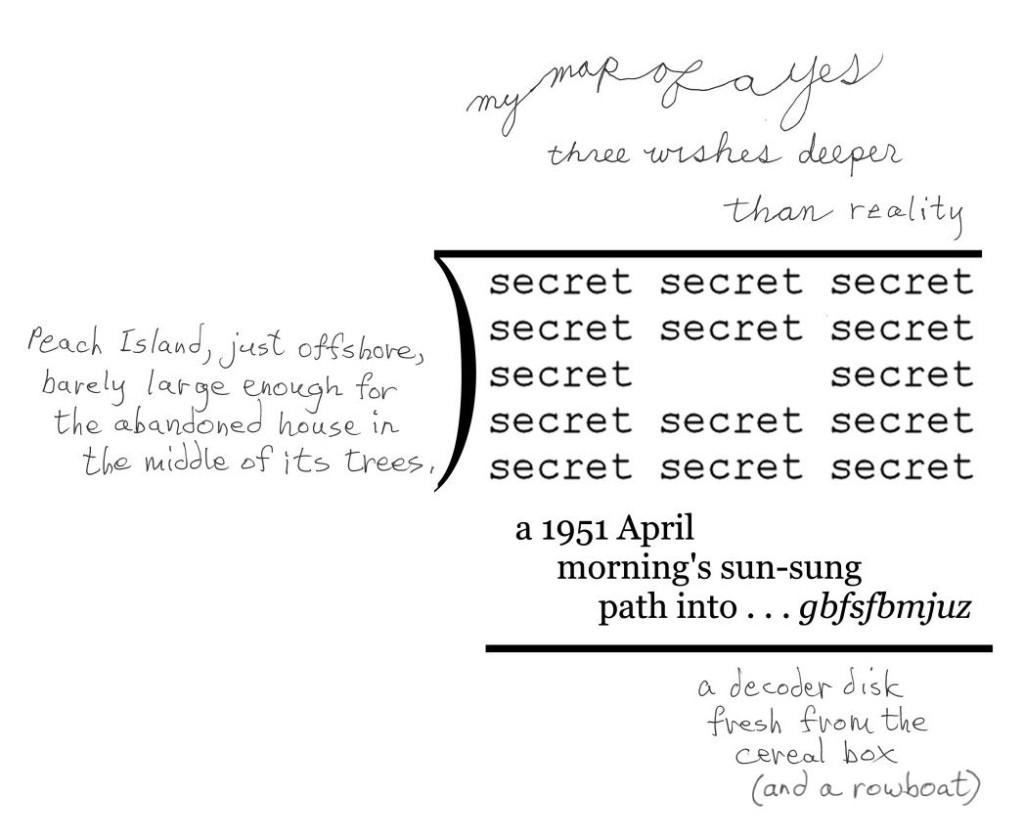
One of my works that I was particularly pleased with when I came across it while backing up blog entries was the following:


I have one problem with this: my only version of  it is a low-resolution jpg, which I don’t know how to convert to high-resolution tif, except by simply redoing it.  Any suggestions from anybody out there who knows more than I do about this kind of thing?

I didn’t re-post it only to ask for help, or because of how much I like it, but as an example of how my work as a poet has evolved.  Actually, I want to show that it has evolved.  That’s because Paul Crowley, the nut I most argue with on the Internet about who wrote the works of Shakespeare, seems not to believe that a poet’s style, or way of making art, evolved once he’s past his apprenticeship.  Of course, he will claim I’m not a poet, and that the evidence I’m about to produce to show my evolution indicates only trivial changes, not anything like genuine evolution.  I enjoy talking about my work, and analyzing any poem, so will go ahead with my demonstration, anyway.

First of all, I should state my claim: it is that over the past couple of years, my style as a poet has evolved appreciably, and that this poem illustrates it.

(1) I only began using cursive ten or fewer years ago, and never for more than a word or two.  This poem and two others have all or most of their texts in cursive.  Because the difference in expressiveness between print and cursive is visiopoetically meaningful to those who appreciate visual poetry, this wholesale use of cursive script counts as a significant evolution of style.

(2) My use of cursive is more elegant here than it is in mt other two recent poems making extensive use of cursive.  Note, for instance, the large O, and the increased gracefulness of all the letters compared with the letters in my other two cursive poems.

(3) Twenty years ago, I didn’t bother giving my poems backgrounds.  Since then I have, and have slowly been improving (but have plenty of room for further improvement).  Note the harmony of the background’s shape and colors with the text, especially the O. 

(4) The background has another important value–the connotations it picks up as a result of its being a variation (mostly through color changes) of the background in another poem of mine.  Connecting poems of mine with others’ poems and others of my own poems is another way I’ve evolved as an artist, not doing it until perhaps twenty years ago, then only very slowly doing it to a greater and greater extent.  This poem may be the first to re-use an entire background from another poem.  This is not trivial, for it allows this poem to suggest “dictionary-as-temple,” the main part of the foreburden of the poem its background is from.  It also should make this poem easier to enjoy, the same way the repetition in a new musical work of an old theme is usually pleasant to hear.  I believe the happiness of the colors of this version of the background gains from the reminder of the different, lower-key mood evoked by the other version.

(5) The use of color in tension with greyscale is another trick new to me twenty years ago that I exploit more and more in my present works, as here (though I’ve done more with it elsewhere).

(6) I think my language has evolved over the years, too–from fairly literal to metaphorical and/or surreal.  The “logic” of this piece and most of my recent pieces is not so easy to guess, which may be an unfortunate evolution, but an evolution nonetheless.

(7) You can’t tell from this image, which has been reduced in size to fit the normal computer screen, but the hard copy is larger than anything I did ten or more years ago, which is another result of evolution. 

Here’s my first or second mathemaku, done thirty or more years ago, to make the profound evolution of my style more inescapable. Yet I maintain this piece is at the level of later pieces; it is simply more condensed. For one thing, it is only linguistic and mathematical. Nothing visioaesthetic happens in it. The eye is used only to recognize the symbols it contains, not to enjoy colors or shapes the way my faereality poem compels it to–i.e., not a visual poem (except inthe mindlessnesses of those for whom just about everything is a visual poem). It is short, and printed. Its words are simple to an extreme.

.

Entry 590 — Playing at Being an Abstract-Expressionist

Sunday, December 11th, 2011

This is a third version of the subdividend product in my division of “the the” poem:

I quite like it.  I experimented with quite a few different colors, none of them seeming to work until I added the maroon, which made a huge difference for some reason.  Now I have to figure out how to use it in a poem.

* * *

Saturday, 10 December 2011, Noon.  I have to get my Christmas chores–basically a Christmas letter and cards–out of the way.  So I’ll be concentrating on that for a few days.  I just posted my blog entry for today, and I arranged it so my second printer can print some copies of my “Christmas Mathemaku, No. 1,” which takes care of my pledge to work daily on something connected to the exhibition–but I hope to do more, like print out some copies of it.  I want to try to sell a few signed copies at the A&H office.  I lost the morning to tennis, and the after-tennis coffee session, this time at a Dunkin’ Donuts place.  I sometimes think I should give up tennis–becauwse (1) I’m lousy at it and (2) it takes time from my cultural activities.  But I’m pretty sure I need it–as a break from cultural activities, and for simply being with others.  The exercise is probably good for me, too.  I have to admit that it can be fun when I’m not too horrible (as I was this morning). 

6 P.M.  This afternoon I went out on my bike again.  I got two more picture frames, some ink for my new printer ($100!) and had some things printed out–parts of my very large “Mathemaku for Scott Helmes.”  Since then, I’ve put my “Christmas Mathemaku, No. 1″ into a frame.  Haven’t done much else.

.

Entry 589 — A Spin-Off

Saturday, December 10th, 2011

The poem below is something I spun off the mathemaku I posted yesterday.  I made it mainly because I wanted to use a complete long divion poem as a term in a larger long division–something I’ve done once before but have never been satisfied with. 


* * *

Friday, 9 December 2011, 8 A.M.   Now that I’m starting to get things done, my luck has soured.   A while ago I was getting ready to take the three framed works I now have for counter-display to the Arts&Humanities Council office.  I could only find two.  I was carrying the missing one around in my bicycle basket a few days ago.  Looks like someone grabbed it.  Unless I found a some incredibly stupid place to hide it from myself here.   Luckily the frame was a cheap one, and the poem, which I’m sure the ones who stole it had not interest in (if they stole it for the poem, I’d be very pleased) is about the easiest of the ones I have to zap out another copy of.  It’s the “Hi” one.  But I’m out ten dollars or so, and have to ride out to get another frame, a wearying chore that upsets my plans for the day.

It is now a little after nine.  Just as I was about to leave to get a new frame and take care of a few other errands, I found the “stolen” work.  It was in a packing envelope (as I remembered it had been) and right in the chair I would naturally have put it in after getting back from the bike ride I’d had it with me on.  My jacket was draped over it, but not entirely over it.  I should have looked where it was as soon as I thought it lost.  I’m not going senile–I’ve been doing things like that all my life.  I must say, I feel a lot better.  And something good came from it: needing another copy of the poem, I fooled around with it at Paint Shop and improved it.  (Hey, that counts as my work for day on exhibition-related matters!)

It’s now eleven.  I did some more work concerned with the exhibition: I went to the A&H office and talked to Judy, the lady in charge.  I got a better idea of things from her–such as the date of the opening (3 January 2012).

5 P.M. and I’ve corrected my “A Christmas Mathemaku,” which I’ve always considered a potential crowd pleaser, and done a write-up on it.  I plan to leave a framed copy of it at the Grumman Exhibition Center on Monday.

 . 

easy tracking
Order Flower Bouquet

Entry 44 — A Mathemaku & Some Poetics Notes « POETICKS

Entry 44 — A Mathemaku & Some Poetics Notes

The following, which is from #691,  is one of my earlier mathemaku.  It’s simple to understand: just think ripples, and remember that in strict mathematical equations, what’s on one side of an equals sign is upposed to stay there, and what it might mean metaphorically if it did not.

Mathemaku4Basho

Next we have a page  I scribbled some notes on in 2003 that makes good sense to me at this time, although I never took the notes into any kind of essay, that I recall:

Sept03page

And now, after two simple uploads, I’m too worn-out to do anything else, believe it or not.

Leave a Reply

minimalist poetry « POETICKS

Archive for the ‘minimalist poetry’ Category

Entry 1652 — 2 Laxian Repeater-Stack Poems

Friday, December 5th, 2014

I was having a great time commenting on an article in yesterday’s issue of the online magazine, Aeon, then pasting my comments, with further comments into this entry when my computer managed to lose one of my comments at Aeon and everything I had written here–in spite of my having remembered twice to save what I had here.  So I’m in a sour mood now, and just posted a poem I just composed followed by Marton Koppany’s preliminary Hungarian translation not of it, but of my first draft of it:

BobGrumman

MartonKoppany

Note: according to the translator of my poem, a person’s first name in Hungarian is not first.  I think that only half explains the problems with Hungarians, however.  –BG

.

AmazingCounters.com

Entry 1250 — Rejected Pwoermd

Saturday, October 26th, 2013

I was going to use the pwoermd, “mythstery,” inside the open letters of “the core of faereality,” which is the dividend of a set of long division poems I’ve been working on, but decided it was too frothily cute.  But maybe not worthless?  Anyway, here it is.  And I’m outta here.

.

Entry 1205 — The Experioddicist, July 1993, P.2

Friday, September 6th, 2013

ExperioddicistPage2Note: the version of my sonnet above is not the final version of it.

.

Entry 732 — Sloops

Tuesday, May 8th, 2012

sloops

I’m super-lethargic again, and this time nor willing to take a dose of APCs.  That’s because I fear my body is too screwed up to meddle with pharmaceutically–any more than my doctors are already meddling that way with it.  So just a word today–“spools” spelled backwards.  It’s the longest word I’ve come up with so far that is a word in both directions.  I bother publicizing it so I can pontificate a bit on my belief in the value of going conceptual as a poet.  I would call the above a poem if printed “sloops spools.”  But it would be an extremely trivial poem because amusing only; “god dog” is much better (putting aside how many times we’ve all seen it) because it has a conceptual interest: the fact that a dog can be considered the antithesis of a god.  Hence, its backwards spelling is a metaphor for its “backwards” meaning.  The images conveyed by the two spellings also interact more interestingly than the images conveyed by “sloops” and “spools”  One set of words is amusing; the other amusing and interesting.  Too many pwoermds and related poems are only amusing.

.

Enter 550 — Marton’s “Cursive” Again

Tuesday, November 1st, 2011

Marton  got back to me about his “cursive” yesterday, giving me enough material for a full entry.

 
He pointed out the direction of the leaves is not consistent.  I had not noticed it.  Which is a good lead-in to one of my much-repeated dogmas: there’s more to every good poem, however seemingly simple, than even a good critic will find on his own.  Marton believes that “the first and the second leaf are connected in a way which is not possible in nature.”  Hence, for him, the poem is displaying “the surmounting (or appeasing) of that impossibility.”  This is a reading in addition to mine, not a counter-reading since it is does not contradict my reading.  (Dogma #2: there is more than one good reading of any good poem-but there is only one main reading–to which all the other readings must conform.  That said, I read the change of the direction of the ellipsis to suggest one leaf’s rebelliousness.  It doesn’t want to be part of an ellipsis.  Or, in my main reading, it is eager for winter, and the other two leaves are not?  As for the linkage of the leaves being impossible in Nature, I’m confused: I view their stems as touching.  But is the image of a vine?  These leaves don’t look like a vine’s leaves to me. 
 
They don’t look like autumn leaves, as my main reading of the poem has it, either.  But they are detached leaves, so can’t be summer or spring leaves.
 
Marton also reminded me that he had dedicated the poem to me.  That, he added, “is an important piece of information. :-)”  I modestly took what he said as a joke, but then I saw that the dedication actually is important, for it connects the poem to my series, “Cursive Mathemaku.”  Thinking about that connection, I thought of something else to mention about the poem–the fact that cursive writing is personal.  The Nature in the poem is not a machine typing out falling leaves but an individual writing a poem with her leaves.
 
Note to Koppany fans: I have other entries on Marton’s work–click on his name below to see them.
.
 

Entry 57 — Minimalist Poem Sequence by Endwar

Monday, December 28th, 2009

#699 through #715 of my old blog are all about the anthology of visio-textual art Crag Hill and I co-edited ten years or so ago, Writing To Be Seen.  I do an entry on one piece by each of the contributors and a few miscellaneous ones.  Rather than run them again here, I’m going to put them all together as an essay in the Pages section to the right.  It’ll start off being a jumble but eventually will get organized, as with several still-disorganized pages.

To make this entry more than just an announcement, here is the sequence of minimalist permutational infraverbal poems (subverse, in his jargon, which I believe he got from his and my pal, Will Napoli) by Endwar that I featured in #716:

Oh, and a second announcement: today I began, and almost completed, my column for the next issue of Small Press Review. No big deal except that it’s a chore I’ve tried to get to every day for at least two months.  I feared I’d never do it!  Really.  I hope my getting to it means I’ll start being at least slightly productive again.  There’s so much I need to get done.
.

.                                                    add
.                                                    read

.                                                    a lie
.                                                    realize

.                                                    a verb
.                                                    reverb

.                                                    a mind
.                                                    remind

.                                                    a vision
.                                                    revision

.                                                    apt
.                                                    repeat

.                                                    a sign
.                                                    resign

.                                                    all
.                                                    real

.

Oh, and a second announcement: today I began, and almost completed, my column for the next issue of Small Press Review. No big deal except that it’s a chore I’ve tried to get to every day for at least two months.  I feared I’d never do it!  Really.  I hope my getting to it means I’ll start being at least slightly productive again.  There’s so much I need to get done.

Entry 48 — Full Effectiveness in Poetry

Saturday, December 19th, 2009

I’m skipping ahead to old blog entry #796 today to make a point about my recent cryptographiku. #796 has Cor van den Heuvel’s poem:

.                                               tundra

I go on in the entry to say I believe Eugen Gomringer’s “Silencio,” of 1954, was the first poem to make consequential  visiophorically expressive use of blank space:

.                      silencio silencio silencio  .                      silencio silencio silencio  .                      silencio          silencio  .                      silencio silencio silencio  .                      silencio silencio silencio

I finish my brief commentary but then opining that van den Heuvel’s poem was the first to make an entire page expressive, the first to make full-scale negative space its most important element. Rather than surround a meaningful parcel of negative space like Gomringer’s masterpiece, it is surrounded by meaningful negative space. I’m certainly not saying it thus surpasses Gomringer’s poem; what it does is equal it in a new way.

I consider it historically important also for being, so far as I know, the first single word to succeed entirely by itself in being a poem of the first level.

Then there’s my poem from 1966:

.                 at his desk
.                         the boy,

.                                writing his way into b wjwje tfdsfu xpsme

This claim to be the first poem in the world to use coding to significant metaphorical effect. Anyone who has followed what I’ve said about “The Four Seasons” should have no trouble deciphering this. I consider it successful as a poem because I believe anyone reasonably skillful at cyrptographical games will be able (at some point if not on a first reading) to emotionally (and sensually) understand/appreciate the main things it’s doing and saying during one reading of it–i.e., read it normally to the coded part, then translate that while at the same time being aware of it as coded material and understanding and appreciating the metaphor its being coded allows.

I’ve decided “The Four Seasons” can’t work like that. It is a clever gadget but not an effective poem because I can’t see anyone being able to make a flowing reading through it and emotionally (and sensually) understanding/appreciating everything that’s going on in it and what all its meanings add up to, even after study and several readings. Being able to understand it the way I do in my explanation of it not enough. This is a lesson from the traditional haiku, which must be felt as experience, known reducticeptually (intellectually), too, but only unconsciously–at the time of reading it as a poem rather than as an object of critical scrutiny, which is just as valid a way to read it but different.

Entry 31 — Old Blog Entries 663 through 670

Wednesday, December 2nd, 2009

In #663, I presented my Odysseus Suite–but the reproduction is too crude for me to re-post it here.   My next entry featured this, by Endwar:

TenByTenAs I announced when I first posted this, I am hoping to publish an anthology of mathematical poems, like this one, so if you have one or know of one, send me a copy of it, or tell me about it.

#665 had this by Marton Koppany, which I have to post here because it was dedicated to ME:

Odysseus

Hey, it’s mathematical, too.  The next entry, whose number I fear to state, concerned this:

Bielski-Haiku-BW

This is from Typewriter Poems, an anthology published by Something Else Press and Second Aeon back in 1972. It’s by Alison Bielski, An English woman born in 1925 whose work I’m unfamiliar with. I find this specimen a charmer . . . but am not sure what to make of it. Three lines, as in the classic haiku. The middle one is some sort of filter. Is “n” the “n” in so much mathematics? If so, what’s the poem saying? And where does the night and stars Hard for me not to assume come in? Pure mathematics below, a sort of practical mathematics above? That idea would work better for me if the n’s were in the lower group rather than in the other. Rather reluctantly, I have to conclude the poem is just a texteme design. I hope someone more clever sets me right, though. (I’m pretty sure I’ve seen later visio-textual works using the same filter idea–or whatever the the combination of +’s. =’s and n’s is, but can’t remember any details.)

It was back to my lifelong search for a word meaning “partaker of artwork” in #667–but I now believe “aesthimbiber,” which I thought of in a post earlier than #667, I believe, but dropped, may be the winner of my search.

Next entry topic was about what visual poets might do to capture a bigger audience.  I said nothing worth reposting on a topic going nowhere because visual poets, in general, are downright inimical to doing anything as base as trying to increase their audience.   One suggestion I had was to post canonical poems along with visual poems inspired by them, which I mention because in my next entry, I did just that, posting a Wordsworth sonnet and a visual poem I did based on and quoting part of it–and don’t re-post here because of space limitations.  I wrote about the two in the final entry in this set of ten old blog entries.


Entry 30 — Discussion of a Short Poem

Tuesday, December 1st, 2009

.

.

.                                                JOE

.

.

.                                                JOE

.

.


The poem above is by Robert Grenier. I quoted it in #661, with some words of Ron Silliman’s about it. Then in #662, I weighed in about it with much the same discussion that follows.   During that discussion, I mentioned a weak parody of it by David Graham that charmed the other stasguards at New-Poetry, none of whom has much sensitivity to minimalistic poetry.

To write an effective parody, you have to understand the text, or kind of text, you are parodying, and Graham understood only the surface of this one–the fact that it consists of two words.  His parody of the poem consisted of the single letter, O. It is a parody within a parody of Silliman’s text, though. This is somewhat better because he pretty much just repeats what Silliman said about “JOE,” but applied to “O.” He got one minor thing right: by raving about the O as also a zero, he indicated that he’s somehow learned that one frequently employed technique of minimalist poems is visual punning, or a text whose visual appearance can be interpreted as two different words, or the equivalent, that do not sound the same.  But he didn’t demonstrate he really knew anything about minimalist poetry or about “JOE.”

Here’s what Silliman said about it: “One could hardly find, or even imagine, a simpler text, yet it undermines everything people know or, worse, have learned, about titles, repetition, rhyme, naming, immanence. If we read it as challenging the status of the title, then on a second level it is the most completely rhymed poem conceivable.  & vice versa.

As language, this is actually quite beautiful in a plainspoken manner, the two words hovering without ever resolving into a static balance, never fully title & text, nor call & response, neither the hierarchy of naming nor parataxis of rhyme.”

I have a confession to make: I said in #661 that “It sounds like Grenier’s work . . . which surely is a point in its favor–that is, despite being minimalist, and–in the view of stasguards–worthless, there’s something about it that makes it recognizable as a particular poet’s.” It is by Robert Grenier, but my recognition of it as his wasn’t as close to being a point in its favor as I said.  I not only had seen it before, but recently more or less studied it, for it was among the poems from Grenier’s Sentences that Silliman had in In the American Treethat I carefully read over and quoted parts of in an essay I’d been working on. I probably had read about it in Silliman’s blog, too. As well as read it years ago when I first got Silliman’s anthology.

I still claim my recognition of who composed the poem is evidence that there’s something to it, something identifiably unique to its author, which a poem of no value at all would not likely have. Otherwise, I probably  wouldn’t have connected it to any particular poet.

I must confess, too, that I now remember not thinking much of “JOE” when I first saw it. Indeed, my reaction to it wasn’t much different from that of the stasguards. However, annoyed by their ignorant dismissal of it, I reflected on it more. It hasn’t become a super favorite of mine, but I now perceive its virtues.

Silliman’s comments helped me, although I also thought little of them, too, at first–I thought he liked the poem for the wrong reasons. I still have major differences with what Silliman says, but no longer feel he’s so much wrong as simply not coming at the poem from the slant I am.

My main problem with what he said was that I didn’t see the first “Joe” as a title. According to the look of the poem in the Silliman anthology, though, it would seem to be a title. There, it is among a sequence of poems excerpted from Sentences with a little row of asterisks between each poem. Most of the poems start with a short line of word without caps, but every once in a while one of them has an all-capital word above the rest of its text that seems to be a title. While I would never agree that the poem therefore “undermines everything people know or, worse, have learned, about titles,” I agree that the first “JOE” is a title–and maybe the second is, too. Grenier treats his title more interestingly than most poets treat theirs, but where does he under- mine the notion that a poem’s title tells you what it’s about, or anything much else about titles? Silliman ought to have spelled out just what he thinks titles are, and how Grenier undermines everything people know about them.

I reject Silliman’s assertion that Grenier’s text “undermines everything people know or, worse, have learned, about . . . repetition, rhyme, naming, immanence.” That it rhymes is nonsense. If it did, then substituting “Gwendolyn” for “Joe” would result in a much greater rhyme than Joe/Joe is.)   That it repeats, and that that is the source of its effect is clear, but I can’t see that it is undermining any view of repetition I, for one, have ever had. What it does is make more poetic use of repetition than a poem by anyone I know of since Stein told us what a rose is. Grenier names like anyone else, too. No undermining there. Immanence may be a different story. Silliman uses the word a lot, but I haven’t read him enough sufficiently to know what he means by it as a critic nor do I have time now to find out, so I’ll ignore it, for now.

Silliman is a revolutionary whereas I’m an aesthete. So he sees under- mining that he’d probably term political where I see poetic creativity. He finds this poem to “challeng(e) the status of the title”; I don’t. I suppose you could say, as he does, that the poem sounds good–“Joe” contains the euphonious long o, and j-words apparently are feel good to say for the English-speaking. It’s not hard to pronounce but it allows one to use a lot of one’s pronouncing equipment. Hints of “joy” may accompany “Joe,” too, particularly when unexpectedly repeated, with nothing after it, to give a mind lots of space to find such things as “joy” near it. I wouldn’t term it especially beautiful, though. Finally, to finish comparing my thoughts on the poem to what Silliman said about it, I wouldn’t describe the two instances of “Joe” as hoveringly avoiding “a static balance” between the opposites he names, but that’s probably only a vocabulary difference between us.

Now, because the stasguards at New-Poetry mocked minimalist poetry in general as well as Grenier’s poem, I feel I ought to say some words in defense of minimalism. Minimalism in art has to do with focusing on details that are generally lost in larger complexities in both art and existence but which produce aesthetic pleasure once properly attended to. A painting that’s nothing but two colors, for example, will minimalistically force a viewer not superior to such things into the purity of color against color–and out of whatever the colors involved are secondary qualities of. A painting in one color only will make the viewer attend to the brushstrokes and or the texture of the canvas or its equivalent. Which may be a bore, but may also be startling interesting.

A minimalist work is nearly always more than it seems. That is, it nearly always includes its usually ignored context–as a painting or poem.  A minimalist painting needs its frame or its location on a wall or in a book or the like for it to be questioned, then recognized, as an artwork; a minimalist poem needs its page and, perhaps, its book. I know I’m expressing myself sloppily, and I’m tiring, so I’ll go to “Joe,” which should make what I’m saying clearer.

The poem is just two words without its being in a book of poetry.  Located there, however, the reader has to ask what it is, and assume it’s intended to be a poem. It’s about someone named Joe, presumably, but the only information about him it provides is . . . his name, repeated. Since it’s a poem, the repeated name must be saying something poetic about Joe.  A background in poetry should readily provide a clue–once the reader softens enough to accept that the poem is telling him something, is saying that the text, “Joe,” is a poem about Joe. And that it is also admitting that that is all it can say about him. A reader with a background in poetry should soon remember the theme much-used in poetry of something’s being beyond the power of words to express. Joe? What can I say about him? He’s just . . . Joe. (Joe is a Joe is a Joe.)

A poem all of the text but one word of which is invisible.

To this the unconventionality of the poem should add under-images like the word, “joy,” I mentioned earlier. The reader can’t flow unreflectingly into amplification; he is arrested in the full semantic value, whatever it is, of “JOE.” The caps add “titledness” to the image of Joe–he is thus a kind of poem. The caps also underscore his being too large for words.

Among the poem’s other minimalistically realized (mostly visceral) meanings is how hugely, and finally, significant names can be. It might be said that, among much else, the poem is a tribute to titling.  But it is finally most massively about the magnitude of a simple human being, something that two O’s as a poem ignore (as such a poem ignores the difference in expectedness–in a poem–between a repeated O and a repeated name–of a person already named).  Which, to get back to the attempt at a parody I began my discussion, is why Graham’s is close to worthless–for anyone with the ability and background to appreciate minimalism.

Entry 29 — A Short Poem

Monday, November 30th, 2009

.

.

.                                                JOE

.

.

.                                                JOE

.

.

.

.

.