Nina Katcadourian « POETICKS

Archive for the ‘Nina Katcadourian’ Category

Entry 1110 — Commercial Visiotextual Art

Tuesday, June 4th, 2013

One of my very lazy entries, just two steals from ARTnews.

MoeBroker1

This one is an example of what many Spidertangle artists would call “asemic poetry,” but which, unlike just about everything with that tag, gets into New York galleries or the equivalent.  Why?  It certainly is no better than much of the pieces shown at Spidertangle, although I do like it–the colors and shapes much more than the scribbling.  Is it only because made by certified painters rather than people coming out of, or too associated with, poets.  For one thing, artists like Brooker never think of their work as poetry of any kind.

ArtTalkJune2013

A related example that I don’t at all like.  In the spirit of Jenny Holzer.  Yeah, makes yuh think but who in the world would hand it on their walls?  On the other hand, like the Weatherly Dixie Cups, these bookspines could work as elements of my long divisions.  That, needless to say, would complicate them beyond all possibility of being written up in ARTnews.

.

Counter

Enter 135 — 13′s from The Pedestal Project « POETICKS

Enter 135 — 13′s from The Pedestal Project

Today I’m finally starting to post what I’ve decided to call “13′s from The Pedestal Project,” by which I mean my favorites of those submissions to John M. Bennett’s and my gallery of visio-textual art at The Pedestal. I call them “13′s” because the people who created them were, so to speak,  all–in my opinion–tied for thirteenth place in the competition for the twelve spots available in the gallery.

The first piece is “Fifth Grade,” by Connie Tettenborn:

When I saw this, I was biased toward it because so many of the other submissions to a gallery supposed to be of visual poetry was (tediously) not visual poetry by any reasonable definition, and this was.  I was also charmed by its evocation of what fifth grade seemed to me.  I found the choice of data the kids were being bombarded with interesting, too: it happened to include three pieces of knowledge of extreme importance to me all my life: the discovery of America (and I claim Columbus discovered America; Eric the Red or his son, whoever it was, who got to Newfoundland only extended the shoreline of Europe), long division and the planets (which in fifth grade were just about equal to dinosaurs and the Pyramids to me).

I liked the little kids in proper order–although I’m not sure why Connie uses the particular letter she does to represent them. Wait, they are, I now see, “e.g.’s” . . . I’m still not getting the connection .  In any case, one of the kids seems not paying full attention, which is a nice touch.  The idea of Knowledge coming in from some Afar that seems almost divine intrigued me, too.  There’s the concept of a window into understanding, too.

In chatting over syberspace with Connie, I’ve learned that she is new to visual poetry, so deserving of special praise for doing so well to being with.  Because she asked for help, I’m now going to say a few minor negative things about “Fifth Grade.”  One is that I’m not sure “bah bah” fits the piece as well as “blah blah” would have, and I think “gaga” and “lala” not particularly effective.  I think the choice of varied fonts good, but believe a little more could have done to the in-flow–for instance, some overlapping could have worked nicely, I think, and great difference in the size of letters.

I wondered about the use of color, finally deciding straight monochromatic, facts-only dry knowledge worked best.  But use of colr and visual imagery might be something to try, too, if the artist wanted to make a sequence of variations on a theme, which her piece would be a good start to.

2 Responses to “Enter 135 — 13′s from The Pedestal Project”

  1. Connie Tettenborn says:

    Thanks for the feedback, Bob. FYI, the letters representing the students are “e a r.” They can only be seen if one clicks on the image to enlarge it to the full screen size. I agree that “blah, blah” is better than “bah.” Too bad I did not think of how to represent the nasally sounding “Wanhh” of the teachers in Charles Shultz’s “Peanuts” movies!

  2. Bob Grumman says:

    Ah, “ear” makes sense, and an e does look like an ear. Not sure I like it, though–to literal. But I can’t think of a good alternative.

Leave a Reply

visual poetry « POETICKS

Archive for the ‘visual poetry’ Category

Entry 628 — New Vocational Triumphs

Wednesday, January 18th, 2012

Just when I thought my visual poetry career was going nowhere, I had a pleasant surprise at an Arts & Humanities gathering last night.  It was an annual affair where local visimagists get together with people representing public places.  The latter look over the works brought to the event, three pieces per artist, and offer exhibition space to those whose work they like.  A bank lobby, for instance.  I went to one of these long ago, but my work wasn’t chosen, and while I’m (probably insanely)  persistant at continuing to make art, I have just about no stick-to-it-ive-ness so far as getting it to where people can see it and maybe like it.  Well, with the encouragement of Olivia and Judy, of the Arts & Humanities Council, and thinking maybe now that I had my current exhibition, someone might think me worthy of another elsewhere, I brought the following three pieces to the main library, where the affair was:


I was going for accessibility with the top two.  I added the bottom one to show a little of what I was doing with long division and color.  In any case, I’m now down for three more exhibitions, two more this year and one in 2013. 

I got to talk with fellow artists, too.  One of them did abstract-expressionist stuff with the word, “love,” embedded in them–another local visual poet!  I came across another artist who uses some kind of transparent, screenlike fabric in her work: she paints an image on it and hangs it in front of regular fabric with a background painted on it.  I thought it worked really well, and have vague ideas on what I might do with it.  So, quite a good hour or so!

.

Entry 621 — Evolution of Style

Wednesday, January 11th, 2012

One of my works that I was particularly pleased with when I came across it while backing up blog entries was the following:


I have one problem with this: my only version of  it is a low-resolution jpg, which I don’t know how to convert to high-resolution tif, except by simply redoing it.  Any suggestions from anybody out there who knows more than I do about this kind of thing?

I didn’t re-post it only to ask for help, or because of how much I like it, but as an example of how my work as a poet has evolved.  Actually, I want to show that it has evolved.  That’s because Paul Crowley, the nut I most argue with on the Internet about who wrote the works of Shakespeare, seems not to believe that a poet’s style, or way of making art, evolved once he’s past his apprenticeship.  Of course, he will claim I’m not a poet, and that the evidence I’m about to produce to show my evolution indicates only trivial changes, not anything like genuine evolution.  I enjoy talking about my work, and analyzing any poem, so will go ahead with my demonstration, anyway.

First of all, I should state my claim: it is that over the past couple of years, my style as a poet has evolved appreciably, and that this poem illustrates it.

(1) I only began using cursive ten or fewer years ago, and never for more than a word or two.  This poem and two others have all or most of their texts in cursive.  Because the difference in expressiveness between print and cursive is visiopoetically meaningful to those who appreciate visual poetry, this wholesale use of cursive script counts as a significant evolution of style.

(2) My use of cursive is more elegant here than it is in mt other two recent poems making extensive use of cursive.  Note, for instance, the large O, and the increased gracefulness of all the letters compared with the letters in my other two cursive poems.

(3) Twenty years ago, I didn’t bother giving my poems backgrounds.  Since then I have, and have slowly been improving (but have plenty of room for further improvement).  Note the harmony of the background’s shape and colors with the text, especially the O. 

(4) The background has another important value–the connotations it picks up as a result of its being a variation (mostly through color changes) of the background in another poem of mine.  Connecting poems of mine with others’ poems and others of my own poems is another way I’ve evolved as an artist, not doing it until perhaps twenty years ago, then only very slowly doing it to a greater and greater extent.  This poem may be the first to re-use an entire background from another poem.  This is not trivial, for it allows this poem to suggest “dictionary-as-temple,” the main part of the foreburden of the poem its background is from.  It also should make this poem easier to enjoy, the same way the repetition in a new musical work of an old theme is usually pleasant to hear.  I believe the happiness of the colors of this version of the background gains from the reminder of the different, lower-key mood evoked by the other version.

(5) The use of color in tension with greyscale is another trick new to me twenty years ago that I exploit more and more in my present works, as here (though I’ve done more with it elsewhere).

(6) I think my language has evolved over the years, too–from fairly literal to metaphorical and/or surreal.  The “logic” of this piece and most of my recent pieces is not so easy to guess, which may be an unfortunate evolution, but an evolution nonetheless.

(7) You can’t tell from this image, which has been reduced in size to fit the normal computer screen, but the hard copy is larger than anything I did ten or more years ago, which is another result of evolution. 

Here’s my first or second mathemaku, done thirty or more years ago, to make the profound evolution of my style more inescapable. Yet I maintain this piece is at the level of later pieces; it is simply more condensed. For one thing, it is only linguistic and mathematical. Nothing visioaesthetic happens in it. The eye is used only to recognize the symbols it contains, not to enjoy colors or shapes the way my faereality poem compels it to–i.e., not a visual poem (except inthe mindlessnesses of those for whom just about everything is a visual poem). It is short, and printed. Its words are simple to an extreme.

.

Entry 620 — Getting Enough Sleep

Tuesday, January 10th, 2012

A little while ago (it is now around 9 P.M., 9 January)  I was feeling good.  I attributed this to my having gotten two naps today, one of an hour, the other of one or two hours.  And I had gotten six hours of sleep last night, which is about as much as I generally get.  I had just about finished backing up my blog entries and was very pleased at how good many of my poems seemed to me when I noticed them during the process.  Unfortunately, I got the dates up my upcoming entries wrong, and in correcting them, lost what I had written for this entry.  That pretty much wiped out my mood.  I can’t stand screwing up like that, but I do it all the time!


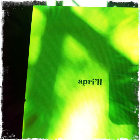
This is a pwoermd I stole from Geof Huth’s blog–because it has become too sophisticated to accept comments from dial-ups like my computer, and I wanted to comment on it.  It’s by Jonathan Jones, lately of Brussels, but a citizen himself of the United Kingdom.  What I like most about it is that it’s lyrical–as too many pwoermds are not.  It wouldn’t be a visual poem for me, but an illustrated poem, except that I subjectively feel “apri’ll” is producing the wonderful colors of spring it is slanted into a portion of (through sheer will-power).  Hence, in my taxonomy it is an infra-verbal visual poem.

.

Entry 618 — “Hungarian Vispo No. 2″

Sunday, January 8th, 2012

Marton Koppany’s latest visual poem may be the gentlest satire on a country’s government ever, if I’m interpreting it correctly. Note the boot on the head of one of the country’s citizens, for instance–and the complete insanity of the country the cloud with an umbrella suggests. Much more is going on that I’ll let you discover without help.

Hungarian Vispo No. 2

.

Entry 613 — Vispo SpamAd

Tuesday, January 3rd, 2012

The following is a detail from a Spam ad that I got yesterday.   It’s a good example of a commercialized visual poem.  Effective as an eye-catcher, but not very good as a visual poem.


 Below is my improved version.  Certainly not yet a great work but better than the original.  If you can’t see why, I’m afraid you aren’t too perceptive about the art.  If you can’t see how the basic idea could be used in a far better piece, you probably aren’t an effective visual poet, or are tired.


Diary Entry

Monday, 2 January 2012, Noon.  I got up late because I stayed up late last night watching my Giants fall apart, but win anyway because Dallas fell apart just in time to keep from winning.  I don’t think the Giants have much hope of going far in the play-offs, but I’ll be rooting for them.  And the other teams are pretty inconsistent, too, except for San Francisco and Green Bay.

I began the day by forcing myself to run.  Actually, I slowly ran, then ran fast albeit not really fast, then walked.  Rrrrrruuuuunnnnnn, rruunn, walk over and over until I’d gone around the middle school field four times (two miles).  My stamina is still amazingly poor, but I actually genuinely sprinted when I went all out.  Which is to say, I was able to pump my legs all the way up and stretch out, the way one does when sprinting.  I didn’t do it fast enough to really sprint, but I did it.  I was worried that I no longer could.  Now it’s just a matter, I think, of getting enough stamina to push myself harder, and for longer periods.  My “sprints” were only for around twenty yards or so–but maybe a whole forty once or twice.  Since getting back, I posted my blog entry for today, which was easy because already done.  I corrected my latest Page, “How to Appreciate a Mathemaku,” after getting a list or errors I very much appreciated from John Jeffrey.  I have a lot more chores to do, but I’m already worn out.  Maybe after lunch and a nap I’ll be able to get more done.

5 P.M.  One more chore out of the way: filling in the size and price of my works on the exhibition contract and tags.  I’m asking $200 for most of them.  Highest price is $600.  Two I’ll accept $100 for.  I don’t expect to sell anything.

.

Entry 607 — More from Spidertangle

Wednesday, December 28th, 2011

Later Vernon Frazer entered the discussion:

Thanks, John. I use “definitions” as a shorthand for conversational or descriptive purposes. As far as trying to work, I avoid the “prescriptions” suggested by definitions because they impose limits on my thinking and interfere with my working at my best. Without the work, nobody would have fodder for all the differing definitions. I’m flashing back to Wittgenstein and trying to define “game.” 

ME: Sorry, Vernon, but I’m (obviously) not a Wittgenstein fan.  Just because a few words are hard to define, at least for someone like Wittgenstein, doesn’t make the eternal struggle to define words (in order fully to understand what they denote) futile. As for the “prescriptiveness” of definitions, they are only prescriptive about how an artist can responsibly label his works, not—if he has a functioning brain—about how he can make them.  I am annoyingly repetitious about stating this, because it seems to me the main misunderstanding artists have about criticism.  (Which is dependent on what artists produce—but that is dependent on what prior artists have produced and, I believe, on what critics have said about it.  A work of art ultimately is not merely what it is by itself, but that and what others have said about it.   –Mr. Cantshuddup

Bobbi Lurie again:

wittgenstein fan or not–

what is this?

is this vispo or not?

http://the-otolith.blogspot.com/2011/10/bobbi-lurie-ludwig-wittgenstein.html

ME: I like your image a lot, Bobbi, but I have to be sarcastic in answering your question: it’s a musical automobile, so a branch of chempo, not of vispo.

Nico was less sarcastic:

I wouldn’t tag it as such, no.

There are these websites you find when doing a search of visual poetry that pertain to photography, wedding shots, naturescapes, etc. They use visual poetry as a descriptive for hallmark type sentiment.

Your drawing of Ludwig is very much reminiscent of egon’s stuff,

ME: Same response here.

which I like quite a bit. It’s not vispo tho. My own filter for such things usually entails the existence of a focus on alphabet. That’s primary to me, but not all on this list. I giggle at your use of
Sophistication. I think we’re still in the process of hammering it down – the ongoing sixty year process. The inability to pluck a satisfying set of terms by now – one that’d satisfy most practitioners just spotlights the fact that this practice is separate to separate people. That means nothing gets answered or gets answered in myriad ways.

ME: At one point I spent some time trying to determine how I thought works concerned with the alphabet should fit into my taxonomy.  I think I concluded that the alphabet is verbal—a peculiar sort of word meaning “these are the letters, in order.”  However, with the works you’re speaking of, Nico, letters are the subject, not the alphabet, so for me they are textual designage.

NICO: Anyway, I did apologize for bringing this up.

ME: As opposed to leaving Spidertangle as a no-discussion zone?

Bobbi replied:

Thank you, Nico. 

As I wrote to David, I really needed this description.

Yes. Sophistication meaning “I don’t know what these people are talking about. What is the secret?”

The fact that you’ve been struggling with terms….may I suggest you just say: “the alphabet must be included–this is in relationship to written language–the representation of something via language vs. via image” (clumsy this, i know, but that would have helped me in the several year search i’ve been on, asking vispo artists this question)

ME: Too bad you somehow missed me, your fellow Bobbi/Bobby, Bobbi.  I’ve been cranking out the dogma that poetry has to have significant words for years, and that it’s silly to consider “visual poetry” not to be a form of poetry. Very few in the visiotextual field (but probably everyone in conventional poetry) agree with me, even though I have a fairly broad idea of what “words” are—I accept word-fragments, punctuation marks, any typographical symbol (like @), mathematical symbols and even the alphabet or some section of it long enough to identify it as an alphabet, as “words”—and don’t dispute that at the border between the verbal and the visual there are activities going on of value that may also qualify as visual poetry (since no definition can have a sharp border—unless it’s of something not in the real world like odd numbers).  Seems to me an art should be defined first of all by what materials it explicitly uses in general (words or visual images, say), then by how it uses them, again in general (by pronouncing them or recording their sound, in one case; in the other, by recording their shape and color); a sub-art, like visual poetry, should be defined by what specific materials it uses and how, specifically, it uses them—words and visual images together by recording their sound, shapes and color.  And so forth, finally to capture even the subbest of arts like Shakespearean sonnets or visiopoetic maple solitextual (i.e., solely textual) sculptures . . . 

BOBBI to Nico: please do not apologize. i am so happy to read this–i didn’t know if i could legitimately send my art work to anyone other than Mark Young of Otoliths, who is tolerant with my experiments / does not define his journal in terms of vispo, unlike others here.

i will have to check closely on this, but from your definition, i’d say a lot of editors are letting a lot of things pass for vispo which isn’t vispo.

thank you, Nico.

ME: We need editors like Mark Young who publish art they like regardless of what it is, but it’d be nice if they could let what they want be known in precise language.  Almost everyone in the otherstream publishes anything.  Anyone who wants material of a specific kind has to carefully say so because “visual poetry” tends to mean anything.  Not just works that are visual but not verbal, but works that are verbal and not visual.  My press doesn’t get submissions anymore, but when it did, people would send me poetry about sunsets—hey, sunsets are visual!—and complain when I rejected it as not visual poetry, which my press was primarily looking to publish.

David Baratier was next up:

People who solely practice visual art or vispo
are verbose and vague
either due to lack of words in their art
or to leave open a potential name shift
to make themselves popular again.

Miro was before vispo, so he is a precursor.

From outside the gates it looks like the best known vizpoets
call themselves artists because vispo is an unknown term to them, or
a fringe term (as Karl pointed out, coming into being as an antithesis
to the concrete poetry movement rather than an art term). Vispo
also has movement qualities rather than just a name.
Ruscha, Jenny Holtzer, Robert Indiana and so on are artists.
.
ME: Ruscha, Holzer and Indiana are all, in some of their works, visual poets, regardless of how they see themselves.  I haven’t seen anything by Miro that seems a visual poem to me, but a few paintings by Klee seem close to being visual poems.  Stuart Davis made some, and so did Magritte.  Picasso may have, too.  I’ve shown these at my blog where I’ve also shown images from ARTnews,, which has something I consider a visual poem in almost every issue.  Visual artists added typography naturally to their subject matter just as they added everything else previous visual artists disregarded, and the world was already set up to accommodate their work as visual art in galleries and museums, so they had no need to call it anything special.  Poets becoming visual did, because their visual poetry was much more radical (because generally a good deal more verbal) than that of artists like Ruscha—and the venues for conventional poetry had, and are still having, trouble with it. 

VERNON: I think the discussions—and Wittgenstein’s increased presence in them in more than one capacity—demonstrate what I was trying to get at. Nobody agrees on what vispo is, even when they look at the same work. If you worry too much about the definition, you won’t concentrate properly on what you’re doing. Some people say I’m a visual poet, some say I’m not. And I’m certainly not one all the time. But I might be one some of the time, depending on who’s forming the opinion.  What I gather from today’s debate about definitions is: do the work and let the definitions fall where they may. 

ME:  As I’ve already said, poets shouldn’t care.  For critics or people trying to work out a reasonable poetics, it’s a different story.  Unfortunately, too many in these two cultures see those in the one they aren’t in as enemies or fools.

No doubt there will be more. 

Diary Entry

Tuesday, 27 December 2011, 5 P.M.  I only played tennis for about an hour this morning, but got tired.  Went to Mcdonald’s for a sausage and egg sandwich.  Got a little marketing done at the Winn Dixie near the McDonald’s, then got a nap of maybe fifteen minutes in.  After that, I spent a lot of time in the Internet discussion I made the subject of the day’s blog entry, which I just made the last corrections to, at least for now.  I guess I contributed over a thousand words to it, some of them insightful and/or interesting.   So I can’t consider myself totally out of it.  I feel the discussion itself will interest, or should interest, scholars later in the century, if only for what it reveals of one group of creative artists yakking with/at each other.  I’ve done no Work of Consequence, though.  I am now going to work up a hand-out for my exhibition, then probably take the rest of the day off.

.

Entry 598 — “Fifty”

Monday, December 19th, 2011

This is from Geof Huth’s blog:

 I liked this when I first saw it although I didn’t find it saying anything verbally.  When I finally realized it said, “fifty,” I thought it accidental because I couldn’t see why it would say that.  My slow mind eventually remember that Geof is now fifty-years-old, which makes this image a particularly effective representation of his present strange combination of freedom and awkward incompleteness . . . straining, yearning for something.  With his ego (“I,” as Karl Kempton would be sure to notice) lost or transcended.

Diary Entry

Sunday 18 December 2011, 6 P.M.  Another unproductive day.  Tennis in the morning, a fine meal at Linda’s in the afternoon.  A blog entry for today just taken care of a little while ago.  A little work done on my “Mathemaku for Scott Helmes” to count as “work on preparation for the A&H exhibition.”  And now I’d like to go to bed, but will probably read instead.

 .

Entry 597 — Chumpy Leg

Sunday, December 18th, 2011

John M. Bennett has another major collection of poetry out.  This one is called The Gnat’s Window.  78 poems.  Bilingual.  Closely inter-associating sequence.  Amazing.  I told John I’d try to do a critique of it, and I still hope to once my year-end chaos of chores is behind me, but–gah–John is one of the few poets I feel may be beyond my abilities as a critic, and he’s at his best–and therefore beyondest–in this book.  Part of one of the poems, which Diane Keys has found a way to, uh, fatten, in all the best senses, with color, a piece of cloth and some cursive annotations–and the circling of “crumpy leg, is below.  It’s from the back cover of John’s book.


Diary Entry

Saturday, 17 December 2011, Noon.  Wow, since getting back at eleven from tennis and a McDonald’s snack, I’ve already gotten the day’s blog entry posted, which was easy because it was already done, and made a finished copy of  the new version of “Mathemaku for Scott Helmes” at Paint Shop.  It’s not the official copy: it’s too small, and the official version will include the original cut-out fragments of magazine ads.  There will also be the A&H framed version which will be in between the one I just made and the official version in size. 

8 P.M.  Since noon I haven’t done much.  I printed out two copies of “Mathemaku for Scott Helmes” and scribbled annotations explaining the terms I will put on one that will be on display atthe exhibition.  Otherwise, I continued reading started yesterday of the magazines and books I will be reviewing for Small Press Review

.

Entry 587 — “The Bells”

Thursday, December 8th, 2011

My friend, Richard Kostelanetz is writing (actually, revising) an essay dealing with, among other things, appropriated art.  When he asked something about Tom Phillips’s A Humument, I remembered other superior examples of appropriation art such as the work on a dictionary of Doris Cross, and the following appropriation of Edgar Allen Poe’s “The Bells” by Michael Basinski, which I thought worth posting here:


Here’s the original:

Hear the sledges with the bells–
Silver bells–
What a world of merriment their melody foretells!
How they tinkle, tinkle, tinkle,
In the icy air of night!
While the stars that oversprinkle
All the heavens, seem to twinkle
With a crystalline delight;
Keeping time, time, time,
In a sort of Runic rhyme,
To the tintinnabulation that so musically wells
From the bells, bells, bells, bells,
Bells, bells, bells,–
From the jingling and the tinkling of the bells.

Hear the mellow wedding-bells,
Golden bells!
What a world of happiness their harmony foretells!
Through the balmy air of night
How they ring out their delight
From the molten-golden notes!
And all in tune,
What a liquid ditty floats
To the turtle-dove that listens, while she gloats
On the moon!
Oh, from out the sounding cells,
What a gust of euphony voluminously wells!
How it swells!
How it dwells
On the Future! how it tells
Of rapture that impels
To the swinging and the ringing
Of the bells, bells, bells–
Of the bells, bells, bells, bells,
Bells, bells, bells–
To the rhyming and the chiming of the bells!

In the essay I quoted Mike’s poem in, I called it “an amazingly loud-though-silent jangle of . . . Poe’s famous poem.”  I’d add here that Basinski’s version gave me the thrill that Poe’s version, I’m sure, gave many of its first readers.

* * *

Wednesday, 7 December 2011, Noon.  I’ve partly recovered from having accidentally deleted my blog entry for Monday.  A semblance of it is back up.  I also posted an entry for today.  I’ve done nothing else yet, but hope soon to go out to buy some frames and a pad of good-quality large paper.

Later note: I succeeded in finding two reasonably-priced frames of the kind I wanted (able to be stood up on a counter) that I bought.  That took care of my pledge to do something of value for my exhibition every day, barely.  Meanwhile, I sketched a new mathemaku.  Then took care of this entry.

.

Entry 584 — An & & My Full Triptych

Monday, December 5th, 2011

It seems that almost every time I seem to be getting productive, something knocks me down.  This time it’s only a lost entry–this one, that I was trying to correct some detail of and lost in the process–without realizing it, so was not able to try to find the lost material by backing up until it was too late.  So now I have to spend an hour or so, restoring what I can recall of what was here two days ago. 

 One item was this by Moribund Face:


And all three of my frames of “Triptych for Tom Phillips”:

About the ampersand, I commented something about how it expressed the essence of “andness.”  I loved the way its bird regurgitated what looked like all of itself, while looking to continue “anding” forever.  I said little about my full triptych except that if you click on them, you’ll see a larger image of them which may be helpful although still very small–and in black&white.  The original frames are each eleven by seventeen.  Oh, one thing I did point out was that the frames are about, “departure,” “journey” and “arrival,” and are intended to be about them in the largest sense, but particularly about them with regard to arriving–for either an engagent of it or its author.

* * *

Sunday, 4 October 2011.  Sunday is hazy to me now, three days in the past as it is.  I played tennis early in the morning–badly.  I didn’t return to my Shakespeare book, but evidentally got a blog entry posted, and probably wrote an exhibition hand-out or two.

.

Jump-Cut Poetry « POETICKS

Archive for the ‘Jump-Cut Poetry’ Category

Entry 1282 — Mail Art from Blorchistan

Tuesday, November 26th, 2013

Mail Art not from the SASE project but a one-only from Ficus stranguensis:

MailArtFromThe PanjandrumOfBlorchistan

.

Entry 1281 — Ficus s., Continued

Tuesday, November 26th, 2013

Included in a letter I got from Ficus strangulensis in 2011:

OneDayCalvinProblem
.

Entry 960 — Jump-Cut Poetry

Saturday, December 22nd, 2012


The following is a passage from John Cage’s “Writing for the first time through Howl” (1986) which I appropriated from Marjorie Perloff’s essay at The Boston Review website:

I think Perloff considers this a conceptual poem.  To me it’s a simple jump-cut poem, a “jump-cut” in my poetics being defined as “a movement in a text from one idea, image or the like to another with no syntactical bridge between the two.”  Thinking about it, I came to the (tentative) conclusion that there are two kinds of (effective) jump-cut poems: (1) procedure-generated ones and (2) moodscape-generated ones.  There is just one kind of ineffective jump-cut poem, ones that are neither (1) or (2).  Wholly random or essentially random because excessively hermetic crap, in other words.

While into a classifying mood, I divided All of Poetry into (1)  Subject-Centered Poetry  (what a poem is about) and (2) Technique-Centered Poetry  (how a poem is made), with “subject” defined as a combinationof the nature of the subject and the poet’s attitude toward it (tone).  Style I consider a technique.

While thinking about many of the comments at The Boston Review website about binaries, I formed one of my own: “Dichotiphobia vs. Rationality.”  Further thinking about a few of those comments, and many I’ve been assaulted by, inspired the following observation: “What I notice more and more in discussions of poetry or poetics is how many involved in them prefer not to attack opinions they oppose but the motives of those expressing those opinions.”

I don’t have a high opinion of the Cage passage, by the way.  Amusing, and occasionally a juxtapositioning makes something fun happen, but . . .   Perloff makes a big deal of its use of appropriation, and it is true that a good deal of what effectiveness it has is due to the way it procedure leads to the randomization of the order of its little locutions–which nonetheless make surprising off-the-wall sense.  This, as I suggested long ago while discussing Doris Cross, a superior employer of appropriations Perloff should be more familiar with than she seems to be, conveys a reassuring sense of Nature’s being rational, of something’s being behind it all that unifies our existence’s apparent meaninglessness.  No matter how you cut up and re-organize something like Ginsberg’s “Howl,” you’ll never get rid of words’ magical ability to mean.  Nor, analogically, of the universe’s.

.

Visitor Counter
Media Center Computer

Entry 32 — A Mathemaku from 2007 « POETICKS

Entry 32 — A Mathemaku from 2007

I continue to be more out of it than not, so have just this for today:

17Aug07B

Guess who composed it.

Leave a Reply

Crag Hill « POETICKS

Archive for the ‘Crag Hill’ Category

Entry 1345 — Excerpts from a Masterpiece

Sunday, January 19th, 2014

The masterpiece is my Of Manywhere-at-Once.  I suddenly had the brilliant thought of taking care of blog entries for the next few days with full pages of the third edition of it (the Runaway Spoon Press, 1998–the first edition was published eight years earlier, with this section the same as it is here).  For once, laziness is not my reason for doing this.  What is, is a need to concentrate of an essay I’m working on whose deadline will soon be on me.  So: here are three consecutive pages from my book, left as is:

 MatOpage149

MatOpage150

MatOpage151

I think I have one or two copies of my available for sale, but they are now collectors’ copies, so I have to ask for a hundred bucks for one.  But I will sign it.  Its buyer will also have the satisfaction of having helped a poet keep from bankruptcy.  (I’m serious–otherstreamers ought to ask for compensation at least equal to a thousandth of what celebrated tenth-raters get for absolute crap.  And what can we lose since we can’t get even the cost of our raw materials for anything?)

As I posted the second of my three pages, I thought to myself (as opposed to thinking to someone else–ain’t the Englush lingo funny at times?) I really ought to save my second and third pages for my next  two entries.  Being nice to my readers triumphed, though, so they are all here.  I do plan to use them again tomorrow.  I have second thoughts about at least one part of my text, and first thoughts about what I think about it, and what was going on in my life at the time I wrote it.

.

Entry 1233 — Rescued by an SASE

Friday, October 4th, 2013

I was in bed for the night just now (at nine, my usual bedtime), when I realized I hadn’t posted an blog entry for today! I’ve been very absent-minded since my surgical procedure on Monday. I hope that’s due to the anaesthesia I was given. In any case, thank goodness I still have contributions to the SASE mail art show Crag Hill sent me to draw on, such as this one from Crag himself, his second in the show:

Crag#2Front


Crag#2Back


.

Entry 1181 — An SASE by Crag Hill

Tuesday, August 13th, 2013

Here’s the SASE Crag Hill, who organized the project, had for it:

CragSASEFront


CragSASEBackIs this his autobiography?

.

Entry 1004 — Back to “Evolution”

Monday, February 4th, 2013

I thought the following worth an attempt at an appreciation, so here it is again:

Actually, I may have only one thing to point out, something I would hope everyone would notice without my help: the way each of the letters of “evolution” evolves.  Nine little narratives of some letter’s journey to . . . who knows where.  But notice, too, some of the wonderfully clever twists Crag adds to some of the processes: such as the different ways the two o’s evolve, and, expecially, the way the one on the left takes bloats into a chain containing two clones of itself on the way to what it eventually becomes.  Meanwhile, the other o is help on its way by the n–which it in turn helps.

Ah, but I’ve made a huge mistake, it seems to me.  Because reading is generally from the top of a page down, I took this visualization of evolution to go from the top down.  It makes much more sense to view it as beginning in uncertainty–as identical forms–and then changing upward.

I suppose it could go either way.  I like it going up, though.  No matter.  I pronounce the poem a sure classic.

.

Entry 1003 — A Transform by Crag Hill

Sunday, February 3rd, 2013

(Note: I had this entry ready a day or more early, then forgot to click the “public” button.  I do that all the time!)

The following is another piece from Score 9; it’s called “Evolution”:

It’s one of a series of similar pieces that  Crag Hill was turning out some twenty years ago he called transforms.  I made a few of them myself, but no one else that I know of has, which I think a shame.  It’s an excellent form he came up with, one with all kinds of possibilities–especially now that color can be added.  I often lament that too few new visual poets either stick with standard concrete poetry practices, like visual onomatopoeia  (forming words that look like what they denote), or leave words entirely for textual designs they call “asemic poems.”  They don’t do anything with forms like Crag’s, or my long divisions.

Of course, there are problems with doing so: fear of stealing someone else’s invention, or being seen to; fear of degrading it by using it badly; a silly belief that everything one does must be 100% “new” (however ridiculously impossible that would be); or because one needs to keep up with what’s fashionable in the field.  I suppose, too, there are those who just don’t connect with transforms or long division poems.  I really really wish a few young poets would start seriously making long division poems.  One reason for that is that I strongly suspect I’d learn from them, and maybe do a lot more with my own long divisions than I have been.

.

Entry 387 — 2006 Discussion of a Poem by Crag Hill

Wednesday, February 23rd, 2011

Recently, I’ve been going through the files with the graphics but not the texts of entries I made to my previous blog in search of mathemaku of mine.  I want to number them all, so need a complete list of them.  I think I posted just about all of them to my blog.  In any event, yesterday I brought up a file for an entry (Blog959) whose visits was recorded as close to 200.  Rarely did my old entries get more than 20 visits.   Curious to see what was in the blog, I then brought up the file that had its text, which I think worth quoting here:

17 September 2006: Among the many intriguing items at Crag Hill’s Poetry Scorecard is this found poem of Crag’s that he posted 3 September:

From Index of First Lines Selected Poems Charles Olson

.     I come back to the geography of it,
.     I don’t mean, just like that, to put down
.     I have been an ability–a machine–up to
.     I have had to learn the simplest things

.     I live underneath
.     I looked up and saw
.     Imbued / with the light
.     I met Death–he was a sportsman–on Cole’s

.     In cold hell, in thicket, how
.     In English the poetics became meubles–furniture–
.     is a monstrance,
.     I sing the tree is a heron

.     I sit here on a Sunday
.     It’s so beautiful, life, goddamn death
.     it was the west wind caught her up, as

Amazing poem, this. I’m not a big fan of Olson’s, though I believe he is a major poet, and that some of his poems are A-1. Surely, these lines could only have been from a poet, though. I recognize one or two, but in this discussion will not look up any of them. (Oops, I realize I couldn’t look up very many of them; I do have The Maximus Poems, and several of my anthologies have poems by Olson, but I don’t have the Selected Poems.)

“I come back to the geography of it,”

Anyway, what a beginning, this return to some geography. Olson was probably only returning to a genuine geography, of the locale I feel he jabbered too much about, but here–dislocated by the line-break–“geography” can wing us to the terrain of all kinds of things, including the memory of a breakfast, banking procedures, 3 A.M., everything having a geography. Less surlogically, the word brings us to fundamentals, to the earth, to reality seen large, solid, inanimate . . .

What, I suddenly wonder, would the geography of geography be? Poems like this– effective jump-cut poems, that is–can flip us into such questions. Questions that resonate for the person flipped into them, I mean–as this one will surely not for everyone.

“I don’t mean, just like that, to put down”

Now a jump-cut leaving “geography” to simmer unconnected to any specific, and making the poem’s narrator more than a pronoun through his attempt to explain himself better. His explanation is broken off before getting anywhere, which effectually explains all the better his state of being at loose ends. A main interest is in whether he has just dropped one activity to return to the geography of whatever he’s involved in, and/or inadvertantly “put down” whatever he was doing because superficial or the like compared to geographical questions. “I have been an ability–a machine–up to”

The narrator continues trying to explain himself without finishing any of his ventures into self-analysis. I take this line to mean he’s not been personally/emotionally involved in whatever it is he’s talking about, “up to (now).” Note, by the way, how this line, with its pronounced metaphor, disturbs the quotidian tone of the previous (which, in turn, had demotically countered the academic tone of the first line).

“I have had to learn the simplest things”

Wow, no longer able (I guess) to let his machinery run his life without his involvement, the narrator has to concentrate, start from a sort of zero.

“I live underneath”

We’ve come to a new stanza. That the narrator says he lives underneath, which the lineation compels us to consider, rather than underneath something, opens a world for me. Certainly, we’re with a narrator deepening through himself (as we would expect from the poem’s consisting entirely of lines in the “i” section of an index).

“I looked up and saw”

This line seems planned to follow the one before it. This sudden strong logic out of the chaos of existence as if to reassure us that life does make sense is one of the virtues of found poetry. Again, a line-break re-locates us, in this case keeping us from a transitive verb’s object, compelling us to consider “saw” as an intransitive verb. The narrator has experienced illumination, not just seen some detail of ordinary life. No big deal if the context set us up for this sort of heightened seeing, but something of a (good) jolt in this zone of reduced context.

“Imbued / with the light”

Yikes, this sentence carries on trouble-free from the previous one.

“I met Death–he was a sportsman–on Cole’s”

The grammar now shatters the logic we seemed for a while to be in, just as “Death” shatters the text’s positive bright ambiance. I can’t help, by the way, thinking of Emily at this point. Death, however, is an absurd, trivial figure, some guy pursuing some conventional sport at some named who-cares-where.

“In cold hell, in thicket, how”

After the intrusion of a line with something of the effect of the famous porter scene in Macbeth, a new stanza, and high rhetoric electrifyingly bleakening the scene. Fascinating how “Cole” quickly colors into “cold hell,” by the way. “In English the poetics became meubles–furniture–”

Another weird shift–to the cold, densely thicketted geography of poetics (in English). “Furniture.” Something inanimate, stupid–but comfortable, for our convenience, to be used. . . . I don’t know the meaning of “meubles” but assume it’s some kind of furniture. Somehow, we are now in a man trying to explain himself in a geography/text trying to explain itself. At least, according to my way of appreciating language poems of this sort, which is partially to take them as exposures of mental states.

“is a monstrance,”

I guess we aren’t meant to sit on the chairs or put anything on the tables in the poem. We are definitely in a darkness and a confusion. “I sing the tree is a heron”

But the narrator can sing. He sings (presumably) of a tree’s resemblance to a heron. In other words, something dark (probably) and solid and motionless, like furniture, has something undark and capable of flight in it. Thus, the stanza ends hopefully, to set up the final one, which begins:

“I sit here on a Sunday”

The tone has gone quiet, conventional–but implicitly celebratory, Sunday being generally a day-off, and devoted to (generally happy) religious services. “It’s so beautiful, life, goddamn death”

The chaos of the poem is resolved with this line. The fragments we’ve been stumbling through, dark and light, are life–which is beautiful in spite of the presence of death.

“it was the west wind caught her up, as”

Because of the line before this one, I’m prepared to read this to be about a woman turned magically into a weightless angel the pleasant west wind is going to give a ride to. Chagall, at his undrippiest. I also read the awe of a man beholding a beautiful woman into the line. An image illustrating the climactic previous statement.

Okay, that was a preliminary once-through I hope some reader will get something out of. I did! Don’t know if I’ll return to it. Probably, so I can use it in a book. Don’t know if I’ll have anything better to say about it then, though.

* * * * *

I’m not ready to say more about the poem now–except that I wondered when I looked at my entry whether I’d mentioned the importance of Crag’s poem’s foundness when I discussed it.  I saw I hadn’t.  In my megalomaniacal opinion, I think I may be the only critic who has ever discussed the full aesthetic value of foundness.  I did this in my discussion, possible two decades ago by now, of Doris Cross’s work–wonderful visual poems brought into being by painting or otherwise defacing, deleting, meddling with dictionary paintings.  (I love Nietzsche not only for all he said, brilliantly, that I agree with, but for the megalomaniacal boasts he made about his accomplishments that have turned out to be valid.)

What I said in my Cross piece isn’t handy, so my comments now will probably be a bit incomplete and not as sharply expressed as what I said in it.   First off, as anyone would agree and as many I’m sure have said, the quotations from Olson, add his life and writings to Crag’s poem. This is important.  But what I think effective appropriation of found materials most importantly does is celebrate the essential logic of the universe.  It reminds us that God is in his heaven allowing accidents to make affirmations–even for someone like I who doesn’t believe in God, and understands that accidents don’t really make affirmations, only happen so often that some of them, especially when a keen discoverer has an eye out for them, are bound to do what Crag’s collection does.  Another, better way of putting it, is that we are reminded of who wonderfully well the human brain finds ways to give existence meanings, meanings that suggest Meaning.

Okay, not a view you’d think anyone would feel like a demigod for having, but it’s more than anyone else has said about foundness that I know of.  And I can’t see how anyone could say it’s wrong.
.
.            Poem Consults the Vseineur
.
.            However seldom the vseineur
.            said “universe” in Poem’s hearing,
.            he accepted it,
.            however clear it always was
.            that it had misspoken.

.

Hal Johnson « POETICKS

Archive for the ‘Hal Johnson’ Category

Entry 653 — A Response to Hal Johnson’s Poem

Sunday, February 12th, 2012


Here’s Hal Johnson’s visio-infraverbal poem again:

 “Lost in thought” is the simplest explication of this, but a better reading focuses on thought that is opposed, disrupted, damaged and finally sent in the wrong direction back to its futile beginning.  With “ugh” and “tough” being disconcealed in the process further to suggest the losing struggle for meaning expressed.   In short, a deft pwoermd.  A visuaol one as well as infraverbal because you can see the word’s letters metaphorically enacting the struggle.

.

Entry 652 — An Infraverbal Poem by Hal Johnson

Saturday, February 11th, 2012


Here’s an infraverbal poem–actually a visio-infraverbal poem–Hal Johnson posted at New-Poetry:

    
 I’ll leave it for now as a puzzle.  Tomorrow I’ll reveal why it’s a first-rate poem.

 .

Thom Olsen « POETICKS

Archive for the ‘Thom Olsen’ Category

Entry 1559 — Another by Thom Olsen

Thursday, September 4th, 2014

It is also from Prose Karen:

Suit

As I didn’t see for a few minutes, all the letters spell appropriate words.  Another fun poem but not, for me, quite as appealing as “Marbles.”  That’s because “Marbles” immediately maybe me visualize (and become) a small boy among friends towering over a carefree, primitive but centrally-important-to-us game.
.

AmazingCounters.com

Entry 1558 — Another Pure Visual Poem

Wednesday, September 3rd, 2014

It’s by Thom Olsen from Prose Karen, published by Marshall Hryciuk’s Nietzsche’s Brolly (2007):


Marbles

Another instant delight!

.

AmazingCounters.com

Entry 584 — An & & My Full Triptych « POETICKS

Entry 584 — An & & My Full Triptych

It seems that almost every time I seem to be getting productive, something knocks me down.  This time it’s only a lost entry–this one, that I was trying to correct some detail of and lost in the process–without realizing it, so was not able to try to find the lost material by backing up until it was too late.  So now I have to spend an hour or so, restoring what I can recall of what was here two days ago. 

 One item was this by Moribund Face:


And all three of my frames of “Triptych for Tom Phillips”:

About the ampersand, I commented something about how it expressed the essence of “andness.”  I loved the way its bird regurgitated what looked like all of itself, while looking to continue “anding” forever.  I said little about my full triptych except that if you click on them, you’ll see a larger image of them which may be helpful although still very small–and in black&white.  The original frames are each eleven by seventeen.  Oh, one thing I did point out was that the frames are about, “departure,” “journey” and “arrival,” and are intended to be about them in the largest sense, but particularly about them with regard to arriving–for either an engagent of it or its author.

* * *

Sunday, 4 October 2011.  Sunday is hazy to me now, three days in the past as it is.  I played tennis early in the morning–badly.  I didn’t return to my Shakespeare book, but evidentally got a blog entry posted, and probably wrote an exhibition hand-out or two.

.

Comments are closed.

Entry 134 — Ellipsis-Haiku « POETICKS

Entry 134 — Ellipsis-Haiku

I’m still having “creative ideas” but having trouble bothering to put them on paper, even ones as easy to do that with as the ones that led to the following:

.

.

.

Good ideas (inspired by Marton Koppany’s recent Otoliths book) not yet finding their best presentation, it seems to me.

Tags:

5 Responses to “Entry 134 — Ellipsis-Haiku”

  1. Connie Tettenborn says:

    Hello,

    Interesting idea to leave out the last few syllables and replace with a visual iinstead. But the yellow ellipses need to be more vivid. I suggest darkening the background and increasing the saturation and brightness of the yellow. Also, the second line needs more description, less laundry list, I think. (Forsythia do not grow in California–I miss them. People not from the East or midwest may have trouble with the poem. Would the daff… work?)

    I like the second one , but kind of want a little more hint. I first put in “unknown immense” in my head then realized you may have meant “unknown expanse.” Would “the unknown immense…..” work?

  2. Bob Grumman says:

    I found it hard to make the yellow show enough from the beginning. I didn’t like my “list,” either. My problem is that I like the idea of colored dots for an ellipsis, and yellow for forsythia is good, too, but not enough. I would keep forsythia, by the way, even knowing there are people not familiar with it. They can look it up. Or look at the footnote my editors will surely provide (you know, fifty years from now when I’m dead and finally world-famous). I think I’ll just have to let the yellow dots sit in my brain until I get lucky and a way properly to use them occurs to me.

    Ditto the second idea. Would “uni . . . rse” work better. My problem here is that it is either not easy enough to decode or too easy. No matter. I felt from the outset that my use of the ellipses within a ellipsis did work here.

    Thanks for the comments, COnnie. They strengthened my misgivings about the poems.

    –Bob

  3. Connie Tettenborn says:

    I hope the misgivings do not cause you to drop them entirely. Do you have Adobe Photoshop Elements? It is not cheap and takes awhile to learn to use, but is very powerful regarding color changes. I believe you could definitely get the first poem to work well with just a bit of tweaking. Darken the background, choose a different contrasting color for the words and use bright yellow for dots. Change mistiness to mist and you’ve got two more syllables to play with in the second line.
    (And yes, forsythia is more interesting than daffodil. I had to rely on the footnotes for “oleander” before I knew they grew all over out here!)

    Universe is the wrong syllable count for a haiku. I actually prefer the ellipses to stand for an unkown something in this haiku. Whatever… Good luck.

    Cheers,
    Connie

  4. Bob Grumman says:

    Good thinking, Connie–since they’re the same as ones I had, myself, but didn’t mention! (Really!)

    I hope the misgivings do not cause you to drop them entirely.

    I hope so, too, but don’t think they will.

    Do you have Adobe Photoshop Elements?

    I have Paint Shop, which I consider the Kmart version of Photo Shop, which I’ve used but can’t afford for myself.

    It is not cheap and takes awhile to learn to use, but is very powerful regarding color changes.

    Paint Shop does color changes nicely.

    I believe you could definitely get the first poem to work well with just a bit of tweaking. Darken the background, choose a different contrasting color for the words and use bright yellow for dots.

    Good thinking that I did not have is to change the color of the words. Only consideration is that I may want the words to be absolutely standard, to make the unstandardness of the ellipsis more pronounced. Changing the background is essential but difficult. I did make it a pale grey to try to help the yellow. A pale blue is another possibility. I don’t want dark grey or blue because it would start the poem already (possibly) too unstandard. Also, I want some kind of natural sky background for the ellipsis.

    Change mistiness to mist and you’ve got two more syllables to play with in the second line.

    Humorously, I changed “mist” to “mistiness” to get my syllable count, not able to find two syllables to add that I though worked.

    (And yes, forsythia is more interesting than daffodil. I had to rely on the footnotes for “oleander” before I knew they grew all over out here!)

    Hey, I don’t know what oleander is! For a haiku poet, I’m terrible with names of trees, bushes and flowers.

    Among the possibilities I’ve come up with for repairing the forsythia poem are to forget forsythia and just go with something a better color for this idea. Another simply to use bigger textemes (if that’s my word for letters and similar elements, like punctuation marks). One thing I feel I’ll almost certainly use is bigger textemes and some kind of scenery inside the dots, like a close-up of forsythia in bloom.

    Hmmm, how about “It’s April and the forsythia is in bl o o o” with the o’s filled in and yellow? Rhetorical question. I do think that idea has possibilities, though. . . . A poem in bl o o o

    all best, Bob

    Universe is the wrong syllable count for a haiku.

    I know. Couldn’t think of a way to make that line five syllables. Gave up, knowing I only had a rough draft.

    I actually prefer the ellipses to stand for an unkown something in this haiku. Whatever… Good luck.

    My problem is that I really don’t know how I want to use it. Most of my ideas for visual poems begin with a gadget like colored ellipses that I play with until I suddenly see what I can make the gadget mean. Then I work on the text until I think it makes that meaning reasonable clear.

    Thanks for your comments. With mine, they provide a good demonstration of what should be going on in the head of a poet but seems not often to. A danger is making a rationale for a poem too overt, but the reverse danger, not bothering to connect a poem to a rationale, is worse, I think.

    –all best, Bob

  5. Connie Tettenborn says:

    Yes, I see why you want to keep a black text in the first haiku. A bright sky blue should contrast well with yellow.

Leave a Reply