Enter 550 — Marton’s “Cursive” Again
Marton got back to me about his “cursive” yesterday, giving me enough material for a full entry.
Monday, May 31st, 2010
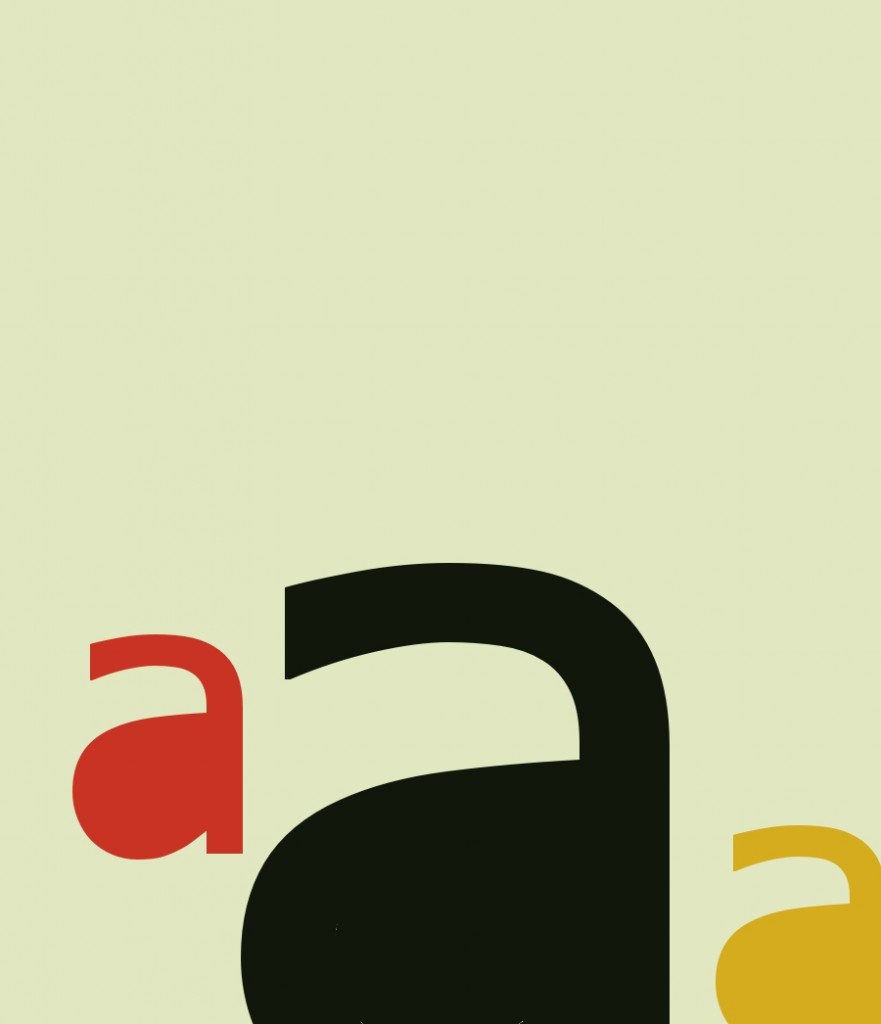
The title of the following work is “Maternity Ward at Wesson Women’s.” Its author is Alexander Jorgensen, one of his four submissions to The Pedestal Gallery, all of them quite good but in the second twelve (in the editors’ highly subjective view). Before he submitted it to the gallery, it appeared in Mark Young’s excellent publication, Otoliths, Issue Eleven, Southern Spring, 2008.
I first saw this at Spidertangle over a year ago, and at once liked it a good deal. I still do. For a while I thought it a perfect example of alphaconceptual textual designage, viewing it as asemic. A charmingly understated design consisting of the letter a to make it textual designage, with a, for me, strong suggestion of language soon to be born, these three a’s close to getting alphabets going.
Later I had to accept it as (barely) a visual poem, for “a” is significant as a word in it, here pregnant with whatever noun it will soon modify–a doubly alphaconceptual visual poem. It’s also pain beautifully serene: all’s right with this world–at least to me.
I
Saturday, May 29th, 2010
For the first time in ever so long, it’s nine o’clock and I don’t want to retire for the day! That’s Very Nice. What’s not nice is that it took an overdose of pain medication to make me feel that way. Oh, well, that I’m able to feel this way is a plus, whatever it takes to make me feel this way.
Ergo: whee!
Friday, May 28th, 2010
Not that anyone should care or does, but I feel my old fart need to jabber about my health again, hence this report.
Today I’ve started taking one hydrocodone pain pill every four hours. The proper maximum dose is one every eight hours. It’s an experiment to see if there’s anything I can do to cancel the pains in my leg. Not that they’re particularly bad. Much of the time I don’t notice them. But at night they’re just enough to interfere with my sleeping, and they keep me from running. I’m also annoyed because last Monday I was given a shot of cortisone and some kind of numbing medicine in my bad hip that was supposed to nullify the pain, or at least reduce it, in two days or so. It did nothing. Which is what two similar shots in my back did a few months ago. Hydrocordone have never cancelled the pain, either. I think it may have reduced it somewhat a few times. Anyway, I’m trying it.
I feel I’m pretty adaptable, and have not whine much about growing old. I’ve expected to slow down, wrinkle, taken longer to mend when I’ve bumped myself or something, and experienced arthritic aches and pains. Until last year, I’ve even been pleased with how little, really has gone wrong with me. this year has been an ordeal, though. And I just can’t understand my leg problem. It would seem that my bad hip is not responsible for it, which is good. I fear it is probably half responsible for it, though. I’ll be talking to my orthopedist in a week or so about what to do. I’d be surprised if there was anything else to do but have my back operated on, and hope that takes care of it.
I seem to be functioning okay otherwise except that I feel tired most of the time. I want to take naps but rarely go to sleep when I try for one. I’m now getting five or six hours of sleep at night, which is the most I’ve been able to get for five or ten years. It’d be wonderful to be able to get eight hours nightly for a week, but I suspect that will never be.
I continue to find it difficult to sit down at my computer and do anything more strenuous mentally than firing arguments and invective at my Shakespeare authorship foes. Recently, though, I’ve started to come out of what I consider the kind of tenth-rate depression I often am inflicted with. I managed finally to post on the visual poem of Connie Tettenborn’s that I’ve wanted to. One would think that no great accomplishment, but doing it was a major accomplishment for me. I kept thinking that I’d be unable to say anything of any value about it. so why bother. And even if I did say anything of value about it, no one would read it. Wanh wanh.
I have plenty of good excuses for feeling depressed, fearing I’m be limping the rest of my life not least among them. But a few good things have been happening, too. The publication of my this is my visual poetry chapbook, for one thing. And recently a Finn has asked permission to publish a book or chapbook of his translations of my mathemaku. That’s huge. I’d love to be able sincerely to feel that I don’t need any positive feedback from the world, but I do. I got paid for something literary recently, too: by The Pedestal for co-editing the gallery the Spitter and me done for it. $75. Final nice thing that happened to me of late was being invited to blurb the upcoming Otoliths publication of a (terrific) collection of pieces by Marton Koppany, and coming up with a blurb he and I both liked. I don’t blurb, by the way–I always try to inform potential buyers about what I compose blurbs for, not hype it.
Friday, May 28th, 2010
Today I’m finally starting to post what I’ve decided to call “13’s from The Pedestal Project,” by which I mean my favorites of those submissions to John M. Bennett’s and my gallery of visio-textual art at The Pedestal. I call them “13’s” because the people who created them were, so to speak, all–in my opinion–tied for thirteenth place in the competition for the twelve spots available in the gallery.
The first piece is “Fifth Grade,” by Connie Tettenborn:
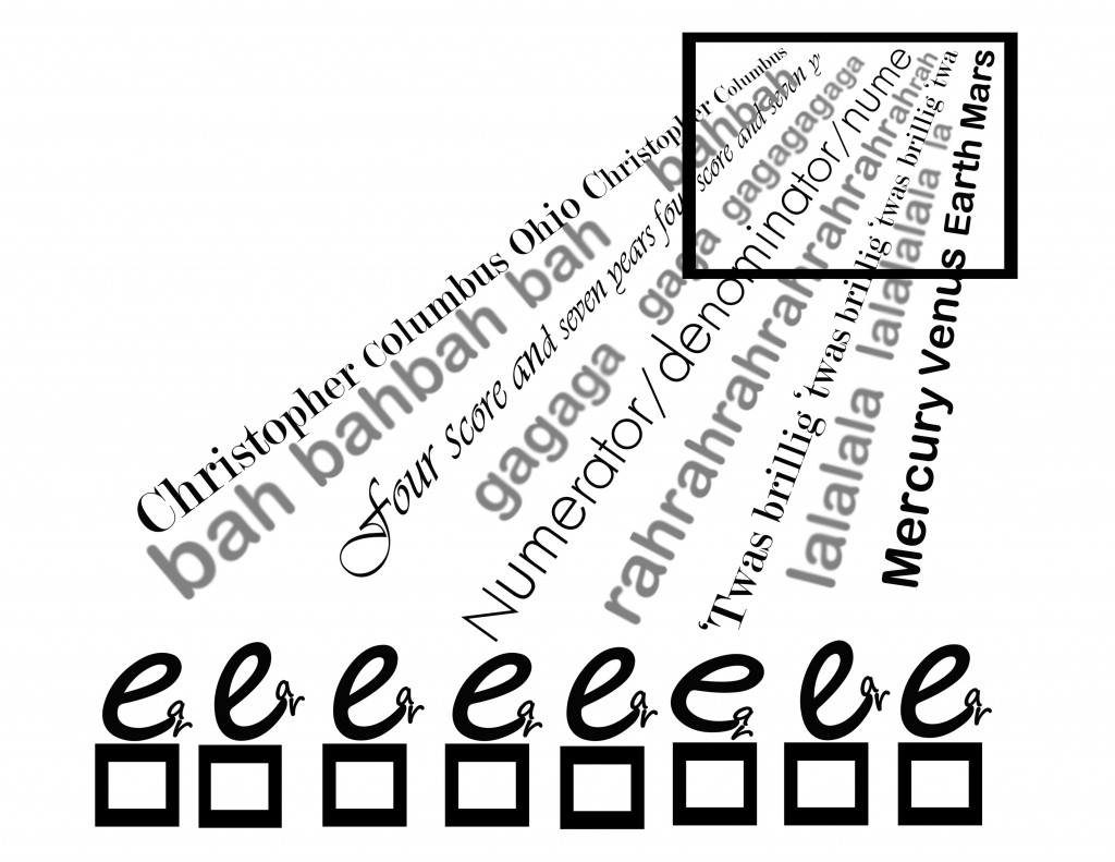
When I saw this, I was biased toward it because so many of the other submissions to a gallery supposed to be of visual poetry was (tediously) not visual poetry by any reasonable definition, and this was. I was also charmed by its evocation of what fifth grade seemed to me. I found the choice of data the kids were being bombarded with interesting, too: it happened to include three pieces of knowledge of extreme importance to me all my life: the discovery of America (and I claim Columbus discovered America; Eric the Red or his son, whoever it was, who got to Newfoundland only extended the shoreline of Europe), long division and the planets (which in fifth grade were just about equal to dinosaurs and the Pyramids to me).
I liked the little kids in proper order–although I’m not sure why Connie uses the particular letter she does to represent them. Wait, they are, I now see, “e.g.’s” . . . I’m still not getting the connection . In any case, one of the kids seems not paying full attention, which is a nice touch. The idea of Knowledge coming in from some Afar that seems almost divine intrigued me, too. There’s the concept of a window into understanding, too.
In chatting over syberspace with Connie, I’ve learned that she is new to visual poetry, so deserving of special praise for doing so well to being with. Because she asked for help, I’m now going to say a few minor negative things about “Fifth Grade.” One is that I’m not sure “bah bah” fits the piece as well as “blah blah” would have, and I think “gaga” and “lala” not particularly effective. I think the choice of varied fonts good, but believe a little more could have done to the in-flow–for instance, some overlapping could have worked nicely, I think, and great difference in the size of letters.
I wondered about the use of color, finally deciding straight monochromatic, facts-only dry knowledge worked best. But use of colr and visual imagery might be something to try, too, if the artist wanted to make a sequence of variations on a theme, which her piece would be a good start to.
Wednesday, May 26th, 2010
Friday, May 21st, 2010
I simply disconnected from my blog–just didn’t think of it for about a week until a day or two ago. Then last night for some reason I started thinking about haiku and came up with the following poems that I thought worth making this entry for:
.
. early April night:
. barely a single haiku
. of moonlight in it
.
. the street’s cherry blooms,
. dazzling, yet almost grey
. besides the haiku’s
.
.
.
.
.
Wednesday, May 12th, 2010
Tough times here, again, so I’ve neglected my entries again, and today am simply repeating the work below:
I’m reprising it as an illustration of what may be my best definition of what a visual poem is: an artwork in which verbal and graphic elements are combined which are intended to be experienced together, with each of them contributing significantly (and more or less equally) to the aesthetic effect of the work, but neither of them by itself necessarily of any significant aesthetic value by itself.
The poem above illustrates this perfectly. One can’t read it without also seeing it, or experiencing it both verbally and graphically at the same time. (Note, for me to see a word in order to read it is to visually but not graphically to experience it; reading is not a visual experience: the mind’s use of the eyes to read is different from the mind’s use of the eyes to see.) In accordance with my definition, the word, “sleep,” printed by itself with no visual enhancement, would be of no aesthetic interest; nor would its being changed to “grilt,” say, to make it non-verbal, would result in nothing but a perhaps mildly pretty picture.
Wait. The nullinguists would find “grilt” verbally meaningful. So make the purely graphic version of this work this:
I suppose it’s close to impossible to make a graphic work that isn’t in some way aesthetically interesting, but I would claim that anyone who finds this as aesthetically appealing as the work with “sleep” in it is dead to the aesthetic value of visual poetry.
My definition, by the way, comes out of the thousands-of-years-old tradition of considering the word “poetry” (in whatever language) to denote something made of words (although it can be used metaphorically to describe something non-verbal, like a pretty sunrise). There is, in fact, no sane reason to reject it as the final definition of the kind of art I apply it to.
The one objection to it seems to be that so “narrow” a definition may inhibit people making artworks it doesn’t cover from continuing to do so. I say if it does, they are clearly not artists, so who cares. Several of my early mathematical poems do not conform to this definition of visual poetry. Do I care? No, I accept them a mathematical poems, but not visual poems.
I ignore the other standard objection of nullinguists: that nothing is definable.
Monday, May 10th, 2010
Sunday, May 9th, 2010
Guess what will be next in this series?
I’m not sure I like the colors in the addition. Oh, well, it’s something to use for another entry. I’ve had another setback, by the way: a very close local friend’s husband died Thursday. I only found out yesterday. I had only gotten to know the husband well enough to extremely miss him–but my sadness over what my friend is going through is worse. I spent a lot of time with her yesterday, but my ability at brightening the bereaved is pretty poor. I think I distracted her at least a little.
Thursday, May 6th, 2010
Wednesday, November 4th, 2009
The image above is from the catalogue of a show I co-curated in Cleveland that Michael Rothenberg was kind enough to give space to in Big Bridge #12–with two special short gatherings of pieces from the show, with commentary by me. I have it here to provide relief from my verosophizing (note: “verosophy” is my word for serious truth-seeking–mainly in science, philosophy, and history). It’s also a filler, for I’ve had too tough a day (doctor visits, marketing, phoning people about bills) to do much of an entry.
It’s not a digression, though–I will come back to it, as a near-perfect example of a pure visual poem.
Now, briefly, to avoid Total Vocational Irresponsibility, back to:
the Nature of Visual Poetry
The pre-awareness is a sort of confederacy of primary pre-aware- nesses, one for each of the senses. Each primary pre-awareness is in turn a confederacy of specialized secondary pre-awarenesses such as the visiolinguistic pre-awareness in the visual pre-awareness and the audiolinguistic pre-awareness in the auditory pre-awareness. Each incoming perceptual cluster (or “pre-knowlecule,” or “knowlecule-in-progress,” by which I mean cluster of percepts, or “atoms of perception,” which have the potential to form full-scale pieces of knowledge such as the visual appearance of a robin, that I call “knowlecules”) enters one of the primary pre-awarenesses, from which it is sent to all the many secondary pre-awarenesses within that primary pre-awareness.
The secondary pre-awarenesses, in turn, screen the pre-knowlecules entering them, accepting for further processing those they are designed to, rejecting all others. The visiolinguistic pre-awareness thus accepts percepts that pass its tests for textuality, and reject all others; the audiolinguistic pre-awareness tests for speech; and so on. More on this tomorrow, I hope.
Thursday, December 24th, 2009
Wednesday, November 27th, 2013
Tuesday, November 26th, 2013
Saturday, November 23rd, 2013
The following is a detail from a Spam ad that I got yesterday. It’s a good example of a commercialized visual poem. Effective as an eye-catcher, but not very good as a visual poem.
Below is my improved version. Certainly not yet a great work but better than the original. If you can’t see why, I’m afraid you aren’t too perceptive about the art. If you can’t see how the basic idea could be used in a far better piece, you probably aren’t an effective visual poet, or are tired.
Diary Entry
Monday, 2 January 2012, Noon. I got up late because I stayed up late last night watching my Giants fall apart, but win anyway because Dallas fell apart just in time to keep from winning. I don’t think the Giants have much hope of going far in the play-offs, but I’ll be rooting for them. And the other teams are pretty inconsistent, too, except for San Francisco and Green Bay.
I began the day by forcing myself to run. Actually, I slowly ran, then ran fast albeit not really fast, then walked. Rrrrrruuuuunnnnnn, rruunn, walk over and over until I’d gone around the middle school field four times (two miles). My stamina is still amazingly poor, but I actually genuinely sprinted when I went all out. Which is to say, I was able to pump my legs all the way up and stretch out, the way one does when sprinting. I didn’t do it fast enough to really sprint, but I did it. I was worried that I no longer could. Now it’s just a matter, I think, of getting enough stamina to push myself harder, and for longer periods. My “sprints” were only for around twenty yards or so–but maybe a whole forty once or twice. Since getting back, I posted my blog entry for today, which was easy because already done. I corrected my latest Page, “How to Appreciate a Mathemaku,” after getting a list or errors I very much appreciated from John Jeffrey. I have a lot more chores to do, but I’m already worn out. Maybe after lunch and a nap I’ll be able to get more done.
5 P.M. One more chore out of the way: filling in the size and price of my works on the exhibition contract and tags. I’m asking $200 for most of them. Highest price is $600. Two I’ll accept $100 for. I don’t expect to sell anything.
.
Saturday, August 7th, 2010
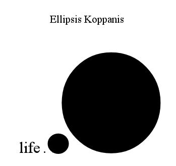
This is one of the three pieces Marton Koppany sent me recently. I’m posting it now (1) to take care of another entry with minimum effort, (2) because I like it a lot, and (3) to allow me to babble a bit more on my favorite topic, What Visual Poetry Is.
As those who know my work as a critic, I contend that a text cannot be a poem unless it has words that are of significant importance to what the text does aesthetically. This piece contains no words, as most people understand the term. Nonetheless, I’m prepared to claim it to be a poem. Clearly, this piece is on what I call the borblur–the borderline between conceptual visimagery and visual poetry. I call it the later because I believe all punctuation marks (and similar symbols such as those used in chemistry or mathematics) can act as words in certain unusual situations.
Specifically, when a punctuation mark in a work is sufficiently emphasized to make it difficult for someone “reading” the work to treat it as nothing more than a punctuation mark, it will become a word. That is, it will not be skimmed through with little or no conscious notice–actually, with no vaonscous verbal notice, as with the dash I just used–but pondered consciously, possibly even indentified consciously as what it is, it will become a word. It will denote as well as, or even perhap instead of, acting purely punctuationally. In the case of the work above, I claim most people–at least most people familiar with the territory–will read the dash in it (even without the title of the piece), as “dash, short-cut,” then realize sensorily how it is making something rather large disappear, or realize how it works. A simple but unexpected metaphor visualized.
The pun in English of “dash” as a verb meaning to go in a hurry is a very nice extra, entirely verbal extra.
Note: my only problem with the piece is its title, which I think too overt. I’d prefer something more like “Punctuation Poem No. 63, or the like. “Mountain subjected to Punctuation?” No, but something like that, but more intelligent. . . .
Monday, December 7th, 2009
.
Csend-Sinc
The Ands
Nothing else. I’m hoping to get going again on columns for Small Press Review. A deadline is approaching and I’d like to get ahead. It’d be nice, too, to start getting real work done.
Wednesday, December 2nd, 2009
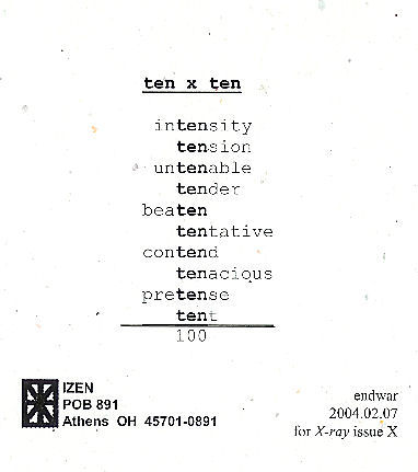
In #663, I presented my Odysseus Suite–but the reproduction is too crude for me to re-post it here. My next entry featured this, by Endwar:
As I announced when I first posted this, I am hoping to publish an anthology of mathematical poems, like this one, so if you have one or know of one, send me a copy of it, or tell me about it.
#665 had this by Marton Koppany, which I have to post here because it was dedicated to ME:
Hey, it’s mathematical, too. The next entry, whose number I fear to state, concerned this:
This is from Typewriter Poems, an anthology published by Something Else Press and Second Aeon back in 1972. It’s by Alison Bielski, An English woman born in 1925 whose work I’m unfamiliar with. I find this specimen a charmer . . . but am not sure what to make of it. Three lines, as in the classic haiku. The middle one is some sort of filter. Is “n” the “n” in so much mathematics? If so, what’s the poem saying? And where does the night and stars Hard for me not to assume come in? Pure mathematics below, a sort of practical mathematics above? That idea would work better for me if the n’s were in the lower group rather than in the other. Rather reluctantly, I have to conclude the poem is just a texteme design. I hope someone more clever sets me right, though. (I’m pretty sure I’ve seen later visio-textual works using the same filter idea–or whatever the the combination of +’s. =’s and n’s is, but can’t remember any details.)
It was back to my lifelong search for a word meaning “partaker of artwork” in #667–but I now believe “aesthimbiber,” which I thought of in a post earlier than #667, I believe, but dropped, may be the winner of my search.
Next entry topic was about what visual poets might do to capture a bigger audience. I said nothing worth reposting on a topic going nowhere because visual poets, in general, are downright inimical to doing anything as base as trying to increase their audience. One suggestion I had was to post canonical poems along with visual poems inspired by them, which I mention because in my next entry, I did just that, posting a Wordsworth sonnet and a visual poem I did based on and quoting part of it–and don’t re-post here because of space limitations. I wrote about the two in the final entry in this set of ten old blog entries.
Monday, May 31st, 2010
The title of the following work is “Maternity Ward at Wesson Women’s.” Its author is Alexander Jorgensen, one of his four submissions to The Pedestal Gallery, all of them quite good but in the second twelve (in the editors’ highly subjective view). Before he submitted it to the gallery, it appeared in Mark Young’s excellent publication, Otoliths, Issue Eleven, Southern Spring, 2008.
I first saw this at Spidertangle over a year ago, and at once liked it a good deal. I still do. For a while I thought it a perfect example of alphaconceptual textual designage, viewing it as asemic. A charmingly understated design consisting of the letter a to make it textual designage, with a, for me, strong suggestion of language soon to be born, these three a’s close to getting alphabets going.
Later I had to accept it as (barely) a visual poem, for “a” is significant as a word in it, here pregnant with whatever noun it will soon modify–a doubly alphaconceptual visual poem. It’s also pain beautifully serene: all’s right with this world–at least to me.
I
Friday, May 28th, 2010
Today I’m finally starting to post what I’ve decided to call “13’s from The Pedestal Project,” by which I mean my favorites of those submissions to John M. Bennett’s and my gallery of visio-textual art at The Pedestal. I call them “13’s” because the people who created them were, so to speak, all–in my opinion–tied for thirteenth place in the competition for the twelve spots available in the gallery.
The first piece is “Fifth Grade,” by Connie Tettenborn:
When I saw this, I was biased toward it because so many of the other submissions to a gallery supposed to be of visual poetry was (tediously) not visual poetry by any reasonable definition, and this was. I was also charmed by its evocation of what fifth grade seemed to me. I found the choice of data the kids were being bombarded with interesting, too: it happened to include three pieces of knowledge of extreme importance to me all my life: the discovery of America (and I claim Columbus discovered America; Eric the Red or his son, whoever it was, who got to Newfoundland only extended the shoreline of Europe), long division and the planets (which in fifth grade were just about equal to dinosaurs and the Pyramids to me).
I liked the little kids in proper order–although I’m not sure why Connie uses the particular letter she does to represent them. Wait, they are, I now see, “e.g.’s” . . . I’m still not getting the connection . In any case, one of the kids seems not paying full attention, which is a nice touch. The idea of Knowledge coming in from some Afar that seems almost divine intrigued me, too. There’s the concept of a window into understanding, too.
In chatting over syberspace with Connie, I’ve learned that she is new to visual poetry, so deserving of special praise for doing so well to being with. Because she asked for help, I’m now going to say a few minor negative things about “Fifth Grade.” One is that I’m not sure “bah bah” fits the piece as well as “blah blah” would have, and I think “gaga” and “lala” not particularly effective. I think the choice of varied fonts good, but believe a little more could have done to the in-flow–for instance, some overlapping could have worked nicely, I think, and great difference in the size of letters.
I wondered about the use of color, finally deciding straight monochromatic, facts-only dry knowledge worked best. But use of colr and visual imagery might be something to try, too, if the artist wanted to make a sequence of variations on a theme, which her piece would be a good start to.
Wednesday, May 26th, 2010
Friday, May 21st, 2010
I simply disconnected from my blog–just didn’t think of it for about a week until a day or two ago. Then last night for some reason I started thinking about haiku and came up with the following poems that I thought worth making this entry for:
.
. early April night:
. barely a single haiku
. of moonlight in it
.
. the street’s cherry blooms,
. dazzling, yet almost grey
. besides the haiku’s
.
.
.
.
.
Monday, May 10th, 2010
Sunday, May 9th, 2010
Guess what will be next in this series?
I’m not sure I like the colors in the addition. Oh, well, it’s something to use for another entry. I’ve had another setback, by the way: a very close local friend’s husband died Thursday. I only found out yesterday. I had only gotten to know the husband well enough to extremely miss him–but my sadness over what my friend is going through is worse. I spent a lot of time with her yesterday, but my ability at brightening the bereaved is pretty poor. I think I distracted her at least a little.
Thursday, May 6th, 2010
Wednesday, May 5th, 2010
Well, I’m trying to get back on track but having a tough time of it. I had ideas while taking hours to get to sleep last night, most of them variations on the idea my “sleep” poem is based on (which I’m pretty sure I stole from Marton). So I tried one of them out at Paint Shop and had all kinds of trouble. The first is the upper one below. I intended it merely as the first step from my “sleep” poem to a new poem but liked what it did, so left it as a variation. Minor but satisfactory. I don’t like the one under it. One error is the font of the central “gh.” I don’t know how it got there. I’m too worn out to change it, which (for me) would be more involved than you might suspect. So I consider it a rough draft. I no longer know whether to bother fixing it. Nonetheless, it’s a Major Accomplishment compared to just about everything else I’ve been doing these past twelve months or so. And it and its companion got me a third consecurive daily blog entry! Whee.
Wednesday, April 21st, 2010
I’ve been in and out of my Null Zone quite a bit of late, and for the past few days have been extremely in it. No zip, at all. I want to sleep but am barely able to–it takes me four or five hours to get to sleep at night, and I can’t sleep past six or seven. Even with a sleeping pill–or two. Ambiens? Something like that. The lowest dosage.
Maybe my trouble sleeping is why I liked the visual poem below of mine so much when I came across it earlier today while looking for a sonnet-related visual poem of mine for use in a presentation on sonnets I’m scheduled to give at the local writers’ center in a little over a week and can’t seem to work on for more than ten or fifteen minutes a day.
I may need my dosage of synthroid, the medicine I take for hypothyroidism, increased. I’m sure I’m suffering depression, too: one of my two brothers recently died. Visiting him for a week, then returning for three or four days for his funeral was one of the reasons for so few recent entries here.
Apologies for this doleful entry, but I wanted you few who come here upon occasion to know what’s going on, especially you few I’ve told I expected to write about an artwork of yours here by now.
Now that I’ve gotten going, I might as well make an announcement: the issue of The Pedestal with the gallery of artworks John M. Bennett and I edited for The Pedestal will be published tomorrow (at www.thepedestalmagazine.com), according to our editor, John Amen. We expect the usual flak about it. I just want to say all the wrong choices were John’s. And that I prefaced it with a ringing undorsement of calling textual designs visual poetry. Which John’s preface countered, but we’re still pals.
Isn’t it amazing? No matter how null I get, I retain my acerbic wit.
Another announcement: if I ever get even slightly energetic, I’m going to post a few of the works submitted to the gallery that didn’t make it into the gallery but that I liked; John says he might like to post a few of his favorites that didn’t make it, too. We also plan to have a gallery containing just about all the works submitted. It will go up at Spidertangle.net 1 August. I thought it’d be extremely informative for people to see what was submitted. We won’t post anything without the submitters’ permission, and have been turned down by three, so far. The same number so far have granted permission.
More, eventually, I very much hope.
Thursday, February 25th, 2010
Surprise! I’m back already. May be back on vacation tomorrow, though. I’m back today because I somehow managed to produce a new mathemaku yesterday:
Sunday, April 7th, 2013
I’m posting this for two reasons: 1. I like it; 2. It startled me because what it did with a word is something I never thought of doing, and can’t figure out why I never have since I’ve done similar things to words, removing the top half of one and replacing it with the top half of another for instance (after seeing a poem by Ezra Mark doing that).
Seems very Byzantine, to me. It’s by Stephen Nelson, by the way. I stole it from the latest edition of Bill DiMichele’s tip of the knife–almost as soon as Bill posted it.
Meanwhile, another webzine in underway: the April edition of Hal Johnson’s TRUCK, guest-edited by John M. Bennett, with four pieces of mine in it, two of which I don’t understand. Well, don’t fully understand. John has so far gather over eighty pieces for the issue: a lot of good stuff!
.
Thursday, August 30th, 2012
Stephen composed this in a dream! I think that happened to me once.
I consider it primarily an infraverbal poem, because dependent on what happens inside it. But it is also a visual poem. What makes it terrific is that, as spelled, it is a double metaphor: for (1) shape-changing flexibility, and (2) a flood surging forward too quickly for its spelling to bother with correctness–but brilliantly describing it as well as denoting it. I got it from the Otherstream Unlimited site, where I called it “an instant classic.”
.
Wednesday, February 6th, 2013
Marshall Hryciuk has edited another neato anthology, this one consisting in part of what Marshall calls “a collection of unsolicited ‘surprise’ or ‘already opened accidently’ mail or, so it seems, items dropped off on my desk or drawers at this new Imago’s shared and open office space.” The rest of the works are from various art-friends Marshall asked for work when he found that, due to another move, he hadn’t enough found items for his anthology. One was “3 Photos,” by jw curry, that I’m featuring today not only because I very much like it but because it’s the first thing by jw that I’ve seen in a while. Good to know he’s still active–at the same high level he’s just about always been at.
.