.
.
. JOE
.
.
. JOE
.
.
The poem above is by Robert Grenier. I quoted it in #661, with some words of Ron Silliman’s about it. Then in #662, I weighed in about it with much the same discussion that follows. During that discussion, I mentioned a weak parody of it by David Graham that charmed the other stasguards at New-Poetry, none of whom has much sensitivity to minimalistic poetry.
To write an effective parody, you have to understand the text, or kind of text, you are parodying, and Graham understood only the surface of this one–the fact that it consists of two words. His parody of the poem consisted of the single letter, O. It is a parody within a parody of Silliman’s text, though. This is somewhat better because he pretty much just repeats what Silliman said about “JOE,” but applied to “O.” He got one minor thing right: by raving about the O as also a zero, he indicated that he’s somehow learned that one frequently employed technique of minimalist poems is visual punning, or a text whose visual appearance can be interpreted as two different words, or the equivalent, that do not sound the same. But he didn’t demonstrate he really knew anything about minimalist poetry or about “JOE.”
Here’s what Silliman said about it: “One could hardly find, or even imagine, a simpler text, yet it undermines everything people know or, worse, have learned, about titles, repetition, rhyme, naming, immanence. If we read it as challenging the status of the title, then on a second level it is the most completely rhymed poem conceivable. & vice versa.
As language, this is actually quite beautiful in a plainspoken manner, the two words hovering without ever resolving into a static balance, never fully title & text, nor call & response, neither the hierarchy of naming nor parataxis of rhyme.”
I have a confession to make: I said in #661 that “It sounds like Grenier’s work . . . which surely is a point in its favor–that is, despite being minimalist, and–in the view of stasguards–worthless, there’s something about it that makes it recognizable as a particular poet’s.” It is by Robert Grenier, but my recognition of it as his wasn’t as close to being a point in its favor as I said. I not only had seen it before, but recently more or less studied it, for it was among the poems from Grenier’s Sentences that Silliman had in In the American Treethat I carefully read over and quoted parts of in an essay I’d been working on. I probably had read about it in Silliman’s blog, too. As well as read it years ago when I first got Silliman’s anthology.
I still claim my recognition of who composed the poem is evidence that there’s something to it, something identifiably unique to its author, which a poem of no value at all would not likely have. Otherwise, I probably wouldn’t have connected it to any particular poet.
I must confess, too, that I now remember not thinking much of “JOE” when I first saw it. Indeed, my reaction to it wasn’t much different from that of the stasguards. However, annoyed by their ignorant dismissal of it, I reflected on it more. It hasn’t become a super favorite of mine, but I now perceive its virtues.
Silliman’s comments helped me, although I also thought little of them, too, at first–I thought he liked the poem for the wrong reasons. I still have major differences with what Silliman says, but no longer feel he’s so much wrong as simply not coming at the poem from the slant I am.
My main problem with what he said was that I didn’t see the first “Joe” as a title. According to the look of the poem in the Silliman anthology, though, it would seem to be a title. There, it is among a sequence of poems excerpted from Sentences with a little row of asterisks between each poem. Most of the poems start with a short line of word without caps, but every once in a while one of them has an all-capital word above the rest of its text that seems to be a title. While I would never agree that the poem therefore “undermines everything people know or, worse, have learned, about titles,” I agree that the first “JOE” is a title–and maybe the second is, too. Grenier treats his title more interestingly than most poets treat theirs, but where does he under- mine the notion that a poem’s title tells you what it’s about, or anything much else about titles? Silliman ought to have spelled out just what he thinks titles are, and how Grenier undermines everything people know about them.
I reject Silliman’s assertion that Grenier’s text “undermines everything people know or, worse, have learned, about . . . repetition, rhyme, naming, immanence.” That it rhymes is nonsense. If it did, then substituting “Gwendolyn” for “Joe” would result in a much greater rhyme than Joe/Joe is.) That it repeats, and that that is the source of its effect is clear, but I can’t see that it is undermining any view of repetition I, for one, have ever had. What it does is make more poetic use of repetition than a poem by anyone I know of since Stein told us what a rose is. Grenier names like anyone else, too. No undermining there. Immanence may be a different story. Silliman uses the word a lot, but I haven’t read him enough sufficiently to know what he means by it as a critic nor do I have time now to find out, so I’ll ignore it, for now.
Silliman is a revolutionary whereas I’m an aesthete. So he sees under- mining that he’d probably term political where I see poetic creativity. He finds this poem to “challeng(e) the status of the title”; I don’t. I suppose you could say, as he does, that the poem sounds good–“Joe” contains the euphonious long o, and j-words apparently are feel good to say for the English-speaking. It’s not hard to pronounce but it allows one to use a lot of one’s pronouncing equipment. Hints of “joy” may accompany “Joe,” too, particularly when unexpectedly repeated, with nothing after it, to give a mind lots of space to find such things as “joy” near it. I wouldn’t term it especially beautiful, though. Finally, to finish comparing my thoughts on the poem to what Silliman said about it, I wouldn’t describe the two instances of “Joe” as hoveringly avoiding “a static balance” between the opposites he names, but that’s probably only a vocabulary difference between us.
Now, because the stasguards at New-Poetry mocked minimalist poetry in general as well as Grenier’s poem, I feel I ought to say some words in defense of minimalism. Minimalism in art has to do with focusing on details that are generally lost in larger complexities in both art and existence but which produce aesthetic pleasure once properly attended to. A painting that’s nothing but two colors, for example, will minimalistically force a viewer not superior to such things into the purity of color against color–and out of whatever the colors involved are secondary qualities of. A painting in one color only will make the viewer attend to the brushstrokes and or the texture of the canvas or its equivalent. Which may be a bore, but may also be startling interesting.
A minimalist work is nearly always more than it seems. That is, it nearly always includes its usually ignored context–as a painting or poem. A minimalist painting needs its frame or its location on a wall or in a book or the like for it to be questioned, then recognized, as an artwork; a minimalist poem needs its page and, perhaps, its book. I know I’m expressing myself sloppily, and I’m tiring, so I’ll go to “Joe,” which should make what I’m saying clearer.
The poem is just two words without its being in a book of poetry. Located there, however, the reader has to ask what it is, and assume it’s intended to be a poem. It’s about someone named Joe, presumably, but the only information about him it provides is . . . his name, repeated. Since it’s a poem, the repeated name must be saying something poetic about Joe. A background in poetry should readily provide a clue–once the reader softens enough to accept that the poem is telling him something, is saying that the text, “Joe,” is a poem about Joe. And that it is also admitting that that is all it can say about him. A reader with a background in poetry should soon remember the theme much-used in poetry of something’s being beyond the power of words to express. Joe? What can I say about him? He’s just . . . Joe. (Joe is a Joe is a Joe.)
A poem all of the text but one word of which is invisible.
To this the unconventionality of the poem should add under-images like the word, “joy,” I mentioned earlier. The reader can’t flow unreflectingly into amplification; he is arrested in the full semantic value, whatever it is, of “JOE.” The caps add “titledness” to the image of Joe–he is thus a kind of poem. The caps also underscore his being too large for words.
Among the poem’s other minimalistically realized (mostly visceral) meanings is how hugely, and finally, significant names can be. It might be said that, among much else, the poem is a tribute to titling. But it is finally most massively about the magnitude of a simple human being, something that two O’s as a poem ignore (as such a poem ignores the difference in expectedness–in a poem–between a repeated O and a repeated name–of a person already named). Which, to get back to the attempt at a parody I began my discussion, is why Graham’s is close to worthless–for anyone with the ability and background to appreciate minimalism.
Hello,
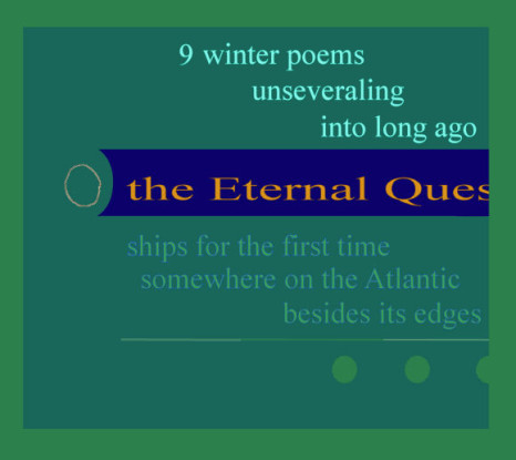
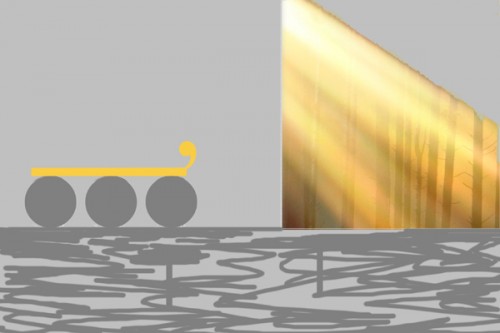
Interesting idea to leave out the last few syllables and replace with a visual iinstead. But the yellow ellipses need to be more vivid. I suggest darkening the background and increasing the saturation and brightness of the yellow. Also, the second line needs more description, less laundry list, I think. (Forsythia do not grow in California–I miss them. People not from the East or midwest may have trouble with the poem. Would the daff… work?)
I like the second one , but kind of want a little more hint. I first put in “unknown immense” in my head then realized you may have meant “unknown expanse.” Would “the unknown immense…..” work?
I found it hard to make the yellow show enough from the beginning. I didn’t like my “list,” either. My problem is that I like the idea of colored dots for an ellipsis, and yellow for forsythia is good, too, but not enough. I would keep forsythia, by the way, even knowing there are people not familiar with it. They can look it up. Or look at the footnote my editors will surely provide (you know, fifty years from now when I’m dead and finally world-famous). I think I’ll just have to let the yellow dots sit in my brain until I get lucky and a way properly to use them occurs to me.
Ditto the second idea. Would “uni . . . rse” work better. My problem here is that it is either not easy enough to decode or too easy. No matter. I felt from the outset that my use of the ellipses within a ellipsis did work here.
Thanks for the comments, COnnie. They strengthened my misgivings about the poems.
–Bob
I hope the misgivings do not cause you to drop them entirely. Do you have Adobe Photoshop Elements? It is not cheap and takes awhile to learn to use, but is very powerful regarding color changes. I believe you could definitely get the first poem to work well with just a bit of tweaking. Darken the background, choose a different contrasting color for the words and use bright yellow for dots. Change mistiness to mist and you’ve got two more syllables to play with in the second line.
(And yes, forsythia is more interesting than daffodil. I had to rely on the footnotes for “oleander” before I knew they grew all over out here!)
Universe is the wrong syllable count for a haiku. I actually prefer the ellipses to stand for an unkown something in this haiku. Whatever… Good luck.
Cheers,
Connie
Good thinking, Connie–since they’re the same as ones I had, myself, but didn’t mention! (Really!)
I hope the misgivings do not cause you to drop them entirely.
I hope so, too, but don’t think they will.
Do you have Adobe Photoshop Elements?
I have Paint Shop, which I consider the Kmart version of Photo Shop, which I’ve used but can’t afford for myself.
It is not cheap and takes awhile to learn to use, but is very powerful regarding color changes.
Paint Shop does color changes nicely.
I believe you could definitely get the first poem to work well with just a bit of tweaking. Darken the background, choose a different contrasting color for the words and use bright yellow for dots.
Good thinking that I did not have is to change the color of the words. Only consideration is that I may want the words to be absolutely standard, to make the unstandardness of the ellipsis more pronounced. Changing the background is essential but difficult. I did make it a pale grey to try to help the yellow. A pale blue is another possibility. I don’t want dark grey or blue because it would start the poem already (possibly) too unstandard. Also, I want some kind of natural sky background for the ellipsis.
Change mistiness to mist and you’ve got two more syllables to play with in the second line.
Humorously, I changed “mist” to “mistiness” to get my syllable count, not able to find two syllables to add that I though worked.
(And yes, forsythia is more interesting than daffodil. I had to rely on the footnotes for “oleander” before I knew they grew all over out here!)
Hey, I don’t know what oleander is! For a haiku poet, I’m terrible with names of trees, bushes and flowers.
Among the possibilities I’ve come up with for repairing the forsythia poem are to forget forsythia and just go with something a better color for this idea. Another simply to use bigger textemes (if that’s my word for letters and similar elements, like punctuation marks). One thing I feel I’ll almost certainly use is bigger textemes and some kind of scenery inside the dots, like a close-up of forsythia in bloom.
Hmmm, how about “It’s April and the forsythia is in bl o o o” with the o’s filled in and yellow? Rhetorical question. I do think that idea has possibilities, though. . . . A poem in bl o o o
all best, Bob
Universe is the wrong syllable count for a haiku.
I know. Couldn’t think of a way to make that line five syllables. Gave up, knowing I only had a rough draft.
I actually prefer the ellipses to stand for an unkown something in this haiku. Whatever… Good luck.
My problem is that I really don’t know how I want to use it. Most of my ideas for visual poems begin with a gadget like colored ellipses that I play with until I suddenly see what I can make the gadget mean. Then I work on the text until I think it makes that meaning reasonable clear.
Thanks for your comments. With mine, they provide a good demonstration of what should be going on in the head of a poet but seems not often to. A danger is making a rationale for a poem too overt, but the reverse danger, not bothering to connect a poem to a rationale, is worse, I think.
–all best, Bob
Yes, I see why you want to keep a black text in the first haiku. A bright sky blue should contrast well with yellow.