Entry 1088 — “painted over red exit sign” « POETICKS

Entry 1088 — “painted over red exit sign”

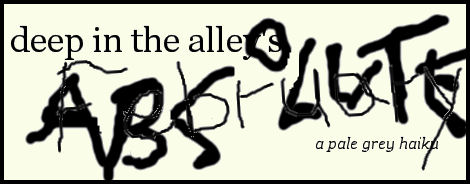
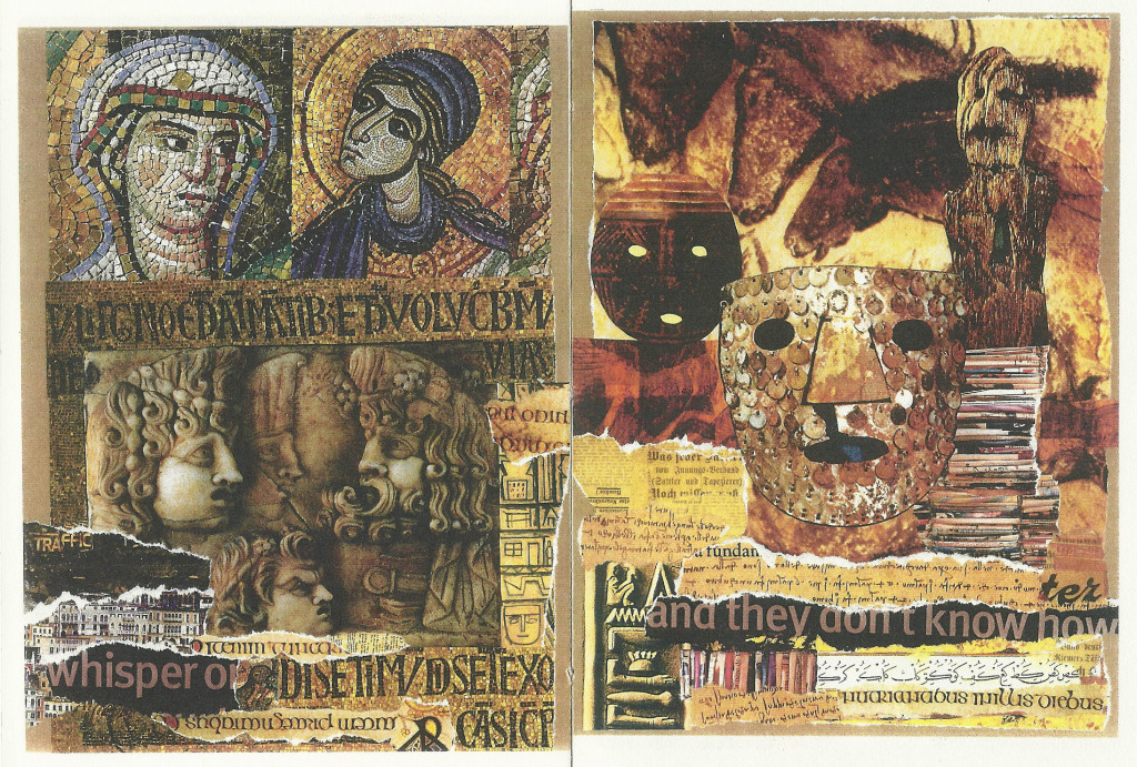
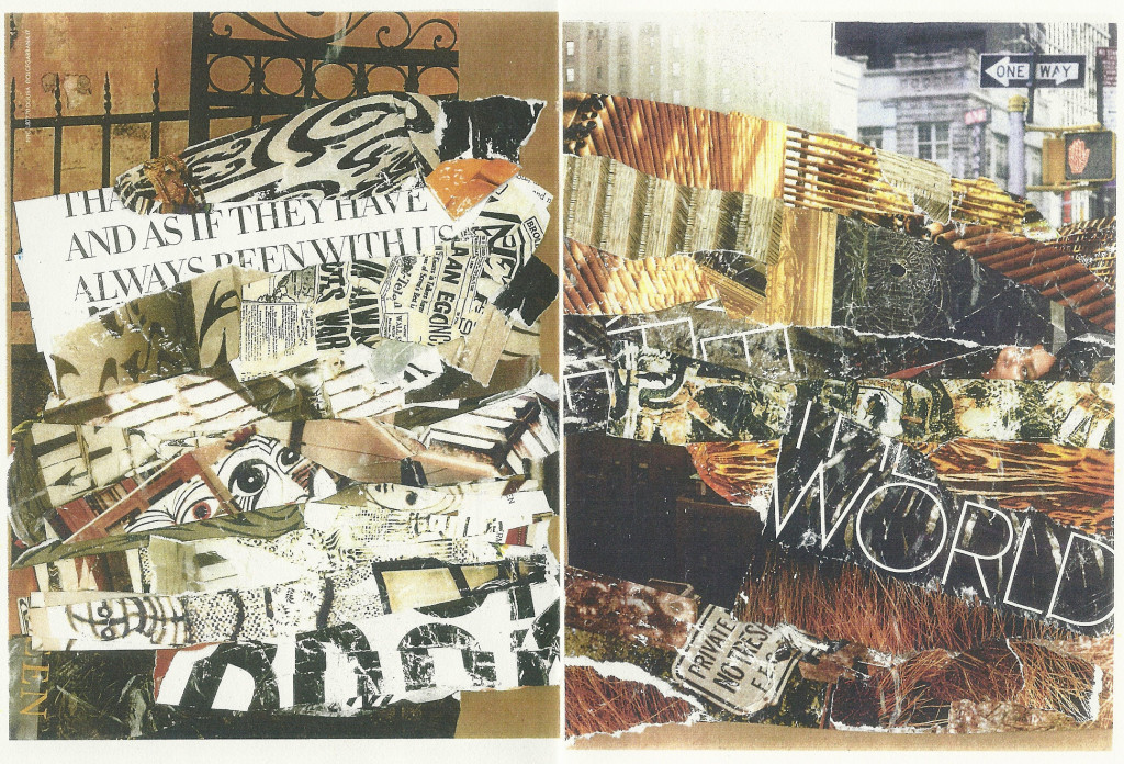
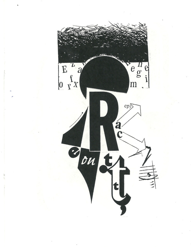
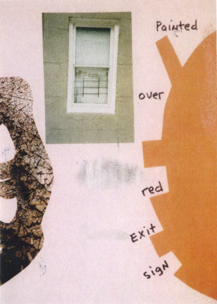
I got a postcard from Guy Beining the other day.  Once again, he’s made making a blog entry an easy chore for me, for the work below was on one side of the card:

ExitSign

Whatever it is that makes the best surrealistic poems and paintings effective, this definitely has.  All I’ve made of it beyond that is that it may concern an exit denied . . .  Parts of existence not meshing, as well?  Things to think about, for sure.

.

Leave a Reply

visual poetry « POETICKS

Archive for the ‘visual poetry’ Category

Entry 138 — “Maternity Ward”

Monday, May 31st, 2010

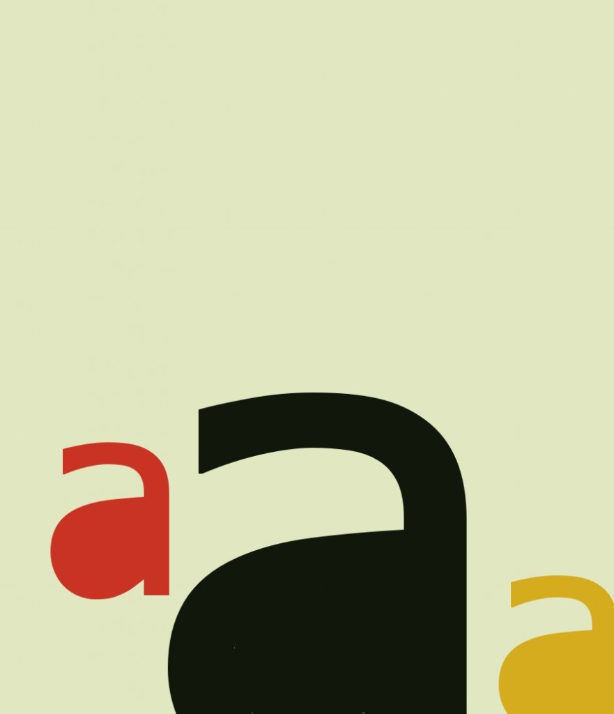
The title of the following work is “Maternity Ward at Wesson Women’s.” Its author is Alexander Jorgensen, one of his four submissions to The Pedestal Gallery, all of them quite good but in the second twelve (in the editors’ highly subjective view).  Before he submitted it to the gallery, it appeared in Mark Young’s excellent publication, Otoliths, Issue Eleven, Southern Spring, 2008.

I first saw this at Spidertangle over a year ago, and at once liked it a good deal. I still do. For a while I thought it a perfect example of alphaconceptual textual designage, viewing it as asemic. A charmingly understated design consisting of the letter a to make it textual designage, with a, for me, strong suggestion of language soon to be born, these three a’s close to getting alphabets going.

Later I had to accept it as (barely) a visual poem, for “a” is significant as a word in it, here pregnant with whatever noun it will soon modify–a doubly alphaconceptual visual poem.  It’s also pain beautifully serene: all’s right with this world–at least to me.

I

Enter 135 — 13’s from The Pedestal Project

Friday, May 28th, 2010

Today I’m finally starting to post what I’ve decided to call “13’s from The Pedestal Project,” by which I mean my favorites of those submissions to John M. Bennett’s and my gallery of visio-textual art at The Pedestal. I call them “13’s” because the people who created them were, so to speak,  all–in my opinion–tied for thirteenth place in the competition for the twelve spots available in the gallery.

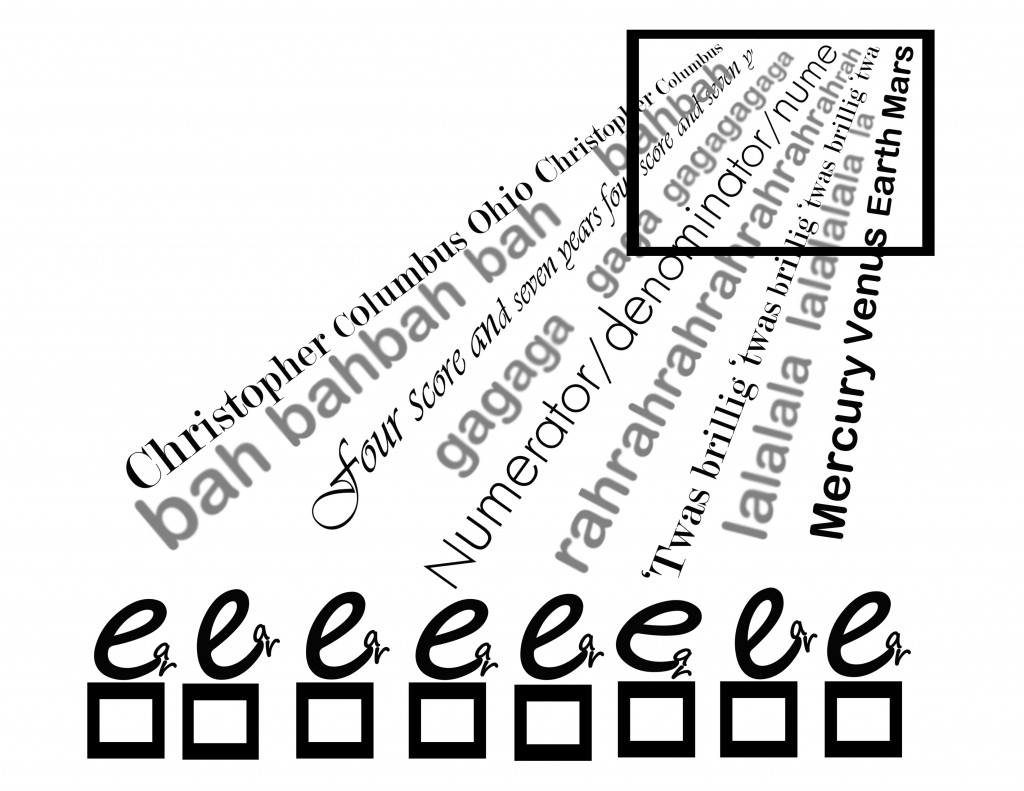
The first piece is “Fifth Grade,” by Connie Tettenborn:

When I saw this, I was biased toward it because so many of the other submissions to a gallery supposed to be of visual poetry was (tediously) not visual poetry by any reasonable definition, and this was.  I was also charmed by its evocation of what fifth grade seemed to me.  I found the choice of data the kids were being bombarded with interesting, too: it happened to include three pieces of knowledge of extreme importance to me all my life: the discovery of America (and I claim Columbus discovered America; Eric the Red or his son, whoever it was, who got to Newfoundland only extended the shoreline of Europe), long division and the planets (which in fifth grade were just about equal to dinosaurs and the Pyramids to me).

I liked the little kids in proper order–although I’m not sure why Connie uses the particular letter she does to represent them. Wait, they are, I now see, “e.g.’s” . . . I’m still not getting the connection .  In any case, one of the kids seems not paying full attention, which is a nice touch.  The idea of Knowledge coming in from some Afar that seems almost divine intrigued me, too.  There’s the concept of a window into understanding, too.

In chatting over syberspace with Connie, I’ve learned that she is new to visual poetry, so deserving of special praise for doing so well to being with.  Because she asked for help, I’m now going to say a few minor negative things about “Fifth Grade.”  One is that I’m not sure “bah bah” fits the piece as well as “blah blah” would have, and I think “gaga” and “lala” not particularly effective.  I think the choice of varied fonts good, but believe a little more could have done to the in-flow–for instance, some overlapping could have worked nicely, I think, and great difference in the size of letters.

I wondered about the use of color, finally deciding straight monochromatic, facts-only dry knowledge worked best.  But use of colr and visual imagery might be something to try, too, if the artist wanted to make a sequence of variations on a theme, which her piece would be a good start to.

Entry 134 — Ellipsis-Haiku

Wednesday, May 26th, 2010

I’m still having “creative ideas” but having trouble bothering to put them on paper, even ones as easy to do that with as the ones that led to the following:

.

.

.

Good ideas (inspired by Marton Koppany’s recent Otoliths book) not yet finding their best presentation, it seems to me.

Entry 133 — Somewhat Awake Again, I Think

Friday, May 21st, 2010

I simply disconnected from my blog–just didn’t think of it for about a week until a day or two ago.  Then last night for some reason I started thinking about haiku and came up with the following poems that I thought worth making this entry for:

.

.                            early April night:
.                            barely a single haiku
.                            of moonlight in it

.

.                            the street’s cherry blooms,
.                            dazzling, yet almost grey
.                            besides the haiku’s

.

.

.

.

.

.

Entry 131 — Another Variation

Monday, May 10th, 2010

I like this one:

In fact, I’d include it among my all-time best works.

Entry 130 — A Variation

Sunday, May 9th, 2010

Guess what will be next in this series?

I’m not sure I like the colors in the addition.  Oh, well, it’s something to use for another entry.  I’ve had another setback, by the way: a very close local friend’s husband died Thursday.  I only found out yesterday.  I had only gotten to know the husband well enough to extremely miss him–but my sadness over what my friend is going through is worse.  I spent a lot of time with her yesterday, but my ability at brightening the bereaved is pretty poor.  I think I distracted her at least a little.

Entry 129 — More Futzing Around at Paint Shop

Thursday, May 6th, 2010

This is here not as a finished product but as a sketch to remind me to make something decent of it when I’m in better shape mentally.

Entry 128 — Vispo Sketches

Wednesday, May 5th, 2010

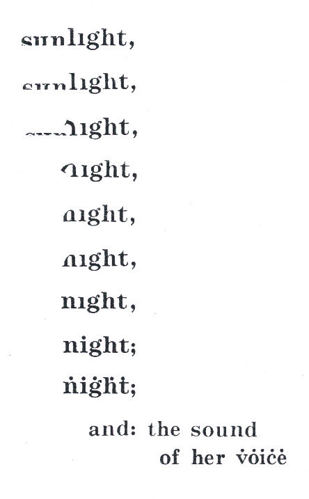
Well, I’m trying to get back on track but having a tough time of it.  I had ideas while taking hours to get to sleep last night, most of them variations on the idea my “sleep” poem is based on (which I’m pretty sure I stole from Marton).  So I tried one of them out at Paint Shop and had all kinds of trouble.  The first is the upper one below.  I intended it merely as the first step from my “sleep” poem to a new poem but liked what it did, so left it as a variation.  Minor but satisfactory.  I don’t like the one under it.  One error is the font of the central “gh.”  I don’t know how it got there.  I’m too worn out to change it, which (for me) would be more involved than you might suspect.  So I consider it a rough draft.  I no longer know whether to bother fixing it.  Nonetheless, it’s a Major Accomplishment compared to just about everything else I’ve been doing these past twelve months or so.  And it and its companion got me a third consecurive daily blog entry!  Whee.

Entry 125 — My Latest Slump

Wednesday, April 21st, 2010

I’ve been in and out of my Null Zone quite a bit of late, and for the past few days have been extremely in it.   No zip, at all.  I want to sleep but am barely able to–it takes me four or five hours to get to sleep at night, and I can’t sleep past six or seven.  Even with a sleeping pill–or two.  Ambiens?  Something like that.  The lowest dosage.

Maybe my trouble sleeping is why I liked the visual poem below of mine so much when I came across it earlier today while looking for a sonnet-related visual poem of mine for use in a presentation on sonnets I’m scheduled to give at the local writers’ center in a little over a week and can’t seem to work on for more than ten or fifteen minutes a day.

I may need my dosage of synthroid, the medicine I take for hypothyroidism, increased.  I’m sure I’m suffering depression, too: one of my two brothers recently died.   Visiting him for a week, then returning for three or four days for his funeral was one of the reasons for so few recent entries here.

Apologies for this doleful entry, but I wanted you few who come here upon occasion to know what’s going on, especially you few I’ve told I expected to write about an artwork of yours here by now.

Now that I’ve gotten going, I might as well make an announcement: the issue of The Pedestal with the gallery of artworks John M. Bennett and I  edited for The Pedestal will be published tomorrow (at www.thepedestalmagazine.com), according to our editor, John Amen.  We expect the usual flak about it.  I just want to say all the wrong choices were John’s.  And that I prefaced it with a ringing undorsement of calling textual designs visual poetry.  Which John’s preface countered, but we’re still pals.

Isn’t it amazing?  No matter how null I get, I retain my acerbic wit.

Another announcement: if I ever get even slightly energetic, I’m going to post a few of the works submitted to the gallery that didn’t make it into the gallery but that I liked; John says he might like to post a few of his favorites that didn’t make it, too.  We also plan to have a gallery containing just about all the works submitted.  It will go up at Spidertangle.net 1 August.   I thought it’d be extremely informative for people to see what was submitted.  We won’t post anything without the submitters’ permission, and have been turned down by three, so far.  The same number so far have granted permission.

More, eventually, I very much hope.

Entry 119 — Defining Visual Poetry Again

Tuesday, March 16th, 2010

In a month or so, John Bennett’s and my selection for a gallery of visual poems in The Pedestal should be appearing.  John and I each will be providing a preface for it, as I understand it.  In any case, I started thinking about mine last night.  Once again I returned to my obsession with defining “visual poetry.”  This time, though, I wasn’t concerned with my main definitional obsession, the requirement of visual poetry to contain words, but with a lesser obsession, the requirement that a visual poem be more than an illustrated poem, or poetically captioned illustration–because of an excellent submission I got consisting of several arresting visual images, each with a haiku running across its bottom.

Dogma#1: a visual poem must consist of a significant graphic element significantly interacting with a significant verbal element.  Dogma #2: a reader of the poem must experience the poem’s graphic and verbal elements simultaneously.  There will come a day when neurophysiologists will be able to detect this simultaneous experience.  Thereupon we will have an objective way of determining whether a not a given work is a visual poem–for a given person.

This simultaneous experience seems to me the whole point of visual poetry, difficult though it be to provide it.   My “Nocturne” demonstrates how it is done, so that’s the poem I’ll be using as my “Editor’s Poem” for the gallery.  It’s based on the simple idea of dotting all the letters in “night” to suggest stars, then doing the same with “voice” to indicate a voice with stars in it.  Very sentimental, but a favorite of mine.  For some reason, though, I can’t find it in my computer files, so apparently have not yet saved it digitally.

collage « POETICKS

Archive for the ‘collage’ Category

Entry 1311 — Time & Again, First & Last

Thursday, December 26th, 2013

Here are the title page of Carol Stetser’s Time & Again and its final two pages:

FirstPage

Pages7&8

Quite a richly concentrated historian of the West, I’d say.

.

Entry 1310 — Time Again Again

Wednesday, December 25th, 2013

The third pair of pages from Carol Stetser’s Time Again:

Pages5&6

Pssst: Merry Christmas, everyone!

.

Entry 1300 — Carol Stetser’s Time Again

Sunday, December 15th, 2013

The first two pages in Carol Stetser’s Time Again:

Pages1&2

Each wonderful as a stand-alone, but look how beautifully they work together!

.

Entry 1038 — Back to Spence/Topel

Sunday, March 10th, 2013

Back to this collage by Pete Spence and remixer Andrew Topel–mainly to get another entry out of the way without much work, but also to provide . . . an insight:
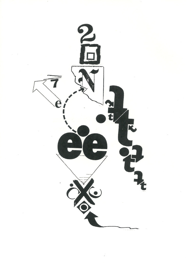
REMIX1topelSpence

I’m a bit more out of it even than usual because of stupid daylight savings, but also because yesterday I had to put in a lot of worrisome work on the latest installment of my Scientific American guest blog that kept me up past my bedtime.  The entry is here.

One interesting thing about it that I think will amuse those who have been following my career here and at New-Poetry the entry’s mention of a poem by none other than Rita Dove (inclusion of the full text of her poem would probably have cost too much)–and I praise it inordinately! I really didn’t want to do a favor for such an exemplar of all I’m against in the poetry scene, but I loved the poem! What can I say?

A thought out of nowhere: it occurred to me while thinking about creative person’s apparent susceptibility to bipolarism in some form or another that I was a “lifetime-phase” manic-depressive in that I was in my manic phase–relatively high-energy and confident–self-despising in a manic way, by which I mean I was angry with myself not sad about myself, and that I went into my depressed phase around sixty, aided no doubt by being hit with prostate cancer at 57, and have since been always tired, except when I’ve taken my zoom-dose (hydrocodone plus caffeine).   My thyroid conked out along the way.  My theory: that I used up my endocrine system due to my mania, leaving me unable to generate any kind of energy without the help of drugs.  I’m exaggerating, I’m certain, but I think there may be more than a little truth in what I’m saying.

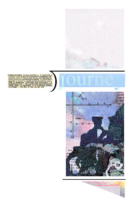
Okay, now for the insight I’m sure you’ve been impatiently awaiting.  I take the Spence/Topel work to be a wonderful evocation of mathematical voyaging which begins, for me with the t’s, the famed symbol of “time,” and here forming plus-signs–and arrows helping the two actual arrows in the piece (and the triangle) represent the directive character of mathematics this piece involves, but leading away from the voyage as time approaches zero.  The voyage, it is quickly apparent, begins at the bottom with the hand-drawn X the voyage seems being taken to determine the “N” of. which, we see, is rather regally exotic.  Decimal points, e’s for energy, and 2 c’s for constants along the way, but with the triangle in opposition, and another arrow to remind us (energetically) of the incompleteness of the solution we’re headed toward, as does the separating equals-sign near the arrow’s head.  An exciting map–of a fully dimensional adventure, for me, because of the 2 and the 7, which combine to equal 3 cubed.

The interpretation I just unspooled is unquestionably subjective.  I offer it merely to indicate where one person let the work take him–based with a fair amount of reason on what’s there in the work.  I hope it also suggests that the work, for being able to suggest so much–the voyage a mathematical attempt to solve something can be–the work is a superior one.  It should inspire other interpretations, some entirely different, but none inconsistent in some general way with mine.

.
Entry 1037 — Spence/Topel Collaborations

Saturday, March 9th, 2013

These are the first two pieces in Remix, a little booklet published by avantacular press that Andrew Topel just sent me:

REMIX1topelSpence

REMIX2topelSpence

They are collages by Pete Spence that have been remixed by Andrew.
.

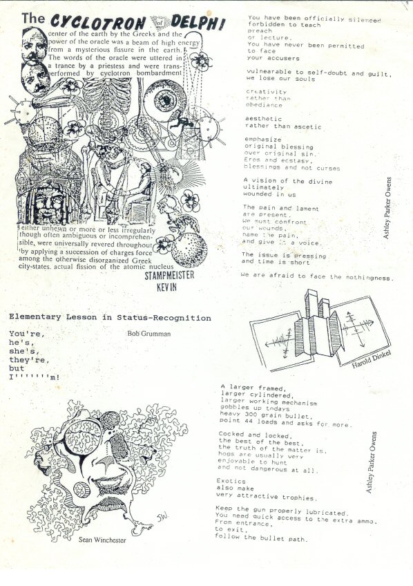
Entry 71 — A Broadside from the Past

Monday, January 11th, 2010

.

I’m pretty sure this resulted from some contact I made in Chicago when there for an underground press conference.  Not sure when that was.  Maybe fifteen years ago. . .  I’ve since lost touch with everyone named on the page.  I do remember Ashley as a good kid and valuable undergrounder.

Entry 628 — New Vocational Triumphs « POETICKS

Entry 628 — New Vocational Triumphs

Just when I thought my visual poetry career was going nowhere, I had a pleasant surprise at an Arts & Humanities gathering last night.  It was an annual affair where local visimagists get together with people representing public places.  The latter look over the works brought to the event, three pieces per artist, and offer exhibition space to those whose work they like.  A bank lobby, for instance.  I went to one of these long ago, but my work wasn’t chosen, and while I’m (probably insanely)  persistant at continuing to make art, I have just about no stick-to-it-ive-ness so far as getting it to where people can see it and maybe like it.  Well, with the encouragement of Olivia and Judy, of the Arts & Humanities Council, and thinking maybe now that I had my current exhibition, someone might think me worthy of another elsewhere, I brought the following three pieces to the main library, where the affair was:


I was going for accessibility with the top two.  I added the bottom one to show a little of what I was doing with long division and color.  In any case, I’m now down for three more exhibitions, two more this year and one in 2013. 

I got to talk with fellow artists, too.  One of them did abstract-expressionist stuff with the word, “love,” embedded in them–another local visual poet!  I came across another artist who uses some kind of transparent, screenlike fabric in her work: she paints an image on it and hangs it in front of regular fabric with a background painted on it.  I thought it worked really well, and have vague ideas on what I might do with it.  So, quite a good hour or so!

.

One Response to “Entry 628 — New Vocational Triumphs”

  1. marton koppany says:

    Good news. Congratulations, Bob!

Leave a Reply

Entry 420 — Clark Lunberry’s Latest Installation « POETICKS

Entry 420 — Clark Lunberry’s Latest Installation

.

.

.

.

.

.

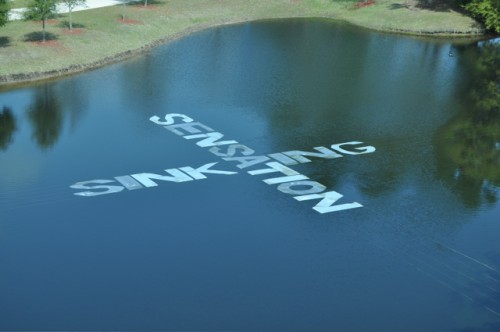
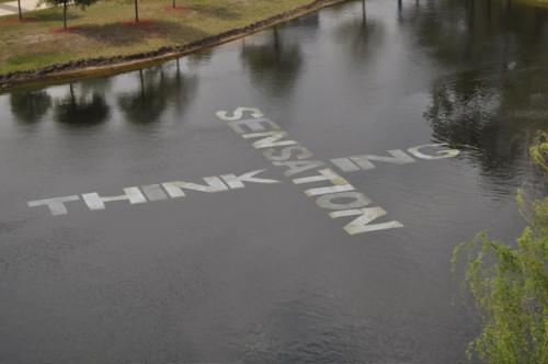
I may have it wrong, but I believe the college pond part of Clark’s installation began with the top image, then changed to “INKING/SENSATION” which, in turn, became the second image, finally becoming “SENSATION” by itself, then the bottom image, thereafter losing verbal meaning gradually until wholly gone. When I visited it, I saw the middle image. My memory is lousy but I remember it as the green of the bottom image.   In any case, it was colored.

I will leave it here for now as an object of meditation as you might have happened on it walking to a class or the library of the college Clark teaches at.   More tomorrow.

One Response to “Entry 420 — Clark Lunberry’s Latest Installation”

  1. endwar says:

    Well, at any rate it appears to have been quite a sensation! Three of them!

    – endwar

Leave a Reply

Entry 1091 — Waves « POETICKS

Entry 1091 — Waves

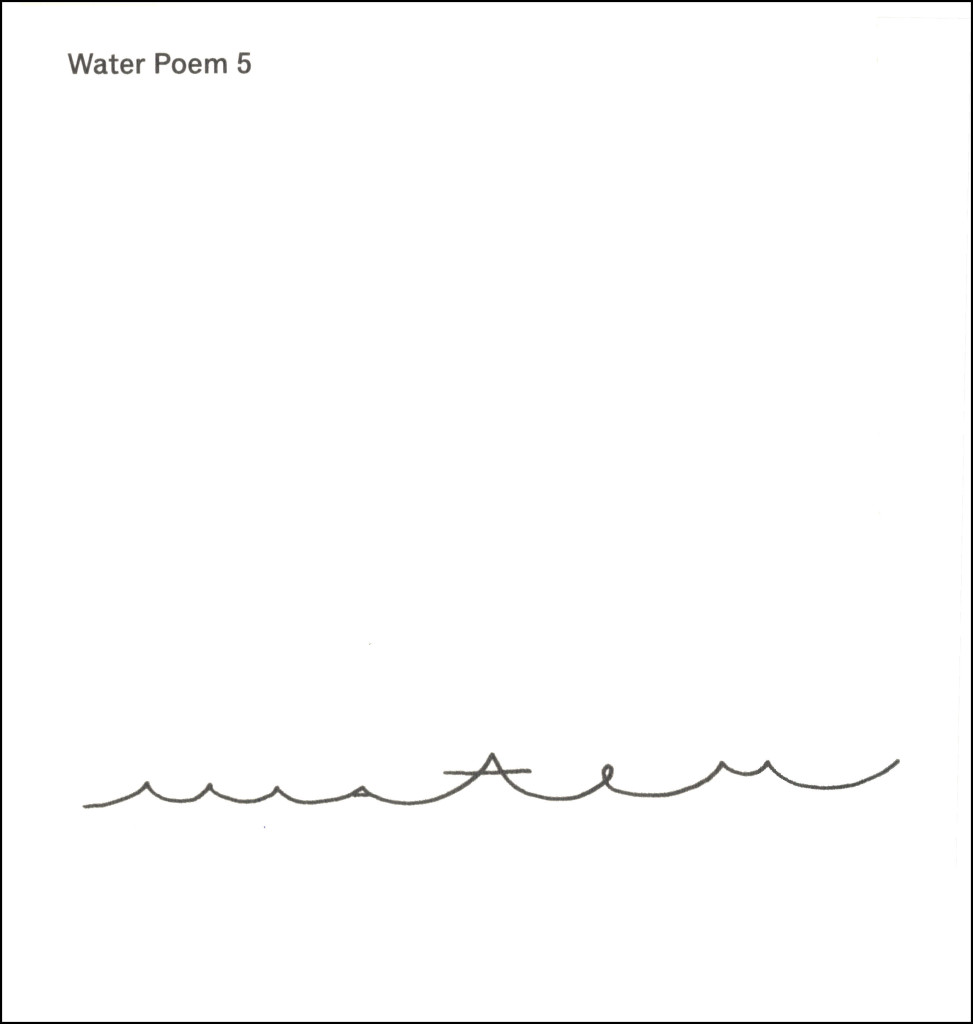
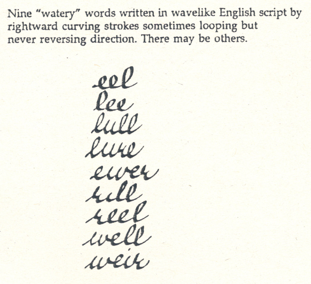
I had all kinds of trouble getting the following images into this post, and I’m exhausted, so won’t say much about them until tomorrow.  I will say that I consider the top one an example of what has been wrong with the arts world for the past 40 or more years.

Darboven01x.
WaterPoem5

.

WaterIntoWord

.

WateryWords

.

Leave a Reply

Alison Bielski « POETICKS

Posts Tagged ‘Alison Bielski’

Entry 31 — Old Blog Entries 663 through 670

Wednesday, December 2nd, 2009

In #663, I presented my Odysseus Suite–but the reproduction is too crude for me to re-post it here.   My nest entry featured this, by Endwar:

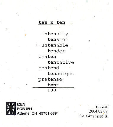
TenByTenAs I announced when I first posted this, I am hoping to publish an antho- logy of mathematical poems, like this one, so if you have one or know of one, send me a copy of it, or tell me about it.
#665 had this by Marton Koppany, which I have to post here because it was dedicated to ME:

Odysseus

Hey, it’s mathematical, too.  The next entry, whose number I fear to state, concerned this:

Bielski-Haiku-BW

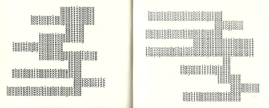
This is from Typewriter Poems, an anthology published by Something Else Press and Second Aeon back in 1972. It’s by Alison Bielski, An English woman born in 1925 whose work I’m unfamiliar with. I find this specimen a charmer . . . but am not sure what to make of it. Three lines, as in the classic haiku. The middle one is some sort of filter. Is “n” the “n” in so much mathematics? If so, what’s the poem saying? And where does the night and stars Hard for me not to assume come in? Pure mathematics below, a sort of practical mathematics above? That idea would work better for me if the n’s were in the lower group rather than in the other. Rather reluctantly, I have to conclude the poem is just a texteme design. I hope someone more clever sets me right, though. (I’m pretty sure I’ve seen later visio-textual works using the same filter idea–or whatever the the combination of +’s. =’s and n’s is, but can’t remember any details.)

It was back to my lifelong search for a word meaning “partaker of artwork” in #667–but I now believe “aesthimbiber,” which I thought of in a post earlier than #667, I believe, but dropped, may be the winner of my search.

Next entry topic was about what visual poets might do to capture a bigger audience.  I said nothing worth reposting on a topic going nowhere because visual poets, in general, are downright inimical to doing anything as base as trying to increase their audience.   One suggestion I had was to post canonical poems along with visual poems inspired by them, which I mention because in my next entry, I did just that, posting a Wordsworth sonnet and a visual poem I did based on and quoting part of it–and don’t re-post here because of space limitations.  I wrote about the two in the final entry in this set of ten old blog entries.

Samuel Jablon « POETICKS

Archive for the ‘Samuel Jablon’ Category

Entry 1585 — Simple Country Girl

Monday, September 29th, 2014

I grabbed the following from the Spring issue of Bomb because I felt I didn’t have time for anything but a hurried entry:
CountryGirl-SamuelJablon

It’s by Samuel Jablon.  Usually the works I post are ones I consider superior ones, so I thought one I didn’t think much of, with a few explanatory remarks would be a nice change.  After more time with Jablon’s work, though, I’m not so sure it isn’t pretty good.  I’m not ready to call it superior because the decorative work is terrific but seems to me arbitrary (so far).  What metaphoric function do the differently-colored tiles have I want to know, for instance.  I feel the artist is choosing them for intuitive visimagistic reasons, which is okay, but limits the result to a beautifully decorated sign, sort of visual prose rather than visual poetry.  But I haven’t studied the reproduction sufficiently to consider my thoughts more than a rough beginning from vague liking toward something more.  Needless to say, to really do it justice, I’d have see the original–from a gallery with more of his work.

Hey, the reason I felt the need to get this entry done as quickly as possible is that I am really focusing on my novel finally: from an average of a chapter every two or three days to eleven chapters in the past four days, and I had a lot of household chores on two of those days!  Five more chapters and an epilogue and I’ll be done.  (With this revision; I feel I need to go through the whole thing one more time; copy editing, but also in hopes of unstilting some of the dialogue; I also have two or three narrative lines I have to make sure are logical.

IMPORTANT CORRECTION OF STATEMENT IN EARLIER BLOG ENTRY: “FACT: almost no statistical study of anything whatever takes into consideration all the variables it should” should say “FACT: almost no statistical study of anything having to do with human beings whatever takes into consideration all the variables it should.”  Obviously there are many areas of study like the roll of dice where all relevant variables can easily be taken into consideration (to get a maximally if not absolutely accurate statistical analysis of).  Sociology and Psychology are the two leading fields of statistically incompetence.

.

AmazingCounters.com

Alexander Jorgensen « POETICKS

Archive for the ‘Alexander Jorgensen’ Category

Entry 138 — “Maternity Ward”

Monday, May 31st, 2010

The title of the following work is “Maternity Ward at Wesson Women’s.” Its author is Alexander Jorgensen, one of his four submissions to The Pedestal Gallery, all of them quite good but in the second twelve (in the editors’ highly subjective view).  Before he submitted it to the gallery, it appeared in Mark Young’s excellent publication, Otoliths, Issue Eleven, Southern Spring, 2008.

I first saw this at Spidertangle over a year ago, and at once liked it a good deal. I still do. For a while I thought it a perfect example of alphaconceptual textual designage, viewing it as asemic. A charmingly understated design consisting of the letter a to make it textual designage, with a, for me, strong suggestion of language soon to be born, these three a’s close to getting alphabets going.

Later I had to accept it as (barely) a visual poem, for “a” is significant as a word in it, here pregnant with whatever noun it will soon modify–a doubly alphaconceptual visual poem.  It’s also plain beautifully serene: all’s right with this world–at least to me.