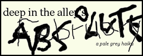
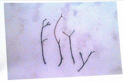
Marton Koppany « POETICKS

Posts Tagged ‘Marton Koppany’

Entry 183 — Another by Marton

Sunday, August 8th, 2010

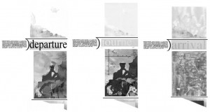
So I can’t get this entry quickly out of the way and try to get into my next column for Small Press Review, in a couple of weeks (and because I really like it!), here’s Marton Koppany’s “Arrival”:

He, like Geof Huth, is another Klee, and I have higher compliment than that (although I have a few equal compliments, like “another Pollock”).

Entry 182 — “Dash No. 1,” by Koppany

Saturday, August 7th, 2010

This is one of the three pieces Marton Koppany sent me recently.   I’m posting it now (1) to take care of another entry with minimum effort, (2) because I like it a lot, and (3) to allow me to babble a bit more on my favorite topic, What Visual Poetry Is.

As those who know my work as a critic, I contend that a text cannot be a poem unless it has words that are of significant importance to what the text does aesthetically.  This piece contains no words, as most people understand the term.  Nonetheless, I’m prepared to claim it to be a poem.  Clearly, this piece is on what I call the borblur–the borderline between conceptual visimagery and visual poetry.  I call it the later because I believe all punctuation marks (and similar symbols such as those used in chemistry or mathematics) can act as words in certain unusual situations.

Specifically, when a punctuation mark in a work is sufficiently emphasized to make it difficult for someone “reading” the work to treat it as nothing more than a punctuation mark, it will become a word.  That is, it will not be skimmed through with little or no conscious notice–actually, with no vaonscous verbal notice, as with the dash I just used–but pondered consciously, possibly even indentified consciously as what it is, it will become a word.  It will denote as well as, or even perhap instead of, acting purely punctuationally.  In the case of the work above, I claim most people–at least most people familiar with the territory–will read the dash in it (even without the title of the piece), as “dash, short-cut,” then realize sensorily how it is making something rather large disappear, or realize how it works.  A simple but unexpected metaphor visualized.

The pun in English of “dash” as a verb meaning to go in a hurry is a very nice extra, entirely verbal extra.

Note: my only problem with the piece is its title, which I think too overt.  I’d prefer something more like “Punctuation Poem No. 63, or the like.  “Mountain subjected to Punctuation?”  No, but something like that, but more intelligent. . . .

Entry 36 — 2 by Koppany from #672

Monday, December 7th, 2009

.

Csend-Sinc

Csend-Sinc

TheAnds

The Ands

Nothing else.  I’m hoping to get going again on columns for Small Press Review. A deadline is approaching and I’d like to get ahead.  It’d be nice, too, to start getting real work done.

Entry 31 — Old Blog Entries 663 through 670

Wednesday, December 2nd, 2009

In #663, I presented my Odysseus Suite–but the reproduction is too crude for me to re-post it here.   My nest entry featured this, by Endwar:

TenByTenAs I announced when I first posted this, I am hoping to publish an antho- logy of mathematical poems, like this one, so if you have one or know of one, send me a copy of it, or tell me about it.

#665 had this by Marton Koppany, which I have to post here because it was dedicated to ME:

Odysseus

Hey, it’s mathematical, too.  The next entry, whose number I fear to state, concerned this:

Bielski-Haiku-BW

This is from Typewriter Poems, an anthology published by Something Else Press and Second Aeon back in 1972. It’s by Alison Bielski, An English woman born in 1925 whose work I’m unfamiliar with. I find this specimen a charmer . . . but am not sure what to make of it. Three lines, as in the classic haiku. The middle one is some sort of filter. Is “n” the “n” in so much mathematics? If so, what’s the poem saying? And where does the night and stars Hard for me not to assume come in? Pure mathematics below, a sort of practical mathematics above? That idea would work better for me if the n’s were in the lower group rather than in the other. Rather reluctantly, I have to conclude the poem is just a texteme design. I hope someone more clever sets me right, though. (I’m pretty sure I’ve seen later visio-textual works using the same filter idea–or whatever the the combination of +’s. =’s and n’s is, but can’t remember any details.)

It was back to my lifelong search for a word meaning “partaker of artwork” in #667–but I now believe “aesthimbiber,” which I thought of in a post earlier than #667, I believe, but dropped, may be the winner of my search.

Next entry topic was about what visual poets might do to capture a bigger audience.  I said nothing worth reposting on a topic going nowhere because visual poets, in general, are downright inimical to doing anything as base as trying to increase their audience.   One suggestion I had was to post canonical poems along with visual poems inspired by them, which I mention because in my next entry, I did just that, posting a Wordsworth sonnet and a visual poem I did based on and quoting part of it–and don’t re-post here because of space limitations.  I wrote about the two in the final entry in this set of ten old blog entries.

Irving Weiss « POETICKS

Archive for the ‘Irving Weiss’ Category

Entry 1093 — Thoughts Regarding Minimalism

Saturday, May 4th, 2013

I suppose the minimalist artwork below is not bad, but seeing it in the latest issue of ARTnews depressed me, reminding me that minimalist painters, even mediocre ones like Hanne Darboven seemed from this one example to be, were continuing to make big bucks forty or more years after the birth of minimalism while someone like me is making the most money of his life after fifty years or so of adulthood because of food stamps. . . .

Note from 1 February 2014 when I was reviewing the past year.  Apparently the computer problem mentioned in my next entry screwed up this entry.  The reproduction of the Darboven visimage got deleted and all my further comments.  No doubt they had to do with the following specimens of much better specimens of minimalism I found by bp Nichol (the top one) and Irving Weiss the other two:

WaterPoem5


WaterIntoWordX


WateryWords


I’m sure I had fascinating things to say about them.

.

Entry 1092 — More Cursive Writing by Irving Weiss

Friday, May 3rd, 2013

I was going to discuss the minimalist works of the previous entry in this one but had so much trouble simply setting the entry up due to my deranged computer and/or my blogsite’s programming, that I couldn’t continue after losing half my commentary, who knows why.  In desperation, I scanned another piece that was in Irving Weiss’s Number Poems (The Runaway Spoon Press, 1997) and managed to post it here:

AMomentAgo

Nifty visiopoetic portrait of a lady, I think.  I haven’t tried super-hard to read the writing but suspect it consists of various scribbled female names–one is Echo.   Wait, at the top are Scylla and Daphne.  I now suspect these are all nymphs or the like who suffered badly at the hands of various gods and goddesses–hence, if full life only a moment.  And en masse here a barely legible flurry representative of all the feminine magic and mystery of the old religions now long-gone.

.

Entry 1091 — Waves

Thursday, May 2nd, 2013

I had all kinds of trouble getting the following images into this post, and I’m exhausted, so won’t say much about them until tomorrow.  I will say that I consider the top one an example of what has been wrong with the arts world for the past 40 or more years.

Darboven01x.
WaterPoem5

.

WaterIntoWord

.

WateryWords

.

Entry 940 — Pronouncements & Blither, Part 2

Sunday, December 2nd, 2012

A few days ago, I got an e.mail from Irving Weiss.  He made some nice remarks about my Scientific American blog, then said that neither “read” nor “peruse” satisfied him “for the way one sticks to looking at a work of abstract art or abstract expressionism or, for that matter, any visual poem lacking identifiable content and without a title to help the viewer. I muse: if you look long at a Pollock, Moherwell, de Kooning, what do you do with your looking mind? You have to avoid thinking of what the painting “looks like” on the one hand and going into a mystical mood or trance. It’s like, if you practice any kind of meditation you must try to avoid going to sleep. What kind of “looking at” is it you exercise while standing in front of a work of abstraction?”

Here’s my answer, to take care of this blog entry: “Glad you’re continuing to keep track of my blog, Irving! I agree with you about “pleruser,” but I do believe some such word is needed and so far haven’t come up with a better. Most excellent question you pose. I think I do a lot of different “looking ats” in front of something by Pollock, say.  A kind of averbal analysis but a purely sensual absorption, back and forth, but maybe, if it’s possible, both at once? I hope other kinds of perception are going on, too. Sense of rhythms—associative glimpsing probably mostly unconscious to my own life-experiences but to other painters, other visual images. And I don’t go long without trying to think of words I could use to describe what the painting is doing for me, the writer’s gift or defect. I’m maxixperiencing it! I’m a maxixperient. Or “magniceptor,” “Magnicepting?” “a maxcipient?” My first good word for this was “aesthcipient,” but I gave it up because it was too hard to pronounce. Urp, Urp, and Away, Bob.”

Close to philogushy, but with some substance, I think.

.

Entry 895 — “Gloss Twombley”

Thursday, October 18th, 2012

Here’s something from Irving Weiss’s collection, Identities, which is published by Xexoxial Editions (www.xexoxial.org).  I’m posting it here so people following the discussion I’m moderating at ART=TEXT=ART, which so far has been almost entirely about Twombly’s “Untitled” of 1971, can come and see it.

.

Entry 856 — Another from Irving’s New Collection

Sunday, September 9th, 2012

This one’s quite a bit different from yesterday’s–to show you the range of the work in Irving Weiss’s new Identities:


It seems wonderfully to represent the Jewish/Hebrew/Yiddish/Middle-Eastern experience–to Gentile me.  I recognized “Moishe” as a Jewish name, but looked it up on the Internet to check and found out that, as I should have known, it is also a Hebrew (or Yiddish) Variant of “Moses,” which was Egyptian.  But I’d already interpretted the work to be about the Exodus (“Moses” already being written in it)–and about the whole Jewish experience–the quest for a home, the struggle against . . . near-Hell? but certainly the hostility of the desert.  But also, for me, the glorious triumph over, or out of, oppression both by Nature and by tribal enemies.  The magical (note the amount of astrology in the piece) triumph.  Knowing Irving, though, and having had a lot of Jewish friends throughout my life, and been exposed to a great deal of Jewish comedy–the Marx Brothers to Woody Allen (before he sold out to “seriousness”), I find a kind of irony, even farce in it–from its title, which suggests both an imploration of the Heroic Leader to get the tribe through its perils but also –well, calling a Jewish kid to dinner.  But I also take “Moishe” as a pun for “Mercy!” which would make the piece essentially about a final escape into a promised land not yet attained.

I could go on into a sociological analysis of Jewishness, which I do think I have a good idea of because they don’t seem to me that much different from me, if different at all (one reason I got quite involved in geneology was the hope that I’d find out that at least one of my ancestors was Jewish; the closest were all the Protestants who were the heretics of their time).  No time for that.  I’ll just repeat that this piece seems to me a powerful, far-ranging expression of Judaism.  And a wonderfully moving piece of verbo-visual art whatever it is taken to mean!

.

Hit Counters
ShopNBC.com

Entry 855 — An Appropriately Titled “Untitled”

Saturday, September 8th, 2012

The following infraverbal masterpiece is the world’s first artwork given the title, “Untitled,” appropriately. It’s just one of the 78 pieces in Identities, a collection of work by Irving Weiss just out from Xexoxial Editions.  It’s something to wonder through many more times than once, with a fantastic skitter through the arts, from low to high, 100% verbal to 100% visual, the comic to the largest ultimates (as well as a combination of both). I hope to say more about it here and elsewhere.

  .

Etel Enan « POETICKS

Archive for the ‘Etel Enan’ Category

Entry 1578 — “Afternoon Poem”

Monday, September 22nd, 2014

Afternoon Poem, 1968 by Etel Adnan:

EtelAdnanAfternoonPoem1968

This is another work from the Spring issue of Bomb–yes, I’m blah, again.  I grabbed the above, which is about the size it is where I got it, because of the colors (which are a bit better, I think, as published in Bomb)–and something else I couldn’t define.  One thought: that it might well be a work that looks nice when not seen close up, but when my scan enlarged it, I found it was even better.  A genuine visual poem of the Kenneth Patchen variety.  Different from but still reminding me of Marilyn R. Rosenberg’s A-1 book art.   Its accordianation is a big plus: text out of colors in&out over white into more color instead of just text from colors across white into other colors.  Perfectly-placed, perfect eye.

.

AmazingCounters.com

Entry 618 — “Hungarian Vispo No. 2″ « POETICKS

Entry 618 — “Hungarian Vispo No. 2″

Marton Koppany’s latest visual poem may be the gentlest satire on a country’s government ever, if I’m interpreting it correctly. Note the boot on the head of one of the country’s citizens, for instance–and the complete insanity of the country the cloud with an umbrella suggests. Much more is going on that I’ll let you discover without help.

Hungarian Vispo No. 2

.

Leave a Reply

Enter 550 — Marton’s “Cursive” Again « POETICKS

Enter 550 — Marton’s “Cursive” Again

Marton  got back to me about his “cursive” yesterday, giving me enough material for a full entry.

 
He pointed out the direction of the leaves is not consistent.  I had not noticed it.  Which is a good lead-in to one of my much-repeated dogmas: there’s more to every good poem, however seemingly simple, than even a good critic will find on his own.  Marton believes that “the first and the second leaf are connected in a way which is not possible in nature.”  Hence, for him, the poem is displaying “the surmounting (or appeasing) of that impossibility.”  This is a reading in addition tomine, not a counter-reading since it is does not contradict my reading.  (Dogma #2: there is more than one good reading of any good poem-but there is only one main reading–to which all the other readings must conform.  That said, I read the change of the direction of the ellipsis to suggest oneleaf’s rebelliousness.  It doesn’t want to be part of an ellipsis.  Or, in my main reading, it it is eager for winter, and the other two leaves are not?  as for the linkage of the leaves being impossible in Nature, I’m confused: I view their stems as touching.  But is the image of a vine?  These leaves don’t look like a vine’s leaves to me. 
 
They don’t look like autumn leaves, as my main reading of the poem has it, either.  But they are detached leaves, so can’t be summer or spring leaves.
 
Marton also reminded me that he had dedicated the poem to me.  That, he added, “is an important piece of information. :-) ”  I was being modest, but I see that the dedication actually is important, for it connects the poem to my series, “Cursive Mathemaku.”  Thinking about that connection, I thought of something else to mention about the poem–the fact that cursive writing is personal.  The Nature in the poem is not a machine typing out falling leaves but an individual writing a poem with her leaves.
.
 

Leave a Reply

May « 2010 « POETICKS

Archive for May, 2010

Entry 138 — “Maternity Ward”

Monday, May 31st, 2010

The title of the following work is “Maternity Ward at Wesson Women’s.” Its author is Alexander Jorgensen, one of his four submissions to The Pedestal Gallery, all of them quite good but in the second twelve (in the editors’ highly subjective view).  Before he submitted it to the gallery, it appeared in Mark Young’s excellent publication, Otoliths, Issue Eleven, Southern Spring, 2008.

I first saw this at Spidertangle over a year ago, and at once liked it a good deal. I still do. For a while I thought it a perfect example of alphaconceptual textual designage, viewing it as asemic. A charmingly understated design consisting of the letter a to make it textual designage, with a, for me, strong suggestion of language soon to be born, these three a’s close to getting alphabets going.

Later I had to accept it as (barely) a visual poem, for “a” is significant as a word in it, here pregnant with whatever noun it will soon modify–a doubly alphaconceptual visual poem.  It’s also pain beautifully serene: all’s right with this world–at least to me.

I

Entry 137 — Whee

Saturday, May 29th, 2010

For the first time in ever so long, it’s nine o’clock and I don’t want to retire for the day!  That’s Very Nice.  What’s not nice is that it took an overdose of pain medication to make me feel that way.  Oh, well, that I’m able to feel this way is a plus, whatever it takes to make me feel this way.

Ergo: whee!

Entry 136 — Health Bulletin

Friday, May 28th, 2010

Not that anyone should care or does, but I feel my old fart need to jabber about my health again, hence this report.

Today I’ve started taking one hydrocodone pain pill every four hours.  The proper maximum dose is one every eight hours.  It’s an experiment to see if there’s anything I can do to cancel the pains in my leg.  Not that they’re particularly bad.  Much of the time I don’t notice them.  But at night they’re just enough to interfere with my sleeping, and they keep me from running.  I’m also annoyed because last Monday I was given a shot of cortisone and some kind of numbing medicine in my bad hip that was supposed to nullify the pain, or at least reduce it, in two days or so.  It did nothing.  Which is what two similar shots in my back did a few months ago.  Hydrocordone have never cancelled the pain, either.  I think it may have reduced it somewhat a few times.   Anyway, I’m trying it.

I feel I’m pretty adaptable, and have not whine much about growing old.  I’ve expected to slow down,  wrinkle,  taken longer to mend when I’ve bumped myself or something, and experienced arthritic aches and pains.  Until last year, I’ve even been pleased with how little, really has gone wrong with me.  this year has been an ordeal, though.  And I just can’t understand my leg problem.  It would seem that my bad hip is not responsible for it, which is good.  I fear it is probably half responsible for it, though.   I’ll be talking to my orthopedist in a week or so about what to do.  I’d be surprised if there was anything else to do but have my back operated on, and hope that takes care of it.

I seem to be functioning okay otherwise except that I feel tired most of the time.  I want to take naps but rarely go to sleep when I try for one.  I’m now getting five or six hours of sleep at night, which is the most I’ve been able to get for five or ten years.  It’d be wonderful to be able to get eight hours nightly for a week, but I suspect that will never be.

I continue to find it difficult to sit down at my computer and do anything more strenuous mentally than firing arguments and invective at my Shakespeare authorship foes.  Recently, though, I’ve started to come out of what I consider the kind of tenth-rate depression I often am inflicted with.  I managed finally to post on the visual poem of Connie Tettenborn’s that I’ve wanted to.  One would think that no great accomplishment, but doing it was a major accomplishment for me.  I kept thinking that I’d be unable to say anything of any value about it. so why bother.  And even if I did say anything of value about it, no one would read it.  Wanh wanh.

I have plenty of good excuses for feeling depressed, fearing I’m be limping the rest of my life not least among them.  But a few good things have been happening, too.  The publication of my this is my visual poetry chapbook, for one thing.  And recently a Finn has asked permission to publish a book or chapbook of his translations of my mathemaku.  That’s huge.  I’d love to be able sincerely to feel that I don’t need any positive feedback from the world, but I do.  I got paid for something literary recently, too: by The Pedestal for co-editing the gallery the Spitter and me done for it.  $75.  Final nice thing that happened to me of late was being invited to blurb the upcoming Otoliths publication of a (terrific) collection of pieces by Marton Koppany, and coming up with a blurb he and I both liked.  I don’t blurb, by the way–I always try to inform potential buyers about what I compose blurbs for, not hype it.

Enter 135 — 13’s from The Pedestal Project

Friday, May 28th, 2010

Today I’m finally starting to post what I’ve decided to call “13’s from The Pedestal Project,” by which I mean my favorites of those submissions to John M. Bennett’s and my gallery of visio-textual art at The Pedestal. I call them “13’s” because the people who created them were, so to speak,  all–in my opinion–tied for thirteenth place in the competition for the twelve spots available in the gallery.

The first piece is “Fifth Grade,” by Connie Tettenborn:

When I saw this, I was biased toward it because so many of the other submissions to a gallery supposed to be of visual poetry was (tediously) not visual poetry by any reasonable definition, and this was.  I was also charmed by its evocation of what fifth grade seemed to me.  I found the choice of data the kids were being bombarded with interesting, too: it happened to include three pieces of knowledge of extreme importance to me all my life: the discovery of America (and I claim Columbus discovered America; Eric the Red or his son, whoever it was, who got to Newfoundland only extended the shoreline of Europe), long division and the planets (which in fifth grade were just about equal to dinosaurs and the Pyramids to me).

I liked the little kids in proper order–although I’m not sure why Connie uses the particular letter she does to represent them. Wait, they are, I now see, “e.g.’s” . . . I’m still not getting the connection .  In any case, one of the kids seems not paying full attention, which is a nice touch.  The idea of Knowledge coming in from some Afar that seems almost divine intrigued me, too.  There’s the concept of a window into understanding, too.

In chatting over syberspace with Connie, I’ve learned that she is new to visual poetry, so deserving of special praise for doing so well to being with.  Because she asked for help, I’m now going to say a few minor negative things about “Fifth Grade.”  One is that I’m not sure “bah bah” fits the piece as well as “blah blah” would have, and I think “gaga” and “lala” not particularly effective.  I think the choice of varied fonts good, but believe a little more could have done to the in-flow–for instance, some overlapping could have worked nicely, I think, and great difference in the size of letters.

I wondered about the use of color, finally deciding straight monochromatic, facts-only dry knowledge worked best.  But use of colr and visual imagery might be something to try, too, if the artist wanted to make a sequence of variations on a theme, which her piece would be a good start to.

Entry 134 — Ellipsis-Haiku

Wednesday, May 26th, 2010

I’m still having “creative ideas” but having trouble bothering to put them on paper, even ones as easy to do that with as the ones that led to the following:

.

.

.

Good ideas (inspired by Marton Koppany’s recent Otoliths book) not yet finding their best presentation, it seems to me.

Entry 133 — Somewhat Awake Again, I Think

Friday, May 21st, 2010

I simply disconnected from my blog–just didn’t think of it for about a week until a day or two ago.  Then last night for some reason I started thinking about haiku and came up with the following poems that I thought worth making this entry for:

.

.                            early April night:
.                            barely a single haiku
.                            of moonlight in it

.

.                            the street’s cherry blooms,
.                            dazzling, yet almost grey
.                            besides the haiku’s

.

.

.

.

.

.

Entry 132 — What a Visual Poem Is

Wednesday, May 12th, 2010

Tough times here, again, so I’ve neglected my entries again, and today am simply repeating the work below:

I’m reprising it as an illustration of what may be my best definition of what a visual poem is: an artwork in which verbal and graphic elements are combined which are intended to be experienced together, with each of them contributing significantly (and more or less equally) to the aesthetic effect of the work, but neither of them by itself necessarily of any significant aesthetic value by itself.

The poem above illustrates this perfectly. One can’t read it without also seeing it, or experiencing it both verbally and graphically at the same time. (Note, for me to see a word in order to read it is to visually but not graphically to experience it; reading is not a visual experience: the mind’s use of the eyes to read is different from the mind’s use of the eyes to see.) In accordance with my definition, the word, “sleep,” printed by itself with no visual enhancement, would be of no aesthetic interest; nor would its being changed to “grilt,” say, to make it non-verbal, would result in nothing but a perhaps mildly pretty picture.

Wait. The nullinguists would find “grilt” verbally meaningful. So make the purely graphic version of this work this:

I suppose it’s close to impossible to make a graphic work that isn’t in some way aesthetically interesting, but I would claim that anyone who finds this as aesthetically appealing as the work with “sleep” in it is dead to the aesthetic value of visual poetry.

My definition, by the way, comes out of the thousands-of-years-old tradition of considering the word “poetry” (in whatever language) to denote something made of words (although it can be used metaphorically to describe something non-verbal, like a pretty sunrise). There is, in fact, no sane reason to reject it as the final definition of the kind of art I apply it to.

The one objection to it seems to be that so “narrow” a definition may inhibit people making artworks it doesn’t cover from continuing to do so. I say if it does, they are clearly not artists, so who cares. Several of my early mathematical poems do not conform to this definition of visual poetry. Do I care? No, I accept them a mathematical poems, but not visual poems.

I ignore the other standard objection of nullinguists: that nothing is definable.

Entry 131 — Another Variation

Monday, May 10th, 2010

I like this one:

In fact, I’d include it among my all-time best works.

Entry 130 — A Variation

Sunday, May 9th, 2010

Guess what will be next in this series?

I’m not sure I like the colors in the addition.  Oh, well, it’s something to use for another entry.  I’ve had another setback, by the way: a very close local friend’s husband died Thursday.  I only found out yesterday.  I had only gotten to know the husband well enough to extremely miss him–but my sadness over what my friend is going through is worse.  I spent a lot of time with her yesterday, but my ability at brightening the bereaved is pretty poor.  I think I distracted her at least a little.

Entry 129 — More Futzing Around at Paint Shop

Thursday, May 6th, 2010

This is here not as a finished product but as a sketch to remind me to make something decent of it when I’m in better shape mentally.

Paloin Biloid « POETICKS

Archive for the ‘Paloin Biloid’ Category

Entry 1279 — Cumminfluenced Itemgs from 2006

Sunday, November 24th, 2013

CummingsAndGongsCoveryou'retoooldnowunderGoingGong

.

Entry 3 — The Nature of Visual Poetry, Part 1

Wednesday, November 4th, 2009

bgfavorites2

The image above is from the catalogue of a show I co-curated in Cleveland that Michael Rothenberg was kind enough to give space to in Big Bridge #12–with two special short gatherings of pieces from the show, with commentary by me.  I have it here to provide relief from my verosophizing (note: “verosophy” is my word for serious truth-seeking–mainly in science, philosophy, and history).  It’s also a filler, for I’ve had too tough a day (doctor visits, marketing, phoning people about bills) to do much of an entry.

It’s not a digression, though–I will come back to it, as a near-perfect example of a pure visual poem.

Now, briefly, to avoid Total Vocational Irresponsibility, back to:

the Nature of Visual Poetry

The pre-awareness is a sort of confederacy of primary pre-aware- nesses, one for each of the senses.  Each primary pre-awareness is in turn a confederacy of specialized secondary pre-awarenesses such as the visiolinguistic pre-awareness in the visual pre-awareness and the audiolinguistic pre-awareness in the auditory pre-awareness.  Each incoming perceptual cluster (or “pre-knowlecule,” or “knowlecule-in-progress,” by which I mean cluster of percepts, or “atoms of perception,” which have the potential to form full-scale pieces of knowledge such as the visual appearance of a robin, that I call “knowlecules”) enters one of the primary pre-awarenesses, from which it is sent to all the many secondary pre-awarenesses within that primary pre-awareness.

The secondary pre-awarenesses, in turn, screen the pre-knowlecules entering them, accepting for further processing those they are designed to, rejecting all others.  The visiolinguistic pre-awareness thus accepts percepts that pass its tests for textuality, and reject all others; the audiolinguistic pre-awareness tests for speech; and so on.  More on this tomorrow, I hope.

Ficus strangulensis « POETICKS

Archive for the ‘Ficus strangulensis’ Category

Entry 1283 — A Terazzo 35 Card from Ficus

Wednesday, November 27th, 2013

Terazzo35

Detail001Terazzo35

Note: I’m not avoiding work here because I’m in the null zone, but because–for a change–I’m far enogh away from it to be too busy to spend much time here!  (Whee.)

.

Entry 1282 — Mail Art from Blorchistan

Tuesday, November 26th, 2013

Mail Art not from the SASE project but a one-only from Ficus stranguensis:

MailArtFromThe PanjandrumOfBlorchistan

.

Entry 1281 — Ficus s., Continued

Tuesday, November 26th, 2013

Included in a letter I got from Ficus strangulensis in 2011:

OneDayCalvinProblem
.

Entry 1278 — A Short Visual Poetry Lesson

Saturday, November 23rd, 2013

Something from a long-time master of visual poetry:

Axiom

Note the three-dimensionality of part of it, the expressive three-dimensionality.
.

Entry 613 — Vispo SpamAd « POETICKS

Entry 613 — Vispo SpamAd

The following is a detail from a Spam ad that I got yesterday.   It’s a good example of a commercialized visual poem.  Effective as an eye-catcher, but not very good as a visual poem.


 Below is my improved version.  Certainly not yet a great work but better than the original.  If you can’t see why, I’m afraid you aren’t too perceptive about the art.  If you can’t see how the basic idea could be used in a far better piece, you probably aren’t an effective visual poet, or are tired.


Diary Entry

Monday, 2 January 2012, Noon.  I got up late because I stayed up late last night watching my Giants fall apart, but win anyway because Dallas fell apart just in time to keep from winning.  I don’t think the Giants have much hope of going far in the play-offs, but I’ll be rooting for them.  And the other teams are pretty inconsistent, too, except for San Francisco and Green Bay.

I began the day by forcing myself to run.  Actually, I slowly ran, then ran fast albeit not really fast, then walked.  Rrrrrruuuuunnnnnn, rruunn, walk over and over until I’d gone around the middle school field four times (two miles).  My stamina is still amazingly poor, but I actually genuinely sprinted when I went all out.  Which is to say, I was able to pump my legs all the way up and stretch out, the way one does when sprinting.  I didn’t do it fast enough to really sprint, but I did it.  I was worried that I no longer could.  Now it’s just a matter, I think, of getting enough stamina to push myself harder, and for longer periods.  My “sprints” were only for around twenty yards or so–but maybe a whole forty once or twice.  Since getting back, I posted my blog entry for today, which was easy because already done.  I corrected my latest Page, “How to Appreciate a Mathemaku,” after getting a list or errors I very much appreciated from John Jeffrey.  I have a lot more chores to do, but I’m already worn out.  Maybe after lunch and a nap I’ll be able to get more done.

5 P.M.  One more chore out of the way: filling in the size and price of my works on the exhibition contract and tags.  I’m asking $200 for most of them.  Highest price is $600.  Two I’ll accept $100 for.  I don’t expect to sell anything.

.

Leave a Reply