Archive for the ‘Michael Basinski’ Category
Entry 1623 — 2 from Snap
Thursday, November 6th, 2014
Entry 1622 — Snap
Wednesday, November 5th, 2014
Entry 1189 — 10 Important American Othersteam Poets
Wednesday, August 21st, 2013
Ten Important American Othersteam Poets
John E. Bennett
Karl Kempton
Guy Beining
K.S. Ernst
Marilyn Rosenberg
Carol Stetser
John Martone
Scott Helmes
Karl Young
Michael Basinski
My list’s title demonstrates one reason I’m so little-known a commentator on poetry: it doesn’t scream that it’s of the ten best American Otherstream Poets, just a list of a few important ones. What makes them “otherstream?” The fact that you’ll almost certainly not find them on any other list of poets on the Internet.
This entry is a bit of a reply to Set Abramson–not because I want to add these names to his list but because two of the names on it have been doing what he calls metamodern poetry for twenty years or more, as far as I can tell from my hazy understanding of his hazy definition by example of metamodern poetry. Both are extraordinary performance poets mixing all kinds of other stuff besides a single language’s words into their works. I would suggest to Seth that he do a serious study of them, or maybe just Bennett, whose work is more widely available on the Internet, and who frequently uses Spanish along with English in it. It would be most instructive to find out how metamodern Seth takes Bennett to be, and what he thinks of him. Warning: Bennett’s range is so great that it’s quite possible one might encounter five or ten collections of his work that happen to be more or less in the same school, and less unconventional than it is elsewhere, so one might dismiss him as not all that innovatively different.
Which prompts me to e.mail John to suggest that he work up a collection that reveals something of his range by including one poem representative of each of the major kinds of poetry he composes. So, off am I to do just that
.
Entry 783 — A Conceptually-Treated Text
Thursday, June 28th, 2012
I’m having another off-day, so will take care of this entry with the following paragraph from one of my early columns for Small Press Review. I’m hoping for more examples of this sort of thing so I can write a major essay on it.
Conceptually-Treated Texts
Basinski also contributes a version of “The Tell-Tale Heart” that lists all of Poe’s words in alphabetical order. This, for me, yields nothing less than the subconscious mind of the story, eerily achieving a narrative interest in its own right as it blends or clashes with what Poe wrote–as in the following passage: “shriek shriek shrieked shrieked shutters silence silence simple since since single single singularity sleep slept slept slight slight slipped…” or “how how however human” followed by 120 instances of “I.”
.
Entry 782 — Kinds of Otherstream Poetry, No. 1
Wednesday, June 27th, 2012
Otherstream Poetries
At present one of my projects is to write a sort of summary of all my 110 Small Press Review columns, which go back to 1993, adding comments as I go along. As I write about my first ones, several things strike me: one is how terrific some of my discussions of poems were; a second is how genuinely good most of the microzines that were my main subject were; third—a crusher—how many times I mistakenly thought the mainstream was finally going to open a gate for us. The Otherstream remains as outside the BigWorld as it’s always been, I fear. What amazes me is that not one poet in what I consider the Otherstream has broken into prominence the way Ginsberg, for instance, did. Or Andy Warhol, the Ginsberg of visimagery. Nor has a critic writing about the Otherstream become widely recognized for his expertise the way Dana Gioia did with his obtuse essay on the state of American Poetry that appeared in the Atlantic in the early nineties, and is still being discussed.
Enough whining. What my project has made me want to do as a side-project is write short essays about the different kinds of Otherstream Poetry there are, since it seems to me there is a lot of confusion about that.
Infraverbal Poetry
One is a kind I long ago dubbed “infraverbal poetry” because it’s poetry whose poetic effect is generated by what is done inside words rather than in between them, in sentences. I believe it was invented by E. E. Cummings. Certainly, it was first used effectively by Cummings. His use of it has been recognized even by such out-of-touch publications as The Princeton Encyclopedia of Poetry and Poetics, which quotes the following:
The encyclopedia considers this a specimen of concrete poetry, which it is, but it is also a specimen of infraverbal poetry. What counts in the former are visioaesthetic effects, in the latter verboaesthetic effects, in this case the breaking up of the word, “loneliness” into “l,” “one,” “l,” again, and “iness,” or “one-ness.” Seemingly trivial laid out bare like that, but much more subtle in context, where it is also part of a visual metaphor for a falling leaf.
Cummings was an infraverbal poet long before he composed his poem about loneliness. Someday I hope to do a history of infraverbality which would surely feature many of his infraverbal adventures. Right now, though, I want to move to a living poet, Mike Basinski, whom I wrote about in my fifth column for Small Press Review.
Mike had had some poems in Poetry USA, a short-lived attempt to cover the whole spectrum of contemporary poetry. Among them was his 4-frame “Odalisque” series, which I described as follows: “In each frame of this a ring of words and near-words surrounds a giant O. The near-word at the top of ‘Odalisque No. 1’ nicely demonstrates what an infra-verbal technique can accomplish. The near-word is “rammar,” the infra-verbal technique simple subtraction, the result a sudden ‘discon- cealment’ of a secret (and, to me, strangely enchanting) symmetry, which rattles the reader into full engagement with ‘grammar,’ ‘ram,’ ‘mar,’ and ‘mirror’–as sounds and signs, by themselves and intermingled.
“In ‘Odalisque No. 4,’ Basinski circles his O with twenty words containing a v–or V. What makes this interesting is that many of these words wouldn’t normally have a v in them–”vords,” for instance. This would undoubtedly seem a silly game to Gioia and his readers, but for me it was (yes) thrilling to experience a ‘down’ sharpened to ‘dovn,’ a ‘water’ turned Germanic and fatherly as ‘vater,’ and such unmodified words as ‘wives’ and ‘aggressive’ as suddenly alien objects, speared into—or about to spear outward. Or, best of all, to find between ‘wildevness’ and ‘festival,’ and opposite ‘wives,’ the wonderfully expanded ‘luVst.’”
.
Entry 587 — “The Bells”
Thursday, December 8th, 2011
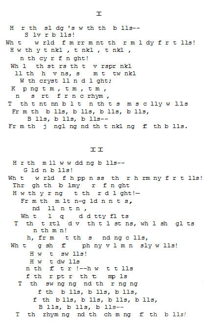
My friend, Richard Kostelanetz is writing (actually, revising) an essay dealing with, among other things, appropriated art. When he asked something about Tom Phillips’s A Humument, I remembered other superior examples of appropriation art such as the work on a dictionary of Doris Cross, and the following appropriation of Edgar Allen Poe’s “The Bells” by Michael Basinski, which I thought worth posting here:
Here’s the original:
Hear the sledges with the bells–
Silver bells–
What a world of merriment their melody foretells!
How they tinkle, tinkle, tinkle,
In the icy air of night!
While the stars that oversprinkle
All the heavens, seem to twinkle
With a crystalline delight;
Keeping time, time, time,
In a sort of Runic rhyme,
To the tintinnabulation that so musically wells
From the bells, bells, bells, bells,
Bells, bells, bells,–
From the jingling and the tinkling of the bells.
Hear the mellow wedding-bells,
Golden bells!
What a world of happiness their harmony foretells!
Through the balmy air of night
How they ring out their delight
From the molten-golden notes!
And all in tune,
What a liquid ditty floats
To the turtle-dove that listens, while she gloats
On the moon!
Oh, from out the sounding cells,
What a gust of euphony voluminously wells!
How it swells!
How it dwells
On the Future! how it tells
Of rapture that impels
To the swinging and the ringing
Of the bells, bells, bells–
Of the bells, bells, bells, bells,
Bells, bells, bells–
To the rhyming and the chiming of the bells!
In the essay I quoted Mike’s poem in, I called it “an amazingly loud-though-silent jangle of . . . Poe’s famous poem.” I’d add here that Basinski’s version gave me the thrill that Poe’s version, I’m sure, gave many of its first readers.
* * *
Wednesday, 7 December 2011, Noon. I’ve partly recovered from having accidentally deleted my blog entry for Monday. A semblance of it is back up. I also posted an entry for today. I’ve done nothing else yet, but hope soon to go out to buy some frames and a pad of good-quality large paper.
Later note: I succeeded in finding two reasonably-priced frames of the kind I wanted (able to be stood up on a counter) that I bought. That took care of my pledge to do something of value for my exhibition every day, barely. Meanwhile, I sketched a new mathemaku. Then took care of this entry.
.


