Archive for the ‘Visual Poetry Specimen’ Category
Entry 621 — Evolution of Style
Wednesday, January 11th, 2012
One of my works that I was particularly pleased with when I came across it while backing up blog entries was the following:

I have one problem with this: my only version of it is a low-resolution jpg, which I don’t know how to convert to high-resolution tif, except by simply redoing it. Any suggestions from anybody out there who knows more than I do about this kind of thing?
I didn’t re-post it only to ask for help, or because of how much I like it, but as an example of how my work as a poet has evolved. Actually, I want to show that it has evolved. That’s because Paul Crowley, the nut I most argue with on the Internet about who wrote the works of Shakespeare, seems not to believe that a poet’s style, or way of making art, evolved once he’s past his apprenticeship. Of course, he will claim I’m not a poet, and that the evidence I’m about to produce to show my evolution indicates only trivial changes, not anything like genuine evolution. I enjoy talking about my work, and analyzing any poem, so will go ahead with my demonstration, anyway.
First of all, I should state my claim: it is that over the past couple of years, my style as a poet has evolved appreciably, and that this poem illustrates it.
(1) I only began using cursive ten or fewer years ago, and never for more than a word or two. This poem and two others have all or most of their texts in cursive. Because the difference in expressiveness between print and cursive is visiopoetically meaningful to those who appreciate visual poetry, this wholesale use of cursive script counts as a significant evolution of style.
(2) My use of cursive is more elegant here than it is in mt other two recent poems making extensive use of cursive. Note, for instance, the large O, and the increased gracefulness of all the letters compared with the letters in my other two cursive poems.
(3) Twenty years ago, I didn’t bother giving my poems backgrounds. Since then I have, and have slowly been improving (but have plenty of room for further improvement). Note the harmony of the background’s shape and colors with the text, especially the O.
(4) The background has another important value–the connotations it picks up as a result of its being a variation (mostly through color changes) of the background in another poem of mine. Connecting poems of mine with others’ poems and others of my own poems is another way I’ve evolved as an artist, not doing it until perhaps twenty years ago, then only very slowly doing it to a greater and greater extent. This poem may be the first to re-use an entire background from another poem. This is not trivial, for it allows this poem to suggest “dictionary-as-temple,” the main part of the foreburden of the poem its background is from. It also should make this poem easier to enjoy, the same way the repetition in a new musical work of an old theme is usually pleasant to hear. I believe the happiness of the colors of this version of the background gains from the reminder of the different, lower-key mood evoked by the other version.
(5) The use of color in tension with greyscale is another trick new to me twenty years ago that I exploit more and more in my present works, as here (though I’ve done more with it elsewhere).
(6) I think my language has evolved over the years, too–from fairly literal to metaphorical and/or surreal. The “logic” of this piece and most of my recent pieces is not so easy to guess, which may be an unfortunate evolution, but an evolution nonetheless.
(7) You can’t tell from this image, which has been reduced in size to fit the normal computer screen, but the hard copy is larger than anything I did ten or more years ago, which is another result of evolution.
Here’s my first or second mathemaku, done thirty or more years ago, to make the profound evolution of my style more inescapable. Yet I maintain this piece is at the level of later pieces; it is simply more condensed. For one thing, it is only linguistic and mathematical. Nothing visioaesthetic happens in it. The eye is used only to recognize the symbols it contains, not to enjoy colors or shapes the way my faereality poem compels it to–i.e., not a visual poem (except inthe mindlessnesses of those for whom just about everything is a visual poem). It is short, and printed. Its words are simple to an extreme.

.
Entry 620 — Getting Enough Sleep
Tuesday, January 10th, 2012
A little while ago (it is now around 9 P.M., 9 January) I was feeling good. I attributed this to my having gotten two naps today, one of an hour, the other of one or two hours. And I had gotten six hours of sleep last night, which is about as much as I generally get. I had just about finished backing up my blog entries and was very pleased at how good many of my poems seemed to me when I noticed them during the process. Unfortunately, I got the dates up my upcoming entries wrong, and in correcting them, lost what I had written for this entry. That pretty much wiped out my mood. I can’t stand screwing up like that, but I do it all the time!

This is a pwoermd I stole from Geof Huth’s blog–because it has become too sophisticated to accept comments from dial-ups like my computer, and I wanted to comment on it. It’s by Jonathan Jones, lately of Brussels, but a citizen himself of the United Kingdom. What I like most about it is that it’s lyrical–as too many pwoermds are not. It wouldn’t be a visual poem for me, but an illustrated poem, except that I subjectively feel “apri’ll” is producing the wonderful colors of spring it is slanted into a portion of (through sheer will-power). Hence, in my taxonomy it is an infra-verbal visual poem.
.
Entry 618 — “Hungarian Vispo No. 2″
Sunday, January 8th, 2012
Marton Koppany’s latest visual poem may be the gentlest satire on a country’s government ever, if I’m interpreting it correctly. Note the boot on the head of one of the country’s citizens, for instance–and the complete insanity of the country the cloud with an umbrella suggests. Much more is going on that I’ll let you discover without help.

- Hungarian Vispo No. 2

.
Entry 613 — Vispo SpamAd
Tuesday, January 3rd, 2012
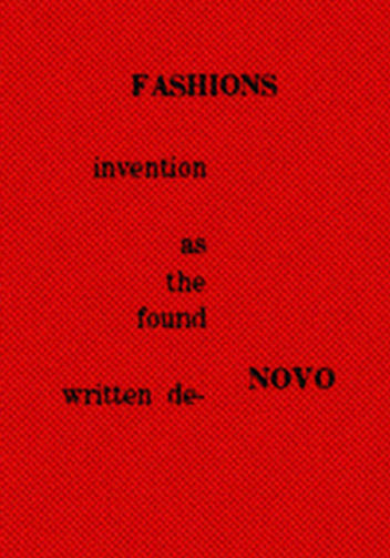
The following is a detail from a Spam ad that I got yesterday. It’s a good example of a commercialized visual poem. Effective as an eye-catcher, but not very good as a visual poem.

Below is my improved version. Certainly not yet a great work but better than the original. If you can’t see why, I’m afraid you aren’t too perceptive about the art. If you can’t see how the basic idea could be used in a far better piece, you probably aren’t an effective visual poet, or are tired.

Diary Entry
Monday, 2 January 2012, Noon. I got up late because I stayed up late last night watching my Giants fall apart, but win anyway because Dallas fell apart just in time to keep from winning. I don’t think the Giants have much hope of going far in the play-offs, but I’ll be rooting for them. And the other teams are pretty inconsistent, too, except for San Francisco and Green Bay.
I began the day by forcing myself to run. Actually, I slowly ran, then ran fast albeit not really fast, then walked. Rrrrrruuuuunnnnnn, rruunn, walk over and over until I’d gone around the middle school field four times (two miles). My stamina is still amazingly poor, but I actually genuinely sprinted when I went all out. Which is to say, I was able to pump my legs all the way up and stretch out, the way one does when sprinting. I didn’t do it fast enough to really sprint, but I did it. I was worried that I no longer could. Now it’s just a matter, I think, of getting enough stamina to push myself harder, and for longer periods. My “sprints” were only for around twenty yards or so–but maybe a whole forty once or twice. Since getting back, I posted my blog entry for today, which was easy because already done. I corrected my latest Page, “How to Appreciate a Mathemaku,” after getting a list or errors I very much appreciated from John Jeffrey. I have a lot more chores to do, but I’m already worn out. Maybe after lunch and a nap I’ll be able to get more done.
5 P.M. One more chore out of the way: filling in the size and price of my works on the exhibition contract and tags. I’m asking $200 for most of them. Highest price is $600. Two I’ll accept $100 for. I don’t expect to sell anything.
.
Entry 598 — “Fifty”
Monday, December 19th, 2011
This is from Geof Huth’s blog:

I liked this when I first saw it although I didn’t find it saying anything verbally. When I finally realized it said, “fifty,” I thought it accidental because I couldn’t see why it would say that. My slow mind eventually remember that Geof is now fifty-years-old, which makes this image a particularly effective representation of his present strange combination of freedom and awkward incompleteness . . . straining, yearning for something. With his ego (“I,” as Karl Kempton would be sure to notice) lost or transcended.
Diary Entry
Sunday 18 December 2011, 6 P.M. Another unproductive day. Tennis in the morning, a fine meal at Linda’s in the afternoon. A blog entry for today just taken care of a little while ago. A little work done on my “Mathemaku for Scott Helmes” to count as “work on preparation for the A&H exhibition.” And now I’d like to go to bed, but will probably read instead.
.
Entry 597 — Chumpy Leg
Sunday, December 18th, 2011
John M. Bennett has another major collection of poetry out. This one is called The Gnat’s Window. 78 poems. Bilingual. Closely inter-associating sequence. Amazing. I told John I’d try to do a critique of it, and I still hope to once my year-end chaos of chores is behind me, but–gah–John is one of the few poets I feel may be beyond my abilities as a critic, and he’s at his best–and therefore beyondest–in this book. Part of one of the poems, which Diane Keys has found a way to, uh, fatten, in all the best senses, with color, a piece of cloth and some cursive annotations–and the circling of “crumpy leg, is below. It’s from the back cover of John’s book.

Diary Entry
Saturday, 17 December 2011, Noon. Wow, since getting back at eleven from tennis and a McDonald’s snack, I’ve already gotten the day’s blog entry posted, which was easy because it was already done, and made a finished copy of the new version of “Mathemaku for Scott Helmes” at Paint Shop. It’s not the official copy: it’s too small, and the official version will include the original cut-out fragments of magazine ads. There will also be the A&H framed version which will be in between the one I just made and the official version in size.
8 P.M. Since noon I haven’t done much. I printed out two copies of “Mathemaku for Scott Helmes” and scribbled annotations explaining the terms I will put on one that will be on display atthe exhibition. Otherwise, I continued reading started yesterday of the magazines and books I will be reviewing for Small Press Review.
.
Entry 587 — “The Bells”
Thursday, December 8th, 2011
My friend, Richard Kostelanetz is writing (actually, revising) an essay dealing with, among other things, appropriated art. When he asked something about Tom Phillips’s A Humument, I remembered other superior examples of appropriation art such as the work on a dictionary of Doris Cross, and the following appropriation of Edgar Allen Poe’s “The Bells” by Michael Basinski, which I thought worth posting here:

Here’s the original:
Hear the sledges with the bells–
Silver bells–
What a world of merriment their melody foretells!
How they tinkle, tinkle, tinkle,
In the icy air of night!
While the stars that oversprinkle
All the heavens, seem to twinkle
With a crystalline delight;
Keeping time, time, time,
In a sort of Runic rhyme,
To the tintinnabulation that so musically wells
From the bells, bells, bells, bells,
Bells, bells, bells,–
From the jingling and the tinkling of the bells.
Hear the mellow wedding-bells,
Golden bells!
What a world of happiness their harmony foretells!
Through the balmy air of night
How they ring out their delight
From the molten-golden notes!
And all in tune,
What a liquid ditty floats
To the turtle-dove that listens, while she gloats
On the moon!
Oh, from out the sounding cells,
What a gust of euphony voluminously wells!
How it swells!
How it dwells
On the Future! how it tells
Of rapture that impels
To the swinging and the ringing
Of the bells, bells, bells–
Of the bells, bells, bells, bells,
Bells, bells, bells–
To the rhyming and the chiming of the bells!
In the essay I quoted Mike’s poem in, I called it “an amazingly loud-though-silent jangle of . . . Poe’s famous poem.” I’d add here that Basinski’s version gave me the thrill that Poe’s version, I’m sure, gave many of its first readers.
* * *
Wednesday, 7 December 2011, Noon. I’ve partly recovered from having accidentally deleted my blog entry for Monday. A semblance of it is back up. I also posted an entry for today. I’ve done nothing else yet, but hope soon to go out to buy some frames and a pad of good-quality large paper.
Later note: I succeeded in finding two reasonably-priced frames of the kind I wanted (able to be stood up on a counter) that I bought. That took care of my pledge to do something of value for my exhibition every day, barely. Meanwhile, I sketched a new mathemaku. Then took care of this entry.
.
Entry 584 — An & & My Full Triptych
Monday, December 5th, 2011
It seems that almost every time I seem to be getting productive, something knocks me down. This time it’s only a lost entry–this one, that I was trying to correct some detail of and lost in the process–without realizing it, so was not able to try to find the lost material by backing up until it was too late. So now I have to spend an hour or so, restoring what I can recall of what was here two days ago.

And all three of my frames of “Triptych for Tom Phillips”:

About the ampersand, I commented something about how it expressed the essence of “andness.” I loved the way its bird regurgitated what looked like all of itself, while looking to continue “anding” forever. I said little about my full triptych except that if you click on them, you’ll see a larger image of them which may be helpful although still very small–and in black&white. The original frames are each eleven by seventeen. Oh, one thing I did point out was that the frames are about, “departure,” “journey” and “arrival,” and are intended to be about them in the largest sense, but particularly about them with regard to arriving–for either an engagent of it or its author.
* * *
Sunday, 4 October 2011. Sunday is hazy to me now, three days in the past as it is. I played tennis early in the morning–badly. I didn’t return to my Shakespeare book, but evidentally got a blog entry posted, and probably wrote an exhibition hand-out or two.
.
Entry 551 — John M. Bennett’s “Cardboard”
Wednesday, November 2nd, 2011
There’s a Penguin anthology of twentieth-century out. It’s edited by Rita Dove. Here’s a list of the poets represented in it, with thanks to John Jeffrey for having alphabetized it:
After seeing this list, I said what I knew I’d be saying before seeing it in a comment at a blog where it had been given an “A”: “Close to worthless. The good poets in it are already amply anthologized. Whole schools of the best American poets of the last forty years of American Poetry are entirely ignored. The one with Robert Lax in it (minimalism) for just one example. The editors of POETRY will find little in it, or not in it, to complain about-–which is proof of how bad it is.”
Another ignored school, needless to say, is visual poetry, as represented by much of the work of John M. Bennett, such as this duo, “Cardboard,” that he posted just today (and he’s done scores as good):


I doubt anyone has more completely captured the essence of carboardedness–or the shuddery feel of decaying tenement rooms–than John has with these. But with strangely joyful coloring in sharp contradiction of shuddering and tenements, but somehow absolutely right. As with the poem by Gregory I seem to have abandoned, I find I need time before I’ll be able fully to appreciate these.
The Penguin anthology annoyed me, but after reflecting only briefly, it cheered me up: a comparison of its poets coming into their prime after 1950 to the poets in my crowd such as John M. Bennett could not more perfectly exemplify academic art (including, I was amused to see, the least innovative portion of what’s being called “language poetry”) versus living art. I may be deceived about the value of my work, but I know I’m not about that of my fellow visual poets. We’re the Monets, Renoirs, van Goghs, Cezannes, they the French academics.
.
Enter 550 — Marton’s “Cursive” Again
Tuesday, November 1st, 2011
Marton got back to me about his “cursive” yesterday, giving me enough material for a full entry.


 As I announced when I first posted this, I am hoping to publish an anthology of mathematical poems, like this one, so if you have one or know of one, send me a copy of it, or tell me about it.


Rita Dove’s response to Helen Vendler’s review, here:
http://www.nybooks.com/articles/archives/2011/dec/22/defending-anthology/
Also, I recommend reading her interview about the anthology in the current (Dec. 2011) AWP “Writer’s Chronicle”.
Thanks, Fred. Thanks to the New-Poetry discussion group, I’ve already gotten to the New York Review of Books respnse by Dove. Not much to it but denial of the validity of what Vendler said–without saying what was wrong with it, as far as I could see. As I said at New-Poetry, it’s a shame that the New York Review of Books publishes poor articles about American poetry like Vendler’s and Dove’s when there are many who could write much better articles on the subject for it. Yes, folks, like me.
all best, Bob