Entry 32 — A Mathemaku from 2007
I continue to be more out of it than not, so have just this for today:
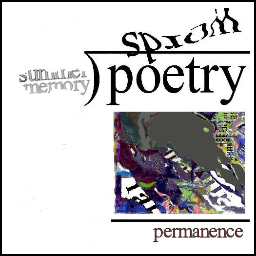
Guess who composed it.
I continue to be more out of it than not, so have just this for today:

Guess who composed it.
Sunday, November 9th, 2014
Friday, November 7th, 2014
I’m pretty much non-functional, so once again finding work by others I hope my readers will enjoy. The following is a selection from Karl Young’s Clouds. It is best experienced one column at a time, as presented on the sheet of many folds each of the selections Karl sent me are. No one does hakuic serenity like he does!
Wednesday, January 5th, 2011
I just happened on the following passage from Karl Young’s introduction at Light and Dust to his two early books, Cried and Measured, and Should Sun Forever Shine. I had to post it here because it so exactly states what I’ve been saying for many years, with little effect, except occasionally to inspire hostile responses from the anti-intellectual school of the Wordsworthian “We murder to dissect” variety.
“How best to provide the (engagent of unfamiliar, relatively new forms of art) with adequate context and background, I don’t know. I do know that the lack of it has crippled visual poetry, as it has other arts, and trying to find an answer to the problem is one of the reasons for writing essays like this one. Whatever the case, in the global world of information overload, the concept that ‘the work speaks for itself’ can be no more than nostalgia for a simpler time with a unified and unchanging cultural background. In the broadest context, what has now become the superstition that avant-garde work can be appreciated without context denies and blocks the possibilities of cooperative construction and understanding in an environment that no individual has the ability to completely comprehend, but which requires cooperation to appreciate.”
. Karl Young
Below is a small portion of a long display case to the right as you enter the college library. It is filled with books about water, trees and sky, the main subjects Clark’s installation is intended to cause engagents to experience sensations of, as we shall see in my entry tomorrow. (I hope.)
.
When I visited the Installation, I was my usual out-of-it self, so took no notes, and let it all wash into me rather than analyze it, so I can’t remember what the pages mushed into the jar are from–although they may be writings of Cezanne, or about him, including something Clark quotes of his regarding the superiority for the artist of sensation to thinking. That is the set-up line for this installation and previous ones in the sequence this installation is only the latest work in.
Here’s yesterday’s image again:

It’s one of my mathemaku, of course. I’ve actually been working industriously on it, trying get it right enough to submit to some sort of anthology Nico Vassilakis and Crag Hill are putting together. The version above is a recent revision of my first draft of 2007, a variation on “Frame One” of my Long Division of Poetry series.
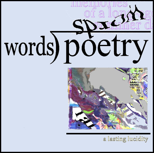
“Frame One” is similar to the top image except that its divisor is “words.” It had long bothered me because (and make sure to write this down, students, because it’s an excellent example of the way I think about my poems) its claim was that “words” squared (basically–although it’s really distorted words, or words told slant. times regular words) happened to equal an image having to do with summer rain. Why that and not, say, a Pacific sunset? Obviously, the quotient times the divisor could equal anything. That, I didn’t want. Off and on I thought about this, but could think of no way to take care of it. Until a couple of days ago, when I finally concentrated for more than a few minutes on it. I came up with several pretty good solutions, one of them changing everything in the poem but the sub-dividend product (the image).
My final solution (I hope) resulted in the above poem. All I did was add “memories of a long-ago summer day” to the quotient. That assured that the sub-dividend product would have to do with summer–that it would be, that is, a visual poem about summer. And, as a poem, it would be poetry.
No doubt in due course I’ll think of something else I find illogical about it and want to revise it again. For now, though, I’m happy with it.
Oh, I’ve made several changes to the main image in it, too. One was to combat the darkness in the top version (which wasn’t in it until I put it out here). I’m as fussy about getting my graphics looking the way I want them as I am about everything else in a poem–except the choice of font, and things I can’t do anything about with my equipment, like density of resolution.
Thursday, November 6th, 2014
Wednesday, November 5th, 2014
Wednesday, August 21st, 2013
Ten Important American Othersteam Poets
John E. Bennett
Karl Kempton
Guy Beining
K.S. Ernst
Marilyn Rosenberg
Carol Stetser
John Martone
Scott Helmes
Karl Young
Michael Basinski
My list’s title demonstrates one reason I’m so little-known a commentator on poetry: it doesn’t scream that it’s of the ten best American Otherstream Poets, just a list of a few important ones. What makes them “otherstream?” The fact that you’ll almost certainly not find them on any other list of poets on the Internet.
This entry is a bit of a reply to Set Abramson–not because I want to add these names to his list but because two of the names on it have been doing what he calls metamodern poetry for twenty years or more, as far as I can tell from my hazy understanding of his hazy definition by example of metamodern poetry. Both are extraordinary performance poets mixing all kinds of other stuff besides a single language’s words into their works. I would suggest to Seth that he do a serious study of them, or maybe just Bennett, whose work is more widely available on the Internet, and who frequently uses Spanish along with English in it. It would be most instructive to find out how metamodern Seth takes Bennett to be, and what he thinks of him. Warning: Bennett’s range is so great that it’s quite possible one might encounter five or ten collections of his work that happen to be more or less in the same school, and less unconventional than it is elsewhere, so one might dismiss him as not all that innovatively different.
Which prompts me to e.mail John to suggest that he work up a collection that reveals something of his range by including one poem representative of each of the major kinds of poetry he composes. So, off am I to do just that
.
Thursday, June 28th, 2012
I’m having another off-day, so will take care of this entry with the following paragraph from one of my early columns for Small Press Review. I’m hoping for more examples of this sort of thing so I can write a major essay on it.
Conceptually-Treated Texts
Basinski also contributes a version of “The Tell-Tale Heart” that lists all of Poe’s words in alphabetical order. This, for me, yields nothing less than the subconscious mind of the story, eerily achieving a narrative interest in its own right as it blends or clashes with what Poe wrote–as in the following passage: “shriek shriek shrieked shrieked shutters silence silence simple since since single single singularity sleep slept slept slight slight slipped…” or “how how however human” followed by 120 instances of “I.”
.
Wednesday, June 27th, 2012
Otherstream Poetries
At present one of my projects is to write a sort of summary of all my 110 Small Press Review columns, which go back to 1993, adding comments as I go along. As I write about my first ones, several things strike me: one is how terrific some of my discussions of poems were; a second is how genuinely good most of the microzines that were my main subject were; third—a crusher—how many times I mistakenly thought the mainstream was finally going to open a gate for us. The Otherstream remains as outside the BigWorld as it’s always been, I fear. What amazes me is that not one poet in what I consider the Otherstream has broken into prominence the way Ginsberg, for instance, did. Or Andy Warhol, the Ginsberg of visimagery. Nor has a critic writing about the Otherstream become widely recognized for his expertise the way Dana Gioia did with his obtuse essay on the state of American Poetry that appeared in the Atlantic in the early nineties, and is still being discussed.
Enough whining. What my project has made me want to do as a side-project is write short essays about the different kinds of Otherstream Poetry there are, since it seems to me there is a lot of confusion about that.
Infraverbal Poetry
One is a kind I long ago dubbed “infraverbal poetry” because it’s poetry whose poetic effect is generated by what is done inside words rather than in between them, in sentences. I believe it was invented by E. E. Cummings. Certainly, it was first used effectively by Cummings. His use of it has been recognized even by such out-of-touch publications as The Princeton Encyclopedia of Poetry and Poetics, which quotes the following:
The encyclopedia considers this a specimen of concrete poetry, which it is, but it is also a specimen of infraverbal poetry. What counts in the former are visioaesthetic effects, in the latter verboaesthetic effects, in this case the breaking up of the word, “loneliness” into “l,” “one,” “l,” again, and “iness,” or “one-ness.” Seemingly trivial laid out bare like that, but much more subtle in context, where it is also part of a visual metaphor for a falling leaf.
Cummings was an infraverbal poet long before he composed his poem about loneliness. Someday I hope to do a history of infraverbality which would surely feature many of his infraverbal adventures. Right now, though, I want to move to a living poet, Mike Basinski, whom I wrote about in my fifth column for Small Press Review.
Mike had had some poems in Poetry USA, a short-lived attempt to cover the whole spectrum of contemporary poetry. Among them was his 4-frame “Odalisque” series, which I described as follows: “In each frame of this a ring of words and near-words surrounds a giant O. The near-word at the top of ‘Odalisque No. 1’ nicely demonstrates what an infra-verbal technique can accomplish. The near-word is “rammar,” the infra-verbal technique simple subtraction, the result a sudden ‘discon- cealment’ of a secret (and, to me, strangely enchanting) symmetry, which rattles the reader into full engagement with ‘grammar,’ ‘ram,’ ‘mar,’ and ‘mirror’–as sounds and signs, by themselves and intermingled.
“In ‘Odalisque No. 4,’ Basinski circles his O with twenty words containing a v–or V. What makes this interesting is that many of these words wouldn’t normally have a v in them–”vords,” for instance. This would undoubtedly seem a silly game to Gioia and his readers, but for me it was (yes) thrilling to experience a ‘down’ sharpened to ‘dovn,’ a ‘water’ turned Germanic and fatherly as ‘vater,’ and such unmodified words as ‘wives’ and ‘aggressive’ as suddenly alien objects, speared into—or about to spear outward. Or, best of all, to find between ‘wildevness’ and ‘festival,’ and opposite ‘wives,’ the wonderfully expanded ‘luVst.’”
.
Thursday, December 8th, 2011
My friend, Richard Kostelanetz is writing (actually, revising) an essay dealing with, among other things, appropriated art. When he asked something about Tom Phillips’s A Humument, I remembered other superior examples of appropriation art such as the work on a dictionary of Doris Cross, and the following appropriation of Edgar Allen Poe’s “The Bells” by Michael Basinski, which I thought worth posting here:
Here’s the original:
Hear the sledges with the bells–
Silver bells–
What a world of merriment their melody foretells!
How they tinkle, tinkle, tinkle,
In the icy air of night!
While the stars that oversprinkle
All the heavens, seem to twinkle
With a crystalline delight;
Keeping time, time, time,
In a sort of Runic rhyme,
To the tintinnabulation that so musically wells
From the bells, bells, bells, bells,
Bells, bells, bells,–
From the jingling and the tinkling of the bells.
Hear the mellow wedding-bells,
Golden bells!
What a world of happiness their harmony foretells!
Through the balmy air of night
How they ring out their delight
From the molten-golden notes!
And all in tune,
What a liquid ditty floats
To the turtle-dove that listens, while she gloats
On the moon!
Oh, from out the sounding cells,
What a gust of euphony voluminously wells!
How it swells!
How it dwells
On the Future! how it tells
Of rapture that impels
To the swinging and the ringing
Of the bells, bells, bells–
Of the bells, bells, bells, bells,
Bells, bells, bells–
To the rhyming and the chiming of the bells!
In the essay I quoted Mike’s poem in, I called it “an amazingly loud-though-silent jangle of . . . Poe’s famous poem.” I’d add here that Basinski’s version gave me the thrill that Poe’s version, I’m sure, gave many of its first readers.
* * *
Wednesday, 7 December 2011, Noon. I’ve partly recovered from having accidentally deleted my blog entry for Monday. A semblance of it is back up. I also posted an entry for today. I’ve done nothing else yet, but hope soon to go out to buy some frames and a pad of good-quality large paper.
Later note: I succeeded in finding two reasonably-priced frames of the kind I wanted (able to be stood up on a counter) that I bought. That took care of my pledge to do something of value for my exhibition every day, barely. Meanwhile, I sketched a new mathemaku. Then took care of this entry.
.
Here’s the latest version of what I think I’m calling “Frame 17″ of The Long Division of Poetry:
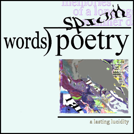
I didn’t like the background blue as dark as it showed here, so I lightened it. For some reason, that made a lot of difference to me. I also changed the quotient of the mathemaku below, another variation on the lead frame of The Long Division of Poetry that I composed in 2007 and have only touched up slightly since, mostly to increase its resolution. I feel it’s about as good as I’m capable of getting as a mathematical poet–although I do feel I’ve done a few mathemaku that are better than it.
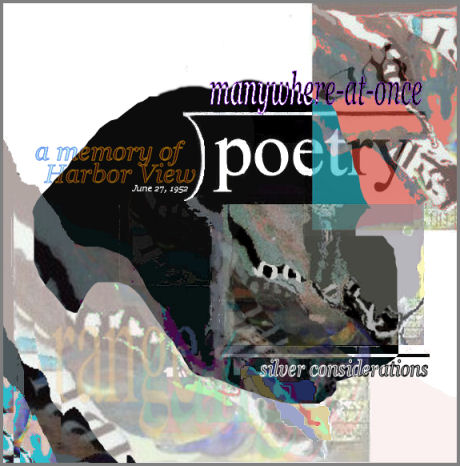
The divisor is hard to read on-site, I don’t know why. The image is much darker than it is on the screen of the computer where I do my Paint Shop work, even though I tried to lighten it. Oh, it’s tiff on my computer, jpeg here, which may explain it. Anyway, the divisor reads, “a memory of/ Harbor View, June 27, 1952″
Note: for those of you new to Grumman Studies, “manywhere-at-once,” which is usually capitalized, is where (according to my poetics) metaphors and other figures of speech send one. Two or more places in one’s brain at the same time. So this poem attempts to express the value of equaphoration–my term for any poetic device that in some way equates one thing with another, even irony, which equates the truth with its opposite.
Thursday, November 5th, 2009
Note to anyone dedicatedly trying to understand my essay, you probably should reread yesterday’s segment, for I’ve revised it. Okay, now back to:
The Nature of Visual Poetry
As a visual poem, Biloid’s “Parrots” is eventually processed in two significantly different major awarenesses, the protoceptual and the reducticeptual. In the protoceptual awareness, the processing occurs in the Visioceptual Awareness, to which it directly proceeds. In the reducticeptual awareness, it first goes to the Linguiceptual Awareness, which is divided into five lesser sub-awarenesses, the Lexiceptual, Texticeptual, Dicticeptual, Vocaceptual, Rhythmiceptual and Metriceptual. The first is in charge of the written word, the second of the spoken word, the third of vocalization, the fourth of the rhythm of speech and the fifth of the meter of speech. Of these, the linguiceptual awareness passes “Parrots” on only to the first, the lexiceptual awareness, because “Parrots” is written, not spoken. Since the single word that comprises its text will be recognized as a word there, it will reach its final cerebral destination, the Verbiceptual Awareness.
The engagent of “Parrots” will thus experience it as both a visioceptual and a verbiceptual knowlecule, or unit of knowledge–at about the same time. Visually and verbally, the first because it is visual, the second because it is a poem and thus necessarily verbal. Clearly, it is substantially more than a conventional poem, which would be processed entirely by its engagent’s verboceptual awareness.
Okay, this essay, only about a thousand words in length so far, is already a mess. Yes, way too many terms. And I keep needing to revise it for clarity. Or, at least, to reduce its obscurity. I have trouble following it myself. My compositional purpose right now, though, is to get everything down. Later, I’ll simplify, if I can.
Wednesday, November 4th, 2009
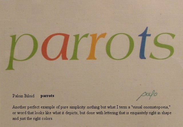
The image above is from the catalogue of a show I co-curated in Cleveland that Michael Rothenberg was kind enough to give space to in Big Bridge #12–with two special short gatherings of pieces from the show, with commentary by me. I have it here to provide relief from my verosophizing (note: “verosophy” is my word for serious truth-seeking–mainly in science, philosophy, and history). It’s also a filler, for I’ve had too tough a day (doctor visits, marketing, phoning people about bills) to do much of an entry.
It’s not a digression, though–I will come back to it, as a near-perfect example of a pure visual poem.
Now, briefly, to avoid Total Vocational Irresponsibility, back to:
the Nature of Visual Poetry
The pre-awareness is a sort of confederacy of primary pre-aware- nesses, one for each of the senses. Each primary pre-awareness is in turn a confederacy of specialized secondary pre-awarenesses such as the visiolinguistic pre-awareness in the visual pre-awareness and the audiolinguistic pre-awareness in the auditory pre-awareness. Each incoming perceptual cluster (or “pre-knowlecule,” or “knowlecule-in-progress,” by which I mean cluster of percepts, or “atoms of perception,” which have the potential to form full-scale pieces of knowledge such as the visual appearance of a robin, that I call “knowlecules”) enters one of the primary pre-awarenesses, from which it is sent to all the many secondary pre-awarenesses within that primary pre-awareness.
The secondary pre-awarenesses, in turn, screen the pre-knowlecules entering them, accepting for further processing those they are designed to, rejecting all others. The visiolinguistic pre-awareness thus accepts percepts that pass its tests for textuality, and reject all others; the audiolinguistic pre-awareness tests for speech; and so on. More on this tomorrow, I hope.
.
Go here to see a slide show about it, which will give you a much better idea of the adventure it was–the evolving adventure–than my entries on it.
Wednesday, December 2nd, 2009
In #663, I presented my Odysseus Suite–but the reproduction is too crude for me to re-post it here. My next entry featured this, by Endwar:
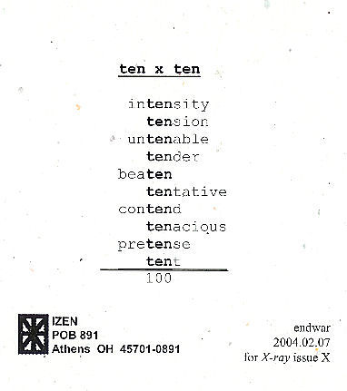 As I announced when I first posted this, I am hoping to publish an anthology of mathematical poems, like this one, so if you have one or know of one, send me a copy of it, or tell me about it.
#665 had this by Marton Koppany, which I have to post here because it was dedicated to ME:
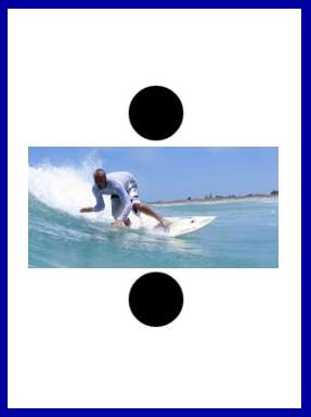
Hey, it’s mathematical, too. The next entry, whose number I fear to state, concerned this:

This is from Typewriter Poems, an anthology published by Something Else Press and Second Aeon back in 1972. It’s by Alison Bielski, An English woman born in 1925 whose work I’m unfamiliar with. I find this specimen a charmer . . . but am not sure what to make of it. Three lines, as in the classic haiku. The middle one is some sort of filter. Is “n” the “n” in so much mathematics? If so, what’s the poem saying? And where does the night and stars Hard for me not to assume come in? Pure mathematics below, a sort of practical mathematics above? That idea would work better for me if the n’s were in the lower group rather than in the other. Rather reluctantly, I have to conclude the poem is just a texteme design. I hope someone more clever sets me right, though. (I’m pretty sure I’ve seen later visio-textual works using the same filter idea–or whatever the the combination of +’s. =’s and n’s is, but can’t remember any details.)
It was back to my lifelong search for a word meaning “partaker of artwork” in #667–but I now believe “aesthimbiber,” which I thought of in a post earlier than #667, I believe, but dropped, may be the winner of my search.
Next entry topic was about what visual poets might do to capture a bigger audience. I said nothing worth reposting on a topic going nowhere because visual poets, in general, are downright inimical to doing anything as base as trying to increase their audience. One suggestion I had was to post canonical poems along with visual poems inspired by them, which I mention because in my next entry, I did just that, posting a Wordsworth sonnet and a visual poem I did based on and quoting part of it–and don’t re-post here because of space limitations. I wrote about the two in the final entry in this set of ten old blog entries.