Later Vernon Frazer entered the discussion:
Thanks, John. I use “definitions” as a shorthand for conversational or descriptive purposes. As far as trying to work, I avoid the “prescriptions” suggested by definitions because they impose limits on my thinking and interfere with my working at my best. Without the work, nobody would have fodder for all the differing definitions. I’m flashing back to Wittgenstein and trying to define “game.”
ME: Sorry, Vernon, but I’m (obviously) not a Wittgenstein fan. Just because a few words are hard to define, at least for someone like Wittgenstein, doesn’t make the eternal struggle to define words (in order fully to understand what they denote) futile. As for the “prescriptiveness” of definitions, they are only prescriptive about how an artist can responsibly label his works, not—if he has a functioning brain—about how he can make them. I am annoyingly repetitious about stating this, because it seems to me the main misunderstanding artists have about criticism. (Which is dependent on what artists produce—but that is dependent on what prior artists have produced and, I believe, on what critics have said about it. A work of art ultimately is not merely what it is by itself, but that and what others have said about it. –Mr. Cantshuddup
Bobbi Lurie again:
wittgenstein fan or not–
what is this?
is this vispo or not?
http://the-otolith.blogspot.com/2011/10/bobbi-lurie-ludwig-wittgenstein.html
ME: I like your image a lot, Bobbi, but I have to be sarcastic in answering your question: it’s a musical automobile, so a branch of chempo, not of vispo.
Nico was less sarcastic:
I wouldn’t tag it as such, no.
There are these websites you find when doing a search of visual poetry that pertain to photography, wedding shots, naturescapes, etc. They use visual poetry as a descriptive for hallmark type sentiment.
Your drawing of Ludwig is very much reminiscent of egon’s stuff,
ME: Same response here.
which I like quite a bit. It’s not vispo tho. My own filter for such things usually entails the existence of a focus on alphabet. That’s primary to me, but not all on this list. I giggle at your use of
Sophistication. I think we’re still in the process of hammering it down – the ongoing sixty year process. The inability to pluck a satisfying set of terms by now – one that’d satisfy most practitioners just spotlights the fact that this practice is separate to separate people. That means nothing gets answered or gets answered in myriad ways.
ME: At one point I spent some time trying to determine how I thought works concerned with the alphabet should fit into my taxonomy. I think I concluded that the alphabet is verbal—a peculiar sort of word meaning “these are the letters, in order.” However, with the works you’re speaking of, Nico, letters are the subject, not the alphabet, so for me they are textual designage.
NICO: Anyway, I did apologize for bringing this up.
ME: As opposed to leaving Spidertangle as a no-discussion zone?
Bobbi replied:
Thank you, Nico.
As I wrote to David, I really needed this description.
Yes. Sophistication meaning “I don’t know what these people are talking about. What is the secret?”
The fact that you’ve been struggling with terms….may I suggest you just say: “the alphabet must be included–this is in relationship to written language–the representation of something via language vs. via image” (clumsy this, i know, but that would have helped me in the several year search i’ve been on, asking vispo artists this question)
ME: Too bad you somehow missed me, your fellow Bobbi/Bobby, Bobbi. I’ve been cranking out the dogma that poetry has to have significant words for years, and that it’s silly to consider “visual poetry” not to be a form of poetry. Very few in the visiotextual field (but probably everyone in conventional poetry) agree with me, even though I have a fairly broad idea of what “words” are—I accept word-fragments, punctuation marks, any typographical symbol (like @), mathematical symbols and even the alphabet or some section of it long enough to identify it as an alphabet, as “words”—and don’t dispute that at the border between the verbal and the visual there are activities going on of value that may also qualify as visual poetry (since no definition can have a sharp border—unless it’s of something not in the real world like odd numbers). Seems to me an art should be defined first of all by what materials it explicitly uses in general (words or visual images, say), then by how it uses them, again in general (by pronouncing them or recording their sound, in one case; in the other, by recording their shape and color); a sub-art, like visual poetry, should be defined by what specific materials it uses and how, specifically, it uses them—words and visual images together by recording their sound, shapes and color. And so forth, finally to capture even the subbest of arts like Shakespearean sonnets or visiopoetic maple solitextual (i.e., solely textual) sculptures . . .
BOBBI to Nico: please do not apologize. i am so happy to read this–i didn’t know if i could legitimately send my art work to anyone other than Mark Young of Otoliths, who is tolerant with my experiments / does not define his journal in terms of vispo, unlike others here.
i will have to check closely on this, but from your definition, i’d say a lot of editors are letting a lot of things pass for vispo which isn’t vispo.
thank you, Nico.
ME: We need editors like Mark Young who publish art they like regardless of what it is, but it’d be nice if they could let what they want be known in precise language. Almost everyone in the otherstream publishes anything. Anyone who wants material of a specific kind has to carefully say so because “visual poetry” tends to mean anything. Not just works that are visual but not verbal, but works that are verbal and not visual. My press doesn’t get submissions anymore, but when it did, people would send me poetry about sunsets—hey, sunsets are visual!—and complain when I rejected it as not visual poetry, which my press was primarily looking to publish.
David Baratier was next up:
People who solely practice visual art or vispo
are verbose and vague
either due to lack of words in their art
or to leave open a potential name shift
to make themselves popular again.
Miro was before vispo, so he is a precursor.
From outside the gates it looks like the best known vizpoets
call themselves artists because vispo is an unknown term to them, or
a fringe term (as Karl pointed out, coming into being as an antithesis
to the concrete poetry movement rather than an art term). Vispo
also has movement qualities rather than just a name.
Ruscha, Jenny Holtzer, Robert Indiana and so on are artists.
.
ME: Ruscha, Holzer and Indiana are all, in some of their works, visual poets, regardless of how they see themselves. I haven’t seen anything by Miro that seems a visual poem to me, but a few paintings by Klee seem close to being visual poems. Stuart Davis made some, and so did Magritte. Picasso may have, too. I’ve shown these at my blog where I’ve also shown images from ARTnews,, which has something I consider a visual poem in almost every issue. Visual artists added typography naturally to their subject matter just as they added everything else previous visual artists disregarded, and the world was already set up to accommodate their work as visual art in galleries and museums, so they had no need to call it anything special. Poets becoming visual did, because their visual poetry was much more radical (because generally a good deal more verbal) than that of artists like Ruscha—and the venues for conventional poetry had, and are still having, trouble with it.
VERNON: I think the discussions—and Wittgenstein’s increased presence in them in more than one capacity—demonstrate what I was trying to get at. Nobody agrees on what vispo is, even when they look at the same work. If you worry too much about the definition, you won’t concentrate properly on what you’re doing. Some people say I’m a visual poet, some say I’m not. And I’m certainly not one all the time. But I might be one some of the time, depending on who’s forming the opinion. What I gather from today’s debate about definitions is: do the work and let the definitions fall where they may.
ME: As I’ve already said, poets shouldn’t care. For critics or people trying to work out a reasonable poetics, it’s a different story. Unfortunately, too many in these two cultures see those in the one they aren’t in as enemies or fools.
No doubt there will be more.
Diary Entry
Tuesday, 27 December 2011, 5 P.M. I only played tennis for about an hour this morning, but got tired. Went to Mcdonald’s for a sausage and egg sandwich. Got a little marketing done at the Winn Dixie near the McDonald’s, then got a nap of maybe fifteen minutes in. After that, I spent a lot of time in the Internet discussion I made the subject of the day’s blog entry, which I just made the last corrections to, at least for now. I guess I contributed over a thousand words to it, some of them insightful and/or interesting. So I can’t consider myself totally out of it. I feel the discussion itself will interest, or should interest, scholars later in the century, if only for what it reveals of one group of creative artists yakking with/at each other. I’ve done no Work of Consequence, though. I am now going to work up a hand-out for my exhibition, then probably take the rest of the day off.
.
This entry was posted on Wednesday, December 28th, 2011 at 12:00 AM and is filed under Language-Use, Terminology, visual poetry. You can follow any responses to this entry through the RSS 2.0 feed. You can leave a response, or trackback from your own site.
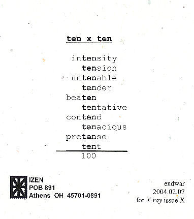 As I announced when I first posted this, I am hoping to publish an anthology of mathematical poems, like this one, so if you have one or know of one, send me a copy of it, or tell me about it.


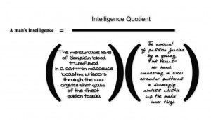 Oops, you may need a magnifying glass. My choice of reproduction seems to be the size above, or four times as large. Anyway, it’s called “A Man’s Intelligence” and may be more informrature–a specimen of informratry–than poetry. Let me quote what it says: “A man’s Intelligence” equals “intelligence Quotient” divided by the product of “The measurable level of Dionysian blood transfused in a saffron masseuse boasting whispers through the cool crystal shot glass of the finest golden tequila” times “The amount of passion fueled by a young pink Venus–her hand wandering in slow circular patterns, a seemingly aimless whistle up the man’s inner thigh.”