Archive for the ‘Textual Designage’ Category
Entry 289 — A Labeled Textual Design
Friday, November 19th, 2010

Entry 288 — Two More Textual Designs
Thursday, November 18th, 2010
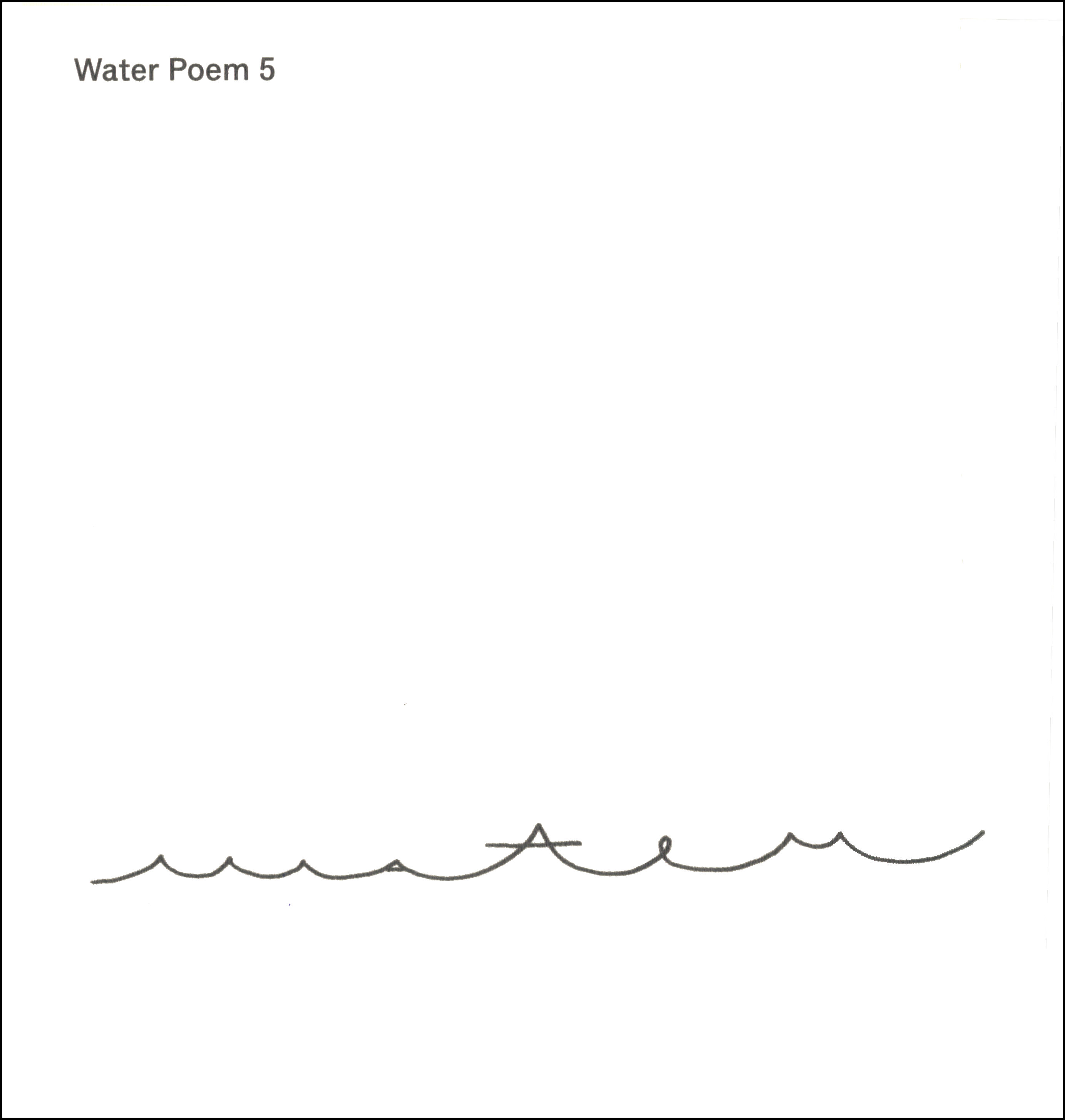
The upper image below is most of the eighth frame of my series of textual designs, reduced to less than half-size. I thought it passable, certainly better than most of the other frames to this point, and much better than the two after it, which don’t even have a detail worth extracting. The other piece is a detail from the upper one. I don’t know which version I prefer. Probably the detail, slightly.
.
 .
.

Entry 287 — More Textual Designs
Wednesday, November 17th, 2010
The following are all details from the seventh frame of my series of textual designs.
.

.

.

Entry 286 — Successful Textual Design
Tuesday, November 16th, 2010
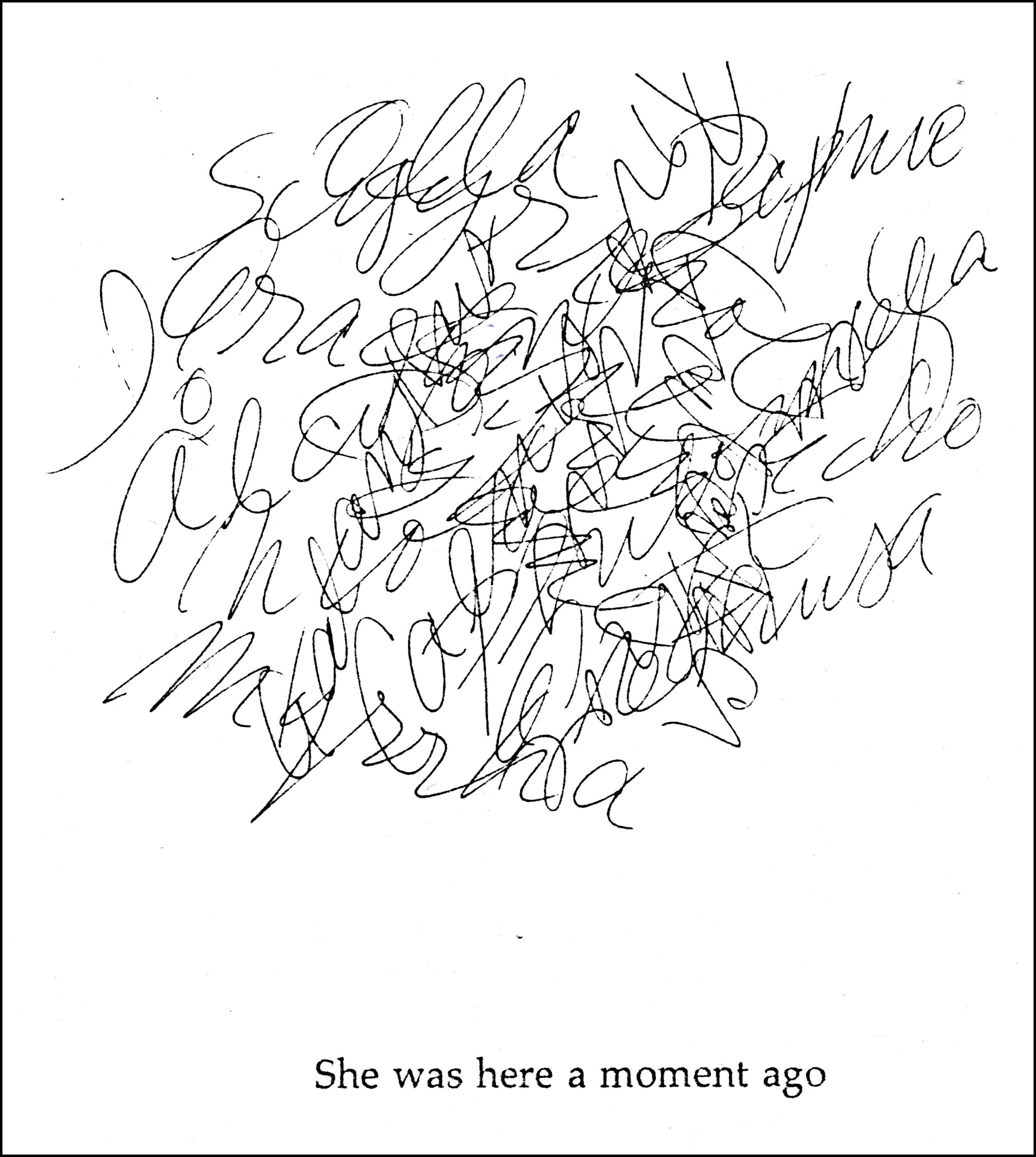
The image below is the first textual design in my series that I really like. It’s a detail from the sixth frame of the work. What makes it succeed, in my opinion, is that I found a nice focal point for part of it, which I cropped to.
.
 .
.
I had a lot of trouble getting what I had on my laptop screen, my laptop being where I work with Paint Shop, to look the same on the screen of the computer I used for this blog. Who knows how it looks on others’ screens, but it’s close to right on the one I’m looking at now.
I have no idea what to make of it. I just like it visually. I’m now wondering what the product would be if I found another image I liked of the same style and multiplied it by that. I do believe I’ll use it in a mathemaku.
Entry 285 — Two More Textual Designs
Monday, November 15th, 2010
The following thumbnails link to two more frames of the sequence of textual designs I made and didn’t like. I keep thinking I may be able to use details of them in better works, preferably visual poems of some sort.
.

.
 .
.
Hmmm, I like the thumbnail of the top one much better than the full image.
Entry 281 — A Thought & a Textual Design
Thursday, November 11th, 2010
Another Saying of Bob, which I just said (somewhat differently) to Karl Kempton about his latest (most excellent) chapbook, This Is Visual Poetry:
The final message of all of the best poems: “God’s in his heaven and all’s right with the world,” which I love to quote because I believe firmly in it (as true in the final analysis although almost never true at any particular moment)–even though I don’t believe in Browning’s God or his heaven. To me, it’s a perfect example of how one person can use language and even ideas to express something another person believes entirely in but would package much differently.
And another, thumbnailed, from the sequence of textual designs:

This was originally number two in my sequence. I flat out don’t like it. Later frames in the sequence I recall as being not bad.
My headache persist, by the way. Otherwise, I’m feeling chipper.
Entry 279 — “Deuteronomy”
Tuesday, November 9th, 2010
When I made up my mind to submit to Dan Waber’s series This Is Visual Poetry, my first impulse was to submit 17 textual designs, my intent being to show what is not visual poetry. I quickly made the designs but thought them too poor to publish, even as a kind of satire. They did have possibilities, though. Below is a thumbnail to the first of them, plus an addition, the diagram to the right.
.

As far as I’m concerned, this is a textual design. It has words but their meanings are irrelevant (as far as I can see). The image to the left is just crumpled paper I scanned. Hey, I like it. I just don’t see it as a visual poem (or, really, as good for a textual design as I think my best visual poems are good for visual poems).
I’m calling it, “Deuteronomy.”
Entry 161 — A Huthian Fidgetglyph
Saturday, July 17th, 2010
In one of his recent mailings to me, Geof Huth sent a folded card with the interior of ther First reformed Church of Schenectady, New York, shown on its 300th birthday in 1980. I’m showing it here because it sets up the fidgetglyph Geof had drawn across the inside of the card and given the title “The Fervent F.” I’m showing that because it seems to me how good a calligrapher Geof is at his best. The original is much better than the image shown here, by the way.


 .
.


