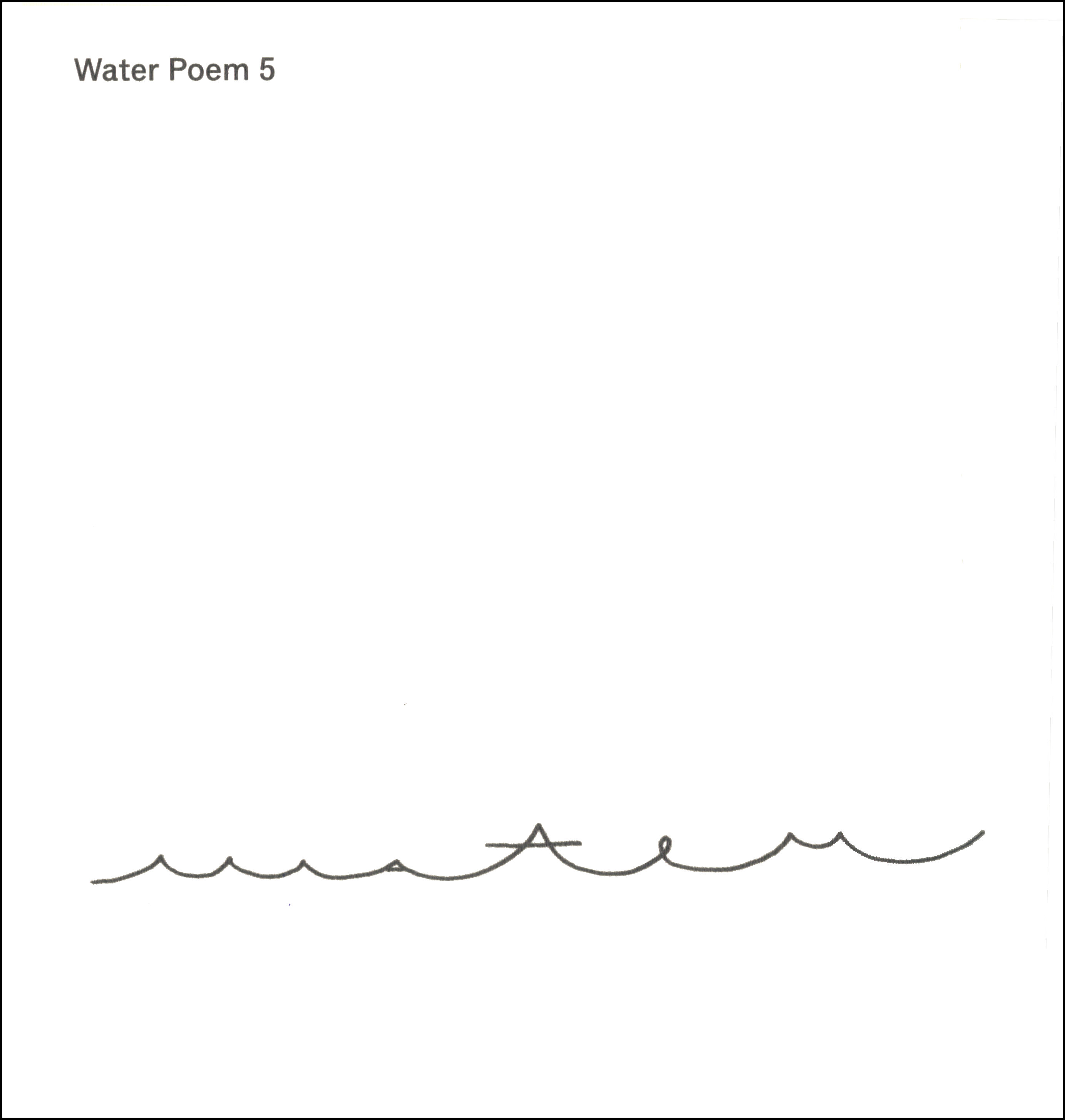
Archive for the ‘Artwork Critique’ Category
Entry 910 — My Bad Artwork Again
Friday, November 2nd, 2012
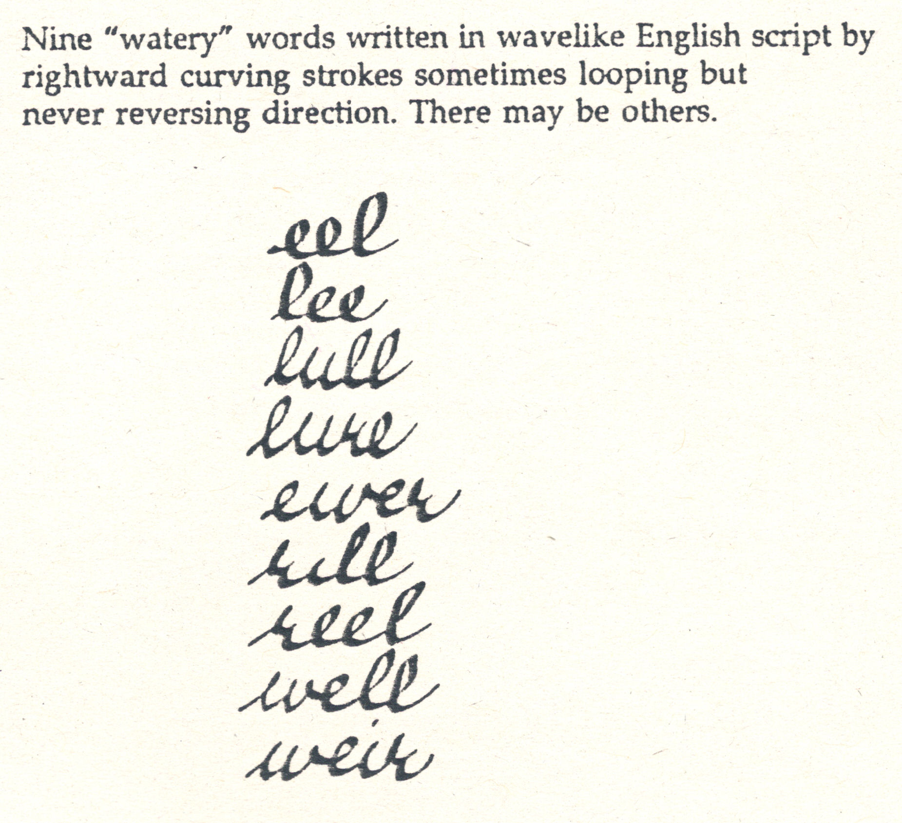
Here’s my bad artwork again. I’m dead in the head, again, and have had a busy day–5 hours helping set up a local Arts & Humanities council show–a bunch of tables for craftspeople and painters, etc., to display and try to sell wares, and organizations trying to sell tickets and/or memberships like our local theatre group. A way of circulating, and fun, but tiring. Anyway, I’m just going to say a few things about the work–which I’ll call “mp” for the time being.

First off, let me say that it’s as hard, and important, to show why an artwork is a failure as it is to show why it is a success. Against some views, I hold that one way to show that a work is bad is to point out what it does not have. This one, for me, does not have what I consider the most important thing any work must have, a unifying principle. Many artists sneer at the need for one, but their best works always have one, and I believe they recognize that intuitively. “MP” has no design focus that I can see. No conceptual center, either. If it had both, would they be in the same place? I don’t know.
This thing makes me think of golf, and I don’t like gold. What do the red lines say? Nothing, to me. I do like the 9 repeating in the nearby g but it’s momentarily interesting without connecting to the rest of the piece. I like the climb of the m’s, but–again–where are they going and why? I’m seeing random graphics, nothing more.
Pointing out what’s bad helps us better experience the absence of those thing in good art; having what a bad work lacks pointed out helps us better expreience what is in a good work that makes it good. Now, I am not contending that some bad in a work would be bad in any other work. Although some bads, like lack of a unifying princile, I consider universally bad. Tone is part of any good work’s unifying principle, and some elements of the work which seem bad in some respects may, if necessary for tone, prove good. A clumsy syntactical step in a formal poem becomes more good than bad if it is required by the meter.
Gad, I’m sleepy.
.


 .
.


