It’ll be “Mathemaku Something-or-Other” when I figure out how many mathemaku I’ve now composed. Close to a hundred, I’m sure.
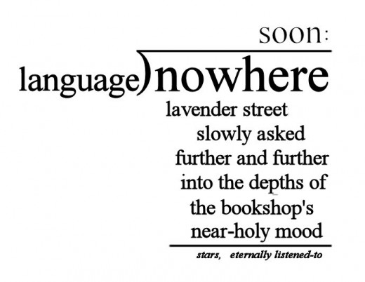
Frankly, I don’t know what to make of this. Whether I keep it or not will depend on what others say about it. I made it as an improvisation using “soon:,” so as not to lose the latter due to my revision of the poem it was in. The sub-dividend product is a fragment of my standard Poem poem semi-automatic imagerying.
It is, in fact, a near-perfect candidate for a pluraphrase. Which I’ll add later today.
* * * * *
Okay, here’s my pluraphrase (with thanks to Conrad Didiodato, whom made a comment to my entry for yesterday that I ought to “flesh out” my description of the pluraphrase by demonstrating its operation on some classical poem. That didn’t appeal to me, classical poems having been more than sufficiently discussed, but doing it for a poem I’d just been working on did. It ought to test as well as demonstrate the procedure–and maybe help me with my poem, which it may well have, it turns out. Time to start it.
After a note to the fore: what follows is to be taken as an attempt, an intelligent attempt, to prove a definitive pluraphrase of the poem treated, not a claim to do so.
1. According to this poem, if you divide “nowhere” by “language,” you’ll get “soon:,” with a remainder of “stars, eternally listened-to.” The poem also indicates that multiplying “language” by “soon:” equals “lavender streets slowly asked further and further into the depths of the bookshop’s near-holy mood.”
2. “soon” is an adjective indicating an event that has not yet occurred, a what-will-happen in the near future. An expectation of something interesting to come is thus connoted, a connotation emphasized by the use of the colon, a punctuation mark indicating something to follow. “Language” is the main human means of expression, communicated expression, so the metaphor, “language” times “soon:” suggests some sort message of consequence that is on the threshold of appearing. The arithmetic of the poem equates this message-to-come with “lavender streets,” or a path not likely to be real because of its color so a fairyland or dream path–through a town or city because a “street,” which has urban connotations, and because entering in some way a bookshop’s mood, which places it in a center of trade.
The street does not go in the mood but is “slowly asked” into it, “asked” serving as a metaphor for “go.” We are not told who or what is doing the asking, ever. A feature of many of the best poems is details left to puzzle the reader into subjective but potentially intriguing never quite sure answers. For instance, that here the draw of the books in the shop is strong enough to invite a street, and those on it, into the shop. It’s subtle, though, or so its slowness suggests. And a production is being made of the asking, since ordinarily to ask something takes but a moment. It’s important.
The personification of the bookshop as a creature capable of experiencing a mood clearly makes “mood” a metaphor” for “ambiance.” This ambiance is “near-holy” for some unspecified reason, probably having something to do with language, books, literature, the word. Something complex since the street apparently goes quite deeply into the mood–and, as I’ve just pointed out, slowly. With perhaps deliberation. Not on whim.
In keeping with “soonness,” the street reaches no final point, it is in the process of going somewhere. Something is building.
If “stars, eternally listened-to” is added (and the addition needn’t be metaphors since additions are not confined to mathematics) to the image of the street descending into the bookshop (or bookshop’s “mood”), we somehow get “nowhere.” Or so the arithmetic requires us to accept. Stars are (effectually, for human beings) eternal, and ‘listened-to” must be a metaphor for attended to or the like. Or a reference to the music of the spheres, making what’s going on a mystically experience. It would seem to be intended to be awe-
inspiring. Hence, for it to contribute, with a perhaps questing street, perhaps questioning street, to nowhere seems a severe anticlimax, or a joke. Nothing makes sense except that the view expressed is that our greatest efforts lead nowhere. Which I don’t like. If I can improve the poem, from my point of view, by changing the dividend, which I may well do, it will demonstrate the value for a poet of a close reading of his work.
My pluraphrase is far from finished, though. We have the technalysis to get through–and, in passing, I have to say that that is a beautiful term, I must say, even if no one but I will ever use it. Melodation? Well, the euphony of “nowhere,” “slowly,” “holy,” “soon:,” “into,” “shop’s” “mood,” “to” and “star,” with the first two carrying off an assonance, and the long-u ones possibly assonant with each other, too. The “uhr”-rhymes, and backward rhyme of “lang” with “lav.” A few instances of assonance, alliteration and consonance, but no more than you’d get in a prose passage of comparable length. I would say that the pleasant sound of the sub-dividend product’s text adds nicely to its fairy-flow, but that melodation is not important in the poem. No visio-aesthetic effects are present, or anything else unusual except, obviously, the matheasthetic effects.
The mpoem’s being in the form of a long division example, the chief of these, allow the metaphors of multiplication and addition already described in the close reading–but also the over-all metaphor of a “long-division machine” chugging along to produce the full meaning of the poem. This provides a tone of inevitability, of certainty, of this is the way things truly are. The ambiance of mathematics caused by the remainder line, and what I call the dividend-shed, is in what should be a stimulating tension with the ambience of the poem’s verbal appearance–as a poem. Extreme abstraction versus the concreteness of the poetic details, science versus art, reason versus intuition. All of which makes an enormous contribution to the poem’s freshness, since very few poems are mathematical.
The final function of an artwork is to cause a person to experience the familiar unexpectedly, here with long division yielding an emotional image-complex some engagents of the poem will find familiar. Too much unfamiliarity for those without some experience of poems like this one. Which reminds me that since this poem has a standard form, at least for this poet’s work, a long-division example–and, more generally, an equation, it alludes to other poems of its kind. No other allusions seem present.
Part of the poem’s freshification, too, are “lavender street” since few streets are lavender, the idea of a street’s being “asked” into something, the idea of stars as “listened-to,” or a bookshop’s having a mood. The breaking up of the poem into five discrete images is easy enough to follow but different enough to be fresh.
That’s it for the pluraphrase. I think I’ll make the dividend “the the.” The only thing I have against that is that I’ve used that before more than once. I’ll probably do more with the look of the thing, add colors. I’ve had thoughts from the beginning of giving it a background, with words.
This entry was posted on Sunday, February 6th, 2011 at 12:00 AM and is filed under Mathematical Poetry Specimen, Pluraphrase, Poetics. You can follow any responses to this entry through the RSS 2.0 feed. You can leave a response, or trackback from your own site.



 .
.

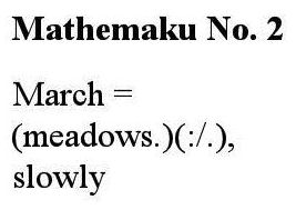

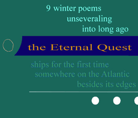
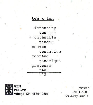 As I announced when I first posted this, I am hoping to publish an antho- logy of mathematical poems, like this one, so if you have one or know of one, send me a copy of it, or tell me about it.
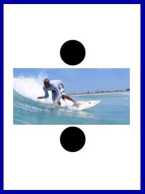


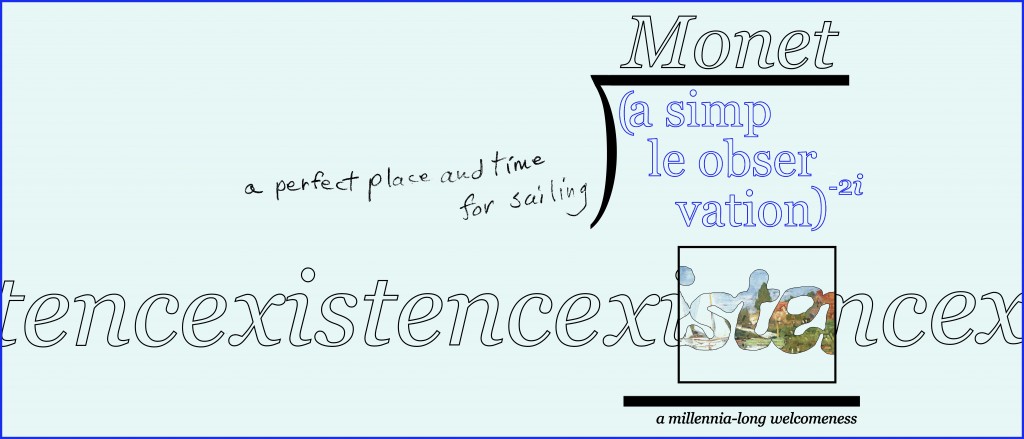
this i like. keep it. do no touch ups.
A very beautiful piece!
Thanks:
Nico–but I’m itching to make one very small change! I probably won’t. IF I do, I promise not to mess with it otherwise.
Marton. Yours and Nico’s encouragement is much appreciated. Your eyes are as good as they come. I hope you get me to do a few more cursive poems. I’ve let some ideas wander in but they so far have all kept going.
–Bob
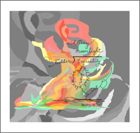
I like this. I think the cursive really flows well with the illustration. Would like to see more of these.
Thanks, Kevin. This one has now gotten three compliments. I did try to do another cursive but it turned off into something else. I do want to try more, though.