Entry 133 — Somewhat Awake Again, I Think « POETICKS

Entry 133 — Somewhat Awake Again, I Think

I simply disconnected from my blog–just didn’t think of it for about a week until a day or two ago.  Then last night for some reason I started thinking about haiku and came up with the following poems that I thought worth making this entry for:

.

.                            early April night:
.                            barely a single haiku
.                            of moonlight in it

.

.                            the street’s cherry blooms,
.                            dazzling, yet almost grey
.                            besides the haiku’s

.

.

.

.

.

.

Tags:

Leave a Reply

haiku « POETICKS

Archive for the ‘haiku’ Category

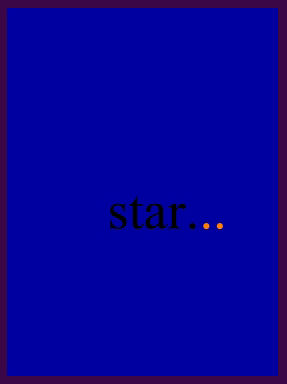
Entry 134 — Ellipsis-Haiku

Wednesday, May 26th, 2010

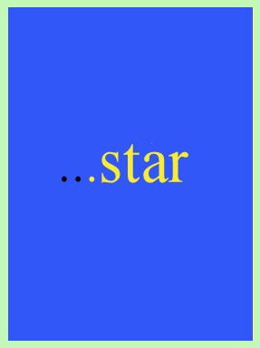
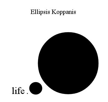
I’m still having “creative ideas” but having trouble bothering to put them on paper, even ones as easy to do that with as the ones that led to the following:

.

.

.

Good ideas (inspired by Marton Koppany’s recent Otoliths book) not yet finding their best presentation, it seems to me.

Entry 133 — Somewhat Awake Again, I Think

Friday, May 21st, 2010

I simply disconnected from my blog–just didn’t think of it for about a week until a day or two ago.  Then last night for some reason I started thinking about haiku and came up with the following poems that I thought worth making this entry for:

.

.                            early April night:
.                            barely a single haiku
.                            of moonlight in it

.

.                            the street’s cherry blooms,
.                            dazzling, yet almost grey
.                            besides the haiku’s

.

.

.

.

.

.

Entry 52 — Some Conventional Haiku

Wednesday, December 23rd, 2009

Today’s entry is a repeat of one from Christmas day, 2005, with a few comments from today at the end of it:

25 December 2005: “clenched sky.” That’s one of the scraps in the notebook yesterday’s entry was about. Circa 1983. Never got into any poem of mine but may yet. Another scrap is the start in fading cursive of a sonnet I completed somewhere else on Dylan Thomas. I was momentarily quite taken by what the word, “steepled” did to its fifth line, “by his construction of a steepled truth,” for it took a while for me to realize the word was not “stupid.”

Other highlights include the following five unpublished haiku:

rain now as loud
against the northern side of the house
as the roof

rotting log
only part of forest floor
to show through melting snow

glimpsed tanned shoulder;
thin white string across it,
tied like a shoelace

bikini-bar dancer
showing off to her boy-friend,
me in between them

far enough from the storm
nearing the color-dotted beach
to see above it

I wrote these about the time I pretty much stopped writing conventional haiku. I quite like the storm one, probably because I still vividly remember the first Florida storm I saw from far enough away to see above–and to both sides–of it. I don’t think it’s a truly outstanding haiku, though. The one about the bikini dancer is fair in the wry sardonicism vein, I think. The one about the bikini string is nearly not a haiku, for it doesn’t really provide any haiku contrast; i.e., it’s a single-image description. On second thought, maybe it’s excitement versus the mundane: girl in bikini versus shoelace.

I dunno. The other two are very standard, but I’ve tried to improve them,anyway:

the rain now louder
against the house’s north side
than on the roof

rotting log:
only portion of the forest floor
to show through the snow

The first is slightly haikuish in the way it obliquely discusses a wind; the second re-uses a very over-done haiku theme, to wit: life goes on, or–more specifically–winter snow won’t win; but the theme is slightly warped toward freshness with the use of something a reader will take to represent a cohort of winter rather than a counter to it, until he realizes the cause of rotting.

Also in the notebook this bit of High Sagacity: “The Eastern Wise Man attempts to reduce his awareness to the size of his experience; the Western Wise Man attempts to increase the size of his experience to the size of his awareness.” Yep, I’ve always been Eurochauvinistic.

From today:

rotting log;
nothing else of the forest floor
showing through the snow.

Entry 28 — Old Blog Entries 652 through 660

Sunday, November 29th, 2009

#652 had some gadgets by Richard Kostelanetz that I thought fun but trivial–4-letter words in squares, one letter in each quadrant.  The gimmick is that three of the letters, in upper-case, spell a word that becomes a second word with the addition of the fourth (lower-case) letter, as in

.                                         G O
.                                         o D

The anti-gimmick is the fact that very few of the too words disconcealed in each specimen relate enough to each other to achieve metaphoricality, or anything poetic else.  The above is the best one I could find among the bunch he sent me (and others of his literary friends).  Another problem is that such words are too easy to find–although I applaud Kosti for bringing their existence to our attention because they do provide word-game fun.

Several nice poems in #653 that I got from the June 2005 issue of Haiku Canada Newsletter, including this, by John M. Bennett:

.                                                Clou
.                                                laem
.                                                foam
.                                                   d

and these two haiku gems, the first by Cor van den Heuvel, the second by Grant  Savage:

 .          end of August--           .          a crinkled elm-leaf falls .          and rocks once           

.          on the park bench     .          this spring afternoon .          a new old man 

#654 featured wonderful pwoermds from LeRoy Gorman like “marshush,” “rainforust” and “riverb”; but I complained that powermds as pwoermds rather than as climaxes in longer lyrics had become boring for me.  I returned to my quest for a decent word to represent “partaker of artwork” in 655, reporting that I’d just coined “aesthimbiber” for that purpose.  I seem to have dumped it soon after that but think I should not have.   I like it right now.

After posting two works of J. Michael Mollohan in #656, which I put on display in yesterday’s entry, I discussed them in my next two entries.   A few lazy autobiographical paragraphs on my procrastination followed.  This set of ten entries (from a zine called Dirt) ended with an example of what can be done with pwoermds used as I’d like to see them used, as parts of longer poems:

                     Ight                     nowhere                                    lignt                     gnight                        lightninght                                         thwords                             now here

It’s by none other than Geof Huth, who calls it “A Series of Pwoermds.”

Entry 23 — An Old Haiku of Mine

Tuesday, November 24th, 2009

Today was another bad day for me (because both my bikes had flat tires so I had to walk to where I had an MRI for my bad back, then walk to the bicycle shop two miles from there to get tubes before going on home, another two miles, so I’m just going to post one entry from my old blog, #631, in its entirety–because it’s one of my best entries for the general poetry public, I think:

24 October 2005: Well, we lost electricity in my neighborhood for seven or eight hours due to Wilma, but we got through it with minimal damage. Naples, to the south, didn’t do so well. Sad for them, but someone had to lose–and one good thing about the outcome is that the weather people seem to have been on top of things all the way through, which is certainly reassuring. In my ideal world there’d be hurricanes–but the land to persons ratio would be so high no one would have to live anywhere near places like Naples. There’d still be places like Naples, but they would be staffed by commuters, and lived in by vacationers. (Down with over-population–which in my book is anything over ten million–for the whole world.)

Okay, the poetry-related subject of this entry is the following poem:

.                                            2 children’s
.                                 rained-around dry quiet spot
.                                               within forsythia

This, or something like it, was in my first book, poemns. After selling some of the copies of the book, I found something wrong with one of the other three poems on the sheet it was on, so removed the whole sheet from the remaining copies of the book. I think the printers failed to make a line in one of the poems go off the edge of the page as I’d intended it to. I should have a copy of the four poems somewhere but it’d take me a week to find them if I tried to, I’m sure.


I’ve used this poem elsewhere since the book, I believe. I want to discuss it here cbecause I consider it a near-perfect example of what I try for as a poet, which is simply to render, in as few words as possible, an image that will cause others as much pleasure as possible. This one accomplishes this through its (1) subject matter, which is (a) quotidianly likely to elicit most persons’ sympathy, (b) pretty, children generally coming off as cute, and forsythia as beautiful, (c) peaceful, the rain having to be little more than mist not to be getting through forsythia branches, and, most important, (d) archetypally resonant by representing Shelter and Companionship, as well as Spring (rain and forsythia, and human beings in their spring); and its diction, which includes the wonderful rained/round rim thyme (but, not, I’m sure that’s not original with me), the with/syth near-=rhyme and the dry/qui aft-rhyme (or whatever it is I’m calling traditional rhymes). Only now, by the way, did I realize that the latter rhymes were near- or full-rhymes. The poem is also effectively concise, and it draws on its being a haiku, for that adds haiku-depth to it (via what it picks up from the tradition, and all haiku before–and after–it).

To me, one of its points of greatest interest is in what it does not have, mainly, manywhere-at-once, or equaphorical layering. In a way, this is a virtue, for it clarifies it into a moment of particular intensity. Amusingly, that emphasizes its being a pure haiku–albeit one without quite the right syllable-count. I do consider its lack of equaphors (or metaphors and the like), in the final analysis, a defect. I continue to believe the very best poems express two or more simultaneous images. But poetry as a whole would suffer consequentially if every poem were equaphorical.

Real life did inspire the poet, by the way. The forsythia in it is from the yard of the Hyde House, as it was known, on Harbor View Island in Norwalk, Connecticut, that I lived in between the ages of 7 and 12. It actually formed a sort of hut, though I’m not sure they could have kept out even mist. I played in it from time to time but most remember my sister Louise, a year younger than I, playing some kind of queen’s court game in it with her friends Ellen and Cindy.

Ironically, just the other day I learned that the Hyde House I’ve been reminiscing about is no more. It was leveled to make way for two condominiums that have to be devastating the ambiance of the shabby-genteel little clump of mostly vacation homes on the island. Progress triumphs again.

note: the large print is stupid, but I’m using it to indicate large blocks of quoted material because I haven’t been able to figure out how to indent at this site (other than use periods as with the poem quoted within my quote–which would take too long to get right for long prose passages).


Entry 9 — Poetry Employing Irrational Language

Tuesday, November 10th, 2009

I have always wondered why anyone would make much of most Dada works.  It was evident that a good number of reasonably intelligent, sensitive people have, though.   Including friends of mine who have shown themselves quite capable of fashioning works I think vastly superior to their Dada works.

Then I came upon Geof Huth’s

.              the car I didn’t notice                              isn’t there

in the recentest issue of Haiku Canada Review.   Not Dada, but certainly nonsense, or so I at first thought.  I would now term it nearsense.   As

.              the crab boils filge at blargets       in the goamy fludge

it would have been nonsense, or a literary work which uses irrational language in order to amuse (in the view of most knowledgeable people encountering it).  As

.        car didn’t (e time)s into                       bleep blegg bllllg you

it would be constersense,  or a literary work whose textual matter seems chosen for no other purpose than to cause consternation–by seeming to be nearsense but ultimately not making sense, or proving amusing.

Then there’s temporary nonsense such as Joyce’s “cropse,” which at first seems either nonsense or constersense (and will always seem constersense to Philistines) but, given time, will quite rationally if poetically say “corpse” and “crops” simultaneously in succinctly sum up all the important cycles of human existence.

I have more to say about this, particularly about why the poem by Geof Huth is nearsense, but I’m too worn-out from another tiring day to do so until (I hope) tomorrow.

Entry 27 — Two By J. Michael Mollohan « POETICKS

Entry 27 — Two By J. Michael Mollohan

dontandsubtlety

Just the two pieces above from #657  today–’cause I’m tired and my back and right leg ache from having played tennis this morning (horrid-badly).  I have sciatica and wrong thought I might be over it.  I’m not.

Leave a Reply

Entry 388 — Visual Poem, 10 February 2007 « POETICKS

Entry 388 — Visual Poem, 10 February 2007

.

.

This I posted in my previous blog.  I don’t know why I like it, but I liked it right after doing it, and each of the two subsequent times I happened to encounter it, so here it is.

Leave a Reply

Roy Arenella « POETICKS

Archive for the ‘Roy Arenella’ Category

Entry 1554 — Two by Roy Arenella Today

Saturday, August 30th, 2014

Like all the work that’s been in my blog recently, these two are from Kalligram–in particular, from the section edited by Marton Koppany called “Reducalt Nyelvek,” with an accent on the three a’s in the preceding Hungarian words:

TwoLetters

I think I may like bright, instantly likable, pure visual poems like these more than just about anything else in poetry.  I think the way I’d put it is that there are days when no other kind of poem could be so welcome–and no days when such poems would not be welcome.  Well, just about no days.
.

AmazingCounters.com

Nina Katcadourian « POETICKS

Archive for the ‘Nina Katcadourian’ Category

Entry 1110 — Commercial Visiotextual Art

Tuesday, June 4th, 2013

One of my very lazy entries, just two steals from ARTnews.

MoeBroker1

This one is an example of what many Spidertangle artists would call “asemic poetry,” but which, unlike just about everything with that tag, gets into New York galleries or the equivalent.  Why?  It certainly is no better than much of the pieces shown at Spidertangle, although I do like it–the colors and shapes much more than the scribbling.  Is it only because made by certified painters rather than people coming out of, or too associated with, poets.  For one thing, artists like Brooker never think of their work as poetry of any kind.

ArtTalkJune2013

A related example that I don’t at all like.  In the spirit of Jenny Holzer.  Yeah, makes yuh think but who in the world would hand it on their walls?  On the other hand, like the Weatherly Dixie Cups, these bookspines could work as elements of my long divisions.  That, needless to say, would complicate them beyond all possibility of being written up in ARTnews.

.

Counter

Enter 135 — 13′s from The Pedestal Project « POETICKS

Enter 135 — 13′s from The Pedestal Project

Today I’m finally starting to post what I’ve decided to call “13′s from The Pedestal Project,” by which I mean my favorites of those submissions to John M. Bennett’s and my gallery of visio-textual art at The Pedestal. I call them “13′s” because the people who created them were, so to speak,  all–in my opinion–tied for thirteenth place in the competition for the twelve spots available in the gallery.

The first piece is “Fifth Grade,” by Connie Tettenborn:

When I saw this, I was biased toward it because so many of the other submissions to a gallery supposed to be of visual poetry was (tediously) not visual poetry by any reasonable definition, and this was.  I was also charmed by its evocation of what fifth grade seemed to me.  I found the choice of data the kids were being bombarded with interesting, too: it happened to include three pieces of knowledge of extreme importance to me all my life: the discovery of America (and I claim Columbus discovered America; Eric the Red or his son, whoever it was, who got to Newfoundland only extended the shoreline of Europe), long division and the planets (which in fifth grade were just about equal to dinosaurs and the Pyramids to me).

I liked the little kids in proper order–although I’m not sure why Connie uses the particular letter she does to represent them. Wait, they are, I now see, “e.g.’s” . . . I’m still not getting the connection .  In any case, one of the kids seems not paying full attention, which is a nice touch.  The idea of Knowledge coming in from some Afar that seems almost divine intrigued me, too.  There’s the concept of a window into understanding, too.

In chatting over syberspace with Connie, I’ve learned that she is new to visual poetry, so deserving of special praise for doing so well to being with.  Because she asked for help, I’m now going to say a few minor negative things about “Fifth Grade.”  One is that I’m not sure “bah bah” fits the piece as well as “blah blah” would have, and I think “gaga” and “lala” not particularly effective.  I think the choice of varied fonts good, but believe a little more could have done to the in-flow–for instance, some overlapping could have worked nicely, I think, and great difference in the size of letters.

I wondered about the use of color, finally deciding straight monochromatic, facts-only dry knowledge worked best.  But use of colr and visual imagery might be something to try, too, if the artist wanted to make a sequence of variations on a theme, which her piece would be a good start to.

2 Responses to “Enter 135 — 13′s from The Pedestal Project”

  1. Connie Tettenborn says:

    Thanks for the feedback, Bob. FYI, the letters representing the students are “e a r.” They can only be seen if one clicks on the image to enlarge it to the full screen size. I agree that “blah, blah” is better than “bah.” Too bad I did not think of how to represent the nasally sounding “Wanhh” of the teachers in Charles Shultz’s “Peanuts” movies!

  2. Bob Grumman says:

    Ah, “ear” makes sense, and an e does look like an ear. Not sure I like it, though–to literal. But I can’t think of a good alternative.

Leave a Reply

visual poetry « POETICKS

Archive for the ‘visual poetry’ Category

Entry 628 — New Vocational Triumphs

Wednesday, January 18th, 2012

Just when I thought my visual poetry career was going nowhere, I had a pleasant surprise at an Arts & Humanities gathering last night.  It was an annual affair where local visimagists get together with people representing public places.  The latter look over the works brought to the event, three pieces per artist, and offer exhibition space to those whose work they like.  A bank lobby, for instance.  I went to one of these long ago, but my work wasn’t chosen, and while I’m (probably insanely)  persistant at continuing to make art, I have just about no stick-to-it-ive-ness so far as getting it to where people can see it and maybe like it.  Well, with the encouragement of Olivia and Judy, of the Arts & Humanities Council, and thinking maybe now that I had my current exhibition, someone might think me worthy of another elsewhere, I brought the following three pieces to the main library, where the affair was:


I was going for accessibility with the top two.  I added the bottom one to show a little of what I was doing with long division and color.  In any case, I’m now down for three more exhibitions, two more this year and one in 2013. 

I got to talk with fellow artists, too.  One of them did abstract-expressionist stuff with the word, “love,” embedded in them–another local visual poet!  I came across another artist who uses some kind of transparent, screenlike fabric in her work: she paints an image on it and hangs it in front of regular fabric with a background painted on it.  I thought it worked really well, and have vague ideas on what I might do with it.  So, quite a good hour or so!

.

Entry 621 — Evolution of Style

Wednesday, January 11th, 2012

One of my works that I was particularly pleased with when I came across it while backing up blog entries was the following:


I have one problem with this: my only version of  it is a low-resolution jpg, which I don’t know how to convert to high-resolution tif, except by simply redoing it.  Any suggestions from anybody out there who knows more than I do about this kind of thing?

I didn’t re-post it only to ask for help, or because of how much I like it, but as an example of how my work as a poet has evolved.  Actually, I want to show that it has evolved.  That’s because Paul Crowley, the nut I most argue with on the Internet about who wrote the works of Shakespeare, seems not to believe that a poet’s style, or way of making art, evolved once he’s past his apprenticeship.  Of course, he will claim I’m not a poet, and that the evidence I’m about to produce to show my evolution indicates only trivial changes, not anything like genuine evolution.  I enjoy talking about my work, and analyzing any poem, so will go ahead with my demonstration, anyway.

First of all, I should state my claim: it is that over the past couple of years, my style as a poet has evolved appreciably, and that this poem illustrates it.

(1) I only began using cursive ten or fewer years ago, and never for more than a word or two.  This poem and two others have all or most of their texts in cursive.  Because the difference in expressiveness between print and cursive is visiopoetically meaningful to those who appreciate visual poetry, this wholesale use of cursive script counts as a significant evolution of style.

(2) My use of cursive is more elegant here than it is in mt other two recent poems making extensive use of cursive.  Note, for instance, the large O, and the increased gracefulness of all the letters compared with the letters in my other two cursive poems.

(3) Twenty years ago, I didn’t bother giving my poems backgrounds.  Since then I have, and have slowly been improving (but have plenty of room for further improvement).  Note the harmony of the background’s shape and colors with the text, especially the O. 

(4) The background has another important value–the connotations it picks up as a result of its being a variation (mostly through color changes) of the background in another poem of mine.  Connecting poems of mine with others’ poems and others of my own poems is another way I’ve evolved as an artist, not doing it until perhaps twenty years ago, then only very slowly doing it to a greater and greater extent.  This poem may be the first to re-use an entire background from another poem.  This is not trivial, for it allows this poem to suggest “dictionary-as-temple,” the main part of the foreburden of the poem its background is from.  It also should make this poem easier to enjoy, the same way the repetition in a new musical work of an old theme is usually pleasant to hear.  I believe the happiness of the colors of this version of the background gains from the reminder of the different, lower-key mood evoked by the other version.

(5) The use of color in tension with greyscale is another trick new to me twenty years ago that I exploit more and more in my present works, as here (though I’ve done more with it elsewhere).

(6) I think my language has evolved over the years, too–from fairly literal to metaphorical and/or surreal.  The “logic” of this piece and most of my recent pieces is not so easy to guess, which may be an unfortunate evolution, but an evolution nonetheless.

(7) You can’t tell from this image, which has been reduced in size to fit the normal computer screen, but the hard copy is larger than anything I did ten or more years ago, which is another result of evolution. 

Here’s my first or second mathemaku, done thirty or more years ago, to make the profound evolution of my style more inescapable. Yet I maintain this piece is at the level of later pieces; it is simply more condensed. For one thing, it is only linguistic and mathematical. Nothing visioaesthetic happens in it. The eye is used only to recognize the symbols it contains, not to enjoy colors or shapes the way my faereality poem compels it to–i.e., not a visual poem (except inthe mindlessnesses of those for whom just about everything is a visual poem). It is short, and printed. Its words are simple to an extreme.

.

Entry 620 — Getting Enough Sleep

Tuesday, January 10th, 2012

A little while ago (it is now around 9 P.M., 9 January)  I was feeling good.  I attributed this to my having gotten two naps today, one of an hour, the other of one or two hours.  And I had gotten six hours of sleep last night, which is about as much as I generally get.  I had just about finished backing up my blog entries and was very pleased at how good many of my poems seemed to me when I noticed them during the process.  Unfortunately, I got the dates up my upcoming entries wrong, and in correcting them, lost what I had written for this entry.  That pretty much wiped out my mood.  I can’t stand screwing up like that, but I do it all the time!


This is a pwoermd I stole from Geof Huth’s blog–because it has become too sophisticated to accept comments from dial-ups like my computer, and I wanted to comment on it.  It’s by Jonathan Jones, lately of Brussels, but a citizen himself of the United Kingdom.  What I like most about it is that it’s lyrical–as too many pwoermds are not.  It wouldn’t be a visual poem for me, but an illustrated poem, except that I subjectively feel “apri’ll” is producing the wonderful colors of spring it is slanted into a portion of (through sheer will-power).  Hence, in my taxonomy it is an infra-verbal visual poem.

.

Entry 618 — “Hungarian Vispo No. 2″

Sunday, January 8th, 2012

Marton Koppany’s latest visual poem may be the gentlest satire on a country’s government ever, if I’m interpreting it correctly. Note the boot on the head of one of the country’s citizens, for instance–and the complete insanity of the country the cloud with an umbrella suggests. Much more is going on that I’ll let you discover without help.

Hungarian Vispo No. 2

.

Entry 613 — Vispo SpamAd

Tuesday, January 3rd, 2012

The following is a detail from a Spam ad that I got yesterday.   It’s a good example of a commercialized visual poem.  Effective as an eye-catcher, but not very good as a visual poem.


 Below is my improved version.  Certainly not yet a great work but better than the original.  If you can’t see why, I’m afraid you aren’t too perceptive about the art.  If you can’t see how the basic idea could be used in a far better piece, you probably aren’t an effective visual poet, or are tired.


Diary Entry

Monday, 2 January 2012, Noon.  I got up late because I stayed up late last night watching my Giants fall apart, but win anyway because Dallas fell apart just in time to keep from winning.  I don’t think the Giants have much hope of going far in the play-offs, but I’ll be rooting for them.  And the other teams are pretty inconsistent, too, except for San Francisco and Green Bay.

I began the day by forcing myself to run.  Actually, I slowly ran, then ran fast albeit not really fast, then walked.  Rrrrrruuuuunnnnnn, rruunn, walk over and over until I’d gone around the middle school field four times (two miles).  My stamina is still amazingly poor, but I actually genuinely sprinted when I went all out.  Which is to say, I was able to pump my legs all the way up and stretch out, the way one does when sprinting.  I didn’t do it fast enough to really sprint, but I did it.  I was worried that I no longer could.  Now it’s just a matter, I think, of getting enough stamina to push myself harder, and for longer periods.  My “sprints” were only for around twenty yards or so–but maybe a whole forty once or twice.  Since getting back, I posted my blog entry for today, which was easy because already done.  I corrected my latest Page, “How to Appreciate a Mathemaku,” after getting a list or errors I very much appreciated from John Jeffrey.  I have a lot more chores to do, but I’m already worn out.  Maybe after lunch and a nap I’ll be able to get more done.

5 P.M.  One more chore out of the way: filling in the size and price of my works on the exhibition contract and tags.  I’m asking $200 for most of them.  Highest price is $600.  Two I’ll accept $100 for.  I don’t expect to sell anything.

.

Entry 607 — More from Spidertangle

Wednesday, December 28th, 2011

Later Vernon Frazer entered the discussion:

Thanks, John. I use “definitions” as a shorthand for conversational or descriptive purposes. As far as trying to work, I avoid the “prescriptions” suggested by definitions because they impose limits on my thinking and interfere with my working at my best. Without the work, nobody would have fodder for all the differing definitions. I’m flashing back to Wittgenstein and trying to define “game.” 

ME: Sorry, Vernon, but I’m (obviously) not a Wittgenstein fan.  Just because a few words are hard to define, at least for someone like Wittgenstein, doesn’t make the eternal struggle to define words (in order fully to understand what they denote) futile. As for the “prescriptiveness” of definitions, they are only prescriptive about how an artist can responsibly label his works, not—if he has a functioning brain—about how he can make them.  I am annoyingly repetitious about stating this, because it seems to me the main misunderstanding artists have about criticism.  (Which is dependent on what artists produce—but that is dependent on what prior artists have produced and, I believe, on what critics have said about it.  A work of art ultimately is not merely what it is by itself, but that and what others have said about it.   –Mr. Cantshuddup

Bobbi Lurie again:

wittgenstein fan or not–

what is this?

is this vispo or not?

http://the-otolith.blogspot.com/2011/10/bobbi-lurie-ludwig-wittgenstein.html

ME: I like your image a lot, Bobbi, but I have to be sarcastic in answering your question: it’s a musical automobile, so a branch of chempo, not of vispo.

Nico was less sarcastic:

I wouldn’t tag it as such, no.

There are these websites you find when doing a search of visual poetry that pertain to photography, wedding shots, naturescapes, etc. They use visual poetry as a descriptive for hallmark type sentiment.

Your drawing of Ludwig is very much reminiscent of egon’s stuff,

ME: Same response here.

which I like quite a bit. It’s not vispo tho. My own filter for such things usually entails the existence of a focus on alphabet. That’s primary to me, but not all on this list. I giggle at your use of
Sophistication. I think we’re still in the process of hammering it down – the ongoing sixty year process. The inability to pluck a satisfying set of terms by now – one that’d satisfy most practitioners just spotlights the fact that this practice is separate to separate people. That means nothing gets answered or gets answered in myriad ways.

ME: At one point I spent some time trying to determine how I thought works concerned with the alphabet should fit into my taxonomy.  I think I concluded that the alphabet is verbal—a peculiar sort of word meaning “these are the letters, in order.”  However, with the works you’re speaking of, Nico, letters are the subject, not the alphabet, so for me they are textual designage.

NICO: Anyway, I did apologize for bringing this up.

ME: As opposed to leaving Spidertangle as a no-discussion zone?

Bobbi replied:

Thank you, Nico. 

As I wrote to David, I really needed this description.

Yes. Sophistication meaning “I don’t know what these people are talking about. What is the secret?”

The fact that you’ve been struggling with terms….may I suggest you just say: “the alphabet must be included–this is in relationship to written language–the representation of something via language vs. via image” (clumsy this, i know, but that would have helped me in the several year search i’ve been on, asking vispo artists this question)

ME: Too bad you somehow missed me, your fellow Bobbi/Bobby, Bobbi.  I’ve been cranking out the dogma that poetry has to have significant words for years, and that it’s silly to consider “visual poetry” not to be a form of poetry. Very few in the visiotextual field (but probably everyone in conventional poetry) agree with me, even though I have a fairly broad idea of what “words” are—I accept word-fragments, punctuation marks, any typographical symbol (like @), mathematical symbols and even the alphabet or some section of it long enough to identify it as an alphabet, as “words”—and don’t dispute that at the border between the verbal and the visual there are activities going on of value that may also qualify as visual poetry (since no definition can have a sharp border—unless it’s of something not in the real world like odd numbers).  Seems to me an art should be defined first of all by what materials it explicitly uses in general (words or visual images, say), then by how it uses them, again in general (by pronouncing them or recording their sound, in one case; in the other, by recording their shape and color); a sub-art, like visual poetry, should be defined by what specific materials it uses and how, specifically, it uses them—words and visual images together by recording their sound, shapes and color.  And so forth, finally to capture even the subbest of arts like Shakespearean sonnets or visiopoetic maple solitextual (i.e., solely textual) sculptures . . . 

BOBBI to Nico: please do not apologize. i am so happy to read this–i didn’t know if i could legitimately send my art work to anyone other than Mark Young of Otoliths, who is tolerant with my experiments / does not define his journal in terms of vispo, unlike others here.

i will have to check closely on this, but from your definition, i’d say a lot of editors are letting a lot of things pass for vispo which isn’t vispo.

thank you, Nico.

ME: We need editors like Mark Young who publish art they like regardless of what it is, but it’d be nice if they could let what they want be known in precise language.  Almost everyone in the otherstream publishes anything.  Anyone who wants material of a specific kind has to carefully say so because “visual poetry” tends to mean anything.  Not just works that are visual but not verbal, but works that are verbal and not visual.  My press doesn’t get submissions anymore, but when it did, people would send me poetry about sunsets—hey, sunsets are visual!—and complain when I rejected it as not visual poetry, which my press was primarily looking to publish.

David Baratier was next up:

People who solely practice visual art or vispo
are verbose and vague
either due to lack of words in their art
or to leave open a potential name shift
to make themselves popular again.

Miro was before vispo, so he is a precursor.

From outside the gates it looks like the best known vizpoets
call themselves artists because vispo is an unknown term to them, or
a fringe term (as Karl pointed out, coming into being as an antithesis
to the concrete poetry movement rather than an art term). Vispo
also has movement qualities rather than just a name.
Ruscha, Jenny Holtzer, Robert Indiana and so on are artists.
.
ME: Ruscha, Holzer and Indiana are all, in some of their works, visual poets, regardless of how they see themselves.  I haven’t seen anything by Miro that seems a visual poem to me, but a few paintings by Klee seem close to being visual poems.  Stuart Davis made some, and so did Magritte.  Picasso may have, too.  I’ve shown these at my blog where I’ve also shown images from ARTnews,, which has something I consider a visual poem in almost every issue.  Visual artists added typography naturally to their subject matter just as they added everything else previous visual artists disregarded, and the world was already set up to accommodate their work as visual art in galleries and museums, so they had no need to call it anything special.  Poets becoming visual did, because their visual poetry was much more radical (because generally a good deal more verbal) than that of artists like Ruscha—and the venues for conventional poetry had, and are still having, trouble with it. 

VERNON: I think the discussions—and Wittgenstein’s increased presence in them in more than one capacity—demonstrate what I was trying to get at. Nobody agrees on what vispo is, even when they look at the same work. If you worry too much about the definition, you won’t concentrate properly on what you’re doing. Some people say I’m a visual poet, some say I’m not. And I’m certainly not one all the time. But I might be one some of the time, depending on who’s forming the opinion.  What I gather from today’s debate about definitions is: do the work and let the definitions fall where they may. 

ME:  As I’ve already said, poets shouldn’t care.  For critics or people trying to work out a reasonable poetics, it’s a different story.  Unfortunately, too many in these two cultures see those in the one they aren’t in as enemies or fools.

No doubt there will be more. 

Diary Entry

Tuesday, 27 December 2011, 5 P.M.  I only played tennis for about an hour this morning, but got tired.  Went to Mcdonald’s for a sausage and egg sandwich.  Got a little marketing done at the Winn Dixie near the McDonald’s, then got a nap of maybe fifteen minutes in.  After that, I spent a lot of time in the Internet discussion I made the subject of the day’s blog entry, which I just made the last corrections to, at least for now.  I guess I contributed over a thousand words to it, some of them insightful and/or interesting.   So I can’t consider myself totally out of it.  I feel the discussion itself will interest, or should interest, scholars later in the century, if only for what it reveals of one group of creative artists yakking with/at each other.  I’ve done no Work of Consequence, though.  I am now going to work up a hand-out for my exhibition, then probably take the rest of the day off.

.

Entry 598 — “Fifty”

Monday, December 19th, 2011

This is from Geof Huth’s blog:

 I liked this when I first saw it although I didn’t find it saying anything verbally.  When I finally realized it said, “fifty,” I thought it accidental because I couldn’t see why it would say that.  My slow mind eventually remember that Geof is now fifty-years-old, which makes this image a particularly effective representation of his present strange combination of freedom and awkward incompleteness . . . straining, yearning for something.  With his ego (“I,” as Karl Kempton would be sure to notice) lost or transcended.

Diary Entry

Sunday 18 December 2011, 6 P.M.  Another unproductive day.  Tennis in the morning, a fine meal at Linda’s in the afternoon.  A blog entry for today just taken care of a little while ago.  A little work done on my “Mathemaku for Scott Helmes” to count as “work on preparation for the A&H exhibition.”  And now I’d like to go to bed, but will probably read instead.

 .

Entry 597 — Chumpy Leg

Sunday, December 18th, 2011

John M. Bennett has another major collection of poetry out.  This one is called The Gnat’s Window.  78 poems.  Bilingual.  Closely inter-associating sequence.  Amazing.  I told John I’d try to do a critique of it, and I still hope to once my year-end chaos of chores is behind me, but–gah–John is one of the few poets I feel may be beyond my abilities as a critic, and he’s at his best–and therefore beyondest–in this book.  Part of one of the poems, which Diane Keys has found a way to, uh, fatten, in all the best senses, with color, a piece of cloth and some cursive annotations–and the circling of “crumpy leg, is below.  It’s from the back cover of John’s book.


Diary Entry

Saturday, 17 December 2011, Noon.  Wow, since getting back at eleven from tennis and a McDonald’s snack, I’ve already gotten the day’s blog entry posted, which was easy because it was already done, and made a finished copy of  the new version of “Mathemaku for Scott Helmes” at Paint Shop.  It’s not the official copy: it’s too small, and the official version will include the original cut-out fragments of magazine ads.  There will also be the A&H framed version which will be in between the one I just made and the official version in size. 

8 P.M.  Since noon I haven’t done much.  I printed out two copies of “Mathemaku for Scott Helmes” and scribbled annotations explaining the terms I will put on one that will be on display atthe exhibition.  Otherwise, I continued reading started yesterday of the magazines and books I will be reviewing for Small Press Review

.

Entry 587 — “The Bells”

Thursday, December 8th, 2011

My friend, Richard Kostelanetz is writing (actually, revising) an essay dealing with, among other things, appropriated art.  When he asked something about Tom Phillips’s A Humument, I remembered other superior examples of appropriation art such as the work on a dictionary of Doris Cross, and the following appropriation of Edgar Allen Poe’s “The Bells” by Michael Basinski, which I thought worth posting here:


Here’s the original:

Hear the sledges with the bells–
Silver bells–
What a world of merriment their melody foretells!
How they tinkle, tinkle, tinkle,
In the icy air of night!
While the stars that oversprinkle
All the heavens, seem to twinkle
With a crystalline delight;
Keeping time, time, time,
In a sort of Runic rhyme,
To the tintinnabulation that so musically wells
From the bells, bells, bells, bells,
Bells, bells, bells,–
From the jingling and the tinkling of the bells.

Hear the mellow wedding-bells,
Golden bells!
What a world of happiness their harmony foretells!
Through the balmy air of night
How they ring out their delight
From the molten-golden notes!
And all in tune,
What a liquid ditty floats
To the turtle-dove that listens, while she gloats
On the moon!
Oh, from out the sounding cells,
What a gust of euphony voluminously wells!
How it swells!
How it dwells
On the Future! how it tells
Of rapture that impels
To the swinging and the ringing
Of the bells, bells, bells–
Of the bells, bells, bells, bells,
Bells, bells, bells–
To the rhyming and the chiming of the bells!

In the essay I quoted Mike’s poem in, I called it “an amazingly loud-though-silent jangle of . . . Poe’s famous poem.”  I’d add here that Basinski’s version gave me the thrill that Poe’s version, I’m sure, gave many of its first readers.

* * *

Wednesday, 7 December 2011, Noon.  I’ve partly recovered from having accidentally deleted my blog entry for Monday.  A semblance of it is back up.  I also posted an entry for today.  I’ve done nothing else yet, but hope soon to go out to buy some frames and a pad of good-quality large paper.

Later note: I succeeded in finding two reasonably-priced frames of the kind I wanted (able to be stood up on a counter) that I bought.  That took care of my pledge to do something of value for my exhibition every day, barely.  Meanwhile, I sketched a new mathemaku.  Then took care of this entry.

.

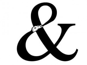
Entry 584 — An & & My Full Triptych

Monday, December 5th, 2011

It seems that almost every time I seem to be getting productive, something knocks me down.  This time it’s only a lost entry–this one, that I was trying to correct some detail of and lost in the process–without realizing it, so was not able to try to find the lost material by backing up until it was too late.  So now I have to spend an hour or so, restoring what I can recall of what was here two days ago. 

 One item was this by Moribund Face:


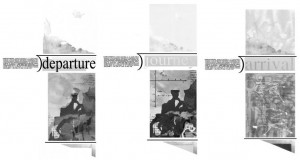
And all three of my frames of “Triptych for Tom Phillips”:

About the ampersand, I commented something about how it expressed the essence of “andness.”  I loved the way its bird regurgitated what looked like all of itself, while looking to continue “anding” forever.  I said little about my full triptych except that if you click on them, you’ll see a larger image of them which may be helpful although still very small–and in black&white.  The original frames are each eleven by seventeen.  Oh, one thing I did point out was that the frames are about, “departure,” “journey” and “arrival,” and are intended to be about them in the largest sense, but particularly about them with regard to arriving–for either an engagent of it or its author.

* * *

Sunday, 4 October 2011.  Sunday is hazy to me now, three days in the past as it is.  I played tennis early in the morning–badly.  I didn’t return to my Shakespeare book, but evidentally got a blog entry posted, and probably wrote an exhibition hand-out or two.

.

Jump-Cut Poetry « POETICKS

Archive for the ‘Jump-Cut Poetry’ Category

Entry 1282 — Mail Art from Blorchistan

Tuesday, November 26th, 2013

Mail Art not from the SASE project but a one-only from Ficus stranguensis:

MailArtFromThe PanjandrumOfBlorchistan

.

Entry 1281 — Ficus s., Continued

Tuesday, November 26th, 2013

Included in a letter I got from Ficus strangulensis in 2011:

OneDayCalvinProblem
.

Entry 960 — Jump-Cut Poetry

Saturday, December 22nd, 2012


The following is a passage from John Cage’s “Writing for the first time through Howl” (1986) which I appropriated from Marjorie Perloff’s essay at The Boston Review website:

I think Perloff considers this a conceptual poem.  To me it’s a simple jump-cut poem, a “jump-cut” in my poetics being defined as “a movement in a text from one idea, image or the like to another with no syntactical bridge between the two.”  Thinking about it, I came to the (tentative) conclusion that there are two kinds of (effective) jump-cut poems: (1) procedure-generated ones and (2) moodscape-generated ones.  There is just one kind of ineffective jump-cut poem, ones that are neither (1) or (2).  Wholly random or essentially random because excessively hermetic crap, in other words.

While into a classifying mood, I divided All of Poetry into (1)  Subject-Centered Poetry  (what a poem is about) and (2) Technique-Centered Poetry  (how a poem is made), with “subject” defined as a combinationof the nature of the subject and the poet’s attitude toward it (tone).  Style I consider a technique.

While thinking about many of the comments at The Boston Review website about binaries, I formed one of my own: “Dichotiphobia vs. Rationality.”  Further thinking about a few of those comments, and many I’ve been assaulted by, inspired the following observation: “What I notice more and more in discussions of poetry or poetics is how many involved in them prefer not to attack opinions they oppose but the motives of those expressing those opinions.”

I don’t have a high opinion of the Cage passage, by the way.  Amusing, and occasionally a juxtapositioning makes something fun happen, but . . .   Perloff makes a big deal of its use of appropriation, and it is true that a good deal of what effectiveness it has is due to the way it procedure leads to the randomization of the order of its little locutions–which nonetheless make surprising off-the-wall sense.  This, as I suggested long ago while discussing Doris Cross, a superior employer of appropriations Perloff should be more familiar with than she seems to be, conveys a reassuring sense of Nature’s being rational, of something’s being behind it all that unifies our existence’s apparent meaninglessness.  No matter how you cut up and re-organize something like Ginsberg’s “Howl,” you’ll never get rid of words’ magical ability to mean.  Nor, analogically, of the universe’s.

.

Visitor Counter
Media Center Computer

Entry 32 — A Mathemaku from 2007 « POETICKS

Entry 32 — A Mathemaku from 2007

I continue to be more out of it than not, so have just this for today:

17Aug07B

Guess who composed it.

Leave a Reply