Nico Vassilakis « POETICKS

Archive for the ‘Nico Vassilakis’ Category

Entry 1551 — 2 by Nico Vassilakis

Wednesday, August 27th, 2014

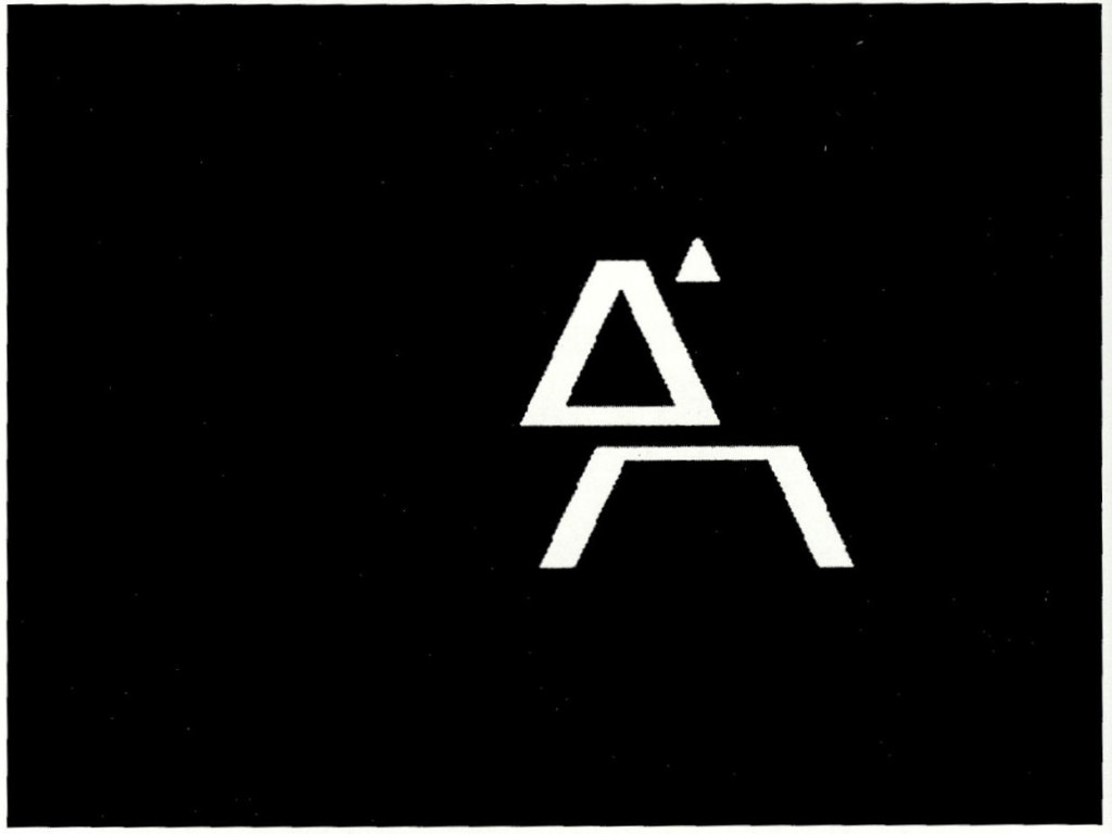
The following are from the same issue of Kalligram that the Poem poems I’ve been featuring here are from:


Shifted A

Shifted L

I call these textual visimages–visual art whose subject is the visual appearance of language.  These are much more than simple designs, but I can’t quite put what they do into words yet.  Something about alteration. Or are they about building simple things that will prove to have vast consequences?  Of course, they are also “just” variations, highly elegant variations, on letters.

.

AmazingCounters.com

Textual Designage « POETICKS

Archive for the ‘Textual Designage’ Category

Entry 1551 — 2 by Nico Vassilakis

Wednesday, August 27th, 2014

The following are from the same issue of Kalligram that the Poem poems I’ve been featuring here are from:


Shifted A

Shifted L

I call these textual visimages–visual art whose subject is the visual appearance of language.  These are much more than simple designs, but I can’t quite put what they do into words yet.  Something about alteration. Or are they about building simple things that will prove to have vast consequences?  Of course, they are also “just” variations, highly elegant variations, on letters.

.

AmazingCounters.com

Entry 1478 — The Beach!!

Sunday, June 8th, 2014

The latest issue of Bill DiMichele’s always excellent netzine, Tip of the Knife, is out. Among my many favorites in it was this, by Ali Znaidi (who is new to me):

Stop! It's the beach. An Asemic Writing by Ali Znaidi

Stop! It’s the beach. An Asemic Writing

It swept Bill into “a seascape with shiny pebbles and beach umbrellas. There are sand castles rising from the shore, aiming for that Sunday blue sky above us all, for those playful children enjoying cotton candy and drawing pictures with driftwood.”  Bill goes on the speak of loving “the soul Ali empties into the depths of the ocean, the swimmers riding peaceful currents, doing a high dive, dallying with mermaids among their coral language homes,” and I know just what he means, although the details of my interpretation of this multi-interpretable work differ from his.  The work is clearly an inspired celebration of the beach as, well: “!!”

I hope to return to this tomorrow with a few better words for what I get from it than I have right now.

.

 AmazingCounters.com

Entry 1110 — Commercial Visiotextual Art

Tuesday, June 4th, 2013

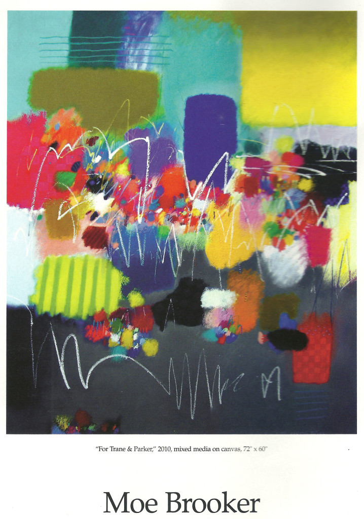
One of my very lazy entries, just two steals from ARTnews.

MoeBroker1

This one is an example of what many Spidertangle artists would call “asemic poetry,” but which, unlike just about everything with that tag, gets into New York galleries or the equivalent.  Why?  It certainly is no better than much of the pieces shown at Spidertangle, although I do like it–the colors and shapes much more than the scribbling.  Is it only because made by certified painters rather than people coming out of, or too associated with, poets.  For one thing, artists like Brooker never think of their work as poetry of any kind.

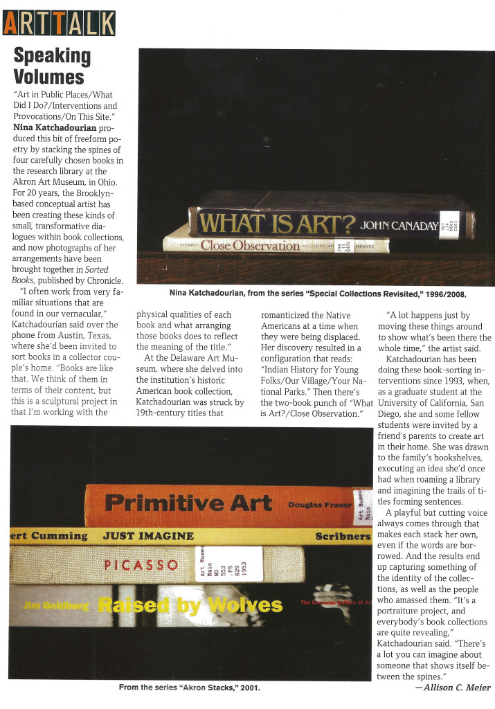
ArtTalkJune2013

A related example that I don’t at all like.  In the spirit of Jenny Holzer.  Yeah, makes yuh think but who in the world would hand it on their walls?  On the other hand, like the Weatherly Dixie Cups, these bookspines could work as elements of my long divisions.  That, needless to say, would complicate them beyond all possibility of being written up in ARTnews.

.

Counter

Entry 1093 — Thoughts Regarding Minimalism

Saturday, May 4th, 2013

I suppose the minimalist artwork below is not bad, but seeing it in the latest issue of ARTnews depressed me, reminding me that minimalist painters, even mediocre ones like Hanne Darboven seemed from this one example to be, were continuing to make big bucks forty or more years after the birth of minimalism while someone like me is making the most money of his life after fifty years or so of adulthood because of food stamps. . . .

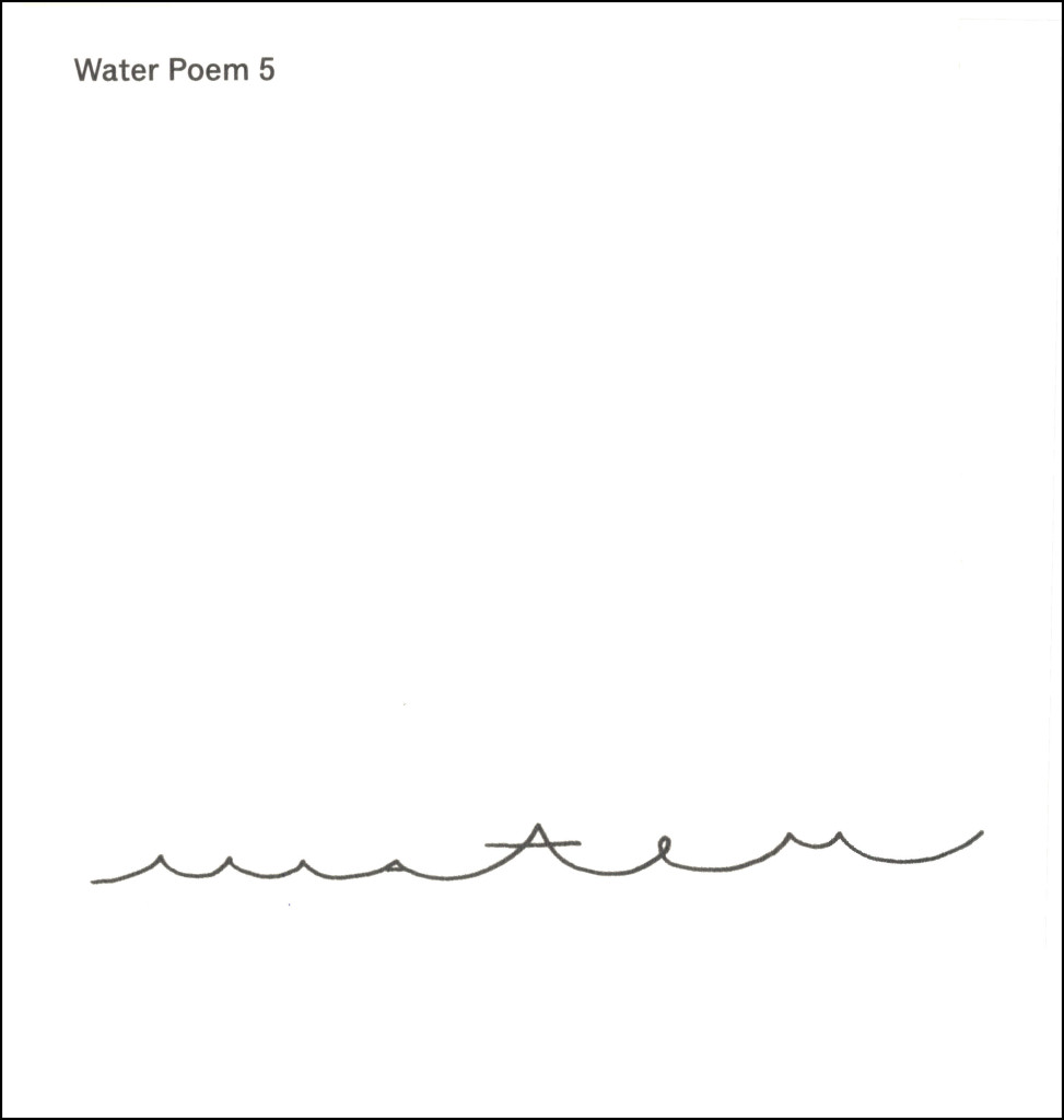
Note from 1 February 2014 when I was reviewing the past year.  Apparently the computer problem mentioned in my next entry screwed up this entry.  The reproduction of the Darboven visimage got deleted and all my further comments.  No doubt they had to do with the following specimens of much better specimens of minimalism I found by bp Nichol (the top one) and Irving Weiss the other two:

WaterPoem5


WaterIntoWordX


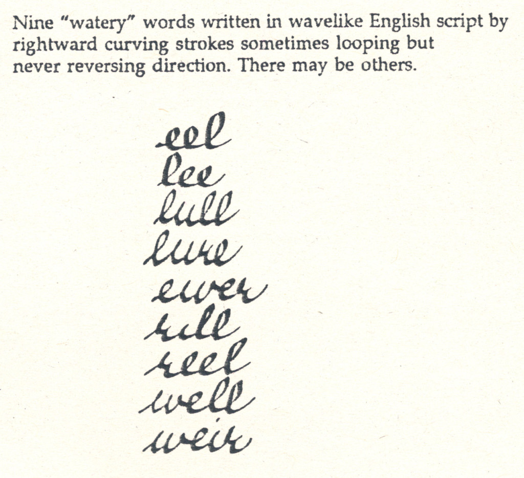
WateryWords


I’m sure I had fascinating things to say about them.

.

Entry 1091 — Waves

Thursday, May 2nd, 2013

I had all kinds of trouble getting the following images into this post, and I’m exhausted, so won’t say much about them until tomorrow.  I will say that I consider the top one an example of what has been wrong with the arts world for the past 40 or more years.

Darboven01x.
WaterPoem5

.

WaterIntoWord

.

WateryWords

.

Entry 1014 — “Haiku #53″

Thursday, February 14th, 2013

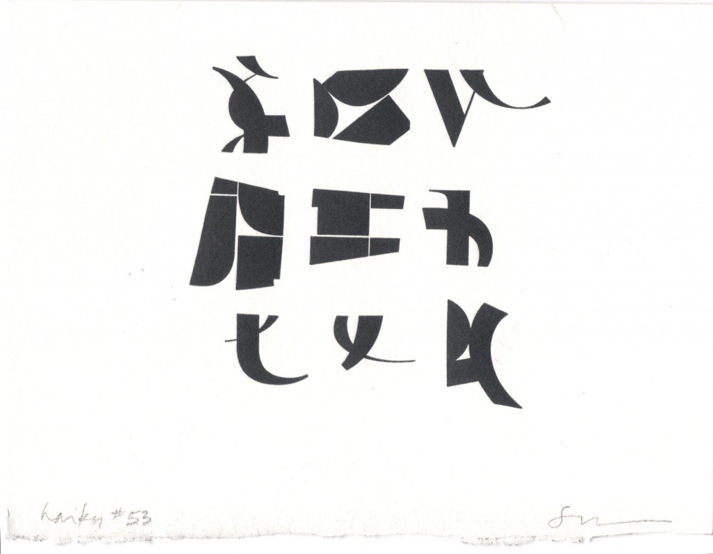
Once again, I’m too out of it tp do more here today than post a poem.  No matter that the poem I’m posting isn’t a poem but a pen&ink visimage of a poem.  It’s from Scott Helmes’s ongoing series of translations of haiku into what I call textual designs.  This one arrived with a mail art project he invited me to contribute to and I hope to, if my brain will only revive enough to help me.


It seems to me the epitome of haiku-elegance.  So many wonderful touches, like the only image of the nine the piece consists of that is nowhere curved is the central one.  The bird I see at the top left is its “season word.”  If even the quarter-mind I’ve been operating on of late can see even those things, how much must be there for those with fully-functional (observing) brains–and is there, even for me, but only in pieces in different parts of my brain, unintegrated, ununderstood in the fullest sense of “understood.”

Note: at first I posted this image cropped; I realized that it worked better with its margins restored so restored ‘em.

.

Entry 1009 — One More from Do Not Write

Saturday, February 9th, 2013

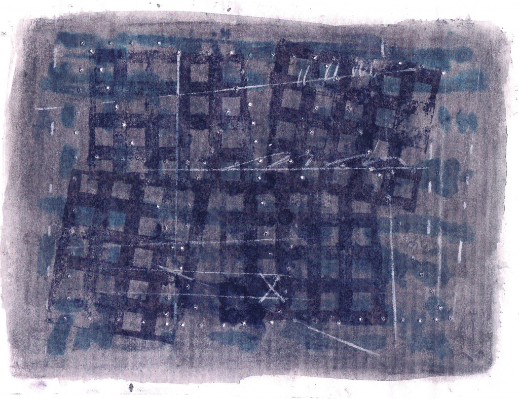
This one is by Carlyle Baker:


I find this image fascinating.  It’s not a poem, for me, but–for one thing–a visualization of a mind’s attempt to find an answer to some unknown but worthy question.  One of the mind’s tactics is a doubling back over what it is diagramming, stolidly diagramming.  It also employs a white abstract map it briefly scribbles notes toward some sort of understanding that fails to emerge–but it does pin down the location of the unknown involved (the X).    I also read in it (less compellingly) the narrative I read in almost all asemic works, the struggle of language to emerge, in this case from thick-lined networks forming layers away from what the language is struggling to speak of, with an abstract outline of what it apparently must include above it.  Or the map of a big city, or a close up of a side of such a city . . .

.

Entry 956 — “Not Worth a Title, No. 1″

Tuesday, December 18th, 2012

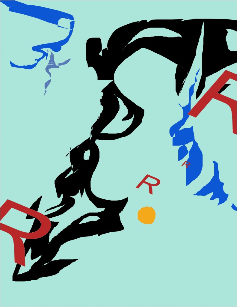
I’ve finally returned to Paint Shop to fool around, something I’ve been too blah to do for several weeks.  The result is nothing I’d want considered part of my oeuvre, but I’m too nowhere to find anything better to take care of this entry with, so here it is:

.

Entry 910 — My Bad Artwork Again

Friday, November 2nd, 2012

Here’s my bad artwork again.  I’m dead in the head, again, and have had a busy day–5 hours helping set up a local Arts & Humanities council show–a bunch of tables for craftspeople and painters, etc., to display and try to sell wares, and organizations trying to sell tickets and/or memberships like our local theatre group.  A way of circulating, and fun, but tiring.  Anyway, I’m just going to say a few things about the work–which I’ll call “mp” for the time being.
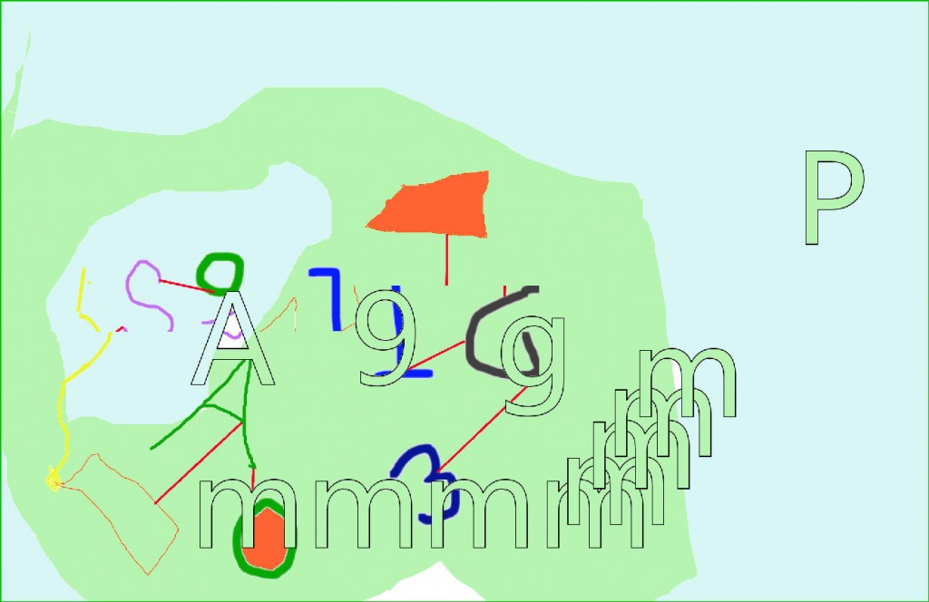
First off, let me say that it’s as hard, and important, to show why an artwork is a failure as it is to show why it is a success.  Against some views, I hold that one way to show that a work is bad is to point out what it does not have.  This one, for me, does not have what I consider the most important thing any work must have, a unifying principle.  Many artists sneer at the need for one, but their best works always have one, and I believe they  recognize that intuitively.  “MP” has no design focus that I can see.  No conceptual center, either.  If it had both, would they be in the same place?  I don’t know.

This thing makes me think of golf, and I don’t like gold.  What do the red lines say?  Nothing, to me.  I do like the 9 repeating in the nearby g but it’s momentarily interesting  without connecting to the rest of the piece.  I like the climb of the m’s, but–again–where are they going and why?  I’m seeing random graphics, nothing more. 

Pointing out what’s bad helps us better experience the absence of those thing in good art; having what a bad work lacks pointed out helps us better expreience what is in a good work that makes it good.  Now, I am not contending that some bad in a work would be bad in any other work.  Although some bads, like lack of a unifying princile, I consider universally bad.  Tone is part of any good work’s unifying principle, and some elements of the work which seem bad in some respects may, if necessary for tone, prove good.  A clumsy syntactical step in a formal poem becomes more good than bad if it is required by the meter.

Gad, I’m sleepy. 

.

count internet trafficLow Airfare Deals

Entry 909 — A Bad ArtWork

Thursday, November 1st, 2012

I made the following myself and think it stinks.  The question is why?  What’s wrong with it?  I hope to return to it tomorrow.  It’s here, by the way, for the usual reason: I had nothing better to post today.

.