Entry 360 — Thoughts about Definitions
Mathematical Poetry is poetry in which a mathematical operation performed on non-mathematical terms contributes significantly to the poem’s aesthetic effect.
Mathematics Poetry is poetry about mathematics.
Neither is a form of visual poetry unless a portion of it is significantly (and directly) visio-aesthetic.
The taxonomic rationale for this is that it allows poetry to be divided into linguexclusive and pluraesthetic poetry–two kinds based on something very clear, whether or not they make aesthetically significant use of more than one expressive modality, with the second category dividing cleanly into poetries whose definition is based on what extra expressive modality they employ–visual poetry, for example, employing visimagery; mathematical poetry employing mathematics; and so forth.
Directly. I mentioned that because there are some who would claim that a linguexclusive poem about a tree so compellingly written as to make almost anyone reading it visualize the tree is a “visual poem.” But it sends one to one’s visual brain indirectly. A genuine visual poem about a tree, by my definition, would use a visual arrangement of letters to suggest a tree, or graphics or the like directly to send one to one’s visual brain.
A confession. I’ve been using the pwoermd, “cropse,” as an example of a linguexlusive poem that muse be seen to be appreciated, but is not a visual poem. Yet it is almost a visual poem, for it visually enacts the combination of “corpse” and “crops” that carries out it aesthetic purpose. To call it a visual poem, however, would ignore its much more potent conceptual effect. I claim that it would be experienced primarily in one’s purely verbal brain, and very likely not at all in one’s visual brain. One understands its poetry as a conception not as a visimage. When I engage it, I, at any rate, do not picture a corpse and crops, I wonder into the idea of the eternal life/death that Nature, that existence, is. It is too much more conceptual than visual to be called a visual poem.
I had a related problem with classifying cryptographic poetry. At first, I found it clearly a form of infraverbal poetry–poetry depending for its aesthetic effect of what its infraverbal elements, its textemes, do, not on what its words and combinations of words do. It was thus linguexclusive. But I later suddenly saw cryptography as a significant distinct modality of expression, which would make cryptographic poetry a kind of pluraesthetic poetry. Currently, I opt for its being linguexclusive, for being more verbo-conceptual than multiply-expressed. A subjective choice. Taxonomy is difficult.
For completeness’s sake, a comment now that I made in response to some comments made to an entry at Kaz’s blog about my taxonomy: “Visual poetry and conventional poetry are visual but only visual poetry is visioaesthetic. The point of calling it ‘visual’ is to emphasize the importance of something visual in it. In my opinion, the shapes of conventional poems, calligraphy, and the like are not important enough to make those poems ‘visual.’ Moreover, to use the term ‘visual poem’ for every kind of poem (and many non-poems) would leave a need for a new term for poems that use graphics to their fullest. It would also make the term of almost no communicative value. By Geof’s logic we would have to consider a waterfall a visual poem because of its ‘poetry.’ Why not simply reduce our language to the word, ‘it?’”


![DSC_1536[12]](/wp-content/uploads/2011/04/DSC_153612-e1302650888895.jpg)


Hello,
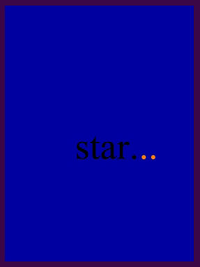
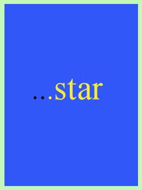
Interesting idea to leave out the last few syllables and replace with a visual iinstead. But the yellow ellipses need to be more vivid. I suggest darkening the background and increasing the saturation and brightness of the yellow. Also, the second line needs more description, less laundry list, I think. (Forsythia do not grow in California–I miss them. People not from the East or midwest may have trouble with the poem. Would the daff… work?)
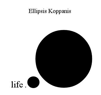
I like the second one , but kind of want a little more hint. I first put in “unknown immense” in my head then realized you may have meant “unknown expanse.” Would “the unknown immense…..” work?
I found it hard to make the yellow show enough from the beginning. I didn’t like my “list,” either. My problem is that I like the idea of colored dots for an ellipsis, and yellow for forsythia is good, too, but not enough. I would keep forsythia, by the way, even knowing there are people not familiar with it. They can look it up. Or look at the footnote my editors will surely provide (you know, fifty years from now when I’m dead and finally world-famous). I think I’ll just have to let the yellow dots sit in my brain until I get lucky and a way properly to use them occurs to me.
Ditto the second idea. Would “uni . . . rse” work better. My problem here is that it is either not easy enough to decode or too easy. No matter. I felt from the outset that my use of the ellipses within a ellipsis did work here.
Thanks for the comments, COnnie. They strengthened my misgivings about the poems.
–Bob
I hope the misgivings do not cause you to drop them entirely. Do you have Adobe Photoshop Elements? It is not cheap and takes awhile to learn to use, but is very powerful regarding color changes. I believe you could definitely get the first poem to work well with just a bit of tweaking. Darken the background, choose a different contrasting color for the words and use bright yellow for dots. Change mistiness to mist and you’ve got two more syllables to play with in the second line.
(And yes, forsythia is more interesting than daffodil. I had to rely on the footnotes for “oleander” before I knew they grew all over out here!)
Universe is the wrong syllable count for a haiku. I actually prefer the ellipses to stand for an unkown something in this haiku. Whatever… Good luck.
Cheers,
Connie
Good thinking, Connie–since they’re the same as ones I had, myself, but didn’t mention! (Really!)
I hope the misgivings do not cause you to drop them entirely.
I hope so, too, but don’t think they will.
Do you have Adobe Photoshop Elements?
I have Paint Shop, which I consider the Kmart version of Photo Shop, which I’ve used but can’t afford for myself.
It is not cheap and takes awhile to learn to use, but is very powerful regarding color changes.
Paint Shop does color changes nicely.
I believe you could definitely get the first poem to work well with just a bit of tweaking. Darken the background, choose a different contrasting color for the words and use bright yellow for dots.
Good thinking that I did not have is to change the color of the words. Only consideration is that I may want the words to be absolutely standard, to make the unstandardness of the ellipsis more pronounced. Changing the background is essential but difficult. I did make it a pale grey to try to help the yellow. A pale blue is another possibility. I don’t want dark grey or blue because it would start the poem already (possibly) too unstandard. Also, I want some kind of natural sky background for the ellipsis.
Change mistiness to mist and you’ve got two more syllables to play with in the second line.
Humorously, I changed “mist” to “mistiness” to get my syllable count, not able to find two syllables to add that I though worked.
(And yes, forsythia is more interesting than daffodil. I had to rely on the footnotes for “oleander” before I knew they grew all over out here!)
Hey, I don’t know what oleander is! For a haiku poet, I’m terrible with names of trees, bushes and flowers.
Among the possibilities I’ve come up with for repairing the forsythia poem are to forget forsythia and just go with something a better color for this idea. Another simply to use bigger textemes (if that’s my word for letters and similar elements, like punctuation marks). One thing I feel I’ll almost certainly use is bigger textemes and some kind of scenery inside the dots, like a close-up of forsythia in bloom.
Hmmm, how about “It’s April and the forsythia is in bl o o o” with the o’s filled in and yellow? Rhetorical question. I do think that idea has possibilities, though. . . . A poem in bl o o o
all best, Bob
Universe is the wrong syllable count for a haiku.
I know. Couldn’t think of a way to make that line five syllables. Gave up, knowing I only had a rough draft.
I actually prefer the ellipses to stand for an unkown something in this haiku. Whatever… Good luck.
My problem is that I really don’t know how I want to use it. Most of my ideas for visual poems begin with a gadget like colored ellipses that I play with until I suddenly see what I can make the gadget mean. Then I work on the text until I think it makes that meaning reasonable clear.
Thanks for your comments. With mine, they provide a good demonstration of what should be going on in the head of a poet but seems not often to. A danger is making a rationale for a poem too overt, but the reverse danger, not bothering to connect a poem to a rationale, is worse, I think.
–all best, Bob
Yes, I see why you want to keep a black text in the first haiku. A bright sky blue should contrast well with yellow.