Archive for the ‘Commercial Art’ Category
Entry 1596 — My Cover Poem
Thursday, October 9th, 2014
Directly below is the cover featuring the design Craig Kaplan and I came up with for the latest issue of The Journal of Mathematics and the Arts. Beneath it, from the bottom up, are my initial rough draft for the cover, then two drafts of mine (from several) combining ideas of Craig’s and mine. The poem is my “Mathemaku No. 10.”
From down&dirty to fairly high-grade commercial art, it seems to me. Two equal but different expressions of aesthetic taste. If we had gone with my initial version, I would have wanted to boost its resolution and possibly made the heart-sequence more like the sequence in the one just above it–i.e., made the upward movement less predictable. I hadn’t realized when I made my first version that the lay-out of the cover was rigidly the way it is in the top image: image in square to top right, name of publication, image in square to bottom right. I’d have a single image take up the entire page with the publication data on top of it around two thirds of the way up. Different strolks for different fokes. Also a good demonstration of why I’ve never made any money from what I’ve done in the arts.
.
Entry 1160 — Commercial Art Specimen
Tuesday, July 23rd, 2013
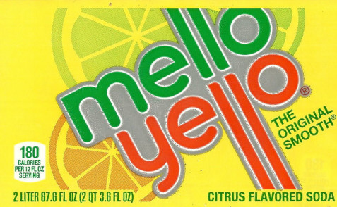
I’ve always said that many commercial artists do work as good as “real artists.” The difference is simply their central goal, which is to persuade someone to buy something, however much they may at times also want to create a thing of beauty. So they are not making art, they are making advocature. I find the label below a wonderful specimen of advocary visiotextual art, but not of advocary visual poetry. A main reason I’m posting is to again make a point about what visual poetry is and is not. This is just an ornamented word. Excuse please, I should say that this is a beautifully-ornamented word, and one should be grateful for it, but that a visual poem, even an advocary visual poem, will do much more. Now if my creative brain hadn’t blown all sixteen of its fuses last year, with no new shipments of fuses due from Uranus until my next life, I’d show you what the melloyello logo would look like as a genuine advocary visual poem. That not being possible, I’ll just say it’d do something to make its visual appearance a metaphor for its text.
On the other hand, the lemon and orange slices seem pretty close to o’s–citrically mellowing beyond the o’s ending the text’s two words . . . Note: I think I couldda made a lot of money in advertising.
.


