ARTnews « POETICKS

Archive for the ‘ARTnews’ Category

Entry 1111 — More Commercial Visiotextual Art

Wednesday, June 5th, 2013

Today I’m just bringing you more ARTnews evidence of artists not calling themselves visual poets who seem to be doing much better in the BigWorld than those of us doing the same kind of work much better but calling it visual poetry:

GillmoreSinghWallengrenMarch2013

Gillmore’s piece is better than anything by Jenny Holzer, but Wallengren’s isn’t.

.

Emily Sessions « POETICKS

Archive for the ‘Emily Sessions’ Category

Entry 857 — A Crossword

Monday, September 10th, 2012

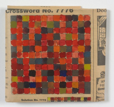
Stephen Dean: “Untitled (Crossword),” 1996–from http://www.artequalstext.com/stephen-dean.


I’m not sure what to say about this.  Emily Sessions says interesting things about it and similar pieces by Dean at the website I stole the above from (which has two other Dean works–and, as I’ve mentioned here before, a large quantity of combinations of text and graphics that visual poets should definitely take a look at.  The website, which is curated by Rachel Nackman, will soon be updated, I understand.

After reflection, I’ve classified this as a visimage (work of visual art). Whereas Emily Sessions thinks of it as an entrance to an underlying universe of colors, it seems to me an act of–well–desecration; Dean has stolen the crossword grid from anyone who wanted to solve it. His repayment, needless to say, more than makes up for the crime (the crossword, after all, will still be available in many other copies of the newspaper it’s in) by doing what Sessions says it does–although it seems more an overlaying of another universe than an entrance into one, for me.  Klee seems to me the magician these magick squares are most in the tradition of.  But they enter the day-to-day of social interactivity in a way Klee’s works do not (as Sessions points out).

My thought at this point, as I consider the work for the first time from my critical zone, is that it surprises one out of a readiness to obey rules, pursue a goal, use analysis–in the familiar context of a newspaper’s entertainment section–and into . . . colors, nothing more. Or, to elaborate, into a purely aesthetic experience one can flow unanalytically, goallessly, freely with.  Yet, a final, numbered order remains ever-so-slightly  visible . . . this newness is safe.

.

Theo Breuer « POETICKS

Archive for the ‘Theo Breuer’ Category

Entry 879 — Asemic Visimagery, Part 2

Tuesday, October 2nd, 2012

Here we are again.  Hold on tight, because this is going to be very controversial!  But, not, I’m afraid, newly controversial.  It’s about my art taxonomy against most of the rest of the art world’s again. 

First controversy: that the term “art” is a stupid term to use to refer to visual art since, (1) it also confusingly refers to art-in-general; (2) it suggests that the visual arts are secondary art by reducing the name one has to use for them when discussing all the arts to “visual art,” an adjective and general term, unlike the auditory art of music and the verbal art of literature, while suggesting the reverse, that it is the primary art, a rank higher in status than mere music and literature; and (3) the adjective derived from “art” is ambiguous (e.g., “if Joe is “artistic,” is he good at painting, or playing the piano, or something else?  Ditto is his said to be “artistically sensitive”), and there is no good adjective derivable from “visual art” . . . well, except for “visioartistic.”  The only good reason to use “art” to mean “visual art” is that it has seniority.  For these reasons, and not narcissistically to  be king of the lexicon or something, I use my coinage “visimagery” for “visual art.”  Over the years I’ve tried many coinages.  This, which comes out of “visual imagery,” is the one I’ve elected to stick with.  Its adjectival form, “visimagistic,” is homologous (if that’s the right word) with “imagistic” as in “imagistic poetry” (for poetry focused on the image).  VIHZ ih muhdj ree and VIHZ ih muh JIHS tihk.

Hey, this may be the one hundredth time I’ve formally argued for a replacement of “art” and “visual art” as the names of . . . visual art.  No one has yet agreed with me.  That’s only good evidence that I’m right, not proof.

Controversy number two, if only among “asemic poets”: the works that follow are not a form of poetry and, for that reason, should not be called “asemic poetry,” or visual poetry.”  When such works are produced by painters, exhibited in “art” museums (why isn’t a library a “verbal museum?”), it is never called poetry (except metaphorically by philogushers–i.e., lovers of gush).  How does it become poetry when put in magaszines like Asemic magazine?  I am aware that by putting a urinal in a visimagery museum, one does contextualize it into actually becoming art–which is to say, that it causes viewers to reperceive in, attach new connotations to it, experience it in a different, visimagistic part of their brains than they did when seeing it in a men’s room (assuming they truly noticed it).  By analogy, does putting works like the two below in a book or magazine labeled a collections of poetry, and perhaps containing work that few would deny is poetry (as the magazine these are in does not), make it poetry?

I say no, because while the urinal is visually perceived and therefore satisfies a major criterion for visimagery, the works below are not verbally perceived–i.e., cannot be read, assuming the handwriting of the one on top is as undecipherable as writing to others as it seems to be for me.  Furthermore, the works below are clearly much more visual than anything else, so why not call them a form of visimagery?  Why not call them what I want them to be called, “textual visimagery?”  (For me, all the pre-verbal symbols of our language–letters, punctuation marks, numerals, etc.–are “textual”. . . until they form words, or convey a significant amount of verbal information as I believe punctuation marks do–for instance, an isolated question mark–which I would argue might be pronounced, “hunh?” at which time they become “verbal.”

There is for me a big difference between the textual and the verbal.  I believe we experience both in a textual part of the lingusitic part of our brains (which I call the verbaceptual sub-awareness), but also experience the verbal but not the solely textual in the lexical part of our brains.  Hence, one’s experience of asemic work like the those below is fully visual but only half-verbal.  Which is a virtue!  It allows the work to have subtle textual effects (very much like the textural effects of many paintings) that are not overwhelmed by verbal effects.   Hence Nancy Brush-Burr’s work, the top one below, does become a sort of poem cue to its evocative power as some kind of wildly emotional letter become verbally incoherent–while achieving visual expressiveness concerning (for me) the circle, or O, approximately in the center of the work.  It seems the objects of an oceanic upward flow of communication gone past comprehension, and–to the left–become hysteric (?), or for some other reason shattering up toward the circle.

Indeed, the work may be a visual poem, after all, for I’ve always been aware of the third line down as “Dear D-somebody”–in a calm before the possible “you” to the right immmediately below the “Dear D-somebody” cause the intense (passionate) star-birth eruption centered by the afore-mentioned O.

Okay, now I’ve revealed both sides of my, uh, condition: excess rationality and beserk intuipretationality!  Whee!

The simple idea I meant to focus on here is that while some asemic work may be literary, most of it is visimagery which takes language and/or textuality as its subject.  This seems to be fully the case with the bottom work below, by Theo Breuer.  Very much, for me, a Duchampian artwork-by-recontextualization.  But Breuer does more than make a textual work visimagistic through recontextualization–he makes what I would term a work of “informrature” appear or not become a work of literature.  He uses text as informational data rather than aesthetic data, as I hold “literature” is, to depict literature–to give the feel of a literary work, in interesting tension with the cut&dry data for machines-only the bulk of the piece consists of.

But there may be seismographic utterances rising to notice, too.  A different sort of textuality.  Or a real language from an ancient civilization, or future dimension . . .

Enough for today, I think. 


 .

Entry 878 — Asemic Visimagery

Monday, October 1st, 2012

 The images below are from the third issue of a zine from Australia called, Asemic magazine, compiled, designed & published by Time Gaze.  I don’t know when it was published.  I found it in a file drawer of mine in a hanging folder marked something like “Work to be looked at More Closely” with three or four other like items from anywhere from four to eight years ago.  Needless to say, I never looked at them “more closely.”  So much stuff in my house like that.  Anyway, a day or two ago I was looking for something else, which I never did find, and thought I might use some of the stuff in this drawer I should have marked, “Kept Out of Sight to Prevent Data Overload,” in my blog–which is what I’ve been trying to do for the past three hours.  My computer and/or the Internet is fighting me.  I failed several times to upload the images, and succeeded only to lose them two or three times.  Right now they seem to be in the entry below.

The top one is by Nancy Brush-Burr, the other by Theo Breuer.  Like almost all the pieces in the zine, they are untitled.  I selected them randomly, finding it almost impossible to rank them according to aesthetic value–which is not to say I didn’t find them well worth “looking at very closely.”  More on that tomorrow–if I manage to get both the images and what I’ve just typed posted today.

.

Graham Gillmore « POETICKS

Archive for the ‘Graham Gillmore’ Category

Entry 1111 — More Commercial Visiotextual Art

Wednesday, June 5th, 2013

Today I’m just bringing you more ARTnews evidence of artists not calling themselves visual poets who seem to be doing much better in the BigWorld than those of us doing the same kind of work much better but calling it visual poetry:

GillmoreSinghWallengrenMarch2013

Gillmore’s piece is better than anything by Jenny Holzer, but Wallengren’s isn’t.

.

Greg Evason « POETICKS

Archive for the ‘Greg Evason’ Category

Entry 898 — “The Blind Canoe”

Sunday, October 21st, 2012

I’m posting the following here because I like it, and because I have nothing else to post today:

 “The Blind Canoe” by Greg Evason. From The Last Vispo Anthology, coming in October.

For anyone happening here who is interested in its taxonomical class, which isn’t easy to specify, in my system, it’s a musical visimage, not a visual poem (because its few words do not contribute significantly to its aesthetic effect).

.

Entry 860 — More Miscellaneants

Thursday, September 13th, 2012

From the same box the other items I’ve been posting were from:


John M. Bennett sent me the cow; I don’t know who made it; I don’t know who made the piece featuring the four-suit King, or where it came from.  I’m pretty sure the bottom piece is by John Byrum.

.

Royce Weatherly « POETICKS

Archive for the ‘Royce Weatherly’ Category

Entry 1107 — ARTnews “Critic’s Pick”

Saturday, June 1st, 2013

This also is from the June issue of ARTnews. 

CriticsPickJune2013

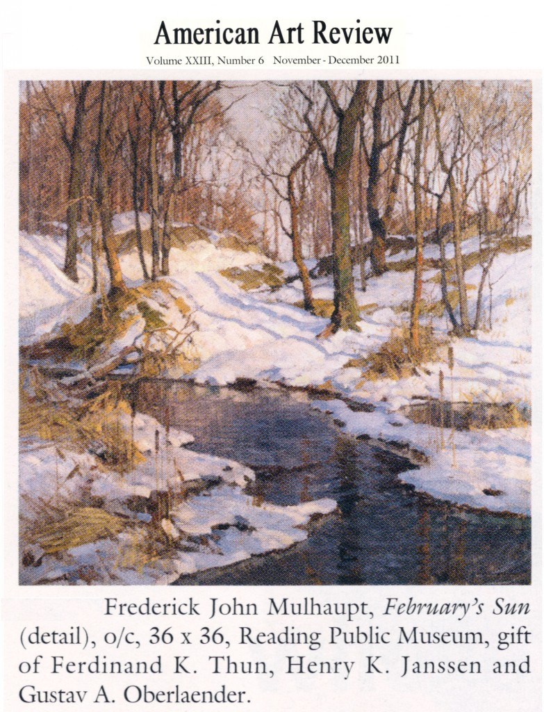
Okay, Weatherly is a fine craftsman, and his still life is interesting–a fine expression of  a now widely-accepted value of superior art: its reminding us of the ability of the ordinary to provide aesthetic delight.  But nothing more.  Thinking about why brought to mind Williams’s red wheelbarrow, but much better.  Or does it?  I think so because both works present ordinary objects sensitively-arranged.  But Williams’s arrangement is also a poem.   Weatherly presents a cup, Williams a wheelbarrow–and something made of words, beautifully-made of words.

.

Stephen Dean « POETICKS

Archive for the ‘Stephen Dean’ Category

Entry 857 — A Crossword

Monday, September 10th, 2012

Stephen Dean: “Untitled (Crossword),” 1996–from http://www.artequalstext.com/stephen-dean.


I’m not sure what to say about this.  Emily Sessions says interesting things about it and similar pieces by Dean at the website I stole the above from (which has two other Dean works–and, as I’ve mentioned here before, a large quantity of combinations of text and graphics that visual poets should definitely take a look at.  The website, which is curated by Rachel Nackman, will soon be updated, I understand.

After reflection, I’ve classified this as a visimage (work of visual art). Whereas Emily Sessions thinks of it as an entrance to an underlying universe of colors, it seems to me an act of–well–desecration; Dean has stolen the crossword grid from anyone who wanted to solve it. His repayment, needless to say, more than makes up for the crime (the crossword, after all, will still be available in many other copies of the newspaper it’s in) by doing what Sessions says it does–although it seems more an overlaying of another universe than an entrance into one, for me.  Klee seems to me the magician these magick squares are most in the tradition of.  But they enter the day-to-day of social interactivity in a way Klee’s works do not (as Sessions points out).

My thought at this point, as I consider the work for the first time from my critical zone, is that it surprises one out of a readiness to obey rules, pursue a goal, use analysis–in the familiar context of a newspaper’s entertainment section–and into . . . colors, nothing more. Or, to elaborate, into a purely aesthetic experience one can flow unanalytically, goallessly, freely with.  Yet, a final, numbered order remains ever-so-slightly  visible . . . this newness is safe.

.

Curators mentioned in Entries « POETICKS

Archive for the ‘Curators mentioned in Entries’ Category

Entry 857 — A Crossword

Monday, September 10th, 2012

Stephen Dean: “Untitled (Crossword),” 1996–from http://www.artequalstext.com/stephen-dean.


I’m not sure what to say about this.  Emily Sessions says interesting things about it and similar pieces by Dean at the website I stole the above from (which has two other Dean works–and, as I’ve mentioned here before, a large quantity of combinations of text and graphics that visual poets should definitely take a look at.  The website, which is curated by Rachel Nackman, will soon be updated, I understand.

After reflection, I’ve classified this as a visimage (work of visual art). Whereas Emily Sessions thinks of it as an entrance to an underlying universe of colors, it seems to me an act of–well–desecration; Dean has stolen the crossword grid from anyone who wanted to solve it. His repayment, needless to say, more than makes up for the crime (the crossword, after all, will still be available in many other copies of the newspaper it’s in) by doing what Sessions says it does–although it seems more an overlaying of another universe than an entrance into one, for me.  Klee seems to me the magician these magick squares are most in the tradition of.  But they enter the day-to-day of social interactivity in a way Klee’s works do not (as Sessions points out).

My thought at this point, as I consider the work for the first time from my critical zone, is that it surprises one out of a readiness to obey rules, pursue a goal, use analysis–in the familiar context of a newspaper’s entertainment section–and into . . . colors, nothing more. Or, to elaborate, into a purely aesthetic experience one can flow unanalytically, goallessly, freely with.  Yet, a final, numbered order remains ever-so-slightly  visible . . . this newness is safe.

.

Moe Brooker « POETICKS

Archive for the ‘Moe Brooker’ Category

Entry 1110 — Commercial Visiotextual Art

Tuesday, June 4th, 2013

One of my very lazy entries, just two steals from ARTnews.

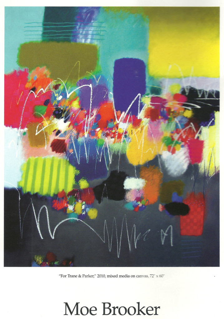
MoeBroker1

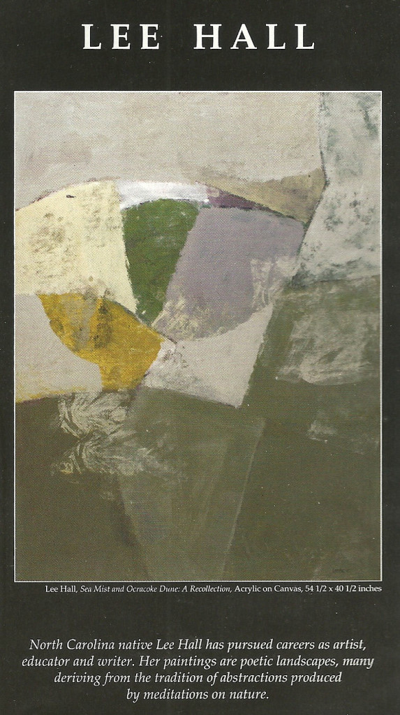
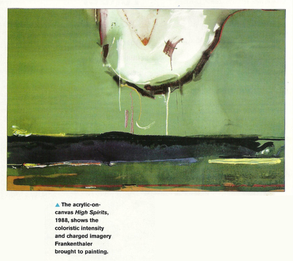
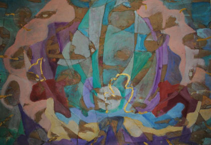
This one is an example of what many Spidertangle artists would call “asemic poetry,” but which, unlike just about everything with that tag, gets into New York galleries or the equivalent.  Why?  It certainly is no better than much of the pieces shown at Spidertangle, although I do like it–the colors and shapes much more than the scribbling.  Is it only because made by certified painters rather than people coming out of, or too associated with, poets.  For one thing, artists like Brooker never think of their work as poetry of any kind.

ArtTalkJune2013

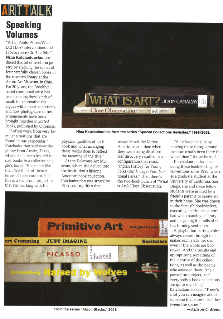
A related example that I don’t at all like.  In the spirit of Jenny Holzer.  Yeah, makes yuh think but who in the world would hand it on their walls?  On the other hand, like the Weatherly Dixie Cups, these bookspines could work as elements of my long divisions.  That, needless to say, would complicate them beyond all possibility of being written up in ARTnews.

.

Counter

Ebenezer Singh « POETICKS

Archive for the ‘Ebenezer Singh’ Category

Entry 1111 — More Commercial Visiotextual Art

Wednesday, June 5th, 2013

Today I’m just bringing you more ARTnews evidence of artists not calling themselves visual poets who seem to be doing much better in the BigWorld than those of us doing the same kind of work much better but calling it visual poetry:

GillmoreSinghWallengrenMarch2013

Gillmore’s piece is better than anything by Jenny Holzer, but Wallengren’s isn’t.

.