Archive for the ‘Roland Packer’ Category
Entry 542 — Thoughts about Haiku
Monday, October 24th, 2011
Arriving with the latest issue of Haiku Canada Review was a broadside containing the winners of several haiku contests run by the Haiku Canada organization. The best, I felt, was the winner (by Pamela Cooper) of the Canada division:
hanami picnic–
more blossoms
than sky
A hanami picnic is a traditional Japanese way of celebrating the flower blossom season, the comments by contest judge an’ya tells us. The blossoms in question are generally cherry blossoms. When I first read, and liked, this haiku, I quickly decided it was not quite A-1. That’s because I failed to perceive any archetypal core, and I feel any haiku–any poem–requires that to be A-1. It was an expression of Nature in an unusual state, delightfully evoking multitudes of cherry blossoms–and patches of sky. Sensitivity, compactness (just six words), even a nice touch–for North Americans–of exotic foreignness. Too bad it hadn’t the depth an archetypal core would have given it.
A day later, thinking about what I was going to type here, I realized I’d again been off. Of course it had an archetypal core! It referred, in fact, to what I consider the absolute top such feature there is: the coming of spring.
Roland Packer’s Poem, “fantasea,” featured here yesterday, is a “pwoermd,” or one-word poem. Is it also a haiku? It seems to be presented as one, sharing a page with conventional haiku (in French) in a magazine specializing in haiku. It’s a juxtapositioning of two images in a sort of tension with each other, which is the best superficial description of what a haiku is, I think. It’s about nature, and extremely compact. Some would call it a senryu, taking it as a joke. Iwouldn’t be upset by that, but I find it serious. It reminded me of Keats’s “faery seas forlorn” (if I have that right), which those familiar with the Mind of Grumman will know is one of the few poetic ingots I continually return to in my poetry and criticism. The Packer poem verysimply tells us of the vast sea that fantasy is–for me, splendid sea, although it might also be a harmful sea for those lost in it rather than in command of it.
I think it worth noting that its last syllable brings what it mainly denotes out of the pure vague. A sea is not a very specific detail but it is real, and sensually rich in local particulars to just about anyone encountering the word for it. What most makes the poem a good one, though, is its freshness–the unexpectedness of its infraverbal twist. What about its archetypal core? I have to admit that a big problem with such a thing is that one can use ingenuity to find an example of it in almost any poem. So an archetypal core I find in a poem may not be there for another reader, who may be as right, or righter, than I. He may be wrong, too, for some covert archetypal cores will exist in poems their best readers find them in, as the one I found in the poem by Pamela Cooper. The one I claim for “fantasea” is simply “man’s inexhaustible imagination”–or “the power (for good) of the human imagination.” I suspect there are much better ways of putting that. Maybe I’ll find one of them someday.
Having to do with the same thing, for me, is the other haiku I posted yesterday, George Swede’s “bottomless, the well/ of dreams–a chickadee/ on the sill.” Its imagined portion is its “well,” its reality its “chickadee.” Fantasy and sea, imaginary garden and frog. One of the best things of this is the contrast of the chickadee with the ultimate size of the well of dreams. But also the suggestion of the fragility of life’s best partly dreamed, partly genuinely experienced moments–since the chickadee is apt to take flight at any moment. I find the well in it fascinating, too–real enough for a bird to perch on a tiny part of it–projecting, that is, into full reality. Note also that, as a well, it is something to draw from, which empasizes it as a source of the liquid from which the imagination creates the arts, without which life would not be worth living for most of us.
Entry 541 — Haiku Canada Review, Oct. Issue
Sunday, October 23rd, 2011
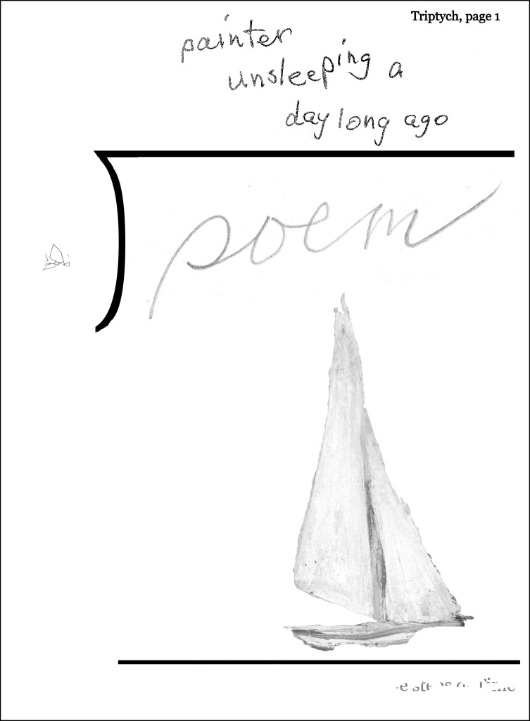
I just got the latest issue of Haiku Canda Review, long edited by my friend LeRoy Gorman. The first poem in it that caught my eye was this, by Roland Packer:
And here’s a nice variation (it strikes me) on Yeats’s description of “imaginary gardens with real frogs in them” (and quoted by Marianne Moore):
bottomless, the well
of dreams–a chickadee
on the sill
It’s by George Swede. Discussion tomorrow of both, and–perhaps–others.
.



“What most makes the poem a good one, though, is its freshness–the unexpectedness of its infraverbal twist.”
A superb statement of haiku impact, Bob. And I, too, happen to see the haiku potential in pwoermds, especially of the Huth variety. Geof has a genius for them, and some of them have hit me with the same force as the very best haiku.
And thanks for promoting the Canada haiku scene: we usually get lost sometimes in the transborder discussions
Thanks for the kind words, Conrad. I do think I’m pretty good as a haiku-commentator. And I’m always glad to publicize LeRoy Gorman’s excellent haiku review, which seems to me the best periodical around for haiku and haiku-related poems.