Nancy Brush-Burr « POETICKS

Archive for the ‘Nancy Brush-Burr’ Category

Entry 889 — Another by Nancy Brush-Burr

Friday, October 12th, 2012

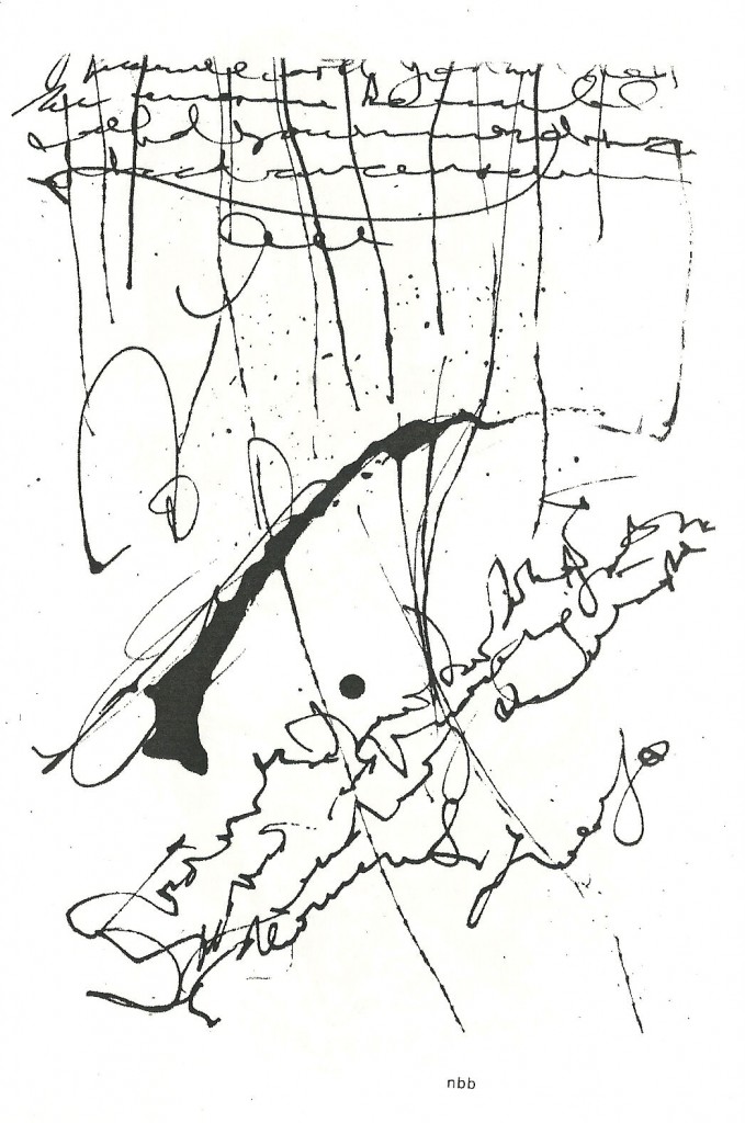
I love rain, so I see rain in this, and therefore love the work.  Even if no one finds rain in it but I.  More tomorrow, I hope.  I’ve just had a rough time with my computer, which for a while seemed to have crashed.  It’s okay, but the stress did me in.  (Please, if you’re just going to comment in order to denigrate the piece as scribbling or whatever instead of intelligently analyzing, hold off.)

 .

Entry 884 — Ruminations on Caffeine Plus a Brush-Burr

Sunday, October 7th, 2012

I’ve now had two caffeine-boosted days in a row.  Once again, I’m into what looks to be a null day.  I can’t think of anything it’d be worth taking a caffeine pill, with or without a part-opium pain pill, to work on.  I’d very much prefer not taking anything, but I have so much to do.  So, drug-dependent Bobby has just taken both pills at 11:19 A.M. e.s.t. this 7 October 2012.  

It seems, according to an Internet site, that caffeine is an Once in the brain, the principal mode of action is “a nonselective antagonist of adenosine receptors”–it connects to these receptors, in the process blocking adensonie from them.  Since it has no affect on the receptors, they keep doing what you do, which seems to be keeping us awake, and boosting our apparent and actual energy, so we feel good and work hard.  Adenosine clamps down on wakefulness and energy.  It seems to me a life-extender inasmuch as it slows you down, keeping you from over-doing anything.  I’m sure my adenosine got too influential, I’m not sure why.  I may be that I got to drinking too much Mountain Dew, the caffeine content of which shut down so many adenosine receptors that my body manusfactured a huge number too many of them in compensation.  This is why drugs generally end increasing whatever problem they at first helped one with.  I hope old age is the culprit, screwing me up by intentionally slowing me down, and went too far.  In any case, I may well be headed toward a state in which now amount of caffeine can help me.  My dosage at the moment is pretty low, though–the quivalent of two cups of mosts kinds of coffee.  I don’t see that I have any alternative. 

Well, maybe I do: maybe there some way to poison my adenosine receptors and whatever mechanism builds new ones.  The probable problem with that is that creativity requires wakefulness followed by null zones during which one accumulates necessary new data. . . .

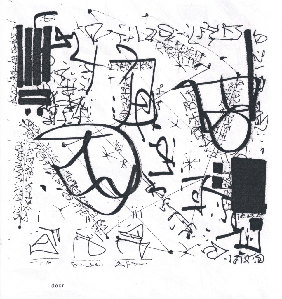
Hey, here’s something else asemic by Nancy Brush-Burr so you’ll get something out of this entry:


While waiting for this image to upload, I thought to myself what a wonderful good deed I was doing for nbb (with whom I’ve exchanged a few letters and/or e.mails but don’t know well–and am wondering if we are distant cousins, the Burr family being prominent in my genealogy [but Aaron is off to the side!]) by giving her work space here and making my everlastingly insightful comments on.  Up there on my peak, I credited her with deserving this favor.  From there my mind went to amusement on the way my drugs bring out my megalomania.  At once, I smiled at myself, observing that I was a megalmonai even without drugs, the difference being that with drugs I am a happy megalomaniac, without them an unhappy one.  A weird kind of manic-depressive, or so I’ve long believed.  Never darkening enough to overcome my instinct to stay alive, nor glistening Sol-levelly enough to go confront Obama in person for not shoveling a few billion of his pay-offs to the 47% to me.

Enough of me (if only for 2.3 minutes): this visimage of Nancy Brush-Burr’s is an absolutely zowwy picture of –hey, maybe my very own communicative excitement at times!  Not a poem, just a terrific representation of language thunder-storming into something glorious.

.


Entry 879 — Asemic Visimagery, Part 2

Tuesday, October 2nd, 2012

Here we are again.  Hold on tight, because this is going to be very controversial!  But, not, I’m afraid, newly controversial.  It’s about my art taxonomy against most of the rest of the art world’s again. 

First controversy: that the term “art” is a stupid term to use to refer to visual art since, (1) it also confusingly refers to art-in-general; (2) it suggests that the visual arts are secondary art by reducing the name one has to use for them when discussing all the arts to “visual art,” an adjective and general term, unlike the auditory art of music and the verbal art of literature, while suggesting the reverse, that it is the primary art, a rank higher in status than mere music and literature; and (3) the adjective derived from “art” is ambiguous (e.g., “if Joe is “artistic,” is he good at painting, or playing the piano, or something else?  Ditto is his said to be “artistically sensitive”), and there is no good adjective derivable from “visual art” . . . well, except for “visioartistic.”  The only good reason to use “art” to mean “visual art” is that it has seniority.  For these reasons, and not narcissistically to  be king of the lexicon or something, I use my coinage “visimagery” for “visual art.”  Over the years I’ve tried many coinages.  This, which comes out of “visual imagery,” is the one I’ve elected to stick with.  Its adjectival form, “visimagistic,” is homologous (if that’s the right word) with “imagistic” as in “imagistic poetry” (for poetry focused on the image).  VIHZ ih muhdj ree and VIHZ ih muh JIHS tihk.

Hey, this may be the one hundredth time I’ve formally argued for a replacement of “art” and “visual art” as the names of . . . visual art.  No one has yet agreed with me.  That’s only good evidence that I’m right, not proof.

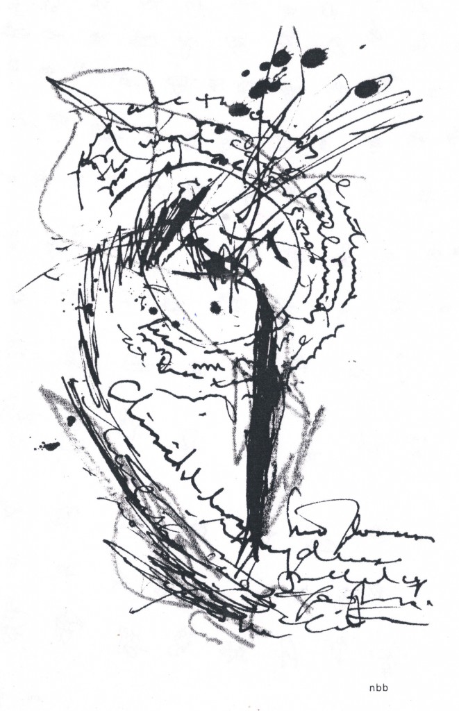
Controversy number two, if only among “asemic poets”: the works that follow are not a form of poetry and, for that reason, should not be called “asemic poetry,” or visual poetry.”  When such works are produced by painters, exhibited in “art” museums (why isn’t a library a “verbal museum?”), it is never called poetry (except metaphorically by philogushers–i.e., lovers of gush).  How does it become poetry when put in magaszines like Asemic magazine?  I am aware that by putting a urinal in a visimagery museum, one does contextualize it into actually becoming art–which is to say, that it causes viewers to reperceive in, attach new connotations to it, experience it in a different, visimagistic part of their brains than they did when seeing it in a men’s room (assuming they truly noticed it).  By analogy, does putting works like the two below in a book or magazine labeled a collections of poetry, and perhaps containing work that few would deny is poetry (as the magazine these are in does not), make it poetry?

I say no, because while the urinal is visually perceived and therefore satisfies a major criterion for visimagery, the works below are not verbally perceived–i.e., cannot be read, assuming the handwriting of the one on top is as undecipherable as writing to others as it seems to be for me.  Furthermore, the works below are clearly much more visual than anything else, so why not call them a form of visimagery?  Why not call them what I want them to be called, “textual visimagery?”  (For me, all the pre-verbal symbols of our language–letters, punctuation marks, numerals, etc.–are “textual”. . . until they form words, or convey a significant amount of verbal information as I believe punctuation marks do–for instance, an isolated question mark–which I would argue might be pronounced, “hunh?” at which time they become “verbal.”

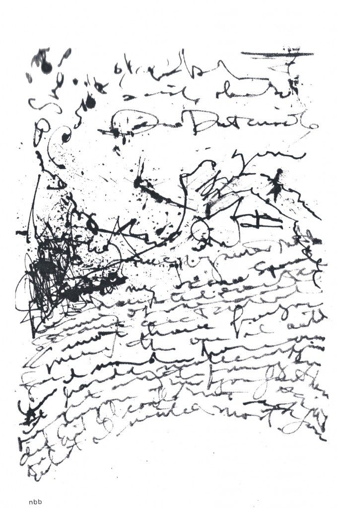
There is for me a big difference between the textual and the verbal.  I believe we experience both in a textual part of the lingusitic part of our brains (which I call the verbaceptual sub-awareness), but also experience the verbal but not the solely textual in the lexical part of our brains.  Hence, one’s experience of asemic work like the those below is fully visual but only half-verbal.  Which is a virtue!  It allows the work to have subtle textual effects (very much like the textural effects of many paintings) that are not overwhelmed by verbal effects.   Hence Nancy Brush-Burr’s work, the top one below, does become a sort of poem cue to its evocative power as some kind of wildly emotional letter become verbally incoherent–while achieving visual expressiveness concerning (for me) the circle, or O, approximately in the center of the work.  It seems the objects of an oceanic upward flow of communication gone past comprehension, and–to the left–become hysteric (?), or for some other reason shattering up toward the circle.

Indeed, the work may be a visual poem, after all, for I’ve always been aware of the third line down as “Dear D-somebody”–in a calm before the possible “you” to the right immmediately below the “Dear D-somebody” cause the intense (passionate) star-birth eruption centered by the afore-mentioned O.

Okay, now I’ve revealed both sides of my, uh, condition: excess rationality and beserk intuipretationality!  Whee!

The simple idea I meant to focus on here is that while some asemic work may be literary, most of it is visimagery which takes language and/or textuality as its subject.  This seems to be fully the case with the bottom work below, by Theo Breuer.  Very much, for me, a Duchampian artwork-by-recontextualization.  But Breuer does more than make a textual work visimagistic through recontextualization–he makes what I would term a work of “informrature” appear or not become a work of literature.  He uses text as informational data rather than aesthetic data, as I hold “literature” is, to depict literature–to give the feel of a literary work, in interesting tension with the cut&dry data for machines-only the bulk of the piece consists of.

But there may be seismographic utterances rising to notice, too.  A different sort of textuality.  Or a real language from an ancient civilization, or future dimension . . .

Enough for today, I think. 
 

 .
Entry 878 — Asemic Visimagery

Monday, October 1st, 2012

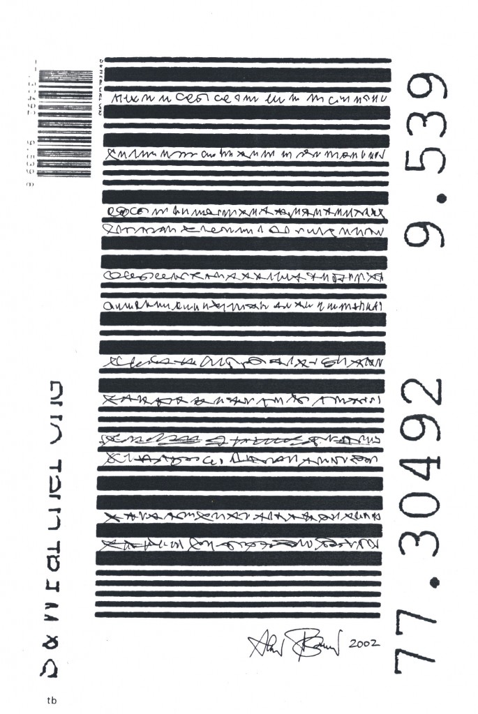
 The images below are from the third issue of a zine from Australia called, Asemic magazine, compiled, designed & published by Time Gaze.  I don’t know when it was published.  I found it in a file drawer of mine in a hanging folder marked something like “Work to be looked at More Closely” with three or four other like items from anywhere from four to eight years ago.  Needless to say, I never looked at them “more closely.”  So much stuff in my house like that.  Anyway, a day or two ago I was looking for something else, which I never did find, and thought I might use some of the stuff in this drawer I should have marked, “Kept Out of Sight to Prevent Data Overload,” in my blog–which is what I’ve been trying to do for the past three hours.  My computer and/or the Internet is fighting me.  I failed several times to upload the images, and succeeded only to lose them two or three times.  Right now they seem to be in the entry below.

The top one is by Nancy Brush-Burr, the other by Theo Breuer.  Like almost all the pieces in the zine, they are untitled.  I selected them randomly, finding it almost impossible to rank them according to aesthetic value–which is not to say I didn’t find them well worth “looking at very closely.”  More on that tomorrow–if I manage to get both the images and what I’ve just typed posted today.

.

Asemic Art « POETICKS

Archive for the ‘Asemic Art’ Category

Entry 915 — Lunacy (Stolte/Bennett)

Wednesday, November 7th, 2012

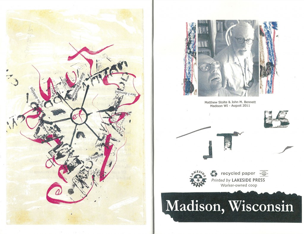
Matthew Stolte is a young friend of mine whom I know only through the mail and the Internet, and John M. Bennett is an older friend of mine whom I’ve actually been within a foot or less of more than once!  They both do work I greatly admire, so you should understand that when I call their chapbook collaboration of 23 pieces (which includes the graphics on both sides of each cover), Jem Tabs, lunacy, I mean greatly to compliment it.  See below for its final interior piece and the inside of its back cover (and left-click it to see it better):

Fantasy Scenario Number Two: Jesus pays a visit to me and tells me I have two choices: (1) live healthily to the age of a hundred but continue having the sort of days I’ve had all my life–i.e., neither horrideously crappy nor particularly whoopeeic, or (2) spend a week with a 100 wacks like Matthew and John (hmmm, Jesus and Matthew and John?), each of whom has been hypnotized, if necessary, to want to spend twelve hours of each day we’re together, collaborating on works like the ones in Jem Tabs, and then leave this mortal coil in some innocuous manner.   Easy choice.  In other words, John and Matthew’s collabs make me drool to collaborate with either–or with the many others in our field known to enjoy collaboration.  In fact, I can’t think of any such collaborations I’ve seen that don’t have a similar effect on me.  Why aren’t I begging people to collaborate with me, then?  Too much else on my plate at the moment.

One general thought about the two pieces above: that one unarguable thing they convey is the pleasure (I almost want to say, “the ecstasy,” but that would be an exaggeration) of the search for meaning, even though it may often not fully succeed, and even sometimes find hardly any large meaning.  Most do lead one to enough discoveries to make one feel good, though.  That’s all that almost any search for meaning will do.  In the piece to the left above, I see, “shut close facet,” with the latter suggesting “focus,” because the its first four letters could be “focu,” and it ends in the center of a focusing wheel.  Then comes the whirl of the request of the reader, or someone, to “set the dribbling/ from (the speaker’s) trembling/ face,” etc. around a triangle of visimages that include what looks to me to be a human ear that is also a tunnel.  Much of a where keeps those caught in anthragreement with John and Matthew’s map willing to explore further. 

Is its verbal content enough to make it a visual poem?  I’m not sure.  The expedition is there for those lunatic enough to see it regardless.

.

Entry 889 — Another by Nancy Brush-Burr

Friday, October 12th, 2012

I love rain, so I see rain in this, and therefore love the work.  Even if no one finds rain in it but I.  More tomorrow, I hope.  I’ve just had a rough time with my computer, which for a while seemed to have crashed.  It’s okay, but the stress did me in.  (Please, if you’re just going to comment in order to denigrate the piece as scribbling or whatever instead of intelligently analyzing, hold off.)

 .

Entry 887 — Another Asemic Work

Wednesday, October 10th, 2012

This one’s by D.E.C. robbins (as his name appears in the table of contents of Asemic magazine).  I’m still a bit wobbly upstairs due to the surgical procedure I underwent yesterday, and the many errands I ran this morning, so I doubt I’ll be able to say much about it.  Its author, new to me, is from San Diego.

I was besmitten at first by the design–the four-plank rectangle in the far upper left rhyming with the filled-in rectangle near the lower right; the four broad-stroked scribbles from left to right pierced by the diagonal of hieroglyphic-like characters beginning in the lower right corner scribbled in slightly less broad strokes.  Does it do more than fascinatingly play theme and variation all over its surface, with strong suggests of textuality?  I’m not sure.  But its layers of pictured expression of some sort intrigue me.


.

Entry 881 — Asemaesthetica, Continued

Thursday, October 4th, 2012

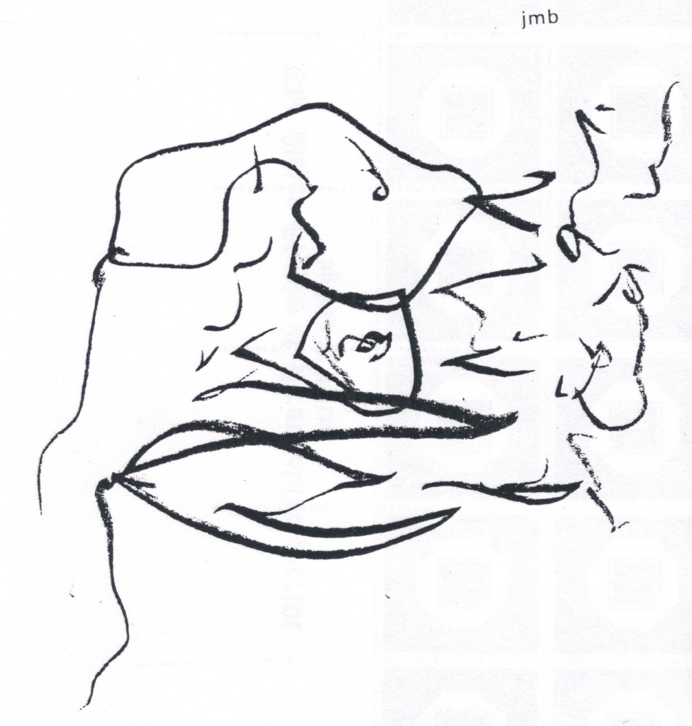
With the top image of asemic art, I run into trouble, for I can’t see what’s textual about it–except for a d and an a–and a 2!  But it’s very difficult to draw something with pen or pencil and not make something that looks like a letter.  I very much like the image (which is by John M. Bennett) as a design, and can force myself to perceive it as a swoopy sort of failed attempt to communicate, but that doesn’t open into anything much, for me.  I find the face I see in it more interesting.

Jake Berry’s image below seems truly textual, though: in fact, it is probably a visual poem, for it has words, and they may well be semantically active (and I hold that a poem needs more than just words, it needs semantically-active words and they must contribute significantly as words to the work’s aesthetic meaning .  I can’t make out these well enough to see how semantically active they are but they work as map labels, so seem to me to contribute significantly enough to what the work is doing aesthetically.  I see it (so far) as an anatomical map of a male torso . . . as countryside.  Lines quivering out a sort of journey to humanness. 

.

Entry 880 — More on Asemaesthetica

Wednesday, October 3rd, 2012

From the coinage, you should be able to tell I’m back on the opium pills, whith two APCs that I’m supposed to avoid to prevent kidney damage.  But I really felt terrible today, and I really really have Important Matters to attend to, basically my next SciAm blog and my moderation duty ies for ART=TEXT=ART.  What I say here about asemic art will count as work on the latter, since it will be about the visimagery/textual interface I’ll be immersed it for that. 

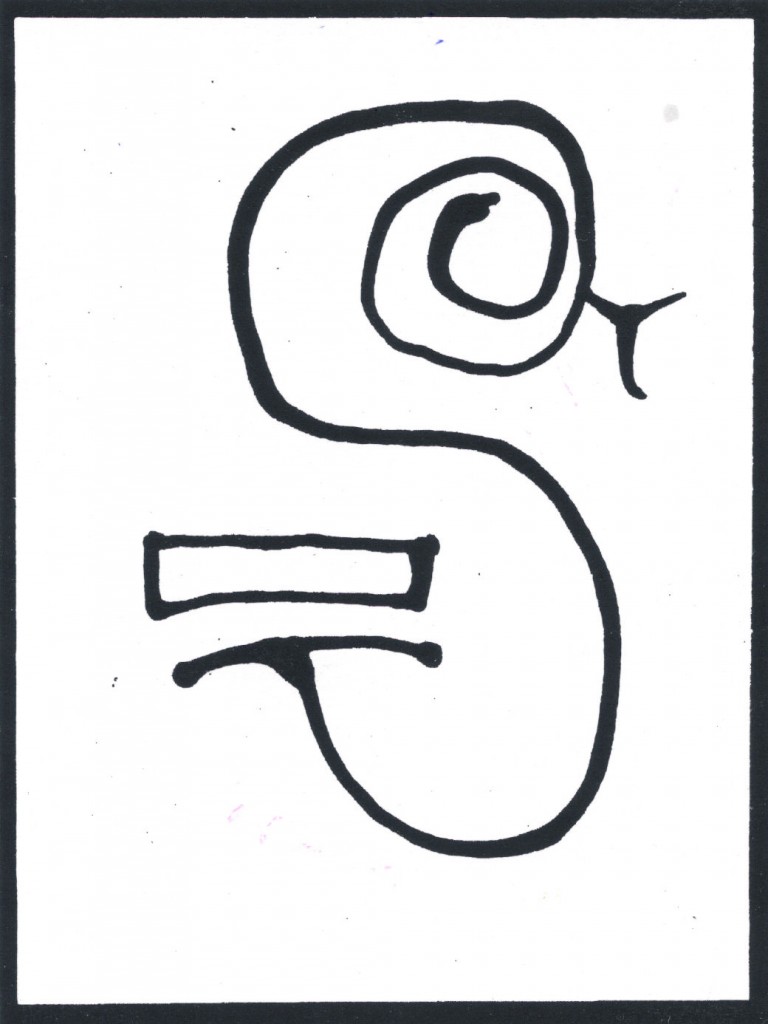
Below is the image from the back cover of the issue of Asemic magazine I’ve been writing about here the past two days.  I believe it’s by “Cornelis Vleeskens (remixed by Tim Gaze),” as the front page of the magazine has it, but I’m not sure because it . . . ah, I see what my problem is now:  the image is described as from “Chinese front cover.”  Veddy clever reference to fact Chinese book start backward.  (That bit of racism was intentional, you should know, ’cause I’m incorrigible.)  Okay, first thing to  notice is that the image looks very Chinese, which I’m assuming it is not.  For me, it’s a picture of a snake as an S.  A beautifully balanced textual design suggestive of A Chinese character, but also–again, for me–of the labyrinth of ancient Crete.  Very simple, very monumental–strongly framed to emphasize both.  The S as something to enter, spend time in, to be captured by . . .  I can’t think of an expressive excuse for the rectangle but like it.  No doubt my intuition is telling me it belongs, and my critical deftness can’t find any words to explain that.  Finally, something very minor, the fact that both an S and a snake hisssssssss.

All this might be pure baloney, but heed me, mine students, my manner of exploration is a most excellent model of attack on an artwork.


.

 count web site traffic
Travelocity Promotion

Entry 878 — Asemic Visimagery

Monday, October 1st, 2012

 The images below are from the third issue of a zine from Australia called, Asemic magazine, compiled, designed & published by Time Gaze.  I don’t know when it was published.  I found it in a file drawer of mine in a hanging folder marked something like “Work to be looked at More Closely” with three or four other like items from anywhere from four to eight years ago.  Needless to say, I never looked at them “more closely.”  So much stuff in my house like that.  Anyway, a day or two ago I was looking for something else, which I never did find, and thought I might use some of the stuff in this drawer I should have marked, “Kept Out of Sight to Prevent Data Overload,” in my blog–which is what I’ve been trying to do for the past three hours.  My computer and/or the Internet is fighting me.  I failed several times to upload the images, and succeeded only to lose them two or three times.  Right now they seem to be in the entry below.

The top one is by Nancy Brush-Burr, the other by Theo Breuer.  Like almost all the pieces in the zine, they are untitled.  I selected them randomly, finding it almost impossible to rank them according to aesthetic value–which is not to say I didn’t find them well worth “looking at very closely.”  More on that tomorrow–if I manage to get both the images and what I’ve just typed posted today.

.

Tim Gaze « POETICKS

Archive for the ‘Tim Gaze’ Category

Entry 880 — More on Asemaesthetica

Wednesday, October 3rd, 2012

From the coinage, you should be able to tell I’m back on the opium pills, whith two APCs that I’m supposed to avoid to prevent kidney damage.  But I really felt terrible today, and I really really have Important Matters to attend to, basically my next SciAm blog and my moderation duty ies for ART=TEXT=ART.  What I say here about asemic art will count as work on the latter, since it will be about the visimagery/textual interface I’ll be immersed it for that. 

Below is the image from the back cover of the issue of Asemic magazine I’ve been writing about here the past two days.  I believe it’s by “Cornelis Vleeskens (remixed by Tim Gaze),” as the front page of the magazine has it, but I’m not sure because it . . . ah, I see what my problem is now:  the image is described as from “Chinese front cover.”  Veddy clever reference to fact Chinese book start backward.  (That bit of racism was intentional, you should know, ’cause I’m incorrigible.)  Okay, first thing to  notice is that the image looks very Chinese, which I’m assuming it is not.  For me, it’s a picture of a snake as an S.  A beautifully balanced textual design suggestive of A Chinese character, but also–again, for me–of the labyrinth of ancient Crete.  Very simple, very monumental–strongly framed to emphasize both.  The S as something to enter, spend time in, to be captured by . . .  I can’t think of an expressive excuse for the rectangle but like it.  No doubt my intuition is telling me it belongs, and my critical deftness can’t find any words to explain that.  Finally, something very minor, the fact that both an S and a snake hisssssssss.

All this might be pure baloney, but heed me, mine students, my manner of exploration is a most excellent model of attack on an artwork.


.

 count web site traffic
Travelocity Promotion

Jake Berry « POETICKS

Archive for the ‘Jake Berry’ Category

Entry 881 — Asemaesthetica, Continued

Thursday, October 4th, 2012

With the top image of asemic art, I run into trouble, for I can’t see what’s textual about it–except for a d and an a–and a 2!  But it’s very difficult to draw something with pen or pencil and not make something that looks like a letter.  I very much like the image (which is by John M. Bennett) as a design, and can force myself to perceive it as a swoopy sort of failed attempt to communicate, but that doesn’t open into anything much, for me.  I find the face I see in it more interesting.

Jake Berry’s image below seems truly textual, though: in fact, it is probably a visual poem, for it has words, and they may well be semantically active (and I hold that a poem needs more than just words, it needs semantically-active words and they must contribute significantly as words to the work’s aesthetic meaning .  I can’t make out these well enough to see how semantically active they are but they work as map labels, so seem to me to contribute significantly enough to what the work is doing aesthetically.  I see it (so far) as an anatomical map of a male torso . . . as countryside.  Lines quivering out a sort of journey to humanness. 

.

Entry 785 — the Otherstream and the Universities

Saturday, June 30th, 2012

As I said in another entry, Jake Berry has an article in The Argotist Online, edited by by Jeffrey Side, that’s about the extremely small attention academia pays to Otherstream poetry you can read here. I and these others wrote responses to it: Ivan Arguelles, Anny Ballardini, Michael Basinski, John M. Bennett, John Bradley, Norman Finkelstein, Jack Foley, Bill Freind, Bill Lavender, Alan May, Carter Monroe, Marjorie Perloff, Dale Smith, Sue Brannan Walker, Henry Weinfield.  A table of contents of the responses is here. I hope eventually to discuss these responses in an essay I’ve started but lately found too many ways to get side-tracked from.   The existence of the article and the responses to it has been fairly widely announced on the Internet.  Jeff Side says they’ve drawn a lot of visitors to The Argotist Online, ” 23,000 visitors, 18,000 of which have viewed it for more than an hour.”  What puzzles both him and me is that so far as we know, almost no one has responded to either the article or the responses to the article.  There’s also a post-article interview of Jake that no one’s said anything about that I know of.  Why?

What we’re most interested in is why no academics have defended academia from Jake’s criticism of it.  Marjorie Perloff was (I believe) the only pure academic to respond to his article, although Jeff invited others to.  And no academic I know of has so much as noted the existence of article and responses.  I find this a fascinating example of the way the universities prevent the status quo from significantly changing in the arts, as for some fifty years they’ve prevented the American status quo in poetry from significantly changing.  Here’s one possible albeit polemical and no doubt exaggerated (and not especially original) explanation for the situation:

Most academics are conformists simply incapable of significantly exploring beyond what they were taught about poetry as students, so lead an intellectual life almost guaranteed to keep them from finding out how ignorant they are of the Full contemporary poetry continuum–they read only magazines guaranteed rarely to publish any kind of poetry they’re unfamiliar with, and just about never reviewing or even mentioning other kinds of poetry.  They only read published collections of poems published by university or commercial (i.e. status quo) presses and visit websites sponsored by their magazines and by universities.  Hence, these academics come sincerely to believe that Wilshberia, the current mainstream in poetry, includes every kind of worthwhile poetry. 

When they encounter evidence that it isn’t such as The Argotist Online’s discussion of academia and the otherstream, several things may happen:

1. the brave ones, like Marjorie Perloff, may actually contest the brief against academia–albeit not very well, as I have shown in a paper I will eventually post somewhere or other;

2. others drawn in by the participation of Perloff may just skim, find flaws in the assertions and arguments of the otherstreamers, and there certainly are some, and leave, satisfied that they’ve been right all along about the otherstream;

3. a few may give some or all the discussion an honest read and investigate otherstream poetry, and join the others satisfied they’ve been right all along, but with better reason since they will have actually investigated it; the problem here is that they won’t have a sufficient amount of what I call accommodance for the ability to basically turn off the critical (academic) mechanisms of their minds to let new ways of poetry make themselves at home in their minds.  In other words, they simply won’t have the ability to deal with the new in poetry. 

4. many will stay completely away from such a discussion, realizing from what those written of in 1., 2. and 3 tell them. that it’s not for them. 

A major question remains: why don’t those described in 2. and 3. comment on their experiences, letting us know why they think they’ve been right all along.  That they do not suggests they unconsciously realize how wrong they may be and don’t want to take a chance of revealing it; or, to be fair, that they consider the otherstream too bereft of value for them to waste time critiquing.  This is stupid; pointing out what’s wrong with bad art is as valuable as pointing out what’s right with good art.  Of course, there are financial reasons to consider:  a critique of art the Establishment is uninterested in will not be anywhere near as likely to get published, or count much toward tenure or post-tenure repute if published as another treatise on Milton or Keats.  Or Ashbery, one of the few slightly innovative contemporary poets of Wilshberia.

But I think, too, that there are academics who unconsciously or even consciously fear giving any publicity at all to visual or sound or performance and any other kind of otherstream poetry because it might overcome Wilshberia and cost them students, invitations to lecture and the like–and/or just make them feel uncomfortably ignorant because incapable of assimilating it.  Even more, it would cost them stature: it would become obvious to all but their closest admirers that they did not know all there is to know about poetry.

Note: I consider this a first draft and almost certainly incomplete.  Comments are nonetheless welcome.

 .

Free Counter
Newegg Promo Codes

Entry 385 — My Most-Used Coinage

Monday, February 21st, 2011

On 2/21/2011 3:21 AM, Jake Berry wrote:

Bob,    Hope this finds you well. I'm working on an essay and I'd like to  use your term 'otherstream', but I want to quote your definition  of the word directly. I haven't been able to find it on the internet  and I have no idea where it might be among all my books and papers.  So how would you define it?    Best,  Jake  

Terrific hearing from you, Jake–although it makes me feel guilty by reminding me of what a horrible correspondent I’ve been for going on ten years or more.  So many people I haven’t kept in touch with but should have!  Although I do keep up with you on the Internet.

Ah, the old days when I was one of the Kings of the  . . . Otherstream because I owned my own Xerox!  I’ve had some ungood years since then.  2010 was possibly the worst year I’ve had in thirty years.  But this year, so far, is going pretty well, although right now I’m in my null zone again.

Maybe not–your e.mail has me at least partway out of it.  Great to know someone still likes my coinage, and it was fun doing my own search for it on the Internet.  I found an article about Dale Jensen and his wife, Judy Wells, in which the term was used, followed by a comment by Jack Foley (good ol’ Jack) declaring that Andrew Joron had not coined “otherstream,” Bob Grumman had!

Somewhere else some guy took credit for coining it in 1996. My guess is that I first used it around 1985, so it has just has its 25th anniversary.  If I, indeed, was the first to use it.  Who knows if I did or not.  I don’t care.  I mean, it’d be nice to know for sure some word that more than a few people use was my word, but I’m really not that big about getting credit.  I want money, not credit!

Oh, I also found out there are various businesses calling themselves “otherstream” this or that, including, I think, a broadcast network.

So, a definition.  I’ve defined it in different although similar ways.  I think I would say that “otherstream” is my adjective for kinds works of art the great majority of arts academics, well-known critics, commercial publishers and commercial magazine editors know little more than the names of, if that.  A brief definition: art that’s now taught in college classes.  For me, it means approximately but only approximately the opposite of “mainstream.”  What it’s the exact opposite of is “knownstream.”  That’s because some art is knownstream, like certain kinds of very formal verse–the sestina, say, is well-known to most literature professors but is not what you’d call a kind of mainstream poetry.  I don’t think cowboy poems are considered mainstream, either, or though fairly popular.  I used it mainly for visual poetry, sound poetry and language poetry when I began using it, but some language poetry has become mainstream.

Hope this helps.  Thanks for wanting to use the word, which I think is a useful one.  And for inspiring me to write what I have here, which I can now use for today’s entry in my blog!  Make sure to link me to your essay when it’s online, or send it to me if it’s printed–with the hundred dollar royalty fee I charge for the use of any of my coinages.  (You can use “knownstream,” also mine, for half-price.)

all best, Bob

Entry 88 — MATO2, Chapter 1.10

Thursday, January 28th, 2010

During the next two  days I got a copy in the mail of the introductory essay Richard Kostelanetz wanted me to critique, the manuscript of a poetry collection John Bennett my press was going to publish, and letters from Jake Berry and Jack Foley.  Richard’s essay was is fairly good but I saw a number of things I counted wrong with it;.  As for John’s manuscript, it seemed fine–one poem in particular, whose main image was a car wash, I especially liked.  I wrote a short letter of full acceptance to John and a card acknowledging receipt, and suggesting he delete much of one section of his essay, to Richard.

Jack’s letter was friendly but he quickly.got on me for under-representing females and blacks (and Asiatics) in of Manywhere.  In my reply I tried to skirt the issue.  I didn’t pugnaciously tell him that my purpose was accuracy, not making the world better for members of victim-groups.  Hence, I wrote about the four canonical poets, all male, whom I admired enough to put explicitly into the sonnet my book was partly about,  and the fifth, also male, to whom the sonnet strongly alluded.  Except for a few short passages about Shakespeare and a mention or two of contemporary linguexpressive poets like Wilbur, my book is about an area of literature few women have done anything of importance in, and no blacks that I knew of at the time I wrote it.  The late Bill Keith is still the only significant black American in visual poetry I know about,  Larry Tomoyasu the only Asian American.   I don’t know whether I knew him when I wrote the first volume of my series.  I don’t believe I mentioned him in it.

The ever-amiable Jake was fully positive about my book.

Cornelis Vleesken « POETICKS

Archive for the ‘Cornelis Vleesken’ Category

Entry 880 — More on Asemaesthetica

Wednesday, October 3rd, 2012

From the coinage, you should be able to tell I’m back on the opium pills, whith two APCs that I’m supposed to avoid to prevent kidney damage.  But I really felt terrible today, and I really really have Important Matters to attend to, basically my next SciAm blog and my moderation duty ies for ART=TEXT=ART.  What I say here about asemic art will count as work on the latter, since it will be about the visimagery/textual interface I’ll be immersed it for that. 

Below is the image from the back cover of the issue of Asemic magazine I’ve been writing about here the past two days.  I believe it’s by “Cornelis Vleeskens (remixed by Tim Gaze),” as the front page of the magazine has it, but I’m not sure because it . . . ah, I see what my problem is now:  the image is described as from “Chinese front cover.”  Veddy clever reference to fact Chinese book start backward.  (That bit of racism was intentional, you should know, ’cause I’m incorrigible.)  Okay, first thing to  notice is that the image looks very Chinese, which I’m assuming it is not.  For me, it’s a picture of a snake as an S.  A beautifully balanced textual design suggestive of A Chinese character, but also–again, for me–of the labyrinth of ancient Crete.  Very simple, very monumental–strongly framed to emphasize both.  The S as something to enter, spend time in, to be captured by . . .  I can’t think of an expressive excuse for the rectangle but like it.  No doubt my intuition is telling me it belongs, and my critical deftness can’t find any words to explain that.  Finally, something very minor, the fact that both an S and a snake hisssssssss.

All this might be pure baloney, but heed me, mine students, my manner of exploration is a most excellent model of attack on an artwork.


.

 count web site traffic
Travelocity Promotion