Matthew Stolte « POETICKS

Archive for the ‘Matthew Stolte’ Category

Entry 918 — Another Collaboration

Saturday, November 10th, 2012

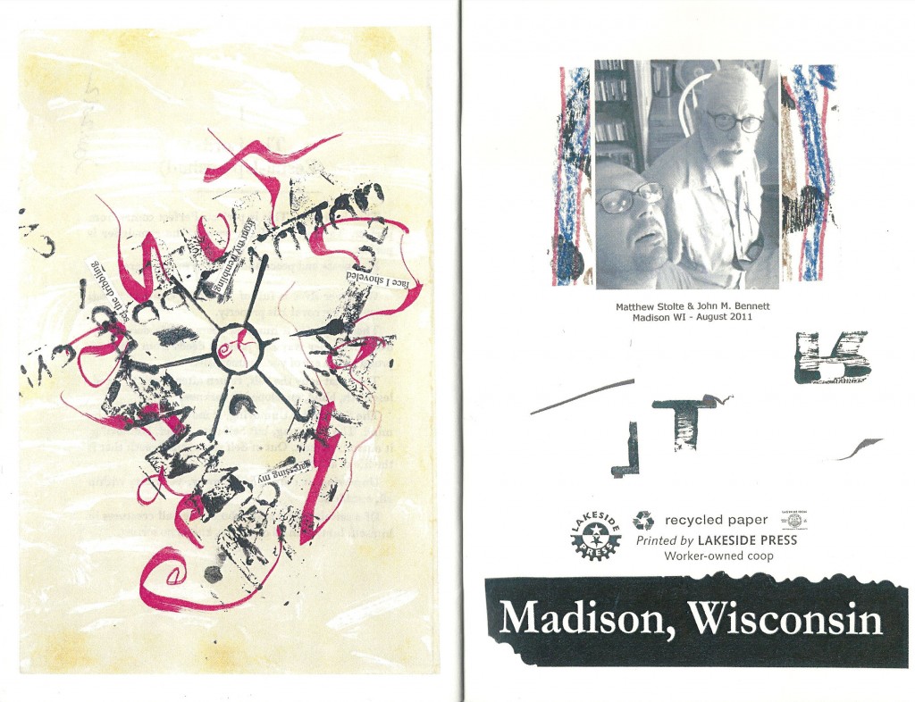
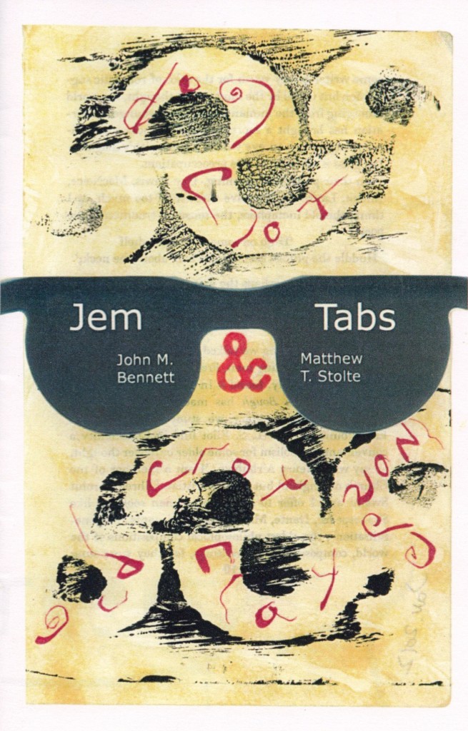
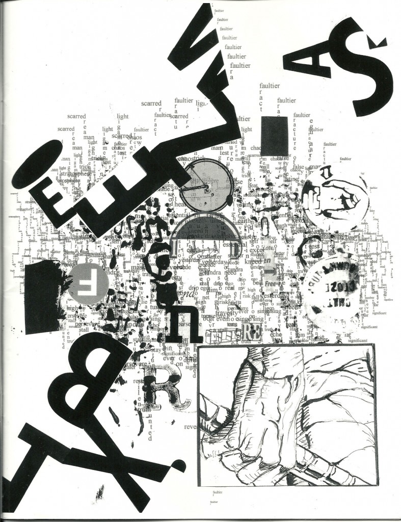
I’ve reproduced the cover of Jem Tabs, the collection of collaborations between John Bennett and Matthew Stolte:


I seem to be  going through a very empty period creatively, I think because I’ll soon be taking a short trip north for a niece’s wedding.  Having to travel too far from home always screws up my mind.  Anyway, I had to scramble to find something to put in this entry.  I grabbed this mainly because, for some reason, I love the idea of scrawled words inside large letters, or parts of letters.  There’s something metaphorically important involved but I can’t yet finger it.  Needless to say, I like the way the thing looks, too.  And it’s always worthwhile giving such material a plug. 

.

Entry 916 — Stolte & Topel

Thursday, November 8th, 2012

Today I have another specimen of collaboration for you, something by Matthew Stolte and Andrew Topel from their ATORVTTK:

This is “just” a collage, but–frankly–I can’t yet begin to interpret it.  That’s after the brief scan that is enough for me usually to see an entrance to some kind of meaning.  Actually, the problem here might be to many entrances at once–which is definitely not a fault but a virtue that forces a pleruser to take a long time to unconfuse into proper appreciation.  I can tell at a glance that this work (which is the first unit in a long sequence) is not slotched together.  But I haven’t time yet to unconfuse, just time to enjoy the surface fun of the piece.

.

Entry 915 — Lunacy (Stolte/Bennett)

Wednesday, November 7th, 2012

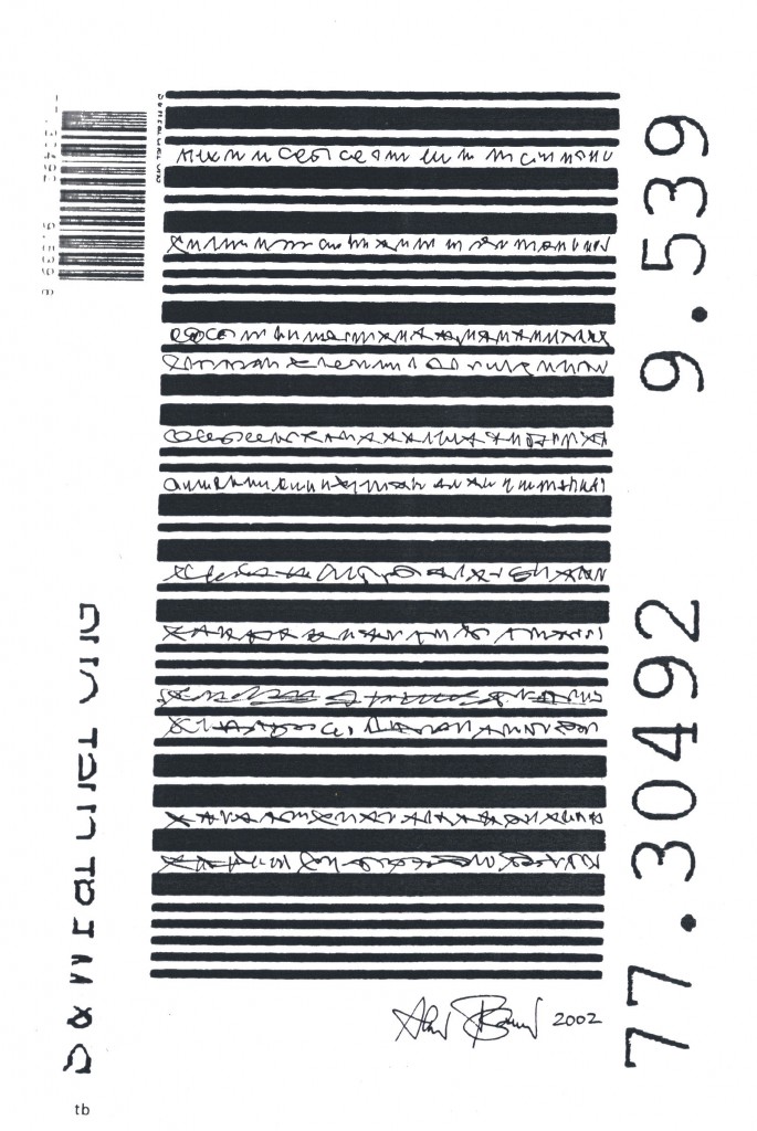
Matthew Stolte is a young friend of mine whom I know only through the mail and the Internet, and John M. Bennett is an older friend of mine whom I’ve actually been within a foot or less of more than once!  They both do work I greatly admire, so you should understand that when I call their chapbook collaboration of 23 pieces (which includes the graphics on both sides of each cover), Jem Tabs, lunacy, I mean greatly to compliment it.  See below for its final interior piece and the inside of its back cover (and left-click it to see it better):

Fantasy Scenario Number Two: Jesus pays a visit to me and tells me I have two choices: (1) live healthily to the age of a hundred but continue having the sort of days I’ve had all my life–i.e., neither horrideously crappy nor particularly whoopeeic, or (2) spend a week with a 100 wacks like Matthew and John (hmmm, Jesus and Matthew and John?), each of whom has been hypnotized, if necessary, to want to spend twelve hours of each day we’re together, collaborating on works like the ones in Jem Tabs, and then leave this mortal coil in some innocuous manner.   Easy choice.  In other words, John and Matthew’s collabs make me drool to collaborate with either–or with the many others in our field known to enjoy collaboration.  In fact, I can’t think of any such collaborations I’ve seen that don’t have a similar effect on me.  Why aren’t I begging people to collaborate with me, then?  Too much else on my plate at the moment.

One general thought about the two pieces above: that one unarguable thing they convey is the pleasure (I almost want to say, “the ecstasy,” but that would be an exaggeration) of the search for meaning, even though it may often not fully succeed, and even sometimes find hardly any large meaning.  Most do lead one to enough discoveries to make one feel good, though.  That’s all that almost any search for meaning will do.  In the piece to the left above, I see, “shut close facet,” with the latter suggesting “focus,” because the its first four letters could be “focu,” and it ends in the center of a focusing wheel.  Then comes the whirl of the request of the reader, or someone, to “set the dribbling/ from (the speaker’s) trembling/ face,” etc. around a triangle of visimages that include what looks to me to be a human ear that is also a tunnel.  Much of a where keeps those caught in anthragreement with John and Matthew’s map willing to explore further. 

Is its verbal content enough to make it a visual poem?  I’m not sure.  The expedition is there for those lunatic enough to see it regardless.

.
Asemic Art « POETICKS

Archive for the ‘Asemic Art’ Category

Entry 915 — Lunacy (Stolte/Bennett)

Wednesday, November 7th, 2012

Matthew Stolte is a young friend of mine whom I know only through the mail and the Internet, and John M. Bennett is an older friend of mine whom I’ve actually been within a foot or less of more than once!  They both do work I greatly admire, so you should understand that when I call their chapbook collaboration of 23 pieces (which includes the graphics on both sides of each cover), Jem Tabs, lunacy, I mean greatly to compliment it.  See below for its final interior piece and the inside of its back cover (and left-click it to see it better):

Fantasy Scenario Number Two: Jesus pays a visit to me and tells me I have two choices: (1) live healthily to the age of a hundred but continue having the sort of days I’ve had all my life–i.e., neither horrideously crappy nor particularly whoopeeic, or (2) spend a week with a 100 wacks like Matthew and John (hmmm, Jesus and Matthew and John?), each of whom has been hypnotized, if necessary, to want to spend twelve hours of each day we’re together, collaborating on works like the ones in Jem Tabs, and then leave this mortal coil in some innocuous manner.   Easy choice.  In other words, John and Matthew’s collabs make me drool to collaborate with either–or with the many others in our field known to enjoy collaboration.  In fact, I can’t think of any such collaborations I’ve seen that don’t have a similar effect on me.  Why aren’t I begging people to collaborate with me, then?  Too much else on my plate at the moment.

One general thought about the two pieces above: that one unarguable thing they convey is the pleasure (I almost want to say, “the ecstasy,” but that would be an exaggeration) of the search for meaning, even though it may often not fully succeed, and even sometimes find hardly any large meaning.  Most do lead one to enough discoveries to make one feel good, though.  That’s all that almost any search for meaning will do.  In the piece to the left above, I see, “shut close facet,” with the latter suggesting “focus,” because the its first four letters could be “focu,” and it ends in the center of a focusing wheel.  Then comes the whirl of the request of the reader, or someone, to “set the dribbling/ from (the speaker’s) trembling/ face,” etc. around a triangle of visimages that include what looks to me to be a human ear that is also a tunnel.  Much of a where keeps those caught in anthragreement with John and Matthew’s map willing to explore further. 

Is its verbal content enough to make it a visual poem?  I’m not sure.  The expedition is there for those lunatic enough to see it regardless.

.
Entry 889 — Another by Nancy Brush-Burr

Friday, October 12th, 2012

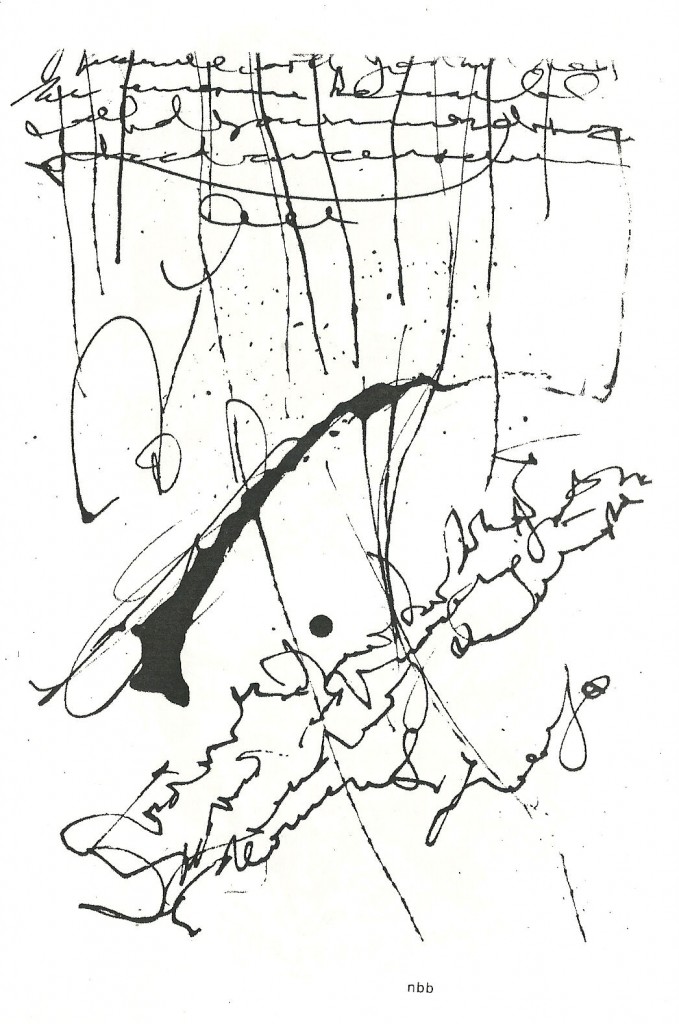
I love rain, so I see rain in this, and therefore love the work.  Even if no one finds rain in it but I.  More tomorrow, I hope.  I’ve just had a rough time with my computer, which for a while seemed to have crashed.  It’s okay, but the stress did me in.  (Please, if you’re just going to comment in order to denigrate the piece as scribbling or whatever instead of intelligently analyzing, hold off.)

 .

Entry 887 — Another Asemic Work

Wednesday, October 10th, 2012

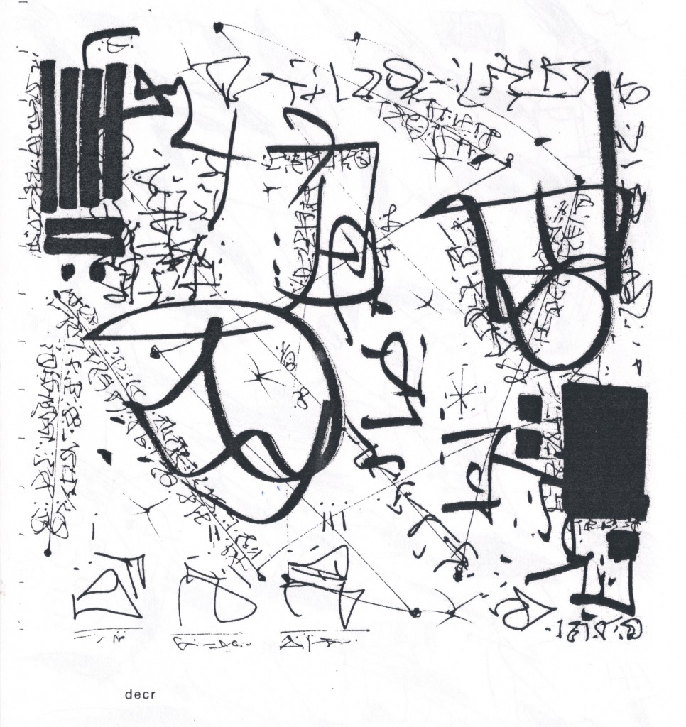
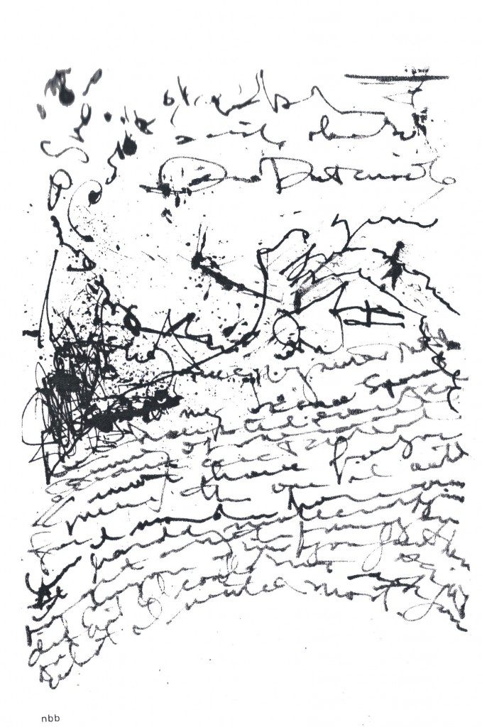
This one’s by D.E.C. robbins (as his name appears in the table of contents of Asemic magazine).  I’m still a bit wobbly upstairs due to the surgical procedure I underwent yesterday, and the many errands I ran this morning, so I doubt I’ll be able to say much about it.  Its author, new to me, is from San Diego.

I was besmitten at first by the design–the four-plank rectangle in the far upper left rhyming with the filled-in rectangle near the lower right; the four broad-stroked scribbles from left to right pierced by the diagonal of hieroglyphic-like characters beginning in the lower right corner scribbled in slightly less broad strokes.  Does it do more than fascinatingly play theme and variation all over its surface, with strong suggests of textuality?  I’m not sure.  But its layers of pictured expression of some sort intrigue me.


.

Entry 881 — Asemaesthetica, Continued

Thursday, October 4th, 2012

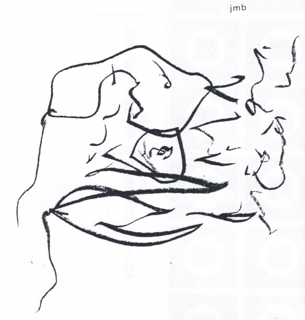
With the top image of asemic art, I run into trouble, for I can’t see what’s textual about it–except for a d and an a–and a 2!  But it’s very difficult to draw something with pen or pencil and not make something that looks like a letter.  I very much like the image (which is by John M. Bennett) as a design, and can force myself to perceive it as a swoopy sort of failed attempt to communicate, but that doesn’t open into anything much, for me.  I find the face I see in it more interesting.

Jake Berry’s image below seems truly textual, though: in fact, it is probably a visual poem, for it has words, and they may well be semantically active (and I hold that a poem needs more than just words, it needs semantically-active words and they must contribute significantly as words to the work’s aesthetic meaning .  I can’t make out these well enough to see how semantically active they are but they work as map labels, so seem to me to contribute significantly enough to what the work is doing aesthetically.  I see it (so far) as an anatomical map of a male torso . . . as countryside.  Lines quivering out a sort of journey to humanness. 

.

Entry 880 — More on Asemaesthetica

Wednesday, October 3rd, 2012

From the coinage, you should be able to tell I’m back on the opium pills, whith two APCs that I’m supposed to avoid to prevent kidney damage.  But I really felt terrible today, and I really really have Important Matters to attend to, basically my next SciAm blog and my moderation duty ies for ART=TEXT=ART.  What I say here about asemic art will count as work on the latter, since it will be about the visimagery/textual interface I’ll be immersed it for that. 

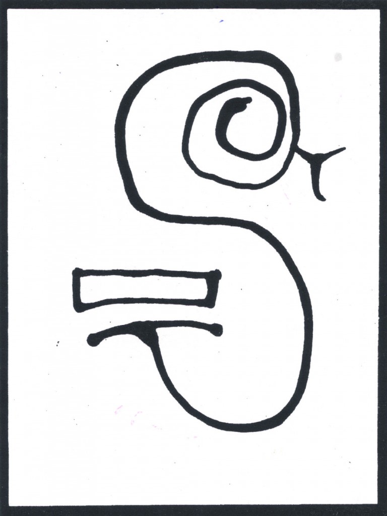
Below is the image from the back cover of the issue of Asemic magazine I’ve been writing about here the past two days.  I believe it’s by “Cornelis Vleeskens (remixed by Tim Gaze),” as the front page of the magazine has it, but I’m not sure because it . . . ah, I see what my problem is now:  the image is described as from “Chinese front cover.”  Veddy clever reference to fact Chinese book start backward.  (That bit of racism was intentional, you should know, ’cause I’m incorrigible.)  Okay, first thing to  notice is that the image looks very Chinese, which I’m assuming it is not.  For me, it’s a picture of a snake as an S.  A beautifully balanced textual design suggestive of A Chinese character, but also–again, for me–of the labyrinth of ancient Crete.  Very simple, very monumental–strongly framed to emphasize both.  The S as something to enter, spend time in, to be captured by . . .  I can’t think of an expressive excuse for the rectangle but like it.  No doubt my intuition is telling me it belongs, and my critical deftness can’t find any words to explain that.  Finally, something very minor, the fact that both an S and a snake hisssssssss.

All this might be pure baloney, but heed me, mine students, my manner of exploration is a most excellent model of attack on an artwork.


.

 count web site traffic
Travelocity Promotion

Entry 878 — Asemic Visimagery

Monday, October 1st, 2012

 The images below are from the third issue of a zine from Australia called, Asemic magazine, compiled, designed & published by Time Gaze.  I don’t know when it was published.  I found it in a file drawer of mine in a hanging folder marked something like “Work to be looked at More Closely” with three or four other like items from anywhere from four to eight years ago.  Needless to say, I never looked at them “more closely.”  So much stuff in my house like that.  Anyway, a day or two ago I was looking for something else, which I never did find, and thought I might use some of the stuff in this drawer I should have marked, “Kept Out of Sight to Prevent Data Overload,” in my blog–which is what I’ve been trying to do for the past three hours.  My computer and/or the Internet is fighting me.  I failed several times to upload the images, and succeeded only to lose them two or three times.  Right now they seem to be in the entry below.

The top one is by Nancy Brush-Burr, the other by Theo Breuer.  Like almost all the pieces in the zine, they are untitled.  I selected them randomly, finding it almost impossible to rank them according to aesthetic value–which is not to say I didn’t find them well worth “looking at very closely.”  More on that tomorrow–if I manage to get both the images and what I’ve just typed posted today.

.